harmony 鸿蒙Panel
Panel
The
NOTE
This component is supported since API version 7. Updates will be marked with a superscript to indicate their earliest API version.
Child Components
Supported
NOTE
Built-in components and custom components are allowed, with support for (if/else, ForEach, and LazyForEach) rendering control.
APIs
Panel(show: boolean)
Parameters
| Name | Type | Mandatory | Description |
|---|---|---|---|
| show | boolean | Yes | Whether the panel is shown. NOTE The panel is hidden and does not take up space in the layout if this parameter is set to false or Visible.None is set. |
Attributes
In addition to the universal attributes, the following attributes are supported.
| Name | Type | Description |
|---|---|---|
| type | PanelType | Type of the panel. Default value: PanelType.Foldable |
| mode | PanelMode | Initial status of the panel. Default value for the Minibar type: PanelMode.Mini Default value for other types: PanelMode.Half Since API version 10, this attribute supports $$ for two-way binding of variables. |
| dragBar | boolean | Whether to enable a drag bar. The value true means that the drag bar will be displayed, and false means the opposite. Default value: true |
| customHeight10+ | Dimension |PanelHeight | Height of the panel in the PanelType.CUSTOM type. Default value: 0 NOTE This attribute cannot be set in percentage. |
| fullHeight | string |number | Height of the panel in PanelMode.Full mode. Default value: main axis height of the panel minus 8 vp NOTE This attribute cannot be set in percentage. |
| halfHeight | string |number | Height of the panel in PanelMode.Half mode. Default value: half of the main axis height of the panel NOTE This attribute cannot be set in percentage. |
| miniHeight | string |number | Panel height in the PanelMode.Mini mode. Default value: 48 Unit: vp NOTE This attribute cannot be set in percentage. |
| show | boolean | Whether to show the panel. Default value: true |
| backgroundMask9+ | ResourceColor | Background mask of the panel. Default value: ’#08182431’ |
| showCloseIcon10+ | boolean | Whether to display the close icon. The value true means to display the close icon, and false means the opposite. Default value: false |
PanelType
| Name | Description |
|---|---|
| Minibar | A minibar panel displays content in the minibar area or a large (fullscreen-like) area. |
| Foldable | A foldable panel displays permanent content in a large (fullscreen-like), medium-sized (halfscreen-like), or small area. |
| Temporary | A temporary panel displays content in a large (fullscreen-like) or medium-sized (halfscreen-like) area. |
| CUSTOM10+ | A custom panel automatically adapts its height to the content, without support for manual size switching. |
PanelMode
| Name | Description |
|---|---|
| Mini | Displays a minibar or foldable panel in its minimum size. This attribute does not take effect for temporary panels. |
| Half | Displays a foldable or temporary panel in a medium-sized (halfscreen-like) area. This attribute does not take effect for minibar panels. |
| Full | Displays a panel in a large (fullscreen-like) area. |
PanelHeight10+
| Name | Description |
|---|---|
| WRAP_CONTENT | When the type is CUSTOM, the panel automatically adapts its height to the content. |
Events
In addition to the universal events, the following events are supported.
| Name | Description |
|---|---|
| onChange(event: (width: number, height: number, mode: PanelMode) => void) | Triggered when the status of the panel changes. The returned height value is the height of the content area. When the value of dragBar is true, the panel height is the sum of the drag bar height and content area height. |
| onHeightChange(callback: (value: number) => void)9+ | Triggered when the height of the panel changes. The returned height value is the height of the content area, in px by default. When the value of dragBar is true, the panel height is the sum of the drag bar height and content area height. For user experience purposes, the panel can be slid to only this height: fullHeight - 8 vp. |
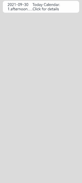
Example
// xxx.ets
@Entry
@Component
struct PanelExample {
  @State show: boolean = false

  build() {
    Column() {
      Text('2021-09-30    Today Calendar: 1.afternoon......Click for details')
        .width('90%')
        .height(50)
        .borderRadius(10)
        .backgroundColor(0xFFFFFF)
        .padding({ left: 20 })
        .onClick(() => {
          this.show = !this.show
        })
            Panel(this.show) { // Display the agenda.
        Column() {
          Text('Today Calendar')
          Divider()
          Text('1. afternoon 4:00 The project meeting')
        }
      }
      .type(PanelType.Foldable)
      .mode(PanelMode.Half)
      .dragBar(true) // The drag bar is enabled by default.
      .halfHeight(500) // The panel height is half of the screen height by default.
      .showCloseIcon(true) // Display the close icon.
      .onChange((width: number, height: number, mode: PanelMode) => {
        console.info(`width:${width},height:${height},mode:${mode}`)
      })
    }.width('100%').height('100%').backgroundColor(0xDCDCDC).padding({ top: 5 })
  }
}
你可能感兴趣的鸿蒙文章
harmony 鸿蒙ArkTS-based Declarative Development Paradigm
0
赞
- 所属分类: 后端技术
- 本文标签:
热门推荐
-
2、 优质文章
-
3、 gt
-
7、 openharmony
-
9、 golang
-
10、 Vue中input框自动聚焦