harmony 鸿蒙安全控件通用属性
安全控件通用属性
安全控件的基础属性,用于设置安全控件通用的属性。
说明:
该组件从API Version 10开始支持。后续版本如有新增内容,则采用上角标单独标记该内容的起始版本。
iconSize
iconSize(value: Dimension): T
设置安全控件图标的尺寸。
原子化服务API: 从API version 11开始,该接口支持在原子化服务中使用。
系统能力: SystemCapability.ArkUI.ArkUI.Full
参数:
| 参数名 | 类型 | 必填 | 说明 |
|---|---|---|---|
| value | Dimension | 是 | 安全控件上图标的尺寸。 默认值:16vp。 不支持设置百分比字符串。 |
返回值:
| 类型 | 说明 |
|---|---|
| T | 返回安全控件的属性。 |
layoutDirection
layoutDirection(value: SecurityComponentLayoutDirection): T
设置安全控件图标和文字分布的方向。
原子化服务API: 从API version 11开始,该接口支持在原子化服务中使用。
系统能力: SystemCapability.ArkUI.ArkUI.Full
参数:
| 参数名 | 类型 | 必填 | 说明 |
|---|---|---|---|
| value | SecurityComponentLayoutDirection | 是 | 安全控件上图标和文字分布的方向。 默认值:SecurityComponentLayoutDirection.HORIZONTAL。 |
返回值:
| 类型 | 说明 |
|---|---|
| T | 返回安全控件的属性。 |
position
position(value: Position): T
设置绝对定位,设置安全控件的左上角相对于父容器左上角的偏移位置。
原子化服务API: 从API version 11开始,该接口支持在原子化服务中使用。
系统能力: SystemCapability.ArkUI.ArkUI.Full
参数:
| 参数名 | 类型 | 必填 | 说明 |
|---|---|---|---|
| value | Position | 是 | 安全控件的左上角相对于父容器左上角的偏移位置。 默认值: { x: 0, y: 0 }。 |
返回值:
| 类型 | 说明 |
|---|---|
| T | 返回安全控件的属性。 |
markAnchor
markAnchor(value: Position): T
设置安全控件在位置定位时的锚点,以控件左上角作为基准点进行偏移。
原子化服务API: 从API version 11开始,该接口支持在原子化服务中使用。
系统能力: SystemCapability.ArkUI.ArkUI.Full
参数:
| 参数名 | 类型 | 必填 | 说明 |
|---|---|---|---|
| value | Position | 是 | 安全控件在位置定位时的锚点,以控件左上角作为基准点进行偏移。通常配合position和offset属性使用,单独使用时,效果类似offset。 默认值: { x: 0, y: 0 }。 |
返回值:
| 类型 | 说明 |
|---|---|
| T | 返回安全控件的属性。 |
offset
offset(value: Position|Edges|LocalizedEdges): T
设置安全控件相对于自身布局位置的坐标偏移。
原子化服务API: 从API version 11开始,该接口支持在原子化服务中使用。
系统能力: SystemCapability.ArkUI.ArkUI.Full
参数:
| 参数名 | 类型 | 必填 | 说明 |
|---|---|---|---|
| value | Position |Edges12+ |LocalizedEdges12+ | 是 | 安全控件相对于自身布局位置的坐标偏移。设置此属性不会影响父容器的布局,仅在绘制过程中调整位置。 默认值: { x: 0, y: 0 }。 |
返回值:
| 类型 | 说明 |
|---|---|
| T | 返回安全控件的属性。 |
fontSize
fontSize(value: Dimension): T
设置安全控件文字的尺寸。
原子化服务API: 从API version 11开始,该接口支持在原子化服务中使用。
系统能力: SystemCapability.ArkUI.ArkUI.Full
参数:
| 参数名 | 类型 | 必填 | 说明 |
|---|---|---|---|
| value | Dimension | 是 | 安全控件上文字的尺寸。 默认值:16fp。 不支持设置百分比字符串。 |
返回值:
| 类型 | 说明 |
|---|---|
| T | 返回安全控件的属性。 |
fontStyle
fontStyle(value: FontStyle): T
设置安全控件文字的样式。
原子化服务API: 从API version 11开始,该接口支持在原子化服务中使用。
系统能力: SystemCapability.ArkUI.ArkUI.Full
参数:
| 参数名 | 类型 | 必填 | 说明 |
|---|---|---|---|
| value | FontStyle | 是 | 安全控件上文字的样式。 默认值:FontStyle.Normal。 |
返回值:
| 类型 | 说明 |
|---|---|
| T | 返回安全控件的属性。 |
fontWeight
fontWeight(value: number|FontWeight|string|Resource): T
设置安全控件文字粗细。
原子化服务API: 从API version 11开始,该接口支持在原子化服务中使用。
系统能力: SystemCapability.ArkUI.ArkUI.Full
参数:
| 参数名 | 类型 | 必填 | 说明 |
|---|---|---|---|
| value | number |FontWeight |string |Resource20+ | 是 | 安全控件上文字粗细。 number类型取值[100, 900],取值间隔为100,取值越大,字体越粗。 string类型支持使用数字字符串(如’400’),以及FontWeight中的枚举值对应的字符串(如’bold’、’bolder’、’lighter’、’regular’、’medium’)。 从API version 20开始,支持Resource类型。Resource类型仅支持’integer’和’string’,当类型为’integer’时,取值参考前述number类型;当类型为’string’时,取值参考前述string类型。 如果控件未设置fontWeight,文字粗细将默认设置为FontWeight.Medium;如果value入参为非法值,文字粗细将被设置为FontWeight.Normal。 |
返回值:
| 类型 | 说明 |
|---|---|
| T | 返回安全控件的属性。 |
fontFamily
fontFamily(value: string|Resource): T
设置安全控件文字的字体。
原子化服务API: 从API version 11开始,该接口支持在原子化服务中使用。
系统能力: SystemCapability.ArkUI.ArkUI.Full
参数:
| 参数名 | 类型 | 必填 | 说明 |
|---|---|---|---|
| value | string |Resource | 是 | 安全控件上文字的字体。 默认字体:’HarmonyOS Sans’。 |
返回值:
| 类型 | 说明 |
|---|---|
| T | 返回安全控件的属性。 |
fontColor
fontColor(value: ResourceColor): T
设置安全控件文字的颜色。
原子化服务API: 从API version 11开始,该接口支持在原子化服务中使用。
系统能力: SystemCapability.ArkUI.ArkUI.Full
参数:
| 参数名 | 类型 | 必填 | 说明 |
|---|---|---|---|
| value | ResourceColor | 是 | 安全控件上文字的颜色。 默认值:$r(‘sys.color.font_on_primary’)。 |
返回值:
| 类型 | 说明 |
|---|---|
| T | 返回安全控件的属性。 |
iconColor
iconColor(value: ResourceColor): T
设置安全控件图标的颜色。
原子化服务API: 从API version 11开始,该接口支持在原子化服务中使用。
系统能力: SystemCapability.ArkUI.ArkUI.Full
参数:
| 参数名 | 类型 | 必填 | 说明 |
|---|---|---|---|
| value | ResourceColor | 是 | 安全控件上图标的颜色。 默认值:$r(‘sys.color.icon_on_primary’)。 |
返回值:
| 类型 | 说明 |
|---|---|
| T | 返回安全控件的属性。 |
backgroundColor
backgroundColor(value: ResourceColor): T
设置安全控件的背景颜色。
原子化服务API: 从API version 11开始,该接口支持在原子化服务中使用。
系统能力: SystemCapability.ArkUI.ArkUI.Full
参数:
| 参数名 | 类型 | 必填 | 说明 |
|---|---|---|---|
| value | ResourceColor | 是 | 安全控件的背景颜色。安全控件按钮背景色高八位的α值低于0x1a(例如0x1800ff00)时,安全控件按钮背景色高八位的α值会被系统强制调整为0xff。 默认值:$r(‘sys.color.icon_emphasize’)。 |
返回值:
| 类型 | 说明 |
|---|---|
| T | 返回安全控件的属性。 |
borderStyle
borderStyle(value: BorderStyle): T
设置安全控件的边框的样式。
原子化服务API: 从API version 11开始,该接口支持在原子化服务中使用。
系统能力: SystemCapability.ArkUI.ArkUI.Full
参数:
| 参数名 | 类型 | 必填 | 说明 |
|---|---|---|---|
| value | BorderStyle | 是 | 安全控件的边框的样式。 默认不设置边框样式。 |
返回值:
| 类型 | 说明 |
|---|---|
| T | 返回安全控件的属性。 |
borderWidth
borderWidth(value: Dimension): T
设置安全控件的边框的宽度。
原子化服务API: 从API version 11开始,该接口支持在原子化服务中使用。
系统能力: SystemCapability.ArkUI.ArkUI.Full
参数:
| 参数名 | 类型 | 必填 | 说明 |
|---|---|---|---|
| value | Dimension | 是 | 安全控件的边框的宽度。 默认不设置边框宽度。 |
返回值:
| 类型 | 说明 |
|---|---|
| T | 返回安全控件的属性。 |
borderColor
borderColor(value: ResourceColor): T
设置安全控件的边框的颜色。
原子化服务API: 从API version 11开始,该接口支持在原子化服务中使用。
系统能力: SystemCapability.ArkUI.ArkUI.Full
参数:
| 参数名 | 类型 | 必填 | 说明 |
|---|---|---|---|
| value | ResourceColor | 是 | 安全控件的边框的颜色。 默认不设置边框颜色。 |
返回值:
| 类型 | 说明 |
|---|---|
| T | 返回安全控件的属性。 |
borderRadius
borderRadius(value: Dimension): T
设置安全控件的边框圆角半径。
原子化服务API: 从API version 11开始,该接口支持在原子化服务中使用。
系统能力: SystemCapability.ArkUI.ArkUI.Full
参数:
| 参数名 | 类型 | 必填 | 说明 |
|---|---|---|---|
| value | Dimension | 是 | 安全控件的边框圆角半径。 |
返回值:
| 类型 | 说明 |
|---|---|
| T | 返回安全控件的属性。 |
borderRadius15+
borderRadius(radius: Dimension|BorderRadiuses): T
设置安全控件的边框圆角半径,支持分别设置四个圆角。
原子化服务API: 从API version 15开始,该接口支持在原子化服务中使用。
系统能力: SystemCapability.ArkUI.ArkUI.Full
参数:
| 参数名 | 类型 | 必填 | 说明 |
|---|---|---|---|
| radius | Dimension |BorderRadiuses | 是 | 安全控件的边框圆角半径。 |
返回值:
| 类型 | 说明 |
|---|---|
| T | 返回安全控件的属性。 |
padding
padding(value: Padding|Dimension): T
设置安全控件的内边距。
原子化服务API: 从API version 11开始,该接口支持在原子化服务中使用。
系统能力: SystemCapability.ArkUI.ArkUI.Full
参数:
| 参数名 | 类型 | 必填 | 说明 |
|---|---|---|---|
| value | Padding |Dimension | 是 | 安全控件的内边距。 默认值:上下8vp,左右16vp。 |
返回值:
| 类型 | 说明 |
|---|---|
| T | 返回安全控件的属性。 |
align15+
align(alignType: Alignment): T
设置安全控件图标文本的对齐方式。
原子化服务API: 从API version 15开始,该接口支持在原子化服务中使用。
系统能力: SystemCapability.ArkUI.ArkUI.Full
参数:
| 参数名 | 类型 | 必填 | 说明 |
|---|---|---|---|
| alignType | Alignment | 是 | 安全控件图标文本的对齐方式。图标文本作为整体在控件背托范围内进行对齐,UX显示受padding影响,在padding生效的基础上进行指定方式对齐。 默认值:Alignment.Center。 |
返回值:
| 类型 | 说明 |
|---|---|
| T | 返回安全控件的属性。 |
textIconSpace
textIconSpace(value: Dimension): T
设置安全控件中图标和文字的间距。
原子化服务API: 从API version 11开始,该接口支持在原子化服务中使用。
系统能力: SystemCapability.ArkUI.ArkUI.Full
参数:
| 参数名 | 类型 | 必填 | 说明 |
|---|---|---|---|
| value | Dimension | 是 | 安全控件中图标和文字的间距。不支持设置百分比字符串。从API 14开始,若设置值为负值,则使用默认值。 默认值:4vp。 |
返回值:
| 类型 | 说明 |
|---|---|
| T | 返回安全控件的属性。 |
width11+
width(value: Length): T
设置安全控件自身的宽度,缺省时将根据元素内容自适配宽度。
原子化服务API: 从API version 12开始,该接口支持在原子化服务中使用。
系统能力: SystemCapability.ArkUI.ArkUI.Full
参数:
| 参数名 | 类型 | 必填 | 说明 |
|---|---|---|---|
| value | Length | 是 | 安全控件自身的宽度,缺省时将根据元素内容自适配宽度。若设置宽度小于当前属性组合下允许的最小宽度时,宽度会调整为设置值,此时按钮文本信息会自动换行,以保证安全控件显示的完整性。 |
返回值:
| 类型 | 说明 |
|---|---|
| T | 返回安全控件的属性。 |
height11+
height(value: Length): T
设置安全控件自身的高度,缺省时将根据元素内容自适配高度。
原子化服务API: 从API version 12开始,该接口支持在原子化服务中使用。
系统能力: SystemCapability.ArkUI.ArkUI.Full
参数:
| 参数名 | 类型 | 必填 | 说明 |
|---|---|---|---|
| value | Length | 是 | 安全控件自身的高度,缺省时将根据元素内容自适配高度。若设置高度小于当前属性组合下允许的最小高度时,高度不会缩减到设置值,此时高度会大于设置高度,以保证安全控件显示的完整性。 |
返回值:
| 类型 | 说明 |
|---|---|
| T | 返回安全控件的属性。 |
size11+
size(value: SizeOptions): T
设置高宽尺寸,缺省时将根据元素内容自适配高宽尺寸。
原子化服务API: 从API version 12开始,该接口支持在原子化服务中使用。
系统能力: SystemCapability.ArkUI.ArkUI.Full
参数:
| 参数名 | 类型 | 必填 | 说明 |
|---|---|---|---|
| value | SizeOptions | 是 | 高宽尺寸,缺省时将根据元素内容自适配高宽尺寸。若设置尺寸小于当前属性组合下允许的最小尺寸时,高度不会缩减到设置值,宽度会调整到设置值,此时按钮文本信息会自动换行,以保证安全控件显示的完整性。 |
返回值:
| 类型 | 说明 |
|---|---|
| T | 返回安全控件的属性。 |
constraintSize11+
constraintSize(value: ConstraintSizeOptions): T
设置约束尺寸,组件布局时,进行尺寸范围限制。
原子化服务API: 从API version 12开始,该接口支持在原子化服务中使用。
系统能力: SystemCapability.ArkUI.ArkUI.Full
参数:
| 参数名 | 类型 | 必填 | 说明 |
|---|---|---|---|
| value | ConstraintSizeOptions | 是 | 约束尺寸,组件布局时,进行尺寸范围限制。constraintSize的优先级高于Width和Height。取值结果参考constraintSize取值对width/height影响。 同width/height一样,若设置尺寸小于当前属性组合下允许的最小尺寸时,高度不会缩减到设置值,宽度会调整到设置值,此时按钮文本信息会自动换行,以保证安全控件显示的完整性。 默认值: { minWidth: 0, maxWidth: Infinity, minHeight: 0, maxHeight: Infinity }。 |
返回值:
| 类型 | 说明 |
|---|---|
| T | 返回安全控件的属性。 |
alignRules15+
alignRules(alignRule: AlignRuleOption): T
指定设置在相对容器中子组件的对齐规则,仅当父容器为RelativeContainer时生效。
原子化服务API: 从API version 15开始,该接口支持在原子化服务中使用。
系统能力: SystemCapability.ArkUI.ArkUI.Full
参数:
| 参数名 | 类型 | 必填 | 说明 |
|---|---|---|---|
| alignRule | AlignRuleOption | 是 | 指定设置在相对容器中子组件的对齐规则。 |
返回值:
| 类型 | 说明 |
|---|---|
| T | 返回安全控件的属性。 |
alignRules15+
alignRules(alignRule: LocalizedAlignRuleOptions): T
指定设置在相对容器中子组件的对齐规则,仅当父容器为RelativeContainer时生效。该方法水平方向上以start和end分别替代上述alignRules的left和right,以便在RTL模式下能镜像显示,建议使用该方法指定设置在相对容器中子组件的对齐规则。
原子化服务API: 从API version 15开始,该接口支持在原子化服务中使用。
系统能力: SystemCapability.ArkUI.ArkUI.Full
参数:
| 参数名 | 类型 | 必填 | 说明 |
|---|---|---|---|
| alignRule | LocalizedAlignRuleOptions | 是 | 指定设置在相对容器中子组件的对齐规则。 |
返回值:
| 类型 | 说明 |
|---|---|
| T | 返回安全控件的属性。 |
id15+
id(description: string): T
组件的唯一标识,唯一性由使用者保证。
原子化服务API: 从API version 15开始,该接口支持在原子化服务中使用。
系统能力: SystemCapability.ArkUI.ArkUI.Full
参数:
| 参数名 | 类型 | 必填 | 说明 |
|---|---|---|---|
| description | string | 是 | 组件的唯一标识,唯一性由使用者保证。 默认值:”。 |
返回值:
| 类型 | 说明 |
|---|---|
| T | 返回安全控件的属性。 |
chainMode15+
chainMode(direction: Axis, style: ChainStyle): T
指定以该组件为链头所构成的链的参数,仅当父容器为RelativeContainer时生效。
原子化服务API: 从API version 15开始,该接口支持在原子化服务中使用。
系统能力: SystemCapability.ArkUI.ArkUI.Full
参数:
| 参数名 | 类型 | 必填 | 说明 |
|---|---|---|---|
| direction | Axis | 是 | 链的方向。 |
| style | ChainStyle | 是 | 链的样式。 |
返回值:
| 类型 | 说明 |
|---|---|
| T | 返回安全控件的属性。 |
minFontScale18+
minFontScale(scale: number|Resource): T
设置文本最小的字体缩小倍数。
原子化服务API: 从API version 18开始,该接口支持在原子化服务中使用。
系统能力: SystemCapability.ArkUI.ArkUI.Full
参数:
| 参数名 | 类型 | 必填 | 说明 |
|---|---|---|---|
| scale | number |Resource | 是 | 文本最小的字体缩小倍数。 取值范围:[0, 1]。 说明: 设置的值小于0时,按值为0处理,即缩小不受限制;设置的值大于1,按值为1处理,即缩小不生效;取值范围外为异常值,默认不生效。 |
返回值:
| 类型 | 说明 |
|---|---|
| T | 返回安全控件的属性。 |
maxFontScale18+
maxFontScale(scale: number|Resource): T
设置文本最大的字体放大倍数。
原子化服务API: 从API version 18开始,该接口支持在原子化服务中使用。
系统能力: SystemCapability.ArkUI.ArkUI.Full
参数:
| 参数名 | 类型 | 必填 | 说明 |
|---|---|---|---|
| scale | number |Resource | 是 | 文本最大的字体放大倍数。 取值范围:[1, +∞)。 说明: 设置的值小于1时,按值为1处理,异常值默认不生效。 |
返回值:
| 类型 | 说明 |
|---|---|
| T | 返回安全控件的属性。 |
minFontSize18+
minFontSize(minSize: number|string|Resource): T
设置文本最小显示字号。 - 配合maxFontSize以及maxLines或布局大小限制使用,可实现自适应字号,单独设置不生效。 - minFontSize小于或等于0时,自适应字号不生效。 - 自适应字号生效时,fontSize设置不生效。
原子化服务API: 从API version 18开始,该接口支持在原子化服务中使用。
系统能力: SystemCapability.ArkUI.ArkUI.Full
参数:
| 参数名 | 类型 | 必填 | 说明 |
|---|---|---|---|
| minSize | number | string | Resource | 是 | 文本最小显示字号。 |
返回值:
| 类型 | 说明 |
|---|---|
| T | 返回安全控件的属性。 |
maxFontSize18+
maxFontSize(maxSize: number|string|Resource): T
设置文本最大显示字号。 - 配合minFontSize以及maxLines或布局大小限制使用,可实现自适应字号,单独设置不生效。 - 自适应字号生效时,fontSize设置不生效。
原子化服务API: 从API version 18开始,该接口支持在原子化服务中使用。
系统能力: SystemCapability.ArkUI.ArkUI.Full
参数:
| 参数名 | 类型 | 必填 | 说明 |
|---|---|---|---|
| maxSize | number | string | Resource | 是 | 文本最大显示字号。 |
返回值:
| 类型 | 说明 |
|---|---|
| T | 返回安全控件的属性。 |
maxLines18+
maxLines(line: number|Resource): T
设置文本的最大行数。默认情况下,文本自动换行,指定此属性后,文本行数最大不会超过指定值。
原子化服务API: 从API version 18开始,该接口支持在原子化服务中使用。
系统能力: SystemCapability.ArkUI.ArkUI.Full
参数:
| 参数名 | 类型 | 必填 | 说明 |
|---|---|---|---|
| line | number |Resource20+ | 是 | 文本的最大行数。 number类型入参的取值范围:[1, +∞)。从API version 20开始,支持Resource类型。Resource类型仅支持’integer’,取值范围为[1, +∞)。 说明: 设置的值小于1时,按默认值100000处理。 |
返回值:
| 类型 | 说明 |
|---|---|
| T | 返回安全控件的属性。 |
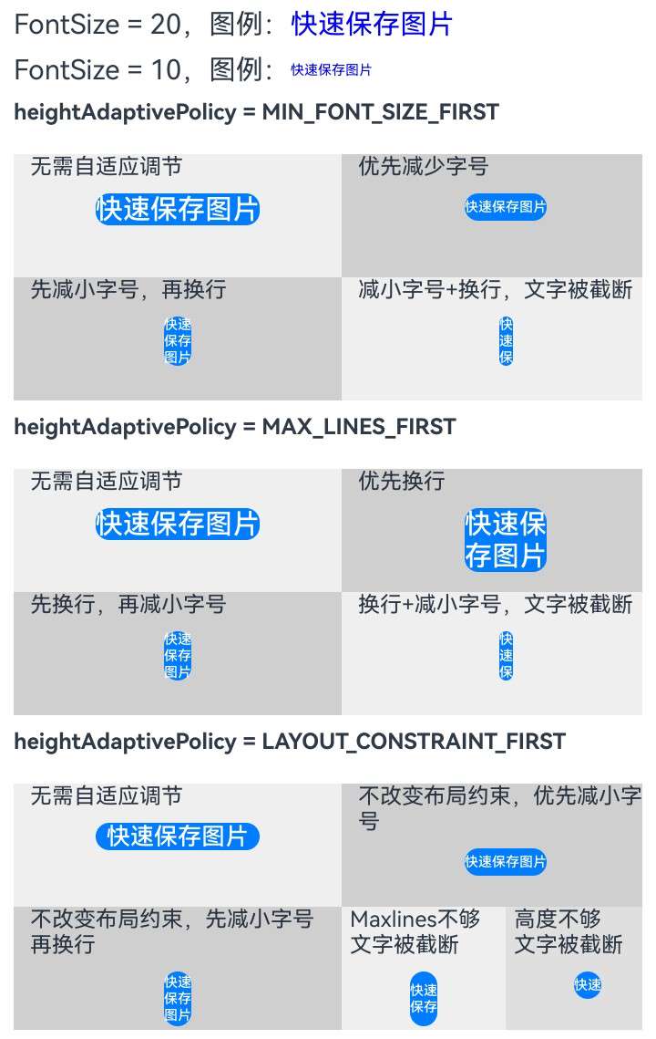
heightAdaptivePolicy18+
heightAdaptivePolicy(policy: TextHeightAdaptivePolicy): T
设置文本自适应高度的方式。
通过文本自适应高度的方式,实现文本大小自适应。
安全控件文本以maxFontSize的值进行布局,如果可以完整显示文本,则无需进行自适应调节,该接口设置不生效,否则按指定文本自适应高度的方式进行调节,具体自适应调节规格如下:
当设置为TextHeightAdaptivePolicy.MAX_LINES_FIRST时,优先使用maxLines属性来调整文本高度。如果使用maxLines属性的布局大小超过了布局约束,则尝试在minFontSize和maxFontSize的范围内缩小字体以显示更多文本,如果此时仍不能完整显示文本信息,安全控件会自适应调整高度以使得文本完整显示。
当设置为TextHeightAdaptivePolicy.MIN_FONT_SIZE_FIRST时,优先使用minFontSize属性来调整文本高度。如果使用minFontSize属性可以将文本布局在一行中,则尝试在minFontSize和maxFontSize的范围内增大字体并使用最大可能的字体大小;如果使用minFontSize属性无法将文本布局在一行中,则尝试使用maxLines属性进行布局,如果此时仍不能完整显示文本信息,安全控件会自适应调整高度以使得文本完整显示。
当设置为TextHeightAdaptivePolicy.LAYOUT_CONSTRAINT_FIRST时,优先使用布局约束来调整文本高度。如果布局大小超过布局约束,则尝试在minFontSize和maxFontSize的范围内缩小字体以满足布局约束。如果将字体大小缩小到minFontSize后,布局大小仍然超过布局约束,则删除超过布局约束的行;如果设置了maxLines属性,布局后行数不超过maxlines值(可能存在横向截断);如果未设置maxlines属性值,布局后的行数不限制。
安全控件文字未完全显示时,点击不授权。
具体效果请见示例。
原子化服务API: 从API version 18开始,该接口支持在原子化服务中使用。
系统能力: SystemCapability.ArkUI.ArkUI.Full
参数:
| 参数名 | 类型 | 必填 | 说明 |
|---|---|---|---|
| policy | TextHeightAdaptivePolicy | 是 | 文本自适应高度的方式。 默认值:TextHeightAdaptivePolicy.MAX_LINES_FIRST。 |
返回值:
| 类型 | 说明 |
|---|---|
| T | 返回安全控件的属性。 |
enabled18+
enabled(respond: boolean): T
设置安全控件是否可交互。
原子化服务API: 从API version 18开始,该接口支持在原子化服务中使用。
系统能力: SystemCapability.ArkUI.ArkUI.Full
参数:
| 参数名 | 类型 | 必填 | 说明 |
|---|---|---|---|
| respond | boolean | 是 | 值为true表示组件可交互,响应点击等操作。 值为false表示组件不可交互,不响应点击等操作。 默认值:true。 |
返回值:
| 类型 | 说明 |
|---|---|
| T | 返回安全控件的属性。 |
SecurityComponentLayoutDirection枚举说明
原子化服务API: 从API version 11开始,该接口支持在原子化服务中使用。
系统能力: SystemCapability.ArkUI.ArkUI.Full
| 名称 | 值 | 说明 |
|---|---|---|
| HORIZONTAL | 0 | 安全控件上图标和文字分布的方向为水平排列。 |
| VERTICAL | 1 | 安全控件上图标和文字分布的方向为垂直排列。 |
ButtonType枚举说明
按钮类型。
不同的按钮类型将影响属性borderRadius(边框圆角半径)的设置效果。影响如下:
- 当按钮类型为Capsule时,borderRadius设置不生效,按钮圆角半径始终为宽、高中较小值的一半。
- 当按钮类型为Circle时,borderRadius设置不生效:
- 若同时设置了宽和高,按钮圆角半径为宽高中较小值的一半;
- 若只设置宽、高中的一个,按钮圆角半径为所设宽或所设高值的一半;
- 若不设置宽高或者borderRadius的值为负,按钮圆角半径根据具体布局确定。
- 当按钮类型为Normal时,按钮圆角半径可通过borderRadius设置,圆角大小受组件尺寸限制,最小值为0,最大值为组件宽高中较小值的一半。
- 当按钮类型为ROUNDED_RECTANGLE时,若不设置borderRadius,圆角矩形按钮的圆角半径大小保持默认值20vp不变,不随按钮高度变化而变化。
原子化服务API: 从API version 11开始,该接口支持在原子化服务中使用。
系统能力: SystemCapability.ArkUI.ArkUI.Full
| 名称 | 说明 |
|---|---|
| Capsule | 胶囊型按钮(圆角默认为高度的一半)。 |
| Circle | 圆形按钮。 |
| Normal | 普通按钮(默认不带圆角)。 |
| ROUNDED_RECTANGLE16+ | 圆角矩形按钮(默认值:圆角半径大小20vp)。 |
示例
说明: 为避免控件样式不合法导致授权失败,请开发者先了解安全控件样式的约束与限制。
示例1
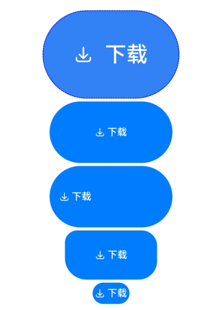
设置SecurityComponent基础属性,生成一个保存控件。
@Entry
@Component
struct Index {
  build() {
    Row() {
      Column({ space: 5 }) {
        // 生成一个保存控件,并设置它的SecurityComponent属性。
        SaveButton()
          .fontSize(35)
          .fontColor(Color.White)
          .iconSize(30)
          .layoutDirection(SecurityComponentLayoutDirection.HORIZONTAL)
          .borderWidth(1)
          .borderStyle(BorderStyle.Dashed)
          .borderColor(Color.Blue)
          .borderRadius(20)
          .fontWeight(100)
          .iconColor(Color.White)
          .padding({
            left: 50,
            top: 50,
            bottom: 50,
            right: 50
          })
          .textIconSpace(20)
          .backgroundColor(0x3282f6)
        SaveButton().size({ width: 200, height: 100 })
        SaveButton()
          .size({ width: 200, height: 100 })
          .align(Alignment.Start)
        SaveButton({ icon: SaveIconStyle.FULL_FILLED, text: SaveDescription.DOWNLOAD, buttonType: ButtonType.Normal })
          .size({ width: 150, height: 80 })
          .borderRadius({
            topLeft: 20,
            topRight: 25,
            bottomRight: 30,
            bottomLeft: 35
          })
        SaveButton().constraintSize({ maxWidth: 60 })
      }.width('100%')
    }.height('100%')
  }
}
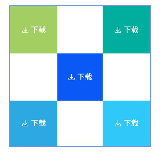
示例2
以容器和容器内组件作为锚点进行布局。
@Entry
@Component
struct Index {
  build() {
    Row() {
      RelativeContainer() {
        SaveButton({ icon: SaveIconStyle.FULL_FILLED, text: SaveDescription.DOWNLOAD, buttonType: ButtonType.Normal })
          .width(100)
          .height(100)
          .backgroundColor('#A3CF62')
          .alignRules({
            top: { anchor: '__container__', align: VerticalAlign.Top },
            left: { anchor: '__container__', align: HorizontalAlign.Start }
          })
          .id('row1')

        SaveButton({ icon: SaveIconStyle.FULL_FILLED, text: SaveDescription.DOWNLOAD, buttonType: ButtonType.Normal })
          .width(100)
          .height(100)
          .backgroundColor('#00AE9D')
          .alignRules({
            top: { anchor: '__container__', align: VerticalAlign.Top },
            right: { anchor: '__container__', align: HorizontalAlign.End }
          })
          .id('row2')

        SaveButton({ icon: SaveIconStyle.FULL_FILLED, text: SaveDescription.DOWNLOAD, buttonType: ButtonType.Normal })
          .height(100)
          .backgroundColor('#0A59F7')
          .alignRules({
            top: { anchor: 'row1', align: VerticalAlign.Bottom },
            left: { anchor: 'row1', align: HorizontalAlign.End },
            right: { anchor: 'row2', align: HorizontalAlign.Start }
          })
          .id('row3')

        SaveButton({ icon: SaveIconStyle.FULL_FILLED, text: SaveDescription.DOWNLOAD, buttonType: ButtonType.Normal })
          .backgroundColor('#2CA9E0')
          .alignRules({
            top: { anchor: 'row3', align: VerticalAlign.Bottom },
            bottom: { anchor: '__container__', align: VerticalAlign.Bottom },
            left: { anchor: '__container__', align: HorizontalAlign.Start },
            right: { anchor: 'row1', align: HorizontalAlign.End }
          })
          .id('row4')

        SaveButton({ icon: SaveIconStyle.FULL_FILLED, text: SaveDescription.DOWNLOAD, buttonType: ButtonType.Normal })
          .backgroundColor('#30C9F7')
          .alignRules({
            top: { anchor: 'row3', align: VerticalAlign.Bottom },
            bottom: { anchor: '__container__', align: VerticalAlign.Bottom },
            left: { anchor: 'row2', align: HorizontalAlign.Start },
            right: { anchor: '__container__', align: HorizontalAlign.End }
          })
          .id('row5')
      }
      .width(300).height(300)
      .margin({ left: 50 })
      .border({ width: 2, color: '#6699FF' })
    }
    .height('100%')
  }
}
示例3
@Entry
@Component
struct Index {
  build() {
    Column() {
      Scroll() {
        Column({ space: 10 }) {
          Column({ space: 10 }) {
            Row() {
              Text('FontSize = 20,图例:').fontSize(20)
              Text('快速保存图片').fontSize(20).fontColor(Color.Blue)
            }.width('100%')

            Row() {
              Text('FontSize = 10,图例:').fontSize(20)
              Text('快速保存图片').fontSize(10).fontColor(Color.Blue)
            }.width('100%')
          }.width('100%')

          Flex({ wrap: FlexWrap.Wrap }) {
            Column() {
              Row() {
                Text('heightAdaptivePolicy = MIN_FONT_SIZE_FIRST').fontSize(16).fontWeight(FontWeight.Bold)
              }
            }.height(40)

            Column() {
              Column({ space: 10 }) {
                Row() {
                  Text('无需自适应调节')
                }.width('90%')

                //当前布局无需调整即可完整显示文本,文本无需自适应调节。
                SaveButton({
                  text: SaveDescription.QUICK_SAVE_TO_GALLERY, buttonType: ButtonType.Normal
                })
                  .maxFontSize(20)
                  .minFontSize(10)
                  .maxLines(6)
                  .heightAdaptivePolicy(TextHeightAdaptivePolicy.MIN_FONT_SIZE_FIRST)
                  .width(120)
                  .height(20)
                  .padding(0)
                  .borderRadius(10)
              }
            }.width('50%').height(90).backgroundColor(0x10000000)

            Column() {
              Column({ space: 10 }) {
                Row() {
                  Text('优先减少字号')
                }.width('90%')

                // 当前布局无法完整显示文字,优先缩小fontSize,缩小后可以一行显示。
                SaveButton({
                  text: SaveDescription.QUICK_SAVE_TO_GALLERY, buttonType: ButtonType.Normal
                })
                  .maxFontSize(20)
                  .minFontSize(10)
                  .maxLines(6)
                  .heightAdaptivePolicy(TextHeightAdaptivePolicy.MIN_FONT_SIZE_FIRST)
                  .width(60)
                  .height(20)
                  .padding(0)
                  .borderRadius(10)
              }
            }.width('50%').height(90).backgroundColor(0x30000000)

            Column() {
              Column({ space: 10 }) {
                Row() {
                  Text('先减小字号,再换行')
                }.width('90%')

                // 当前布局无法完整显示文字,优先缩小fontSize,缩小后仍然无法完整显示,尝试使用maxLines属性换行布局。
                // 由于高度不足以完整显示,自动调整高度使文本完整显示。
                SaveButton({
                  text: SaveDescription.QUICK_SAVE_TO_GALLERY, buttonType: ButtonType.Normal
                })
                  .maxFontSize(20)
                  .minFontSize(10)
                  .maxLines(6)
                  .heightAdaptivePolicy(TextHeightAdaptivePolicy.MIN_FONT_SIZE_FIRST)
                  .width(20)
                  .height(20)
                  .padding(0)
                  .borderRadius(10)
              }
            }.width('50%').height(90).backgroundColor(0x30000000)

            Column() {
              Column({ space: 10 }) {
                Row() {
                  Text('减小字号+换行,文字被截断')
                }.width('90%')

                // 当前布局无法完整显示文字,优先缩小fontSize,缩小后仍然无法完整显示,尝试使用maxLines属性换行布局。
                // 由于maxlines属性为3,只能显示三行,所以文字被截断。
                // 由于高度不足以完整显示,自动调整高度使文本完整显示。
                SaveButton({
                  text: SaveDescription.QUICK_SAVE_TO_GALLERY, buttonType: ButtonType.Normal
                })
                  .maxFontSize(20)
                  .minFontSize(10)
                  .maxLines(3)
                  .heightAdaptivePolicy(TextHeightAdaptivePolicy.MIN_FONT_SIZE_FIRST)
                  .width(10)
                  .height(20)
                  .padding(0)
                  .borderRadius(10)
              }
            }.width('50%').height(90).backgroundColor(0x10000000)
          }.width('100%')

          Flex({ wrap: FlexWrap.Wrap }) {
            Column() {
              Row() {
                Text('heightAdaptivePolicy = MAX_LINES_FIRST').fontSize(16).fontWeight(FontWeight.Bold)
              }
            }.height(40)

            Column() {
              Column({ space: 10 }) {
                Row() {
                  Text('无需自适应调节')
                }.width('90%')

                //当前布局无需调整即可完整显示文本,文本无需自适应调节。
                SaveButton({
                  text: SaveDescription.QUICK_SAVE_TO_GALLERY, buttonType: ButtonType.Normal
                })
                  .maxFontSize(20)
                  .minFontSize(10)
                  .maxLines(6)
                  .heightAdaptivePolicy(TextHeightAdaptivePolicy.MAX_LINES_FIRST)
                  .width(120)
                  .height(20)
                  .padding(0)
                  .borderRadius(10)
              }
            }.width('50%').height(90).backgroundColor(0x10000000)

            Column() {
              Column({ space: 10 }) {
                Row() {
                  Text('优先换行')
                }.width('90%')

                // 当前布局无法完整显示文字,优先使用maxlines属性换行布局,换行后可以完整显示。
                // 由于高度不足以完整显示,自动调整高度使文本完整显示。
                SaveButton({
                  text: SaveDescription.QUICK_SAVE_TO_GALLERY, buttonType: ButtonType.Normal
                })
                  .maxFontSize(20)
                  .minFontSize(10)
                  .maxLines(6)
                  .heightAdaptivePolicy(TextHeightAdaptivePolicy.MAX_LINES_FIRST)
                  .width(60)
                  .height(20)
                  .padding(0)
                  .borderRadius(10)
              }
            }.width('50%').height(90).backgroundColor(0x30000000)

            Column() {
              Column({ space: 10 }) {
                Row() {
                  Text('先换行,再减小字号')
                }.width('90%')

                // 当前布局无法完整显示文字,优先使用maxlines属性换行布局,换行后仍然无法完整显示,缩小fontSize尝试布局,缩小字体后可以完整显示。
                // 由于高度不足以完整显示,自动调整高度使文本完整显示。
                SaveButton({
                  text: SaveDescription.QUICK_SAVE_TO_GALLERY, buttonType: ButtonType.Normal
                })
                  .maxFontSize(20)
                  .minFontSize(10)
                  .maxLines(3)
                  .heightAdaptivePolicy(TextHeightAdaptivePolicy.MAX_LINES_FIRST)
                  .width(20)
                  .height(20)
                  .padding(0)
                  .borderRadius(10)
              }
            }.width('50%').height(90).backgroundColor(0x30000000)

            Column() {
              Column({ space: 10 }) {
                Row() {
                  Text('换行+减小字号,文字被截断')
                }.width('90%')

                // 当前布局无法完整显示文字,优先使用maxlines属性换行布局,换行后仍然无法完整显示,缩小fontSize尝试布局。
                // 由于minFontSize属性为10,每行只能显示一个字,所以文字被截断。
                // 由于高度不足以完整显示,自动调整高度使文本完整显示。
                SaveButton({
                  text: SaveDescription.QUICK_SAVE_TO_GALLERY, buttonType: ButtonType.Normal
                })
                  .maxFontSize(20)
                  .minFontSize(10)
                  .maxLines(3)
                  .heightAdaptivePolicy(TextHeightAdaptivePolicy.MAX_LINES_FIRST)
                  .width(10)
                  .height(20)
                  .padding(0)
                  .borderRadius(10)
              }
            }.width('50%').height(90).backgroundColor(0x10000000)
          }.width('100%')

          Flex({ wrap: FlexWrap.Wrap }) {

            Column() {
              Row() {
                Text('heightAdaptivePolicy = LAYOUT_CONSTRAINT_FIRST').fontSize(16).fontWeight(FontWeight.Bold)
              }
            }.height(40)

            Column() {
              Column({ space: 10 }) {
                Row() {
                  Text('无需自适应调节')
                }.width('90%')

                //当前布局无需调整即可完整显示文本,文本无需自适应调节。
                SaveButton({
                  text: SaveDescription.QUICK_SAVE_TO_GALLERY, buttonType: ButtonType.Normal
                })
                  .maxFontSize(20)
                  .minFontSize(10)
                  .maxLines(6)
                  .heightAdaptivePolicy(TextHeightAdaptivePolicy.LAYOUT_CONSTRAINT_FIRST)
                  .width(120)
                  .height(20)
                  .padding(0)
                  .borderRadius(10)
              }
            }.width('50%').height(90).backgroundColor(0x10000000)

            Column() {
              Column({ space: 10 }) {
                Row() {
                  Text('不改变布局约束,优先减小字号')
                }.width('90%')

                // 当前布局无法完整显示文字,优先缩小fontSize,缩小后可以一行显示。
                SaveButton({
                  text: SaveDescription.QUICK_SAVE_TO_GALLERY, buttonType: ButtonType.Normal
                })
                  .maxFontSize(20)
                  .minFontSize(10)
                  .maxLines(6)
                  .heightAdaptivePolicy(TextHeightAdaptivePolicy.LAYOUT_CONSTRAINT_FIRST)
                  .width(60)
                  .height(20)
                  .padding(0)
                  .borderRadius(10)
              }
            }.width('50%').height(90).backgroundColor(0x30000000)

            Column() {
              Column({ space: 10 }) {
                Row() {
                  Text('不改变布局约束,先减小字号再换行')
                }.width('90%')

                // 当前布局无法完整显示文字,优先缩小fontSize,缩小后无法完整显示,使用maxlines属性进行换行布局。布局后可以完整显示。
                // LAYOUT_CONSTRAINT_FIRST模式下安全控件高度不支持自适应调整。
                SaveButton({
                  text: SaveDescription.QUICK_SAVE_TO_GALLERY, buttonType: ButtonType.Normal
                })
                  .maxFontSize(20)
                  .minFontSize(10)
                  .maxLines(6)
                  .heightAdaptivePolicy(TextHeightAdaptivePolicy.LAYOUT_CONSTRAINT_FIRST)
                  .width(20)
                  .height(40)
                  .padding(0)
                  .borderRadius(10)
              }
            }.width('50%').height(90).backgroundColor(0x30000000)

            Column() {
              Column({ space: 10 }) {
                Row() {
                  Text(`Maxlines不够\n文字被截断`)
                }.width('90%')

                // 当前布局无法完整显示文字,优先缩小fontSize,缩小后无法完整显示,但由于height只能显示一行,所以文字被截断。
                // LAYOUT_CONSTRAINT_FIRST模式下安全控件高度不支持自适应调整。
                SaveButton({
                  text: SaveDescription.QUICK_SAVE_TO_GALLERY, buttonType: ButtonType.Normal
                })
                  .maxFontSize(20)
                  .minFontSize(10)
                  .maxLines(2)
                  .heightAdaptivePolicy(TextHeightAdaptivePolicy.LAYOUT_CONSTRAINT_FIRST)
                  .width(20)
                  .height(40)
                  .padding(0)
                  .borderRadius(10)
              }
            }.width('25%').height(90).backgroundColor(0x10000000)

            Column() {
              Column({ space: 10 }) {
                Row() {
                  Text(`高度不够\n文字被截断`)
                }.width('90%')

                // 当前布局无法完整显示文字,优先缩小fontSize,缩小后无法完整显示,但由于height只能显示一行,所以文字被截断。
                // LAYOUT_CONSTRAINT_FIRST模式下安全控件高度不支持自适应调整。
                SaveButton({
                  text: SaveDescription.QUICK_SAVE_TO_GALLERY, buttonType: ButtonType.Normal
                })
                  .maxFontSize(20)
                  .minFontSize(10)
                  .maxLines(6)
                  .heightAdaptivePolicy(TextHeightAdaptivePolicy.LAYOUT_CONSTRAINT_FIRST)
                  .width(20)
                  .height(20)
                  .padding(0)
                  .borderRadius(10)
              }
            }.width('25%').height(90).backgroundColor(0x20000000)
          }.width('100%')

        }.width('100%')
      }.width('100%').margin({ top: 10, left: 10, right: 10 })
    }
  }
}
你可能感兴趣的鸿蒙文章
- 所属分类: 后端技术
- 本文标签:
热门推荐
-
2、 优质文章
-
3、 gt
-
7、 openharmony
-
9、 golang
-
10、 Vue中input框自动聚焦