harmony 鸿蒙构建食物分类Grid布局
构建食物分类Grid布局
健康饮食应用在主页提供给用户两种食物显示方式:列表显示和网格显示。开发者将实现通过页签切换不同食物分类的网格布局。
- 将Category枚举类型引入FoodCategoryList页面。
import { Category, FoodData } from '../model/FoodData'
- 创建FoodCategoryList和FoodCategory组件,其中FoodCategoryList作为新的页面入口组件,在入口组件调用initializeOnStartup方法。
   @Component
   struct FoodList {
     private foodItems: FoodData[]
     build() {
       ......
     }
   }

   @Component
   struct FoodCategory {
     private foodItems: FoodData[]
     build() {
       ......
     }
   }

   @Entry
   @Component
   struct FoodCategoryList {
     private foodItems: FoodData[] = initializeOnStartup()
     build() {
       ......
     }
   }
- 在FoodCategoryList组件内创建showList成员变量,用于控制List布局和Grid布局的渲染切换。需要用到条件渲染语句if…else…。
   @Entry
   @Component
   struct FoodCategoryList {
     private foodItems: FoodData[] = initializeOnStartup()
     private showList: boolean = false

     build() {
       Stack() {
         if (this.showList) {
           FoodList({ foodItems: this.foodItems })
         } else {
           FoodCategory({ foodItems: this.foodItems })
         }
       }
     }
   }
- 在页面右上角创建切换List/Grid布局的图标。设置Stack对齐方式为顶部尾部对齐TopEnd,创建Image组件,设置其点击事件,即showList取反。
   @Entry
   @Component
   struct FoodCategoryList {
     private foodItems: FoodData[] = initializeOnStartup()
     private showList: boolean = false

     build() {
       Stack({ alignContent: Alignment.TopEnd }) {
         if (this.showList) {
           FoodList({ foodItems: this.foodItems })
         } else {
           FoodCategory({ foodItems: this.foodItems })
         }
         Image($r('app.media.Switch'))
           .height(24)
           .width(24)
           .margin({ top: 15, right: 10 })
           .onClick(() => {
           this.showList = !this.showList
         })
       }.height('100%')
     }
   }
- 添加@State装饰器。点击右上角的switch标签后,页面没有任何变化,这是因为showList不是有状态数据,它的改变不会触发页面的刷新。需要为其添加\@State装饰器,使其成为状态数据,它的改变会引起其所在组件的重新渲染。
   @Entry
   @Component
   struct FoodCategoryList {
     private foodItems: FoodData[] = initializeOnStartup()
     @State private showList: boolean = false

     build() {
       Stack({ alignContent: Alignment.TopEnd }) {
         if (this.showList) {
           FoodList({ foodItems: this.foodItems })
         } else {
           FoodCategory({ foodItems: this.foodItems })
         }
         Image($r('app.media.Switch'))
           .height(24)
           .width(24)
           .margin({ top: 15, right: 10 })
           .onClick(() => {
           this.showList = !this.showList
         })
       }.height('100%')
     }
   }
点击切换图标,FoodList组件出现,再次点击,FoodList组件消失。
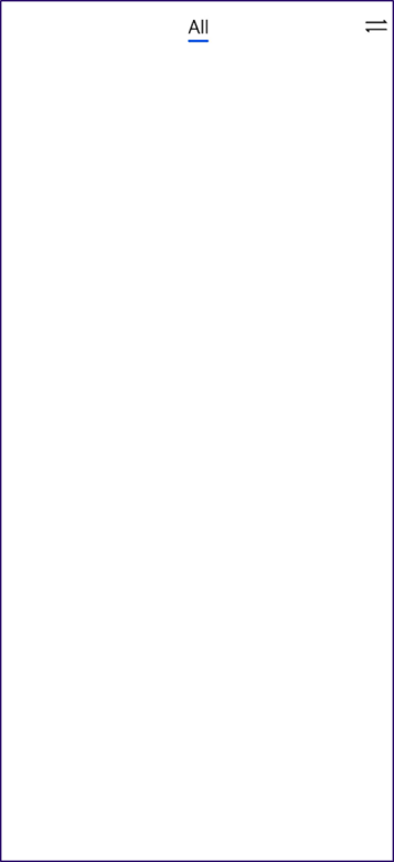
- 创建显示所有食物的页签(All)。在FoodCategory组件内创建Tabs组件和其子组件TabContent,设置tabBar为All。设置TabBars的宽度为280,布局模式为Scrollable,即超过总长度后可以滑动。Tabs是一种可以通过页签进行内容视图切换的容器组件,每个页签对应一个内容视图TabContent。
   @Component
   struct FoodCategory {
     private foodItems: FoodData[]
     build() {
       Stack() {
         Tabs() {
           TabContent() {}.tabBar('All')
         }
         .barWidth(280)
         .barMode(BarMode.Scrollable)
       }
     }
   }
- 创建FoodGrid组件,作为TabContent的子组件。
   @Component
   struct FoodGrid {
     private foodItems: FoodData[]
     build() {}
   }

   @Component
   struct FoodCategory {
     private foodItems: FoodData[]
     build() {
       Stack() {
         Tabs() {
           TabContent() {
             FoodGrid({ foodItems: this.foodItems })
           }.tabBar('All')
         }
         .barWidth(280)
         .barMode(BarMode.Scrollable)
       }
     }
   }
- 实现2 * 6的网格布局(一共12个食物数据资源)。创建Grid组件,设置列数columnsTemplate(‘1fr 1fr’),行数rowsTemplate(‘1fr 1fr 1fr 1fr 1fr 1fr’),行间距和列间距rowsGap和columnsGap为8。创建Scroll组件,使其可以滑动。
   @Component
   struct FoodGrid {
     private foodItems: FoodData[]
     build() {
       Scroll() {
         Grid() {
           ForEach(this.foodItems, (item: FoodData) => {
             GridItem() {}
           }, (item: FoodData) => item.id.toString())
         }
         .rowsTemplate('1fr 1fr 1fr 1fr 1fr 1fr')
         .columnsTemplate('1fr 1fr')
         .columnsGap(8)
         .rowsGap(8)
       }
       .scrollBar(BarState.Off)
       .padding({left: 16, right: 16})
     }
   }
- 创建FoodGridItem组件,展示食物图片、名称和卡路里,实现其UI布局,为GridItem的子组件。每个FoodGridItem高度为184,行间距为8,设置Grid总高度为(184 + 8) * 6 - 8 = 1144。
   @Component
   struct FoodGridItem {
     private foodItem: FoodData
     build() {
       Column() {
         Row() {
           Image(this.foodItem.image)
             .objectFit(ImageFit.Contain)
             .height(152)
             .width('100%')
         }
         Flex({ justifyContent: FlexAlign.Start, alignItems: ItemAlign.Center }) {
           Text(this.foodItem.name)
             .fontSize(14)
             .flexGrow(1)
             .padding({ left: 8 })
           Text(this.foodItem.calories + 'kcal')
             .fontSize(14)
             .margin({ right: 6 })
         }
         .height(32)
         .width('100%')
         .backgroundColor('#FFe5e5e5')
       }
       .height(184)
       .width('100%')
     }
   }

   @Component
   struct FoodGrid {
     private foodItems: FoodData[]
     build() {
       Scroll() {
         Grid() {
           ForEach(this.foodItems, (item: FoodData) => {
             GridItem() {
               FoodGridItem({foodItem: item})
             }
           }, (item: FoodData) => item.id.toString())
         }
         .rowsTemplate('1fr 1fr 1fr 1fr 1fr 1fr')
         .columnsTemplate('1fr 1fr')
         .columnsGap(8)
         .rowsGap(8)
         .height(1144)
       }
       .scrollBar(BarState.Off)
       .padding({ left: 16, right: 16 })
     }
   }
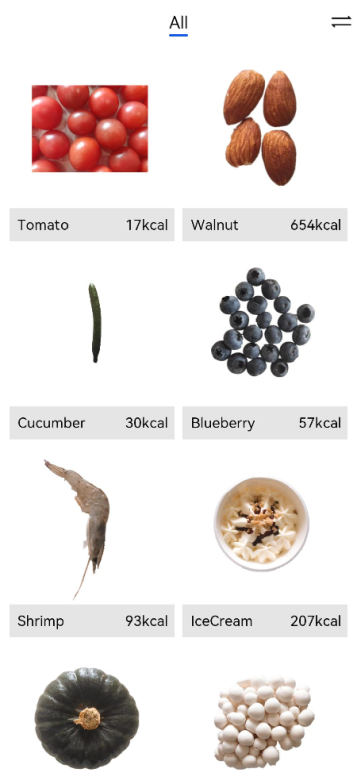
创建展示蔬菜(Category.Vegetable)、水果(Category.Fruit)、坚果(Category.Nut)、海鲜(Category.SeaFood)和甜品(Category.Dessert)分类的页签。
@Component
struct FoodCategory {
  private foodItems: FoodData[]


  build() {
    Stack() {
      Tabs() {
        TabContent() {
          FoodGrid({ foodItems: this.foodItems })
        }.tabBar('All')


        TabContent() {
          FoodGrid({ foodItems: this.foodItems.filter(item => (item.category === Category.Vegetable)) })
        }.tabBar('Vegetable')


        TabContent() {
          FoodGrid({ foodItems: this.foodItems.filter(item => (item.category === Category.Fruit)) })
        }.tabBar('Fruit')


        TabContent() {
          FoodGrid({ foodItems: this.foodItems.filter(item => (item.category === Category.Nut)) })
        }.tabBar('Nut')


        TabContent() {
          FoodGrid({ foodItems: this.foodItems.filter(item => (item.category === Category.Seafood)) })
        }.tabBar('Seafood')


        TabContent() {
          FoodGrid({ foodItems: this.foodItems.filter(item => (item.category === Category.Dessert)) })
        }.tabBar('Dessert')
      }
      .barWidth(280)
      .barMode(BarMode.Scrollable)
    }
  }
}
设置不同食物分类的Grid的行数和高度。因为不同分类的食物数量不同,所以不能用’1fr 1fr 1fr 1fr 1fr 1fr ‘常量来统一设置成6行。 创建gridRowTemplate和HeightValue成员变量,通过成员变量设置Grid行数和高度。
@Component
struct FoodGrid {
  private foodItems: FoodData[]
  private gridRowTemplate: string = ''
  private heightValue: number


  build() {
    Scroll() {
      Grid() {
        ForEach(this.foodItems, (item: FoodData) => {
          GridItem() {
            FoodGridItem({ foodItem: item })
          }
        }, (item: FoodData) => item.id.toString())
      }
      .rowsTemplate(this.gridRowTemplate)
      .columnsTemplate('1fr 1fr')
      .columnsGap(8)
      .rowsGap(8)
      .height(this.heightValue)
    }
    .scrollBar(BarState.Off)
    .padding({ left: 16, right: 16 })
  }
}
调用aboutToAppear接口计算行数(gridRowTemplate )和高度(heightValue)。
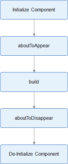
aboutToAppear() {
  var rows = Math.round(this.foodItems.length / 2);
  this.gridRowTemplate = '1fr '.repeat(rows);
  this.heightValue = rows * 192 - 8;
}
自定义组件提供了两个生命周期的回调接口aboutToAppear和aboutToDisappear。aboutToAppear的执行时机在创建自定义组件后,执行自定义组件build方法之前。aboutToDisappear在自定义组件销毁之前的时机执行。
@Component
struct FoodGrid {
  private foodItems: FoodData[]
  private gridRowTemplate: string = ''
  private heightValue: number


  aboutToAppear() {
    var rows = Math.round(this.foodItems.length / 2);
    this.gridRowTemplate = '1fr '.repeat(rows);
    this.heightValue = rows * 192 - 8;
  }


  build() {
    Scroll() {
      Grid() {
        ForEach(this.foodItems, (item: FoodData) => {
          GridItem() {
            FoodGridItem({ foodItem: item })
          }
        }, (item: FoodData) => item.id.toString())
      }
      .rowsTemplate(this.gridRowTemplate)
      .columnsTemplate('1fr 1fr')
      .columnsGap(8)
      .rowsGap(8)
      .height(this.heightValue)
    }
    .scrollBar(BarState.Off)
    .padding({ left: 16, right: 16 })
  }
}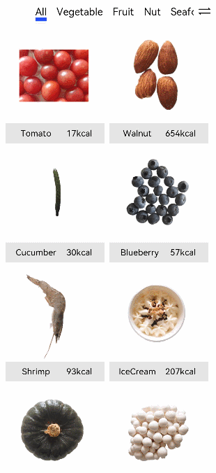
你可能感兴趣的鸿蒙文章
1
赞
热门推荐
-
2、 优质文章
-
3、 gt
-
7、 openharmony
-
9、 golang
-
10、 Vue中input框自动聚焦