harmony 鸿蒙ProgressButtonV2
ProgressButtonV2
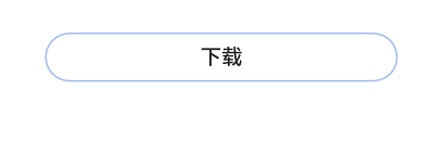
文本下载按钮,可显示具体的下载进度。
该组件基于状态管理V2实现,相较于状态管理V1,状态管理V2增强了对数据对象的深度观察与管理能力,不再局限于组件层级。借助状态管理V2,开发者可以通过该组件更灵活地控制文本下载按钮的数据和状态,实现更高效的用户界面刷新。
说明:
该组件从API version 18开始支持。后续版本如有新增内容,则采用上角标单独标记该内容的起始版本。
该组件不支持在Wearable设备上使用。
导入模块
import { ColorMetrics, LengthMetrics, ProgressButtonV2, ProgressButtonV2Color } from '@kit.ArkUI';
ProgressButtonV2
ProgressButtonV2({progress: number, content: ResourceStr, progressButtonWidth?: LengthMetrics, onClicked: ClickCallback, isEnabled: boolean, colorOptions?: ProgressButtonColorOptions, progressButtonRadius?: LengthMetrics})
文本下载按钮,可显示具体下载进度。
装饰器类型:\@ComponentV2
原子化服务API: 从API version 18开始,该接口支持在原子化服务中使用。
系统能力: SystemCapability.ArkUI.ArkUI.Full
| 名称 | 类型 | 必填 | 装饰器类型 | 说明 |
|---|---|---|---|---|
| progress | number | 是 | \@Require \@Param |
下载按钮的当前进度值。 取值范围:[0,100]。设置小于0的数值时置为0,设置大于100的数值置为100。 默认值:0 |
| content | ResourceStr | 是 | \@Require \@Param |
下载按钮的文本。 |
| progressButtonWidth | LengthMetrics | 否 | \@Param \@Once |
下载按钮的宽度。 默认值:44vp |
| onClicked | ClickCallback | 是 | \@Param | 下载按钮的点击回调。 |
| isEnabled | boolean | 是 | \@Param | 下载按钮是否可以点击。 isEnabled为true时,表示可以点击。 isEnabled为false时,表示不可点击。 |
| colorOptions | ProgressButtonV2Color | 否 | \@Param | 下载按钮颜色选项。 默认值:undefined |
| progressButtonRadius18+ | LengthMetrics | 否 | \@Param | 下载按钮的圆角(不支持百分比设置)。 取值范围:[0, height/2] 默认值:height/2 设置非法数值时,按照默认值处理。 |
属性
不支持通用属性。
ClickCallback
type ClickCallback = () => void
下载按钮的点击回调。
原子化服务API: 从API version 18开始,该接口支持在原子化服务中使用。
系统能力: SystemCapability.ArkUI.ArkUI.Full
ProgressButtonV2Color
下载按钮颜色选项。
装饰器类型:\@ObservedV2
属性
原子化服务API: 从API version 18开始,该接口支持在原子化服务中使用。
系统能力: SystemCapability.ArkUI.ArkUI.Full
| 名称 | 类型 | 必填 | 装饰器类型 | 说明 |
|---|---|---|---|---|
| progressColor | ColorMetrics | 否 | \@Trace | 进度条颜色。 默认值:undefined |
| borderColor | ColorMetrics | 否 | \@Trace | 按钮描边颜色。 默认值:undefined |
| textColor | ColorMetrics | 否 | \@Trace | 按钮文本颜色。 默认值:undefined |
| backgroundColor | ColorMetrics | 否 | \@Trace | 按钮背景颜色。 默认值:undefined |
constructor
constructor(options: ProgressButtonV2ColorOptions);
下载按钮颜色选项构造函数。
原子化服务API: 从API version 18开始,该接口支持在原子化服务中使用。
系统能力: SystemCapability.ArkUI.ArkUI.Full
| 名称 | 类型 | 必填 | 说明 |
|---|---|---|---|
| options | ProgressButtonV2ColorOptions | 是 | 色彩信息。 |
ProgressButtonV2ColorOptions
下载按钮色彩信息选项。
原子化服务API: 从API version 18开始,该接口支持在原子化服务中使用。
系统能力: SystemCapability.ArkUI.ArkUI.Full
| 名称 | 类型 | 必填 | 说明 |
|---|---|---|---|
| progressColor | ColorMetrics | 否 | 进度条颜色。 默认值:undefined |
| borderColor | ColorMetrics | 否 | 按钮描边颜色。 默认值:undefined |
| textColor | ColorMetrics | 否 | 按钮文本颜色。 默认值:undefined |
| backgroundColor | ColorMetrics | 否 | 按钮背景颜色。 默认值:undefined |
事件
不支持通用事件。
示例
该示例实现了一个简单的带加载进度的文本下载按钮。
import { ColorMetrics, LengthMetrics, ProgressButtonV2, ProgressButtonV2Color } from '@kit.ArkUI';

@Entry
@ComponentV2
struct Index {
  @Local progressIndex: number = 0;
  @Local textState: string = '下载';
  @Local ButtonWidth: LengthMetrics = LengthMetrics.vp(200);
  @Local isRunning: boolean = false;
  @Local enableState: boolean = true;

  build() {
    Column() {
      Scroll() {
        Column({ space: 20 }) {
          ProgressButtonV2({
            progress: this.progressIndex,
            progressButtonWidth: this.ButtonWidth,
            content: this.textState,
            isEnabled: this.enableState,
            onClicked: () => {
              if (this.textState && !this.isRunning && this.progressIndex < 100) {
                this.textState = '继续';
              }
              this.isRunning = !this.isRunning;
              let timer = setInterval(() => {
                if (this.isRunning) {
                  if (this.progressIndex === 100) {

                  } else {
                    this.progressIndex++
                    if (this.progressIndex === 100) {
                      this.textState = '已完成';
                      this.enableState = false;
                    }
                  }
                } else {
                  clearInterval(timer);
                }
              }, 20);
            }
          })
        }.alignItems(HorizontalAlign.Center).width('100%').margin({ top: 20 });
      }
    }
  }
}
你可能感兴趣的鸿蒙文章
- 所属分类: 后端技术
- 本文标签:
热门推荐
-
2、 优质文章
-
3、 gt
-
7、 openharmony
-
9、 golang
-
10、 Vue中input框自动聚焦