harmony 鸿蒙ProgressButton
ProgressButton
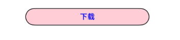
文本下载按钮,可显示具体下载进度。
说明:
该组件从API version 10开始支持。后续版本如有新增内容,则采用上角标单独标记该内容的起始版本。
该组件不支持在Wearable设备上使用。
导入模块
import { ProgressButton } from '@kit.ArkUI';
属性
不支持通用属性。
ProgressButton
ProgressButton({progress: number, content: ResourceStr, progressButtonWidth?: Length, clickCallback: () => void, enable: boolean, colorOptions?: ProgressButtonColorOptions, progressButtonRadius?: LengthMetrics})
装饰器类型:\@Component
系统能力: SystemCapability.ArkUI.ArkUI.Full
| 名称 | 类型 | 必填 | 装饰器类型 | 说明 |
|---|---|---|---|---|
| progress | number | 是 | \@Prop | 下载按钮的当前进度值。 取值范围:[0,100]。设置小于0的数值时置为0,设置大于100的数值置为100。 默认值:0。 原子化服务API: 从API version 11开始,该接口支持在原子化服务中使用。 |
| content | ResourceStr | 是 | \@Prop | 下载按钮的文本。 默认值:空字符串。 说明:最长显示组件宽度,超出部分用省略号代替。从API version 20开始,支持Resource类型。 原子化服务API: 从API version 11开始,该接口支持在原子化服务中使用。 |
| progressButtonWidth | Length | 否 | - | 下载按钮的宽度,单位vp。 取值范围:大于等于44vp。 默认值:44vp。小于默认值和非法值设置为默认值。 原子化服务API: 从API version 11开始,该接口支持在原子化服务中使用。 |
| clickCallback | () => void | 是 | - | 下载按钮的点击回调。 原子化服务API: 从API version 11开始,该接口支持在原子化服务中使用。 |
| enable | boolean | 是 | \@Prop | 下载按钮是否可以点击。 enable为true时,表示可以点击。 enable为false时,表示不可点击。 原子化服务API: 从API version 11开始,该接口支持在原子化服务中使用。 |
| colorOptions18+ | ProgressButtonColorOptions | 否 | \@Prop | 下载按钮颜色。 原子化服务API: 从API version 18开始,该接口支持在原子化服务中使用。 |
| progressButtonRadius18+ | LengthMetrics | 否 | \@Prop | 下载按钮的圆角(不支持百分比设置)。 取值范围:[0, height/2] 默认值:height/2 设置非法数值时,按照默认值处理。 原子化服务API: 从API version 18开始,该接口支持在原子化服务中使用。 |
ProgressButtonColorOptions18+
下载按钮颜色选项
原子化服务API: 从API version 18开始,该接口支持在原子化服务中使用。
系统能力: SystemCapability.ArkUI.ArkUI.Full
| 名称 | 类型 | 必填 | 说明 |
|---|---|---|---|
| progressColor | ResourceColor | 否 | 进度条颜色。 默认值:#330A59F7 |
| borderColor | ResourceColor | 否 | 按钮描边颜色。 默认值:#330A59F7 |
| textColor | ResourceColor | 否 | 按钮文本颜色。 默认值:系统默认值 |
| backgroundColor | ResourceColor | 否 | 按钮背景色。 默认值:\$r(‘sys.color.ohos_id_color_foreground_contrary’) |
事件
不支持通用事件。
示例
示例1(进度条下载按钮)
该示例实现了一个简单的带加载进度的文本下载按钮。
import { ProgressButton } from '@kit.ArkUI';

@Entry
@Component
struct Index {
  @State progressIndex: number = 0;
  @State textState: string = '下载';
  @State ButtonWidth: number = 200;
  @State isRunning: boolean = false;
  @State enableState: boolean = true;

  build() {
    Column() {
      Scroll() {
        Column({ space: 20 }) {
          ProgressButton({
            progress: this.progressIndex,
            progressButtonWidth: this.ButtonWidth,
            content: this.textState,
            enable: this.enableState,
            clickCallback: () => {
              if (this.textState && !this.isRunning && this.progressIndex < 100) {
                this.textState = '继续';
              }
              this.isRunning = !this.isRunning;
              let timer = setInterval(() => {
                if (this.isRunning) {
                  if (this.progressIndex === 100) {
                  } else {
                    this.progressIndex++;
                    if (this.progressIndex === 100) {
                      this.textState = '已完成';
                      this.enableState = false;
                    }
                  }
                } else {
                  clearInterval(timer);
                }
              }, 20)
            }
          })
        }.alignItems(HorizontalAlign.Center).width('100%').margin({ top: 20 })
      }
    }
  }
}

示例2(自定义颜色按钮)
该示例实现了一个简单的自定义颜色的文本下载按钮。
import { ProgressButton } from '@kit.ArkUI';

@Entry
@Component
struct Index {
  @State progressIndex: number = 0;
  @State textState: string = '下载';
  @State ButtonWidth: number = 200;
  @State isRunning: boolean = false;
  @State enableState: boolean = true;

  build() {
    Column() {
      Scroll() {
        Column({ space: 20 }) {
          ProgressButton({
            //设置下载按钮颜色
            colorOptions: {
              progressColor: Color.Orange,
              borderColor: Color.Black,
              textColor: Color.Blue,
              backgroundColor: Color.Pink
            },
            progress: this.progressIndex,
            progressButtonWidth: this.ButtonWidth,
            content: this.textState,
            enable: this.enableState,
            clickCallback: () => {
              if (this.textState && !this.isRunning && this.progressIndex < 100) {
                this.textState = '继续';
              }
              this.isRunning = !this.isRunning;
              let timer = setInterval(() => {
                if (this.isRunning) {
                  if (this.progressIndex === 100) {
                  } else {
                    this.progressIndex++;
                    if (this.progressIndex === 100) {
                      this.textState = '已完成';
                      this.enableState = false;
                    }
                  }
                } else {
                  clearInterval(timer);
                }
              }, 20)
            }
          })
        }.alignItems(HorizontalAlign.Center).width('100%').margin({ top: 20 })
      }
    }
  }
}
示例3(自定义圆角按钮)
该示例实现了一个简单的自定义圆角的文本下载按钮。
import { ProgressButton, LengthMetrics } from '@kit.ArkUI';

@Entry
@Component
struct Index {
  @State progressIndex: number = 0;
  @State textState: string = '下载';
  @State ButtonWidth: number = 200;
  @State isRunning: boolean = false;
  @State enableState: boolean = true;

  build() {
    Column() {
      Scroll() {
        Column({ space: 20 }) {
          ProgressButton({
            progressButtonRadius: LengthMetrics.vp(8), //自定义圆角值为8vp
            progress: this.progressIndex,
            progressButtonWidth: this.ButtonWidth,
            content: this.textState,
            enable: this.enableState,
            clickCallback: () => {
              if (this.textState && !this.isRunning && this.progressIndex < 100) {
                this.textState = '继续';
              }
              this.isRunning = !this.isRunning;
              let timer = setInterval(() => {
                if (this.isRunning) {
                  if (this.progressIndex === 100) {
                  } else {
                    this.progressIndex++;
                    if (this.progressIndex === 100) {
                      this.textState = '已完成';
                      this.enableState = false;
                    }
                  }
                } else {
                  clearInterval(timer);
                }
              }, 20)
            }
          })
        }.alignItems(HorizontalAlign.Center).width('100%').margin({ top: 20 })
      }
    }
  }
}

你可能感兴趣的鸿蒙文章
0
赞
- 所属分类: 后端技术
- 本文标签:
热门推荐
-
2、 优质文章
-
3、 gt
-
7、 openharmony
-
9、 golang
-
10、 Vue中input框自动聚焦