harmony 鸿蒙Popup
Popup
Popup是用于显示特定样式气泡。
说明:
- 该组件从API version 11开始支持。后续版本如有新增内容,则采用上角标单独标记该内容的起始版本。
- 该组件不支持在Wearable设备上使用。
- 建议结合Popup控制中的自定义气泡功能。
导入模块
import { Popup, PopupOptions, PopupTextOptions, PopupButtonOptions, PopupIconOptions } from '@kit.ArkUI';
子组件
无
Popup
Popup(options: PopupOptions): void
装饰器类型:@Builder
原子化服务API: 从API version 12开始,该接口支持在原子化服务中使用。
系统能力: SystemCapability.ArkUI.ArkUI.Full
参数:
| 参数名 | 类型 | 必填 | 说明 |
|---|---|---|---|
| options | PopupOptions | 是 | 定义Popup组件的类型。 |
PopupOptions
PopupOptions定义Popup的具体式样参数。
系统能力: SystemCapability.ArkUI.ArkUI.Full
| 名称 | 类型 | 必填 | 说明 |
|---|---|---|---|
| icon | PopupIconOptions | 否 | 设置popup图标。 说明: 当size设置异常值或0时不显示。 原子化服务API: 从API version 12开始,该接口支持在原子化服务中使用。 |
| title | PopupTextOptions | 否 | 设置popup标题文本。 原子化服务API: 从API version 12开始,该接口支持在原子化服务中使用。 |
| message | PopupTextOptions | 是 | 设置popup内容文本。 说明: message不支持设置fontWeight。 原子化服务API: 从API version 12开始,该接口支持在原子化服务中使用。 |
| showClose | boolean |Resource | 否 | 设置popup关闭按钮。值为true时,显示关闭按钮,值为false时,不显示关闭按钮。设置为Resource,显示对应的图标。 默认值:true 原子化服务API: 从API version 12开始,该接口支持在原子化服务中使用。 |
| onClose | () => void | 否 | 设置popup关闭按钮回调函数。 原子化服务API: 从API version 12开始,该接口支持在原子化服务中使用。 |
| buttons | [PopupButtonOptions?,PopupButtonOptions?] | 否 | 设置popup操作按钮,按钮最多设置两个。 原子化服务API: 从API version 12开始,该接口支持在原子化服务中使用。 |
| direction12+ | Direction | 否 | 布局方向。 默认值:Direction.Auto 原子化服务API: 从API version 12开始,该接口支持在原子化服务中使用。 |
| maxWidth18+ | Dimension | 否 | 设置popup的最大宽度,通过此接口popup可以自定义宽度显示。 默认值:400vp 原子化服务API: 从API version 18开始,该接口支持在原子化服务中使用。 |
| avoidTarget20+ | AvoidanceMode | 否 | 设置Popup避让时是否覆盖指向组件。 默认值:AvoidanceMode.COVER_TARGET 原子化服务API: 从API version 20开始,该接口支持在原子化服务中使用。 |
PopupTextOptions
设置文本样式。
原子化服务API: 从API version 12开始,该接口支持在原子化服务中使用。
系统能力: SystemCapability.ArkUI.ArkUI.Full
| 名称 | 类型 | 必填 | 说明 |
|---|---|---|---|
| text | ResourceStr | 是 | 设置文本内容。 |
| fontSize | number |string |Resource | 否 | 设置文本字体大小。 默认值: $r('sys.float.ohos_id_text_size_body2') string类型可选值:可以转化为数字的字符串(如’10’)或带长度单位的字符串(如’10px’),不支持设置百分比字符串。 number:取值范围(0,+∞)。 |
| fontColor | ResourceColor | 否 | 设置文本字体颜色。 默认值: $r('sys.color.ohos_id_color_text_secondary') |
| fontWeight | number |FontWeight |string | 否 | 设置文本字体粗细。 number类型取值[100,900],取值间隔为100,默认为400,取值越大,字体越粗。 string类型仅支持number类型取值的字符串形式,例如“400”,以及“bold”、“bolder”、“lighter”、“regular” 、“medium”分别对应FontWeight中相应的枚举值。 默认值:FontWeight.Regular |
PopupButtonOptions
PopupButtonOptions定义按钮的相关属性和事件。
原子化服务API: 从API version 12开始,该接口支持在原子化服务中使用。
系统能力: SystemCapability.ArkUI.ArkUI.Full
| 名称 | 类型 | 必填 | 说明 |
|---|---|---|---|
| text | ResourceStr | 是 | 设置按钮内容。 |
| action | () => void | 否 | 设置按钮click回调。 |
| fontSize | number |string |Resource | 否 | 设置按钮文本字体大小。 默认值: $r('sys.float.ohos_id_text_size_button2') |
| fontColor | ResourceColor | 否 | 设置按钮文本字体颜色。 默认值: $r('sys.color.ohos_id_color_text_primary_activated') |
PopupIconOptions
PopupIconOptions定义icon(左上角图标)的属性。
原子化服务API: 从API version 12开始,该接口支持在原子化服务中使用。
系统能力: SystemCapability.ArkUI.ArkUI.Full
| 名称 | 类型 | 必填 | 说明 |
|---|---|---|---|
| image | ResourceStr | 是 | 设置图标内容。 |
| width | Dimension | 否 | 设置图标宽度。 默认值:32VP |
| height | Dimension | 否 | 设置图标高度。 默认值:32VP |
| fillColor | ResourceColor | 否 | 设置图标填充颜色。仅针对svg图源生效。 |
| borderRadius | Length |BorderRadiuses | 否 | 设置图标圆角。 默认值: $r('sys.float.ohos_id_corner_radius_default_s') |
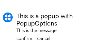
示例
示例1(设置气泡样式)
该示例通过配置PopupIconOptions、PopupTextOptions、PopupButtonOptions实现气泡的样式。
// xxx.ets
import { Popup, PopupTextOptions, PopupButtonOptions, PopupIconOptions } from '@kit.ArkUI';

@Entry
@Component
struct PopupExample {
  build() {
    Row() {
      // popup 自定义高级组件
      Popup({
        // PopupIconOptions类型设置图标内容
        icon: {
          image: $r('app.media.icon'),
          width: 32,
          height: 32,
          fillColor: Color.White,
          borderRadius: 16
        } as PopupIconOptions,
        // PopupTextOptions类型设置文字内容
        title: {
          text: 'This is a popup with PopupOptions',
          fontSize: 20,
          fontColor: Color.Black,
          fontWeight: FontWeight.Normal
        } as PopupTextOptions,
        // PopupTextOptions类型设置文字内容
        message: {
          text: 'This is the message',
          fontSize: 15,
          fontColor: Color.Black
        } as PopupTextOptions,
        showClose: false,
        onClose: () => {
          console.info('close Button click');
        },
        // PopupButtonOptions类型设置按钮内容
        buttons: [{
          text: 'confirm',
          action: () => {
            console.info('confirm button click');
          },
          fontSize: 15,
          fontColor: Color.Black,
        },
          {
            text: 'cancel',
            action: () => {
              console.info('cancel button click');
            },
            fontSize: 15,
            fontColor: Color.Black
          },] as [PopupButtonOptions?, PopupButtonOptions?]
      })
    }
    .width(300)
    .height(200)
    .borderWidth(2)
    .justifyContent(FlexAlign.Center)
  }
}
示例 2(设置镜像效果)
该示例通过配置direction参数实现Popup的镜像布局效果。
// xxx.ets
import { Popup, PopupTextOptions, PopupButtonOptions, PopupIconOptions } from '@kit.ArkUI';

@Entry
@Component
struct PopupPage {
  @State currentDirection: Direction = Direction.Rtl;

  build() {
    Column() {
      // popup 自定义高级组件
      Popup({
        //PopupIconOptions 类型设置图标内容
        direction: this.currentDirection,
        icon: {
          image: $r('app.media.icon'),
          width: 32,
          height: 32,
          fillColor: Color.White,
          borderRadius: 16,
        } as PopupIconOptions,
        // PopupTextOptions 类型设置文字内容
        title: {
          text: 'This is a popup with PopupOptions',
          fontSize: 20,
          fontColor: Color.Black,
          fontWeight: FontWeight.Normal,

        } as PopupTextOptions,
        //PopupTextOptions 类型设置文字内容
        message: {
          text: 'This is the message',
          fontSize: 15,
          fontColor: Color.Black,
        } as PopupTextOptions,
        showClose: true,
        onClose: () => {
          console.info('close Button click');
        },
        // PopupButtonOptions 类型设置按钮内容
        buttons: [{
          text: 'confirm',
          action: () => {
            console.info('confirm button click');
          },
          fontSize: 15,
          fontColor: Color.Black,

        },
          {
            text: 'cancel',
            action: () => {
              console.info('cancel button click');
            },
            fontSize: 15,
            fontColor: Color.Black,
          },] as [PopupButtonOptions?, PopupButtonOptions?],
      })

    }
    .justifyContent(FlexAlign.Center)
    .width('100%')
    .height('100%')
  }
}

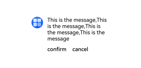
示例3(设置自定义宽度)
该示例通过配置maxWidth实现Popup的自定义宽度效果。
// xxx.ets
import { Popup, PopupTextOptions, PopupButtonOptions, PopupIconOptions } from '@kit.ArkUI';

@Entry
@Component
struct PopupPage {
  @State currentDirection: Direction = Direction.Rtl;

  build() {
    Row() {
      // popup 自定义高级组件
      Popup({
        //设置自定义宽度
        maxWidth: '50%',
        //PopupIconOptions 类型设置图标内容
        icon: {
          image: $r('app.media.startIcon'),
          width: 32,
          height: 32,
          fillColor: Color.White,
          borderRadius: 16,
        } as PopupIconOptions,
        // PopupTextOptions类型设置文字内容
        message: {
          text: 'This is the message,This is the message,This is the message,This is the message',
          fontSize: 15,
          fontColor: Color.Black
        } as PopupTextOptions,
        showClose: false,
        onClose: () => {
          console.info('close Button click');
        },
        // PopupButtonOptions类型设置按钮内容
        buttons: [{
          text: 'confirm',
          action: () => {
            console.info('confirm button click');
          },
          fontSize: 15,
          fontColor: Color.Black,
        },
          {
            text: 'cancel',
            action: () => {
              console.info('cancel button click');
            },
            fontSize: 15,
            fontColor: Color.Black
          },] as [PopupButtonOptions?, PopupButtonOptions?]
      })
    }
    .width(400)
    .height(200)
    .borderWidth(2)
    .justifyContent(FlexAlign.Center)
  }
}
你可能感兴趣的鸿蒙文章
0
赞
- 所属分类: 后端技术
- 本文标签:
热门推荐
-
2、 优质文章
-
3、 gt
-
7、 openharmony
-
9、 golang
-
10、 Vue中input框自动聚焦