harmony 鸿蒙ListItemGroup
ListItemGroup
该组件用来展示列表item分组,宽度默认充满List组件,必须配合List组件来使用。
说明:
- 该组件从API version 9开始支持。后续版本如有新增内容,则采用上角标单独标记该内容的起始版本。
- 该组件的父组件只能是List。
- ListItemGroup组件不支持设置通用属性aspectRatio。
- 当ListItemGroup的父组件List的listDirection属性为Axis.Vertical时,设置通用属性height属性不生效。ListItemGroup的高度为header高度、footer高度和所有ListItem布局后总高度之和。
- 当父组件List的listDirection属性为Axis.Horizontal时,设置通用属性width属性不生效。ListItemGroup的宽度为header宽度、footer宽度和所有ListItem布局后总宽度之和。
- 当前ListItemGroup内部的ListItem组件不支持编辑、拖拽功能,即ListItem组件的editable属性不生效。
- ListItemGroup使用direction属性设置布局方向不生效,ListItemGroup组件布局方向跟随父容器List组件的布局方向。
子组件
包含ListItem子组件。
接口
ListItemGroup(options?: ListItemGroupOptions)
创建ListItemGroup组件。
原子化服务API: 从API version 11开始,该接口支持在原子化服务中使用。
系统能力: SystemCapability.ArkUI.ArkUI.Full
参数:
| 参数名 | 类型 | 必填 | 说明 |
|---|---|---|---|
| options | ListItemGroupOptions | 否 | 列表item分组组件参数。 |
ListItemGroupOptions对象说明
ListItemGroup组件参数。
系统能力: SystemCapability.ArkUI.ArkUI.Full
| 名称 | 类型 | 必填 | 说明 |
|---|---|---|---|
| header | CustomBuilder | 否 | 设置ListItemGroup头部组件。 说明: 可以放单个子组件或不放子组件。 原子化服务API: 从API version 11开始,该接口支持在原子化服务中使用。 |
| headerComponent13+ | ComponentContent | 否 | 使用ComponentContent类型参数设置ListItemGroup头部组件。 说明: 可以放单个子组件或不放子组件。 该参数的优先级高于参数header。即同时设置header和headerComponent时,以headerComponent设置的值为准。 同一个headerComponent不推荐同时给不同的ListItemGroup使用,否则会导致显示问题。 原子化服务API: 从API version 13开始,该接口支持在原子化服务中使用。 |
| footer | CustomBuilder | 否 | 设置ListItemGroup尾部组件。 说明: 可以放单个子组件或不放子组件。 原子化服务API: 从API version 11开始,该接口支持在原子化服务中使用。 |
| footerComponent13+ | ComponentContent | 否 | 使用ComponentContent类型参数设置ListItemGroup尾部组件。 说明: 可以放单个子组件或不放子组件。该参数的优先级高于参数footer。 即同时设置footer和footerComponent时,以footerComponent设置的值为准。 同一个footerComponent不推荐同时给不同的ListItemGroup使用,否则会导致显示问题。 原子化服务API: 从API version 13开始,该接口支持在原子化服务中使用。 |
| space | number | string | 否 | 列表项间距。只作用于ListItem与ListItem之间,不作用于header与ListItem、footer与ListItem之间。 默认值:0 单位:vp 说明: 设置为负数或者大于等于List内容区长度时,按默认值显示。 原子化服务API: 从API version 11开始,该接口支持在原子化服务中使用。 |
| style10+ | ListItemGroupStyle | 否 | 设置List组件卡片样式。 默认值:ListItemGroupStyle.NONE 设置为ListItemGroupStyle.NONE时无样式。 设置为ListItemGroupStyle.CARD时,建议配合ListItem的ListItemStyle.CARD同时使用,显示默认卡片样式。 卡片样式下,ListItemGroup默认规格:左右外边距12vp,上下左右内边距4vp。 卡片样式下,为卡片内的列表选项提供了默认的focus、hover、press、selected和disable样式。 说明: 当前卡片模式下,使用默认Axis.Vertical排列方向,如果listDirection属性设置为Axis.Horizontal,会导致显示混乱;List属性alignListItem默认为ListItemAlign.Center,居中对齐显示。 原子化服务API: 从API version 11开始,该接口支持在原子化服务中使用。 |
属性
divider
divider(value: ListDividerOptions|null)
设置ListItem分割线样式,默认无分割线。
strokeWidth, startMargin和endMargin不支持设置百分比。
ListItem设置多态样式时,被按压的子组件上下的分割线不绘制。
原子化服务API: 从API version 11开始,该接口支持在原子化服务中使用。
系统能力: SystemCapability.ArkUI.ArkUI.Full
参数:
| 参数名 | 类型 | 必填 | 说明 |
|---|---|---|---|
| value | ListDividerOptions | null | 是 | ListItem分割线样式。 默认值:null |
childrenMainSize12+
childrenMainSize(value: ChildrenMainSize)
设置ListItemGroup组件的子组件在主轴方向的大小信息。
说明: > > - 必须同时给所在的List组件设置childrenMainSize属性才可以正常生效。
原子化服务API: 从API version 12开始,该接口支持在原子化服务中使用。
系统能力: SystemCapability.ArkUI.ArkUI.Full
参数:
| 参数名 | 类型 | 必填 | 说明 |
|---|---|---|---|
| value | ChildrenMainSize | 是 | 该对象用来维护子组件在主轴方向的大小信息。 |
ListItemGroupStyle10+枚举说明
List组件卡片样式枚举。
原子化服务API: 从API version 11开始,该接口支持在原子化服务中使用。
系统能力: SystemCapability.ArkUI.ArkUI.Full
| 名称 | 值 | 说明 |
|---|---|---|
| NONE | 0 | 无样式。 |
| CARD | 1 | 显示默认卡片样式。 |
示例
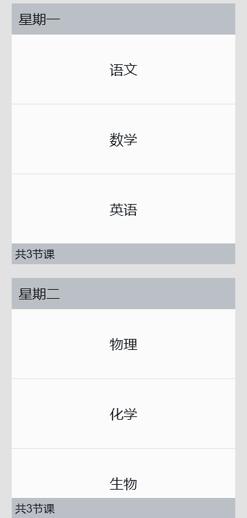
示例1(设置吸顶/吸底)
该示例通过stick实现了Header吸顶和Footer吸底的效果。
// ListDataSource.ets
export class TimeTableDataSource implements IDataSource {
  private list: TimeTable[] = [];
  private listeners: DataChangeListener[] = [];

  constructor(list: TimeTable[]) {
    this.list = list;
  }

  totalCount(): number {
    return this.list.length;
  }

  getData(index: number): TimeTable {
    return this.list[index];
  }

  registerDataChangeListener(listener: DataChangeListener): void {
    if (this.listeners.indexOf(listener) < 0) {
      this.listeners.push(listener);
    }
  }

  unregisterDataChangeListener(listener: DataChangeListener): void {
    const pos = this.listeners.indexOf(listener);
    if (pos >= 0) {
      this.listeners.splice(pos, 1);
    }
  }

  // 通知控制器数据变化
  notifyDataChange(index: number): void {
    this.listeners.forEach(listener => {
      listener.onDataChange(index);
    });
  }

  // 修改第一个元素
  public change1stItem(temp: TimeTable): void {
    this.list[0] = temp;
    this.notifyDataChange(0);
  }
}

export class ProjectsDataSource implements IDataSource {
  private list: string[] = [];

  constructor(list: string[]) {
    this.list = list;
  }

  totalCount(): number {
    return this.list.length;
  }

  getData(index: number): string {
    return this.list[index];
  }

  registerDataChangeListener(listener: DataChangeListener): void {
  }

  unregisterDataChangeListener(listener: DataChangeListener): void {
  }
}

export interface TimeTable {
  title: string;
  projects: string[];
}
// xxx.ets
import { TimeTable, ProjectsDataSource, TimeTableDataSource } from './ListDataSource';
@Entry
@Component
struct ListItemGroupExample {
  itemGroupArray: TimeTableDataSource = new TimeTableDataSource([]);

  aboutToAppear(): void {
    let timeTable: TimeTable[] = [
      {
        title: '星期一',
        projects: ['语文', '数学', '英语']
      },
      {
        title: '星期二',
        projects: ['物理', '化学', '生物']
      },
      {
        title: '星期三',
        projects: ['历史', '地理', '政治']
      },
      {
        title: '星期四',
        projects: ['美术', '音乐', '体育']
      }
    ];
    this.itemGroupArray = new TimeTableDataSource(timeTable);
  }

  @Builder
  itemHead(text: string) {
    Text(text)
      .fontSize(20)
      .backgroundColor(0xAABBCC)
      .width('100%')
      .padding(10)
  }

  @Builder
  itemFoot(num: number) {
    Text('共' + num + '节课')
      .fontSize(16)
      .backgroundColor(0xAABBCC)
      .width('100%')
      .padding(5)
  }

  build() {
    Column() {
      List({ space: 20 }) {
        LazyForEach(this.itemGroupArray, (item: TimeTable) => {
          ListItemGroup({ header: this.itemHead(item.title), footer: this.itemFoot(item.projects.length) }) {
            LazyForEach(new ProjectsDataSource(item.projects), (project: string) => {
              ListItem() {
                Text(project)
                  .width('100%')
                  .height(100)
                  .fontSize(20)
                  .textAlign(TextAlign.Center)
                  .backgroundColor(0xFFFFFF)
              }
            }, (item: string) => item)
          }
          .divider({ strokeWidth: 1, color: Color.Blue }) // 每行之间的分界线
        })
      }
      .width('90%')
      .sticky(StickyStyle.Header|StickyStyle.Footer)
      .scrollBar(BarState.Off)
    }.width('100%').height('100%').backgroundColor(0xDCDCDC).padding({ top: 5 })
  }
}
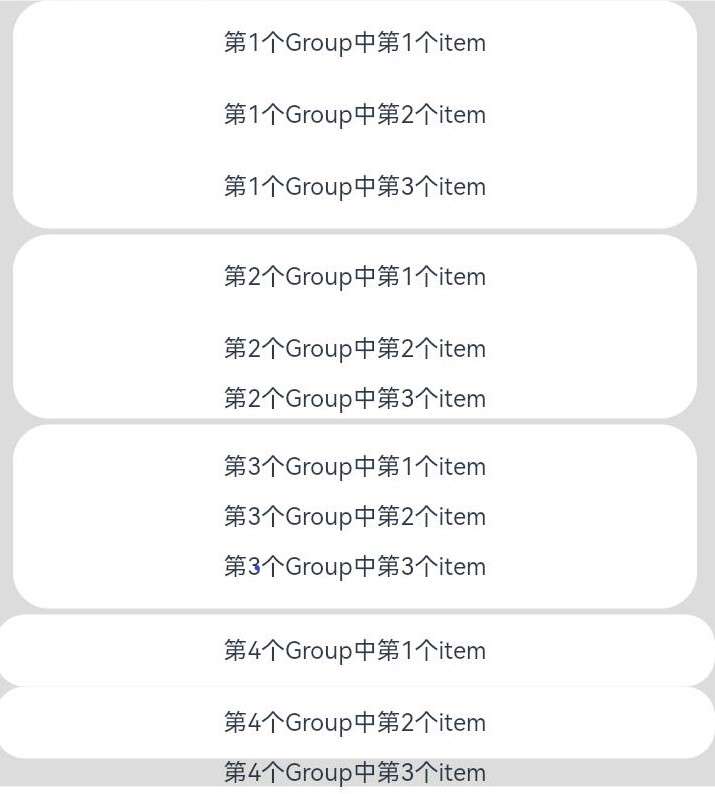
示例2(设置卡片样式)
该示例展示了ListItemGroup的卡片样式效果。
// xxx.ets
@Entry
@Component
struct ListItemGroupExample2 {
  private arr: ArrObject[] = [
    {
      style: ListItemGroupStyle.CARD,
      itemStyles: [ListItemStyle.CARD, ListItemStyle.CARD, ListItemStyle.CARD]
    },
    {
      style: ListItemGroupStyle.CARD,
      itemStyles: [ListItemStyle.CARD, ListItemStyle.CARD, ListItemStyle.NONE]
    },
    {
      style: ListItemGroupStyle.CARD,
      itemStyles: [ListItemStyle.CARD, ListItemStyle.NONE, ListItemStyle.CARD]
    },
    {
      style: ListItemGroupStyle.NONE,
      itemStyles: [ListItemStyle.CARD, ListItemStyle.CARD, ListItemStyle.NONE]
    }
  ];

  build() {
    Column() {
      List({ space: '4vp', initialIndex: 0 }) {
        ForEach(this.arr, (item: ArrObject, index?: number) => {
          ListItemGroup({ style: item.style }) {
            ForEach(item.itemStyles, (itemStyle: number, itemIndex?: number) => {
              ListItem({ style: itemStyle }) {
                if (index != undefined && itemIndex != undefined) {
                  Text('第' + (index + 1) + '个Group中第' + (itemIndex + 1) + '个item')
                    .width('100%')
                    .textAlign(TextAlign.Center)
                }
              }
            }, (item: string) => item)
          }
        })
      }
      .width('100%')
      .multiSelectable(true)
      .backgroundColor(0xDCDCDC)
    }
    .width('100%')
    .padding({ top: 5 })
  }
}

interface ArrObject {
  style: number;
  itemStyles: number[];
}
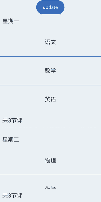
示例3(设置Header/Footer)
该示例通过ComponentContent设置Header/Footer。
// xxx.ets
import { ComponentContent } from '@kit.ArkUI';
import { TimeTable, ProjectsDataSource, TimeTableDataSource } from './ListDataSource';

class HeadBuilderParams {
  text: string|Resource;
  constructor(text: string|Resource) {
    this.text = text;
  }
}

class FootBuilderParams {
  num: number|Resource;
  constructor(num: number|Resource) {
    this.num = num;
  }
}

@Builder
function itemHead(params: HeadBuilderParams) {
  Text(params.text)
    .fontSize(20)
    .height('48vp')
    .width('100%')
    .padding(10)
    .backgroundColor($r('sys.color.background_tertiary'))
}

@Builder
function itemFoot(params: FootBuilderParams) {
  Text('共' + params.num + '节课')
    .fontSize(20)
    .height('48vp')
    .width('100%')
    .padding(10)
    .backgroundColor($r('sys.color.background_tertiary'))
}

@Component
struct MyItemGroup {
  item: TimeTable = { title: '', projects: [] };
  header?: ComponentContent<HeadBuilderParams> = undefined;
  footer?: ComponentContent<FootBuilderParams> = undefined;
  headerParam = new HeadBuilderParams(this.item.title);
  footerParam = new FootBuilderParams(this.item.projects.length);
  itemArr: ProjectsDataSource = new ProjectsDataSource([]);

  aboutToAppear(): void {
    this.header = new ComponentContent(this.getUIContext(), wrapBuilder(itemHead), this.headerParam);
    this.footer = new ComponentContent(this.getUIContext(), wrapBuilder(itemFoot), this.footerParam);
    this.itemArr = new ProjectsDataSource(this.item.projects);
  }
  GetHeader() {
    this.header?.update(new HeadBuilderParams(this.item.title));
    return this.header;
  }

  GetFooter() {
    this.footer?.update(new FootBuilderParams(this.item.projects.length));
    return this.footer;
  }

  build() {
    ListItemGroup({
      headerComponent: this.GetHeader(),
      footerComponent: this.GetFooter()
    }) {
      LazyForEach(this.itemArr, (project: string) => {
        ListItem() {
          Text(project)
            .width('100%')
            .height(100)
            .fontSize(20)
            .textAlign(TextAlign.Center)
        }
      }, (item: string) => item)
    }
    .divider({ strokeWidth: 1, color: Color.Blue }) // 每行之间的分界线
  }
}

@Entry
@Component
struct ListItemGroupExample {
  itemGroupArray: TimeTableDataSource = new TimeTableDataSource([]);
  aboutToAppear(): void {
    let timeTable: TimeTable[] = [
      {
        title: '星期一',
        projects: ['语文', '数学', '英语']
      },
      {
        title: '星期二',
        projects: ['物理', '化学', '生物']
      },
      {
        title: '星期三',
        projects: ['历史', '地理', '政治', '体育']
      },
      {
        title: '星期四',
        projects: ['美术', '音乐']
      }
    ];
    this.itemGroupArray = new TimeTableDataSource(timeTable);
  }

  build() {
    Column() {
      Button('update').width(100).height(50).onClick(() => {
        this.itemGroupArray.change1stItem({
          title: '更新后的星期一',
          projects: ['语文', '物理', '历史', '美术']
        });
      })
      List({ space: 20 }) {
        LazyForEach(this.itemGroupArray, (item: TimeTable) => {
          MyItemGroup({ item: item })
        }, (item: TimeTable) => item.title) // LazyForEach依赖键值判断是否刷新子组件
      }
      .layoutWeight(1)
      .sticky(StickyStyle.Header|StickyStyle.Footer)
      .scrollBar(BarState.Off)
    }
    .backgroundColor($r('sys.color.background_primary'))
  }
}
你可能感兴趣的鸿蒙文章
- 所属分类: 后端技术
- 本文标签:
热门推荐
-
2、 优质文章
-
3、 gt
-
7、 openharmony
-
9、 golang
-
10、 Vue中input框自动聚焦