harmony 鸿蒙隐私遮罩
隐私遮罩
用于对组件内容进行隐私遮罩处理。
说明:
从API version 10开始支持。后续版本如有新增内容,则采用上角标单独标记该内容的起始版本。
obscured
obscured(reasons: Array<ObscuredReasons>): T
设置组件内容的遮罩类型。
原子化服务API: 从API version 11开始,该接口支持在原子化服务中使用。
系统能力: SystemCapability.ArkUI.ArkUI.Full
参数:
| 参数名 | 类型 | 必填 | 描述 |
|---|---|---|---|
| reasons | Array<ObscuredReasons> | 是 | 设置组件内容的遮罩类型。 默认值:[] 仅支持Image组件、Text组件和Formcomponent组件12+的隐私遮罩处理。 说明: 如需在图片加载过程中显示隐私遮罩,需要设置Image组件的宽度和高度。 Text组件设置子组件或设置属性字符串时,不支持隐私遮罩。 |
返回值:
| 类型 | 说明 |
|---|---|
| T | 返回当前组件。 |
示例
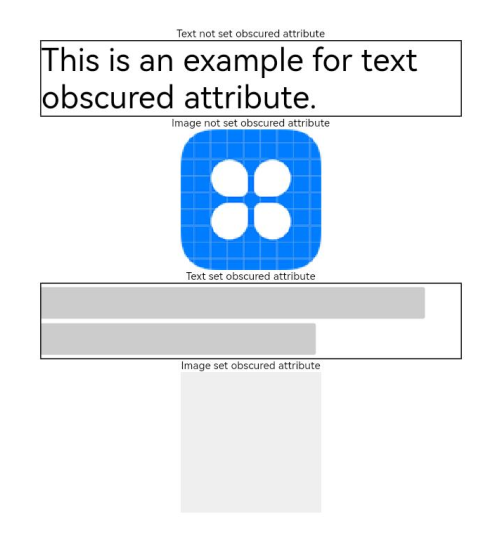
该示例通过obscured对Text、Image组件实现了隐私遮罩效果。
// xxx.ets
@Entry
@Component
struct ObscuredExample {
  build() {
    Row() {
      Column() {
        Text('Text not set obscured attribute').fontSize(10).fontColor(Color.Black)
        Text('This is an example for text obscured attribute.')
          .fontSize(30)
          .width('600px')
          .fontColor(Color.Black)
          .border({ width: 1 })
        Text('Image not set obscured attribute').fontSize(10).fontColor(Color.Black)
        Image($r('app.media.icon'))
          .width('200px')
          .height('200px')
        Text('Text set obscured attribute').fontSize(10).fontColor(Color.Black)
        Text('This is an example for text obscured attribute.')
          .fontSize(30)
          .width('600px')
          .fontColor(Color.Black)
          .border({ width: 1 })
          .obscured([ObscuredReasons.PLACEHOLDER])
        Text('Image set obscured attribute').fontSize(10).fontColor(Color.Black)
        Image($r('app.media.icon'))
          .width('200px')
          .height('200px')
          .obscured([ObscuredReasons.PLACEHOLDER])
      }
      .width('100%')
    }
    .height('100%')
  }
}
你可能感兴趣的鸿蒙文章
0
赞
- 所属分类: 后端技术
- 本文标签:
热门推荐
-
2、 优质文章
-
3、 gt
-
7、 openharmony
-
9、 golang
-
10、 Vue中input框自动聚焦