harmony 鸿蒙文本滑动选择器弹窗 (TextPickerDialog)
文本滑动选择器弹窗 (TextPickerDialog)
根据指定的选择范围创建文本选择器,展示在弹窗上。
说明:
TextPickerDialog
show(deprecated)
static show(options?: TextPickerDialogOptions)
定义文本滑动选择器弹窗并弹出。
说明:
从API version 18开始废弃,建议使用UIContext中的showTextPickerDialog替代。
从API version 10开始,可以通过使用UIContext中的showTextPickerDialog来明确UI的执行上下文。
原子化服务API: 从API version 11开始,该接口支持在原子化服务中使用。
系统能力: SystemCapability.ArkUI.ArkUI.Full
参数:
| 参数名 | 类型 | 必填 | 说明 |
|---|---|---|---|
| options | TextPickerDialogOptions | 否 | 配置文本选择器弹窗的参数。 |
TextPickerDialogOptions对象说明
文本选择器弹窗的参数继承自TextPickerOptions。
系统能力: SystemCapability.ArkUI.ArkUI.Full
| 名称 | 类型 | 必填 | 说明 |
|---|---|---|---|
| defaultPickerItemHeight | number |string | 否 | 设置选择器中选项的高度。number类型取值范围:[0, +∞),string类型仅支持number类型取值的字符串形式,例如”56”。 默认值:选中项56vp,非选中项36vp。设置该参数后,选中项与非选中项的高度均为所设置的值。 原子化服务API: 从API version 11开始,该接口支持在原子化服务中使用。 |
| disappearTextStyle10+ | PickerTextStyle | 否 | 设置所有选项中最上和最下两个选项的文本颜色、字号、字体粗细。 默认值: { color: ‘#ff182431’, font: { size: ‘14fp’, weight: FontWeight.Regular } } 原子化服务API: 从API version 11开始,该接口支持在原子化服务中使用。 |
| textStyle10+ | PickerTextStyle | 否 | 设置所有选项中除了最上、最下及选中项以外的文本颜色、字号、字体粗细。 默认值: { color: ‘#ff182431’, font: { size: ‘16fp’, weight: FontWeight.Regular } } 原子化服务API: 从API version 11开始,该接口支持在原子化服务中使用。 |
| selectedTextStyle10+ | PickerTextStyle | 否 | 设置选中项的文本颜色、字号、字体粗细。 默认值: { color: ‘#ff007dff’, font: { size: ‘20fp’, weight: FontWeight.Medium } } 原子化服务API: 从API version 11开始,该接口支持在原子化服务中使用。 |
| acceptButtonStyle12+ | PickerDialogButtonStyle | 否 | 设置确认按钮显示样式、样式和重要程度、角色、背景色、圆角、文本颜色、字号、字体粗细、字体样式、字体列表、按钮是否默认响应Enter键。 说明: 1.acceptButtonStyle与cancelButtonStyle中最多只能有一个primary字段配置为true,如果同时设置为true,则primary字段不生效,保持默认值false。 2.按钮高度默认40vp,在关怀模式-大字体场景下高度不变,即使按钮样式设置为圆角矩形ROUNDED_RECTANGLE,呈现效果依然是胶囊型按钮Capsule。 原子化服务API: 从API version 12开始,该接口支持在原子化服务中使用。 |
| cancelButtonStyle12+ | PickerDialogButtonStyle | 否 | 设置取消按钮显示样式、样式和重要程度、角色、背景色、圆角、文本颜色、字号、字体粗细、字体样式、字体列表、按钮是否默认响应Enter键。 说明: 1.acceptButtonStyle与cancelButtonStyle中最多只能有一个primary字段配置为true,如果同时设置为true,则primary字段不生效,保持默认值false。 2.按钮高度默认40vp,在关怀模式-大字体场景下高度不变,即使按钮样式设置为圆角矩形ROUNDED_RECTANGLE,呈现效果依然是胶囊型按钮Capsule。 原子化服务API: 从API version 12开始,该接口支持在原子化服务中使用。 |
| canLoop10+ | boolean | 否 | 设置是否可循环滚动,true:可循环,false:不可循环,默认值:true。 原子化服务API: 从API version 11开始,该接口支持在原子化服务中使用。 |
| alignment10+ | DialogAlignment | 否 | 弹窗在竖直方向上的对齐方式。 默认值:DialogAlignment.Default 原子化服务API: 从API version 11开始,该接口支持在原子化服务中使用。 |
| offset10+ | Offset | 否 | 弹窗相对alignment所在位置的偏移量。 默认值:{ dx: 0 , dy: 0 } 原子化服务API: 从API version 11开始,该接口支持在原子化服务中使用。 |
| maskRect10+ | Rectangle | 否 | 弹窗遮蔽层区域,在遮蔽层区域内的事件不透传,在遮蔽层区域外的事件透传。 默认值:{ x: 0, y: 0, width: ‘100%’, height: ‘100%’ } 原子化服务API: 从API version 11开始,该接口支持在原子化服务中使用。 |
| onAccept | (value: TextPickerResult) => void | 否 | 点击弹窗中的“确定”按钮时触发该回调。 原子化服务API: 从API version 11开始,该接口支持在原子化服务中使用。 |
| onCancel | () => void | 否 | 点击弹窗中的“取消”按钮时触发该回调。 原子化服务API: 从API version 11开始,该接口支持在原子化服务中使用。 |
| onChange | (value: TextPickerResult) => void | 否 | 滑动弹窗中的选择器后,选项归位至选中项位置时,触发该回调。 原子化服务API: 从API version 11开始,该接口支持在原子化服务中使用。 |
| onScrollStop14+ | (value: TextPickerResult) => void | 否 | 滑动弹窗中的选择器的选择列停止触发该回调。 原子化服务API: 从API version 14开始,该接口支持在原子化服务中使用。 |
| backgroundColor11+ | ResourceColor | 否 | 弹窗背板颜色。 默认值:Color.Transparent 说明: 当设置了backgroundColor为非透明色时,backgroundBlurStyle需要设置为BlurStyle.NONE,否则颜色显示将不符合预期效果。 原子化服务API: 从API version 12开始,该接口支持在原子化服务中使用。 |
| backgroundBlurStyle11+ | BlurStyle | 否 | 弹窗背板模糊材质。 默认值:BlurStyle.COMPONENT_ULTRA_THICK 说明: 设置为BlurStyle.NONE即可关闭背景虚化。当设置了backgroundBlurStyle为非NONE值时,则不要设置backgroundColor,否则颜色显示将不符合预期效果。 原子化服务API: 从API version 12开始,该接口支持在原子化服务中使用。 |
| backgroundBlurStyleOptions19+ | BackgroundBlurStyleOptions | 否 | 背景模糊效果。 原子化服务API: 从API version 19开始,该接口支持在原子化服务中使用。 |
| backgroundEffect19+ | BackgroundEffectOptions | 否 | 背景效果参数。 原子化服务API: 从API version 19开始,该接口支持在原子化服务中使用。 |
| onDidAppear12+ | () => void | 否 | 弹窗弹出时的事件回调。 说明: 1.正常时序依次为:onWillAppear>>onDidAppear>>(onAccept/onCancel/onChange/onScrollStop)>>onWillDisappear>>onDidDisappear。 2.在onDidAppear内设置改变弹窗显示效果的回调事件,二次弹出生效。 3.快速点击弹出,消失弹窗时,存在onWillDisappear在onDidAppear前生效。 4. 当弹窗入场动效未完成时关闭弹窗,该回调不会触发。 原子化服务API: 从API version 12开始,该接口支持在原子化服务中使用。 |
| onDidDisappear12+ | () => void | 否 | 弹窗消失时的事件回调。 说明: 1.正常时序依次为:onWillAppear>>onDidAppear>>(onAccept/onCancel/onChange/onScrollStop)>>onWillDisappear>>onDidDisappear。 原子化服务API: 从API version 12开始,该接口支持在原子化服务中使用。 |
| onWillAppear12+ | () => void | 否 | 弹窗显示动效前的事件回调。 说明: 1.正常时序依次为:onWillAppear>>onDidAppear>>(onAccept/onCancel/onChange/onScrollStop)>>onWillDisappear>>onDidDisappear。 2.在onWillAppear内设置改变弹窗显示效果的回调事件,二次弹出生效。 原子化服务API: 从API version 12开始,该接口支持在原子化服务中使用。 |
| onWillDisappear12+ | () => void | 否 | 弹窗退出动效前的事件回调。 说明: 1.正常时序依次为:onWillAppear>>onDidAppear>>(onAccept/onCancel/onChange/onScrollStop)>>onWillDisappear>>onDidDisappear。 2.快速点击弹出,消失弹窗时,存在onWillDisappear在onDidAppear前生效。 原子化服务API: 从API version 12开始,该接口支持在原子化服务中使用。 |
| shadow12+ | ShadowOptions | ShadowStyle | 否 | 设置弹窗背板的阴影。 当设备为2in1时,默认场景下获焦阴影值为ShadowStyle.OUTER_FLOATING_MD,失焦为ShadowStyle.OUTER_FLOATING_SM 原子化服务API: 从API version 12开始,该接口支持在原子化服务中使用。 |
| enableHoverMode14+ | boolean | 否 | 是否响应悬停态。 默认值:false,默认不响应。 原子化服务API: 从API version 14开始,该接口支持在原子化服务中使用。 |
| hoverModeArea14+ | HoverModeAreaType | 否 | 设置悬停态下弹窗默认展示区域。 默认值:HoverModeAreaType.BOTTOM_SCREEN 原子化服务API: 从API version 14开始,该接口支持在原子化服务中使用。 |
| disableTextStyleAnimation15+ | boolean | 否 | 设置滑动过程中是否有文本样式变化动效。 true:无文本样式变化动效,false:有文本样式变化动效。 默认值:false |
| defaultTextStyle15+ | TextPickerTextStyle | 否 | 设置关闭滑动过程中文本样式变化动效时的各个选项文本的样式,仅当disableTextStyleAnimation为true时生效。 默认值:与Text组件默认值相同。 |
| onEnterSelectedArea18+ | Callback<TextPickerResult> | 否 | 滑动过程中,选项进入分割线区域内,触发该回调。与onChange事件的差别在于,该事件的触发时机早于onChange事件,当当前滑动列滑动距离超过选中项高度的一半时,选项此时已经进入分割线区域内,会触发该事件。 说明: 在多列联动场景中,不建议使用该回调,由于该回调标识的是滑动过程中选项进入分割线区域内的节点,而跟随变化的选项并不涉及滑动,因此,回调的返回值中,仅当前滑动列的值会正常变化,其余未滑动列的值保持不变。 原子化服务API: 从API version 18开始,该接口支持在原子化服务中使用。 |
| enableHapticFeedback18+ | boolean | 否 | 设置是否开启触控反馈。 默认值:true,true表示开启触控反馈,false表示不开启触控反馈。 原子化服务API: 从API version 18开始,该接口支持在原子化服务中使用。 说明: 开启触控反馈时,需要在工程的module.json5中配置requestPermissions字段开启振动权限,配置如下: “requestPermissions”: [{“name”: “ohos.permission.VIBRATE”}] |
| selectedBackgroundStyle20+ | PickerBackgroundStyle | 否 | 设置选中项背景样式。 默认值: { color: ‘#0C182431’ borderRadius: { value:24 unit:1 } } 原子化服务API: 从API version 20开始,该接口支持在原子化服务中使用。 |
TextPickerResult对象说明
原子化服务API: 从API version 11开始,该接口支持在原子化服务中使用。
系统能力: SystemCapability.ArkUI.ArkUI.Full
| 名称 | 类型 | 只读 | 可选 | 说明 |
|---|---|---|---|---|
| value | string |string []10+ | 否 | 否 | 选中项的文本内容。 说明:当显示文本或图片加文本列表时,value值为选中项中的文本值。(文本选择器显示多列时,value为数组类型。) 当显示图片列表时,value值为空。 value值不支持包含转义字符’\‘。 |
| index | number |number []10+ | 否 | 否 | 选中项在选择范围数组中的索引值,索引从0开始。(文本选择器显示多列时,index为数组类型。) |
示例
说明:
推荐通过使用UIContext中的showTextPickerDialog来明确UI的执行上下文。
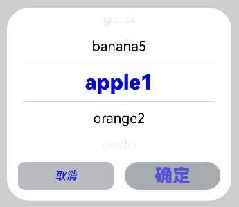
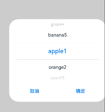
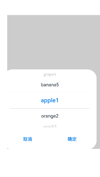
示例1(弹出文本选择弹窗)
该示例通过点击按钮弹出文本选择弹窗。
// xxx.ets
@Entry
@Component
struct TextPickerDialogExample {
private select: number|number[] = 0;
private fruits: string[] = ['apple1', 'orange2', 'peach3', 'grape4', 'banana5'];
@State v: string = '';
build() {
Row() {
Column() {
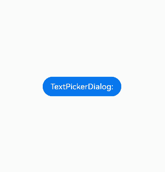
Button("TextPickerDialog:" + this.v)
.margin(20)
.onClick(() => {
this.getUIContext().showTextPickerDialog({
range: this.fruits,
selected: this.select,
value: this.v,
defaultPickerItemHeight: 40,
onAccept: (value: TextPickerResult) => {
// 设置select为按下确定按钮时候的选中项index,这样当弹窗再次弹出时显示选中的是上一次确定的选项
this.select = value.index;
console.log(this.select + '');
// 点击确定后,被选到的文本数据展示到页面
this.v = value.value as string;
console.info("TextPickerDialog:onAccept()" + JSON.stringify(value));
},
onCancel: () => {
console.info("TextPickerDialog:onCancel()");
},
onChange: (value: TextPickerResult) => {
console.info("TextPickerDialog:onChange()" + JSON.stringify(value));
},
onScrollStop: (value: TextPickerResult) => {
console.info("TextPickerDialog:onScrollStop()" + JSON.stringify(value));
},
onDidAppear: () => {
console.info("TextPickerDialog:onDidAppear()");
},
onDidDisappear: () => {
console.info("TextPickerDialog:onDidDisappear()");
},
onWillAppear: () => {
console.info("TextPickerDialog:onWillAppear()");
},
onWillDisappear: () => {
console.info("TextPickerDialog:onWillDisappear()");
}
});
})
}.width('100%')
}.height('100%')
}
}
示例2(自定义样式)
该示例通过配置disappearTextStyle、textStyle、selectedTextStyle、acceptButtonStyle、cancelButtonStyle实现了自定义文本和按钮样式。
// xxx.ets
@Entry
@Component
struct TextPickerDialogExample {
  private select: number|number[] = 0;
  private fruits: string[] = ['apple1', 'orange2', 'peach3', 'grape4', 'banana5'];
  @State v: string = '';

  build() {
    Row() {
      Column() {
        Button("TextPickerDialog:" + this.v)
          .margin(20)
          .onClick(() => {
            this.getUIContext().showTextPickerDialog({
              range: this.fruits,
              selected: this.select,
              disappearTextStyle: { color: '#297bec', font: { size: 15, weight: FontWeight.Lighter } },
              textStyle: { color: Color.Black, font: { size: 20, weight: FontWeight.Normal } },
              selectedTextStyle: { color: Color.Blue, font: { size: 30, weight: FontWeight.Bolder } },
              acceptButtonStyle: {
                type: ButtonType.Normal,
                style: ButtonStyleMode.NORMAL,
                role: ButtonRole.NORMAL,
                fontColor: 'rgb(81, 81, 216)',
                fontSize: '26fp',
                fontWeight: FontWeight.Bolder,
                fontStyle: FontStyle.Normal,
                fontFamily: 'sans-serif',
                backgroundColor: '#A6ACAF',
                borderRadius: 20
              },
              cancelButtonStyle: {
                type: ButtonType.Normal,
                style: ButtonStyleMode.NORMAL,
                role: ButtonRole.NORMAL,
                fontColor: Color.Blue,
                fontSize: '16fp',
                fontWeight: FontWeight.Normal,
                fontStyle: FontStyle.Italic,
                fontFamily: 'sans-serif',
                backgroundColor: '#50182431',
                borderRadius: 10
              },
              onAccept: (value: TextPickerResult) => {
                // 设置select为按下确定按钮时候的选中项index,这样当弹窗再次弹出时显示选中的是上一次确定的选项
                this.select = value.index;
                console.log(this.select + '');
                // 点击确定后,被选到的文本数据展示到页面
                this.v = value.value as string;
                console.info("TextPickerDialog:onAccept()" + JSON.stringify(value));
              },
              onCancel: () => {
                console.info("TextPickerDialog:onCancel()");
              },
              onChange: (value: TextPickerResult) => {
                console.info("TextPickerDialog:onChange()" + JSON.stringify(value));
              },
              onScrollStop: (value: TextPickerResult) => {
                console.info("TextPickerDialog:onScrollStop()" + JSON.stringify(value));
              },
              onDidAppear: () => {
                console.info("TextPickerDialog:onDidAppear()");
              },
              onDidDisappear: () => {
                console.info("TextPickerDialog:onDidDisappear()");
              },
              onWillAppear: () => {
                console.info("TextPickerDialog:onWillAppear()");
              },
              onWillDisappear: () => {
                console.info("TextPickerDialog:onWillDisappear()");
              }
            });
          })
      }.width('100%')
    }.height('100%')
  }
}
示例3(悬停态弹窗)
该示例展示了在折叠屏悬停态下设置dialog布局区域的效果。
@Entry
@Component
struct TextPickerDialogExample {
  private select: number|number[] = 0;
  private fruits: string[] = ['apple1', 'orange2', 'peach3', 'grape4', 'banana5'];
  @State v: string = '';

  build() {
    Row() {
      Column() {
        Button("TextPickerDialog:" + this.v)
          .margin(20)
          .onClick(() => {
            this.getUIContext().showTextPickerDialog({
              range: this.fruits,
              selected: this.select,
              disappearTextStyle: { color: Color.Red, font: { size: 15, weight: FontWeight.Lighter }},
              textStyle: { color: Color.Black, font: { size: 20, weight: FontWeight.Normal }},
              selectedTextStyle: { color: Color.Blue, font: { size: 30, weight: FontWeight.Bolder }},
              onAccept: (value: TextPickerResult) => {
                // 设置select为按下确定按钮时候的选中项index,这样当弹窗再次弹出时显示选中的是上一次确定的选项
                this.select = value.index;
                console.log(this.select + '');
                // 点击确定后,被选到的文本数据展示到页面
                this.v = value.value as string;
                console.info("TextPickerDialog:onAccept()" + JSON.stringify(value));
              },
              onCancel: () => {
                console.info("TextPickerDialog:onCancel()");
              },
              onChange: (value: TextPickerResult) => {
                console.info("TextPickerDialog:onChange()" + JSON.stringify(value));
              },
              onScrollStop: (value: TextPickerResult) => {
                console.info("TextPickerDialog:onScrollStop()" + JSON.stringify(value));
              },
              onDidAppear: () => {
                console.info("TextPickerDialog:onDidAppear()");
              },
              onDidDisappear: () => {
                console.info("TextPickerDialog:onDidDisappear()");
              },
              onWillAppear: () => {
                console.info("TextPickerDialog:onWillAppear()");
              },
              onWillDisappear: () => {
                console.info("TextPickerDialog:onWillDisappear()");
              },
              enableHoverMode: true,
              hoverModeArea: HoverModeAreaType.TOP_SCREEN
            });
          })
      }.width('100%')
    }.height('100%')
  }
}
示例4(设置弹窗位置)
该示例通过alignment、offset设置弹窗的位置。
// xxx.ets
@Entry
@Component
struct TextPickerDialogExample {
  private select: number|number[] = 0;
  private fruits: string[] = ['apple1', 'orange2', 'peach3', 'grape4', 'banana5'];
  @State v: string = '';

  build() {
    Row() {
      Column() {
        Button("TextPickerDialog:" + this.v)
          .margin(20)
          .onClick(() => {
            this.getUIContext().showTextPickerDialog({
              range: this.fruits,
              selected: this.select,
              alignment: DialogAlignment.Center,
              offset: { dx: 20, dy: 0 },
              onAccept: (value: TextPickerResult) => {
                // 设置select为按下确定按钮时候的选中项index,这样当弹窗再次弹出时显示选中的是上一次确定的选项
                this.select = value.index;
                console.log(this.select + '');
                // 点击确定后,被选到的文本数据展示到页面
                this.v = value.value as string;
                console.info("TextPickerDialog:onAccept()" + JSON.stringify(value));
              }
            });
          })
      }.width('100%')
    }.height('100%')
  }
}
示例5(设置遮蔽区)
该示例通过maskRect设置遮蔽区。
// xxx.ets
@Entry
@Component
struct TextPickerDialogExample {
  private select: number|number[] = 0;
  private fruits: string[] = ['apple1', 'orange2', 'peach3', 'grape4', 'banana5'];
  @State v: string = '';

  build() {
    Row() {
      Column() {
        Button("TextPickerDialog:" + this.v)
          .margin(20)
          .onClick(() => {
            this.getUIContext().showTextPickerDialog({
              range: this.fruits,
              selected: this.select,
              maskRect: {
                x: 30,
                y: 60,
                width: '100%',
                height: '60%'
              },
              onAccept: (value: TextPickerResult) => {
                // 设置select为按下确定按钮时候的选中项index,这样当弹窗再次弹出时显示选中的是上一次确定的选项
                this.select = value.index;
                console.log(this.select + '');
                // 点击确定后,被选到的文本数据展示到页面
                this.v = value.value as string;
                console.info("TextPickerDialog:onAccept()" + JSON.stringify(value));
              }
            });
          })
      }.width('100%')
    }.height('100%')
  }
}
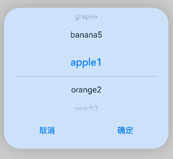
示例6(设置弹窗背板)
该示例通过backgroundColor、backgroundBlurStyle和shadow设置弹窗背板。
// xxx.ets
@Entry
@Component
struct TextPickerDialogExample {
  private select: number|number[] = 0;
  private fruits: string[] = ['apple1', 'orange2', 'peach3', 'grape4', 'banana5'];
  @State v: string = '';

  build() {
    Row() {
      Column() {
        Button("TextPickerDialog:" + this.v)
          .margin(20)
          .onClick(() => {
            this.getUIContext().showTextPickerDialog({
              range: this.fruits,
              selected: this.select,
              backgroundColor: 'rgb(204, 226, 251)',
              backgroundBlurStyle: BlurStyle.NONE,
              shadow: ShadowStyle.OUTER_FLOATING_SM,
              onAccept: (value: TextPickerResult) => {
                // 设置select为按下确定按钮时候的选中项index,这样当弹窗再次弹出时显示选中的是上一次确定的选项
                this.select = value.index;
                console.log(this.select + '');
                // 点击确定后,被选到的文本数据展示到页面
                this.v = value.value as string;
                console.info("TextPickerDialog:onAccept()" + JSON.stringify(value));
              }
            });
          })
      }.width('100%')
    }.height('100%')
  }
}
示例7(设置循环滚动)
该示例通过配置canLoop设置是否循环滚动。
// xxx.ets
@Entry
@Component
struct TextPickerDialogExample {
  private select: number|number[] = 0;
  private fruits: string[] = ['apple1', 'orange2', 'peach3', 'grape4', 'banana5'];
  @State v: string = '';

  build() {
    Row() {
      Column() {
        Button("TextPickerDialog:" + this.v)
          .margin(20)
          .onClick(() => {
            this.getUIContext().showTextPickerDialog({
              range: this.fruits,
              selected: this.select,
              value: this.v,
              canLoop: false,
              onAccept: (value: TextPickerResult) => {
                // 设置select为按下确定按钮时候的选中项index,这样当弹窗再次弹出时显示选中的是上一次确定的选项
                this.select = value.index;
                console.log(this.select + '');
                // 点击确定后,被选到的文本数据展示到页面
                this.v = value.value as string;
                console.info("TextPickerDialog:onAccept()" + JSON.stringify(value));
              }
            });
          })
      }.width('100%')
    }.height('100%')
  }
}
示例8(设置选中项背景样式)
该示例通过配置selectedBackgroundStyle实现文本选择器选中项的背景样式。
// xxx.ets
@Entry
@Component
struct TextPickerExample {
  private showText1: string [] = ['Text1', 'Text1', 'Text1', 'Text1']
  build() {
    Column() {
      Row() {
        Button("TextPickerDialog")
          .margin(20)
          .onClick(() => {
            this.getUIContext().showTextPickerDialog({
              range: this.showText1,
              selectedBackgroundStyle: {
                borderRadius: {
                  topLeft:15,
                  topRight:15,
                  bottomLeft:15,
                  bottomRight:15
                },
                color: "FFC3C3C3"
              }
            })
          })
      }
    }.height('100%')
  }
}
你可能感兴趣的鸿蒙文章
- 所属分类: 后端技术
- 本文标签:
热门推荐
-
2、 优质文章
-
3、 gt
-
7、 openharmony
-
9、 golang
-
10、 Vue中input框自动聚焦