harmony 鸿蒙Title Bar
Title Bar
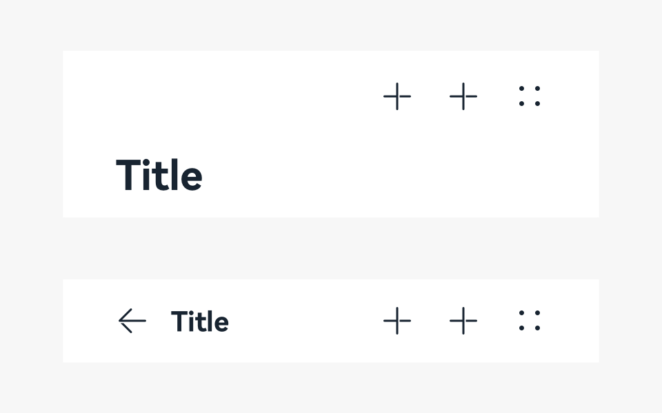
The title bar is used to display the name and operation entry of a screen.
How to Use
Use the title bar mainly on a tool screen or content-oriented screen.
Place the title bar on the top of the screen. You do not need to highlight the title if the function or content needs to be highlighted.
Regular Title Bars
A regular title bar is used when the title does not need to be highlighted.
The title bar may have icons that show common actions, usually on the right side. Users can touch an icon to perform a particular action.
Title bars are needed on all screens, except for immersive screens.
Title Bars on Non-level-1 Screens
- The title of a non-level-1 screen is the name of the screen.
- Place a maximum of three icons on the right. Alternatively, you can choose not to place any icon.
- The main title and subtitle are optional. In the case of a two-line title, the title of the second line provides auxiliary description for the title of the first line.
- [Not recommended] If there are multiple views but all other views except the default view are seldom used, you can use the drop-down menu title. However, this practice hides the content in the drop-down menu title and reduces their usage. Therefore, it is not recommended.
Writing Instructions
Keep the text on a title bar short and clear.
Keep the title consistent with the entry name of the previous screen.
Use noun phrases without punctuations.
Resources
For details about the development guide related to the title bar, see Navigation.
你可能感兴趣的鸿蒙文章
harmony 鸿蒙OpenHarmony Application UX Design Specifications
harmony 鸿蒙Animation Attributes
harmony 鸿蒙Animation Design Principles
harmony 鸿蒙Application Navigation Structure Design
harmony 鸿蒙Application Page Structure Design
- 所属分类: 后端技术
- 本文标签:
热门推荐
-
2、 优质文章
-
3、 gt
-
7、 openharmony
-
9、 golang
-
10、 Vue中input框自动聚焦