harmony 鸿蒙Gauge
Gauge
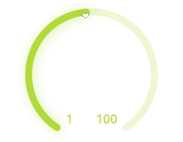
数据量规图表组件,用于将数据展示为环形图表。
说明:
该组件从API Version 8开始支持。后续版本如有新增内容,则采用上角标单独标记该内容的起始版本。
子组件
可以包含单个子组件。
说明:
建议使用文本组件构建当前数值文本和辅助文本。
若子组件宽高为百分比形式,则基准范围为以外圆环做为内切圆的矩形。
接口
Gauge(options: GaugeOptions)
创建数据量规图表组件。
卡片能力: 从API version 9开始,该接口支持在ArkTS卡片中使用。
原子化服务API: 从API version 11开始,该接口支持在原子化服务中使用。
系统能力: SystemCapability.ArkUI.ArkUI.Full
参数:
| 参数名 | 类型 | 必填 | 说明 |
|---|---|---|---|
| options | GaugeOptions | 是 | 数据量规图表组件参数。 |
GaugeOptions18+对象说明
卡片能力: 从API version 18开始,该接口支持在ArkTS卡片中使用。
原子化服务API: 从API version 18开始,该接口支持在原子化服务中使用。
系统能力: SystemCapability.ArkUI.ArkUI.Full
| 名称 | 类型 | 必填 | 说明 |
|---|---|---|---|
| value8+ | number | 是 | 量规图的当前数据值,即图中指针指向位置。用于组件创建时量规图初始值的预置。 卡片能力: 从API version 9开始,该接口支持在ArkTS卡片中使用。 原子化服务API: 从API version 11开始,该接口支持在原子化服务中使用。 说明: value不在min和max范围内时使用min作为默认值。 |
| min8+ | number | 否 | 当前数据段最小值。 默认值:0 卡片能力: 从API version 9开始,该接口支持在ArkTS卡片中使用。 原子化服务API: 从API version 11开始,该接口支持在原子化服务中使用。 |
| max8+ | number | 否 | 当前数据段最大值。 默认值:100 卡片能力: 从API version 9开始,该接口支持在ArkTS卡片中使用。 原子化服务API: 从API version 11开始,该接口支持在原子化服务中使用。 说明: max小于min时使用默认值0和100。 max和min支持负数。 |
属性
除支持通用属性外,还支持以下属性:
value
value(value: number)
设置量规图的数据值。
卡片能力: 从API version 9开始,该接口支持在ArkTS卡片中使用。
原子化服务API: 从API version 11开始,该接口支持在原子化服务中使用。
系统能力: SystemCapability.ArkUI.ArkUI.Full
参数:
| 参数名 | 类型 | 必填 | 说明 |
|---|---|---|---|
| value | number | 是 | 量规图的数据值,可用于动态修改量规图的数据值。 默认值:0 |
startAngle
startAngle(angle: number)
设置起始角度位置。
卡片能力: 从API version 9开始,该接口支持在ArkTS卡片中使用。
原子化服务API: 从API version 11开始,该接口支持在原子化服务中使用。
系统能力: SystemCapability.ArkUI.ArkUI.Full
参数:
| 参数名 | 类型 | 必填 | 说明 |
|---|---|---|---|
| angle | number | 是 | 起始角度位置,时钟0点为0度,顺时针方向为正角度。 默认值:0 |
endAngle
endAngle(angle: number)
设置终止角度位置。起始角度位置和终止角度位置差过小时,会绘制出异常图像,请取合理的起始角度位置和终止角度位置。建议使用单色环改变Gauge的value参数实现数据值的调节,可通过定时器setTimeout进行数值的延迟加载。
卡片能力: 从API version 9开始,该接口支持在ArkTS卡片中使用。
原子化服务API: 从API version 11开始,该接口支持在原子化服务中使用。
系统能力: SystemCapability.ArkUI.ArkUI.Full
参数:
| 参数名 | 类型 | 必填 | 说明 |
|---|---|---|---|
| angle | number | 是 | 终止角度位置,时钟0点为0度,顺时针方向为正角度。 默认值:360 |
colors
colors(colors: ResourceColor|LinearGradient|Array<[ResourceColor|LinearGradient, number]>)
设置量规图的颜色。
从API version 11开始,该接口使用以下规则:
参数类型为ResourceColor,则圆环类型为单色环。
参数类型为LinearGradient,则圆环类型为渐变环。
参数类型为数组,则圆环类型为分段渐变环,第一个参数为颜色值,若设置为非颜色类型,则置为”0xFFE84026”。第二个参数为颜色所占比重,若设置为负数或是非数值类型,则将比重置为0。
分段渐变环最大显示段数为9段,若多于9段,则多于部分不显示。
卡片能力: 从API version 9开始,该接口支持在ArkTS卡片中使用。
原子化服务API: 从API version 11开始,该接口支持在原子化服务中使用。
系统能力: SystemCapability.ArkUI.ArkUI.Full
参数:
| 参数名 | 类型 | 必填 | 说明 |
|---|---|---|---|
| colors | ResourceColor11+ | LinearGradient11+ | Array<[ResourceColor | LinearGradient11+ \, number]> | 是 | 量规图的颜色,支持分段颜色设置。 API version 9 默认值:Color.Black API version 11默认值: 若不传颜色,或者数组为空,无法确定圆环类型及颜色,则圆环颜色为”0xFF64BB5C”、”0xFFF7CE00”、”0xFFE84026”的渐变环。 若传入颜色,但颜色值有误,则该颜色为”0xFFE84026”。 若对应颜色的比重为0,则该颜色在圆环中不显示。若所有颜色比重均为0,圆环不显示。 |
strokeWidth
strokeWidth(length: Length)
设置环形量规图的环形厚度。
卡片能力: 从API version 9开始,该接口支持在ArkTS卡片中使用。
原子化服务API: 从API version 11开始,该接口支持在原子化服务中使用。
系统能力: SystemCapability.ArkUI.ArkUI.Full
参数:
| 参数名 | 类型 | 必填 | 说明 |
|---|---|---|---|
| length | Length | 是 | 环形量规图的环形厚度。 默认值:4 单位:vp 说明: 设置小于0的值时,按默认值显示。 环形厚度的最大值为圆环的半径,超过最大值按最大值处理。 不支持百分比。 |
description11+
description(value: CustomBuilder)
设置说明内容。
原子化服务API: 从API version 12开始,该接口支持在原子化服务中使用。
系统能力: SystemCapability.ArkUI.ArkUI.Full
参数:
| 参数名 | 类型 | 必填 | 说明 |
|---|---|---|---|
| value | CustomBuilder | 是 | 说明内容。 说明: @Builder中的内容由开发者自定义,建议使用文本或者图片。 若自定义部分的宽高为百分比形式,则基准范围为圆环直径的44.4%*25.4%的矩形(图片为28.6%*28.6%),距离圆环底部0vp,左右居中。 设置null则不显示内容。 不设置则依赖是否设置数据最大最小值。 若设置最大最小值或者只设置其中一个,则显示最大最小值。 若未设置最大最小值,则不显示内容。 最大最小值显示在圆环底部,位置不可移动,若圆环开口角度设置不恰当,存在圆环遮挡文字的情况。 |
trackShadow11+
trackShadow(value: GaugeShadowOptions)
设置阴影样式。
原子化服务API: 从API version 12开始,该接口支持在原子化服务中使用。
系统能力: SystemCapability.ArkUI.ArkUI.Full
参数:
| 参数名 | 类型 | 必填 | 说明 |
|---|---|---|---|
| value | GaugeShadowOptions | 是 | 阴影样式。 说明: 阴影颜色与圆环颜色一致。 设置null为不开启投影。 |
indicator11+
indicator(value: GaugeIndicatorOptions)
设置指针样式。
原子化服务API: 从API version 12开始,该接口支持在原子化服务中使用。
系统能力: SystemCapability.ArkUI.ArkUI.Full
参数:
| 参数名 | 类型 | 必填 | 说明 |
|---|---|---|---|
| value | GaugeIndicatorOptions | 是 | 指针样式。 说明: 设置null则不显示指针。 |
privacySensitive12+
privacySensitive(isPrivacySensitiveMode: Optional<boolean>)
设置隐私敏感。
卡片能力: 从API version 12开始,该接口支持在ArkTS卡片中使用。
原子化服务API: 从API version 12开始,该接口支持在原子化服务中使用。
系统能力: SystemCapability.ArkUI.ArkUI.Full
参数:
| 参数名 | 类型 | 必填 | 说明 |
|---|---|---|---|
| isPrivacySensitiveMode | Optional<boolean> | 是 | 设置隐私敏感。在隐私模式下,Gauge指针指向0位置,最大值最小值文本将被遮罩,量程显示灰色或底色。true表示打开隐私敏感,false表示关闭隐私敏感。 说明: 设置null则不敏感。 需要在卡片中使用Gauge,并用FormComponent组件设置隐私遮罩属性,显示卡片时才有隐私遮罩效果。 |
contentModifier12+
contentModifier(modifier: ContentModifier<GaugeConfiguration>)
定制Gauge内容区的方法。
原子化服务API: 从API version 12开始,该接口支持在原子化服务中使用。
系统能力: SystemCapability.ArkUI.ArkUI.Full
参数:
| 参数名 | 类型 | 必填 | 说明 |
|---|---|---|---|
| modifier | ContentModifier<GaugeConfiguration> | 是 | 在Gauge组件上定制内容区的方法。 modifier:内容修改器,开发者需要自定义class实现ContentModifier接口。 |
GaugeShadowOptions11+对象说明
GaugeShadowOptions继承自MultiShadowOptions,具有MultiShadowOptions的全部属性。
原子化服务API: 从API version 12开始,该接口支持在原子化服务中使用。
GaugeIndicatorOptions11+对象说明
原子化服务API: 从API version 12开始,该接口支持在原子化服务中使用。
系统能力: SystemCapability.ArkUI.ArkUI.Full
| 名称 | 类型 | 必填 | 说明 |
|---|---|---|---|
| icon | ResourceStr | 否 | 图标资源路径。 说明: 不配置则使用默认的三角形样式指针。 支持使用svg格式的图标,若使用其他格式,则使用默认的三角形样式指针。 |
| space | Dimension | 否 | 指针距离圆环外边的间距。(不支持百分比) 默认值:8 单位:vp 说明: 对于默认的三角形样式指针,间距为黑色三角形到圆环外边的间距。 若设置值小于0,则使用默认值。 若设置值大于圆环半径,则使用默认值。 |
GaugeConfiguration12+对象说明
开发者需要自定义class实现ContentModifier接口。
原子化服务API: 从API version 12开始,该接口支持在原子化服务中使用。
系统能力: SystemCapability.ArkUI.ArkUI.Full
| 名称 | 类型 | 必填 | 说明 |
|---|---|---|---|
| value | number | 是 | 当前数据值。 |
| min | number | 是 | 当前数据段最小值。 |
| max | number | 是 | 当前数据段最大值。 |
示例
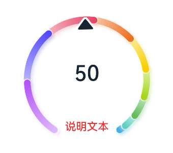
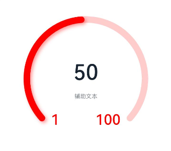
示例1(设置多色量规图)
该示例通过colors接口,实现了多色量规图效果。
@Entry
@Component
struct Gauge1 {
  @Builder
  descriptionBuilder() {
    Text('说明文本')
      .maxFontSize('30sp')
      .minFontSize("10.0vp")
      .fontColor("#fffa2a2d")
      .fontWeight(FontWeight.Medium)
      .width('100%')
      .height("100%")
      .textAlign(TextAlign.Center)
  }

  build() {
    Column() {
      Gauge({ value: 50, min: 1, max: 100 }) {
        Column() {
          Text('50')
            .fontWeight(FontWeight.Medium)
            .width('62%')
            .fontColor("#ff182431")
            .maxFontSize("60.0vp")
            .minFontSize("30.0vp")
            .textAlign(TextAlign.Center)
            .margin({ top: '35%' })
            .textOverflow({ overflow: TextOverflow.Ellipsis })
            .maxLines(1)
          Text('辅助文本')
            .maxFontSize("16.0fp")
            .minFontSize("10.0vp")
            .fontColor($r('sys.color.ohos_id_color_text_secondary'))
            .fontColor($r('sys.color.ohos_id_color_text_secondary'))
            .fontWeight(FontWeight.Regular)
            .width('67.4%')
            .height('9.5%')
            .textAlign(TextAlign.Center)
        }.width('100%').height('100%')
      }
      .value(50)
      .startAngle(210)
      .endAngle(150)
      .colors([[new LinearGradient([{ color: "#deb6fb", offset: 0 }, { color: "#ac49f5", offset: 1 }]), 9],
        [new LinearGradient([{ color: "#bbb7fc", offset: 0 }, { color: "#564af7", offset: 1 }]), 8],
        [new LinearGradient([{ color: "#f5b5c2", offset: 0 }, { color: "#e64566", offset: 1 }]), 7],
        [new LinearGradient([{ color: "#f8c5a6", offset: 0 }, { color: "#ed6f21", offset: 1 }]), 6],
        [new LinearGradient([{ color: "#fceb99", offset: 0 }, { color: "#f7ce00", offset: 1 }]), 5],
        [new LinearGradient([{ color: "#dbefa5", offset: 0 }, { color: "#a5d61d", offset: 1 }]), 4],
        [new LinearGradient([{ color: "#c1e4be", offset: 0 }, { color: "#64bb5c", offset: 1 }]), 3],
        [new LinearGradient([{ color: "#c0ece5", offset: 0 }, { color: "#61cfbe", offset: 1 }]), 2],
        [new LinearGradient([{ color: "#b5e0f4", offset: 0 }, { color: "#46b1e3", offset: 1 }]), 1]])
      .width('80%')
      .height('80%')
      .strokeWidth(18)
      .trackShadow({ radius: 7, offsetX: 7, offsetY: 7 })
      .description(this.descriptionBuilder)
      .padding(18)
    }.margin({ top: 40 }).width('100%').height('100%')
  }
}

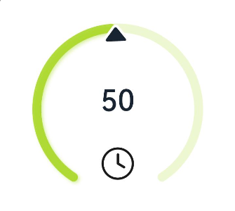
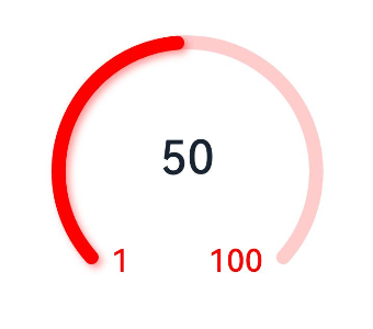
示例2(设置单色量规图)
该示例通过colors接口,实现了单色量规图效果。
@Entry
@Component
struct Gauge2 {
  @Builder
  descriptionBuilderImage() {
    Image($r('sys.media.ohos_ic_public_clock')).width(72).height(72)
  }

  build() {
    Column() {
      Gauge({ value: 50, min: 1, max: 100 }) {
        Column() {
          Text('50')
            .fontWeight(FontWeight.Medium)
            .width('62%')
            .fontColor("#ff182431")
            .maxFontSize("60.0vp")
            .minFontSize("30.0vp")
            .textAlign(TextAlign.Center)
            .margin({ top: '35%' })
            .textOverflow({ overflow: TextOverflow.Ellipsis })
            .maxLines(1)
        }.width('100%').height('100%')
      }
      .startAngle(210)
      .endAngle(150)
      .colors('#cca5d61d')
      .width('80%')
      .height('80%')
      .strokeWidth(18)
      .description(this.descriptionBuilderImage)
      .padding(18)
    }.margin({ top: 40 }).width('100%').height('100%')
  }
}
示例3(设置定制说明区)
该示例通过description接口,实现了说明区的设置功能。
@Entry
@Component
struct Gauge3 {
  @Builder
  descriptionBuilder() {
    Text('说明文本')
      .maxFontSize('30sp')
      .minFontSize("10.0vp")
      .fontColor("#fffa2a2d")
      .fontWeight(FontWeight.Medium)
      .width('100%')
      .height("100%")
      .textAlign(TextAlign.Center)
  }

  build() {
    Column() {
      Column() {
        Gauge({ value: 50, min: 1, max: 100 }) {
          Column() {
            Text('50')
              .fontWeight(FontWeight.Medium)
              .width('62%')
              .fontColor("#ff182431")
              .maxFontSize("60.0vp")
              .minFontSize("30.0vp")
              .textAlign(TextAlign.Center)
              .margin({ top: '35%' })
              .textOverflow({ overflow: TextOverflow.Ellipsis })
              .maxLines(1)
          }.width('100%').height('100%')
        }
        .startAngle(210)
        .endAngle(150)
        .colors([[new LinearGradient([{ color: "#deb6fb", offset: 0 }, { color: "#ac49f5", offset: 1 }]), 9],
          [new LinearGradient([{ color: "#bbb7fc", offset: 0 }, { color: "#564af7", offset: 1 }]), 8],
          [new LinearGradient([{ color: "#f5b5c2", offset: 0 }, { color: "#e64566", offset: 1 }]), 7],
          [new LinearGradient([{ color: "#f8c5a6", offset: 0 }, { color: "#ed6f21", offset: 1 }]), 6],
          [new LinearGradient([{ color: "#fceb99", offset: 0 }, { color: "#f7ce00", offset: 1 }]), 5],
          [new LinearGradient([{ color: "#dbefa5", offset: 0 }, { color: "#a5d61d", offset: 1 }]), 4],
          [new LinearGradient([{ color: "#c1e4be", offset: 0 }, { color: "#64bb5c", offset: 1 }]), 3],
          [new LinearGradient([{ color: "#c0ece5", offset: 0 }, { color: "#61cfbe", offset: 1 }]), 2],
          [new LinearGradient([{ color: "#b5e0f4", offset: 0 }, { color: "#46b1e3", offset: 1 }]), 1]])
        .width('80%')
        .height('80%')
        .strokeWidth(18)
        .description(this.descriptionBuilder)
        .trackShadow({ radius: 7, offsetX: 7, offsetY: 7 })
        .padding(18)
      }.margin({ top: 40 }).width('100%').height('100%')
    }
  }
}
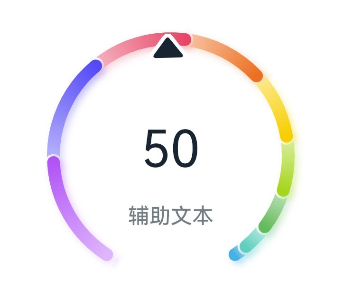
示例4(设置辅助区)
该示例通过设置子组件,实现了辅助区的设置功能。
@Entry
@Component
struct Gauge4 {
  build() {
    Column() {
      Gauge({ value: 50, min: 1, max: 100 }) {
        Column() {
          Text('50')
            .maxFontSize("72.0vp")
            .minFontSize("10.0vp")
            .fontColor("#ff182431")
            .width('40%')
            .textAlign(TextAlign.Center)
            .margin({ top: '35%' })
            .textOverflow({ overflow: TextOverflow.Ellipsis })
            .maxLines(1)
          Text('辅助文本')
            .maxFontSize("30.0vp")
            .minFontSize("18.0vp")
            .fontWeight(FontWeight.Medium)
            .fontColor($r('sys.color.ohos_id_color_text_secondary'))
            .width('62%')
            .height('15.9%')
            .textAlign(TextAlign.Center)
        }.width('100%').height('100%')
      }
      .startAngle(210)
      .endAngle(150)
      .colors([[new LinearGradient([{ color: "#deb6fb", offset: 0 }, { color: "#ac49f5", offset: 1 }]), 9],
        [new LinearGradient([{ color: "#bbb7fc", offset: 0 }, { color: "#564af7", offset: 1 }]), 8],
        [new LinearGradient([{ color: "#f5b5c2", offset: 0 }, { color: "#e64566", offset: 1 }]), 7],
        [new LinearGradient([{ color: "#f8c5a6", offset: 0 }, { color: "#ed6f21", offset: 1 }]), 6],
        [new LinearGradient([{ color: "#fceb99", offset: 0 }, { color: "#f7ce00", offset: 1 }]), 5],
        [new LinearGradient([{ color: "#dbefa5", offset: 0 }, { color: "#a5d61d", offset: 1 }]), 4],
        [new LinearGradient([{ color: "#c1e4be", offset: 0 }, { color: "#64bb5c", offset: 1 }]), 3],
        [new LinearGradient([{ color: "#c0ece5", offset: 0 }, { color: "#61cfbe", offset: 1 }]), 2],
        [new LinearGradient([{ color: "#b5e0f4", offset: 0 }, { color: "#46b1e3", offset: 1 }]), 1]])
      .width('80%')
      .height('80%')
      .strokeWidth(18)
      .description(null)
      .trackShadow({ radius: 7, offsetX: 7, offsetY: 7 })
      .padding(18)
    }.margin({ top: 40 }).width('100%').height('100%')
  }
}
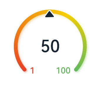
示例5(设置最大最小值)
该示例通过设置min,max属性,实现了量规图的最大最小值设置的功能。
@Entry
@Component
struct Gauge5 {
  build() {
    Column() {
      Gauge({ value: 50, min: 1, max: 100 }) {
        Column() {
          Text('50')
            .maxFontSize("80sp")
            .minFontSize("60.0vp")
            .fontWeight(FontWeight.Medium)
            .fontColor("#ff182431")
            .width('40%')
            .height('30%')
            .textAlign(TextAlign.Center)
            .margin({ top: '22.2%' })
            .textOverflow({ overflow: TextOverflow.Ellipsis })
            .maxLines(1)
        }.width('100%').height('100%')
      }
      .startAngle(225)
      .endAngle(135)
      .colors(new LinearGradient([{ color: "#e84026", offset: 0 },
        { color: "#f7ce00", offset: 0.6 },
        { color: "#64bb5c", offset: 1 }]))
      .width('80%')
      .height('80%')
      .strokeWidth(18)
      .trackShadow({ radius: 7, offsetX: 7, offsetY: 7 })
      .padding(18)
    }.margin({ top: 40 }).width('100%').height('100%')
  }
}
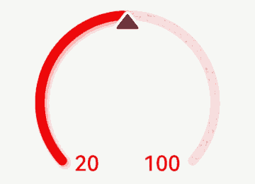
示例6(设置指针)
该示例通过indicator接口,实现了设置量规图的指针的功能。
@Entry
@Component
struct Gauge6 {
  build() {
    Column() {
      Gauge({ value: 50, min: 1, max: 100 }) {
        Column() {
          Text('50')
            .maxFontSize('60sp')
            .minFontSize('30.0vp')
            .fontWeight(FontWeight.Medium)
            .fontColor("#ff182431")
            .width('62%')
            .textAlign(TextAlign.Center)
            .margin({ top: '35%' })
            .textOverflow({ overflow: TextOverflow.Ellipsis })
            .maxLines(1)
          Text('辅助文本')
            .maxFontSize('16sp')
            .minFontSize("10.0vp")
            .fontColor($r('sys.color.ohos_id_color_text_secondary'))
            .fontWeight(FontWeight.Regular)
            .width('67.4%')
            .height('9.5%')
            .textAlign(TextAlign.Center)
        }.width('100%').height('100%')
      }
      .startAngle(225)
      .endAngle(135)
      .colors(Color.Red)
      .width('80%')
      .height('80%')
      .indicator(null)
      .strokeWidth(18)
      .trackShadow({ radius: 7, offsetX: 7, offsetY: 7 })
      .padding(18)
    }.margin({ top: 40 }).width('100%').height('100%')
  }
}
示例7(设置起止角度)
该示例通过startAngle和endAngle接口,实现了量规图起止角度设置的功能。
@Entry
@Component
struct Gauge7 {
  build() {
    Column() {
      Gauge({ value: 50, min: 1, max: 100 }) {
        Column() {
          Text('50')
            .maxFontSize('60sp')
            .minFontSize('30.0vp')
            .fontWeight(FontWeight.Medium)
            .fontColor("#ff182431")
            .width('62%')
            .textAlign(TextAlign.Center)
            .margin({ top: '35%' })
            .textOverflow({ overflow: TextOverflow.Ellipsis })
            .maxLines(1)
        }.width('100%').height('100%')
      }
      .startAngle(225)
      .endAngle(135)
      .colors(Color.Red)
      .width('80%')
      .height('80%')
      .indicator(null)
      .strokeWidth(18)
      .trackShadow({ radius: 7, offsetX: 7, offsetY: 7 })
      .padding(18)
    }.margin({ top: 40 }).width('100%').height('100%')
  }
}
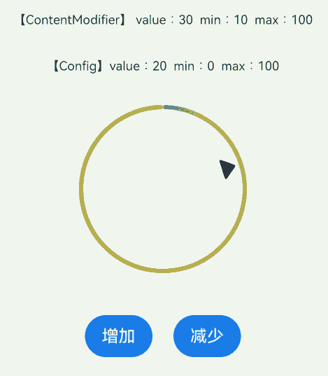
示例8(设置定制内容区)
该示例通过contentModifier接口,实现了定制量规图内容区的功能。
// xxx.ets
//该示例实现了Gauge组件使用Builder定制内容区,使用了环形图表组件,按钮和文本框。点击增加按钮,环形图表指针位置会向右偏移,反之点减少按钮环形图表指针位置会向左偏移。
@Builder
function buildGauge(config: GaugeConfiguration) {
  Column({ space: 30 }) {
    Row() {
      Text('【ContentModifier】 value:' + JSON.stringify((config.contentModifier as MyGaugeStyle).value) +
        '  min:' + JSON.stringify((config.contentModifier as MyGaugeStyle).min) +
        '  max:' + JSON.stringify((config.contentModifier as MyGaugeStyle).max))
        .fontSize(12)
    }

    Text('【Config】value:' + config.value + '  min:' + config.min + '  max:' + config.max).fontSize(12)
    Gauge({
      value: config.value,
      min: config.min,
      max: config.max
    }).width("50%")
  }
  .width("100%")
  .padding(20)
  .margin({ top: 5 })
  .alignItems(HorizontalAlign.Center)
}

class MyGaugeStyle implements ContentModifier<GaugeConfiguration> {
  value: number = 0
  min: number = 0
  max: number = 0

  constructor(value: number, min: number, max: number) {
    this.value = value
    this.min = min
    this.max = max
  }

  applyContent(): WrappedBuilder<[GaugeConfiguration]> {
    return wrapBuilder(buildGauge)
  }
}

@Entry
@Component
struct refreshExample {
  @State gaugeValue: number = 20
  @State gaugeMin: number = 0
  @State gaugeMax: number = 100

  build() {
    Column({ space: 20 }) {
      Gauge({
        value: this.gaugeValue,
        min: this.gaugeMin,
        max: this.gaugeMax
      })
        .contentModifier(new MyGaugeStyle(30, 10, 100))

      Column({ space: 20 }) {
        Row({ space: 20 }) {
          Button('增加').onClick(() => {
            if (this.gaugeValue < this.gaugeMax) {
              this.gaugeValue += 1
            }
          })
          Button('减少').onClick(() => {
            if (this.gaugeValue > this.gaugeMin) {
              this.gaugeValue -= 1
            }
          })
        }
      }.width('100%')
    }.width('100%').margin({ top: 5 })
  }
}
示例9(设置隐私隐藏)
该示例通过privacySensitive接口,实现了隐私隐藏效果,效果展示需要卡片框架支持
@Entry
@Component
struct GaugeExample {
  build() {
    Scroll() {
      Column({ space: 15 }) {
        Row() {
          Gauge({ value: 50, min: 1, max: 100 }) {
            Column() {
              Text('60')
                .maxFontSize("180sp")
                .minFontSize("160.0vp")
                .fontWeight(FontWeight.Medium)
                .fontColor("#ff182431")
                .width('40%')
                .height('30%')
                .textAlign(TextAlign.Center)
                .margin({ top: '22.2%' })
                .textOverflow({ overflow: TextOverflow.Ellipsis })
                .maxLines(1)
            }.width('100%').height('100%')
          }
          .startAngle(225)
          .endAngle(135)
          .colors(Color.Red)
          .width('80%')
          .height('80%')
          .strokeWidth(18)
          .trackShadow({ radius: 7, offsetX: 7, offsetY: 7 })
          .padding(18)
          .privacySensitive(true)
        }
      }
    }
  }
}
示例10(设置自定义指针)
该示例通过indicator接口,实现了自定义指针功能,开发者导入svg类型的图片以替换默认指针。
@Entry
@Component
struct Gauge2 {
  build() {
    Column() {
      Gauge({ value: 50, min: 1, max: 100 })
        .indicator({ space: 10, icon: $r('app.media.indicator') })
        .startAngle(210)
        .endAngle(150)
        .colors('#cca5d61d')
        .width('80%')
        .height('80%')
        .strokeWidth(18)
        .padding(18)
    }.margin({ top: 40 }).width('100%').height('100%')
  }
}
<svg width="200px" height="200px">
    <path d="M 10,30 A 20,20 0,0,1 50,30 A 20,20 0,0,1 90,30 Q 90,60 50,90 Q 10,60 10,30 z"
          stroke="black" stroke-width="3" fill="white">
    </path>
</svg>
你可能感兴趣的鸿蒙文章
- 所属分类: 后端技术
- 本文标签:
热门推荐
-
2、 优质文章
-
3、 gt
-
7、 openharmony
-
9、 golang
-
10、 Vue中input框自动聚焦