harmony 鸿蒙Shape Clipping
Shape Clipping
Shape clipping changes the visible portion of a component through clipping or masking.
NOTE
The APIs of this module are supported since API version 7. Updates will be marked with a superscript to indicate their earliest API version.
Attributes
| Name | Type | Description |
|---|---|---|
| clip | Circle |Ellipse |Path |Rect |boolean | Clip mode. If the value is a shape, the component is clipped based on the specified shape. If the value is of the Boolean type, it specifies whether to clip the component based on the edge outline of the parent container. Default value: false Since API version 9, this API is supported in ArkTS widgets. |
| mask | Circle |Ellipse |Path |Rect|ProgressMask | Mask of the specified shape to add to the component. Since API version 9, this API is supported in ArkTS widgets. Since API version 10, this API supports the ProgressMask parameter. |
ProgressMask10+
Implements a ProgressMask object to set the progress, maximum value, and color of the mask.
constructor10+
constructor(value: number, total: number, color: ResourceColor)
Constructs a ProgressMask object.
Parameters
| Name | Type | Mandatory | Description |
|---|---|---|---|
| value | number | Yes | Current value of the progress mask. |
| total | number | Yes | Maximum value of the progress mask. |
| color | ResourceColor | Yes | Color of the progress mask. |
updateProgress10+
updateProgress(value: number): void
Updates the progress value of the progress mask.
Parameters
| Name | Type | Mandatory | Description |
|---|---|---|---|
| value | number | Yes | Current value of the progress mask. |
updateColor10+
updateColor(value: ResourceColor): void
Updates the color of the progress mask.
Parameters
| Name | Type | Mandatory | Description |
|---|---|---|---|
| value | ResourceColor | Yes | Color of the progress mask. |
Example
Example 1
// xxx.ets
@Entry
@Component
struct ClipAndMaskExample {
build() {
Column({ space: 15 }) {
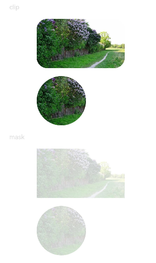
Text('clip').fontSize(12).width('75%').fontColor('#DCDCDC')
Row() {
Image($r('app.media.testImg')).width('500px').height('280px')
}
.clip(true) // If clip is not set to true, the image is not confined by the rounded corners of the <Row> component and may extend beyond the <Row> component.
.borderRadius(20)
// Clip the image based on a circle with a diameter of 280 px.
Image($r('app.media.testImg'))
.clip(new Circle({ width: '280px', height: '280px' }))
.width('500px').height('280px')
Text('mask').fontSize(12).width('75%').fontColor('#DCDCDC')
// Add a 500 px x 280 px square mask to the image.
Image($r('app.media.testImg'))
.mask(new Rect({ width: '500px', height: '280px' }).fill(Color.Gray))
.width('500px').height('280px')
// Add a 280 px x 280 px circular mask to the image.
Image($r('app.media.testImg'))
.mask(new Circle({ width: '280px', height: '280px' }).fill(Color.Gray))
.width('500px').height('280px')
}
.width('100%')
.margin({ top: 15 })
}
}
Example 2
@Entry
@Component
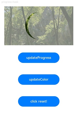
struct ProgressMaskExample {
@State progressflag1: boolean = true;
@State color: Color = 0x01006CDE;
@State value: number = 10.0;
@State progress: ProgressMask = new ProgressMask(10.0, 100.0, Color.Gray);
build() {
Column({ space: 15 }) {
Text('progress mask').fontSize(12).width('75%').fontColor('#DCDCDC')
// Add a 280px x 280px progress mask to the image.
Image($r('app.media.testImg'))
.width('500px').height('280px')
.mask(this.progress)
.animation({
duration: 2000, // Animation duration.
.curve(Curve.Linear) // Animation curve.
delay: 0, // Animation delay.
iterations: 1, // Number of playback times.
playMode: PlayMode.Normal // Animation playback mode.
}) // Animation configuration for the width and height attributes of the <Button> component.
// Update the progress value of the progress mask.
Button('updateProgress')
.onClick((event?: ClickEvent) => {
this.value += 10;
this.progress.updateProgress(this.value);
}).width(200).height(50).margin(20)
// Update the color of the progress mask.
Button('updateColor')
.onClick((event?: ClickEvent) => {
if (this.progressflag1) {
this.progress.updateColor(0x9fff0000);
} else {
this.progress.updateColor(0x9f0000ff);
}
this.progressflag1 = !this.progressflag1
}).width(200).height(50).margin(20)
// Restores the progress mask.
Button('click reset!')
.onClick((event?: ClickEvent) => {
this.value = 0;
this.progress.updateProgress(this.value);
}).width(200).height(50).margin(20)
}
.width('100%')
.margin({ top: 15 })
}
}
你可能感兴趣的鸿蒙文章
harmony 鸿蒙ArkTS-based Declarative Development Paradigm
0
赞
- 所属分类: 后端技术
- 本文标签:
热门推荐
-
2、 优质文章
-
3、 gt
-
7、 openharmony
-
9、 golang
-
10、 Vue中input框自动聚焦