harmony 鸿蒙Tabs
Tabs
The <Tabs> component is a container component that allows users to switch between content views through tabs. Each tab page corresponds to a content view.
NOTE
This component is supported since API version 7. Updates will be marked with a superscript to indicate their earliest API version.
Child Components
Only the <TabContent> child component is supported.
APIs
Tabs(value?: {barPosition?: BarPosition, index?: number, controller?: TabsController})
Parameters
| Name | Type | Mandatory | Description |
|---|---|---|---|
| barPosition | BarPosition | No | Position of the <Tabs> component. Default value: BarPosition.Start |
| index | number | No | Initial tab index. Default value: 0 NOTE A value less than 0 evaluates to the default value. The value ranges from 0 to the number of <TabContent> subnodes minus 1. When this parameter is set to different values, the slide animation for tab switching is enabled by default. To disable the animation, set animationDuration to 0. Since API version 10, this parameter supports $$ for two-way binding of variables. |
| controller | TabsController | No | Tab controller. |
BarPosition
| Name | Description |
|---|---|
| Start | If the vertical attribute is set to true, the tab is on the left of the container. If the vertical attribute is set to false, the tab is on the top of the container. |
| End | If the vertical attribute is set to true, the tab is on the right of the container. If the vertical attribute is set to false, the tab is at the bottom of the container. |
Attributes
In addition to the universal attributes, the following attributes are supported.
| Name | Type | Description |
|---|---|---|
| vertical | boolean | Whether to use vertical tabs. The value true means to use vertical tabs, and false means to use horizontal tabs. Default value: false |
| scrollable | boolean | Whether the tabs are scrollable. The value true means that the tabs are scrollable, and false means the opposite. Default value: true |
| barMode | BarMode,ScrollableBarModeOptions | Tab bar layout mode. BarMode is mandatory, and ScrollableBarModeOptions is optional. For details, see BarMode and ScrollableBarModeOptions. Since API version 10, the optional ScrollableBarModeOptions parameter is supported. It is effective only when the tab bar is in scrollable mode. Default value: BarMode.Fixed |
| barWidth | number |Length8+ | Width of the tab bar. The default value varies. If the tab bar has the vertical attribute set to false and does not have a style specified, the default value is the width of the <Tabs> component. If the tab bar has the vertical attribute set to true and does not have a style specified, the default value is 56vp. If the tab bar has the vertical attribute set to false and SubTabbarStyle specified, the default value is the width of the <Tabs> component. If the tab bar has the vertical attribute set to true and SubTabbarStyle specified, the default value is 56vp. If the tab bar has the vertical attribute set to true and BottomTabbarStyle specified, the default value is 96vp. If the tab bar has the vertical attribute set to false and BottomTabbarStyle specified, the default value is the width of the <Tabs> component. NOTE A value less than 0 or greater than the width of the <Tabs> component evaluates to the default value. |
| barHeight | number |Length8+ | Height of the tab bar. The default value varies. If the tab bar has the vertical attribute set to false and does not have a style specified, the default value is 56vp. If the tab bar has the vertical attribute set to true and does not have a style specified, the default value is the height of the <Tabs> component. If the tab bar has the vertical attribute set to false and SubTabbarStyle specified, the default value is 56vp. If the tab bar has the vertical attribute set to true and SubTabbarStyle specified, the default value is the height of the <Tabs> component. If the tab bar has the vertical attribute set to true and BottomTabbarStyle specified, the default value is the height of the <Tabs> component. If the tab bar has the vertical attribute set to false and BottomTabbarStyle specified, the default value is 56vp. NOTE A value less than 0 or greater than the height of the <Tabs> component evaluates to the default value. |
| animationDuration | number | Duration of the slide animation for tab switching. If this parameter is set, the tab switching animation is played when the user switches between tabs by sliding or clicking. If this parameter is not set, the tab switching animation is played only when the user switches between tabs by sliding. Default value: 300 NOTE A value less than 0 or in percentage evaluates to the default value. |
| divider10+ | DividerStyle |null | Whether the divider is displayed for the <TabBar> and <TabContent> components and the divider style. By default, the divider is not displayed. DividerStyle: divider style. null: The divider is not displayed. |
| fadingEdge10+ | boolean | Whether the tab fades out when it exceeds the container width. Default value: true |
| barOverlap10+ | boolean | Whether the tab bar is superimposed on the <TabContent> component after having its background blurred. Default value: false |
| barBackgroundColor10+ | ResourceColor | Background color of the tab bar. Default value: transparent |
| barGridAlign10+ | BarGridColumnOptions | Visible area of the tab bar in grid mode. For details, see BarGridColumnOptions. This attribute is effective only in horizontal mode. It is not applicable to XS, XL, and XXL devices. |
DividerStyle10+
| Name | Type | Mandatory | Description |
|---|---|---|---|
| strokeWidth | Length | Yes | Width of the divider. It cannot be set in percentage. |
| color | ResourceColor | No | Color of the divider. Default value: #33182431 |
| startMargin | Length | No | Distance between the divider and the top of the sidebar. It cannot be set in percentage. Default value: 0.0 Unit: vp |
| endMargin | Length | No | Distance between the divider and the bottom of the sidebar. It cannot be set in percentage. Default value: 0.0 Unit: vp |
BarGridColumnOptions10+
| Name | Type | Mandatory | Description |
|---|---|---|---|
| margin | Dimension | No | Column margin in grid mode. It cannot be set in percentage. Default value: 24.0 Unit: vp |
| gutter | Dimension | No | Column gutter (that is, gap between columns) in grid mode. It cannot be set in percentage. Default value: 24.0 Unit: vp |
| sm | number | No | Number of columns occupied by a tab on a screen whose width is greater than or equal to 320 vp but less than 600 vp. The value must be a non-negative even number. The default value is -1, indicating that the tab takes up the entire width of the tab bar. |
| md | number | No | Number of columns occupied by a tab on a screen whose width is greater than or equal to 600 vp but less than 800 vp. The value must be a non-negative even number. The default value is -1, indicating that the tab takes up the entire width of the tab bar. |
| lg | number | No | Number of columns occupied by a tab on a screen whose width is greater than or equal to 840 vp but less than 1024 vp. The value must be a non-negative even number. The default value is -1, indicating that the tab takes up the entire width of the tab bar. |
ScrollableBarModeOptions10+
| Name | Type | Mandatory | Description |
|---|---|---|---|
| margin | Dimension | No | Left and right margin of the tab bar in scrollable mode. It cannot be set in percentage. Default value: 0.0 Unit: vp |
| nonScrollableLayoutStyle | LayoutStyle | No | Tab layout mode of the tab bar when not scrolling in scrollable mode. Default value: LayoutStyle.ALWAYS_CENTER |
BarMode
| Name | Description |
|---|---|
| Scrollable | The width of each tab is determined by the actual layout. The tabs are scrollable in the following case: In horizontal layout, the total width exceeds the tab bar width; in horizontal layout, the total height exceeds the tab bar height. |
| Fixed | The width of each tab is determined by equally dividing the number of tabs by the bar width (or bar height in the vertical layout). |
LayoutStyle10+
| Name | Description |
|---|---|
| ALWAYS_CENTER | When the tab content exceeds the tab bar width, the tabs are scrollable. Otherwise, the tabs are compactly centered and not scrollable. |
| ALWAYS_AVERAGE_SPLITE | When the tab content exceeds the tab bar width, the tabs are scrollable. Otherwise, the tabs are not scrollable, and the tab bar width is distributed evenly between all tabs. This option is valid only in horizontal mode, and is equivalent to LayoutStyle.ALWAYS_CENTER otherwise. |
| SPACE_BETWEEN_OR_CENTER | When the tab content exceeds the tab bar width, the tabs are scrollable. When the tab content exceeds half of the tab bar width but still within the tab bar width, the tabs are compactly centered and not scrollable. When the tab content does not exceed half of the tab bar width, the tabs are centered within half of the tab bar width, with even spacing between, and not scrollable. |
Events
In addition to the universal events, the following events are supported.
| Name | Description |
|---|---|
| onChange(event: (index: number) => void) | Triggered when a tab is switched. - index: index of the active tab. The index starts from 0. This event is triggered when any of the following conditions is met: 1. The <TabContent> component supports sliding, and the user slides on the tab bar. 2. The Controller API is called. 3. The attribute value is updated using a state variable. 4. A tab is clicked. |
| onTabBarClick(event: (index: number) => void)10+ | Triggered when a tab is clicked. - index: index of the clicked tab. The index starts from 0. |
TabsController
Defines a tab controller, which is used to control switching of tabs. One TabsController cannot control multiple <Tabs> components.
Objects to Import
let controller: TabsController = new TabsController()
changeIndex
changeIndex(value: number): void
Switches to the specified tab.
Parameters
| Name | Type | Mandatory | Description |
|---|---|---|---|
| value | number | Yes | Index of the tab. The value starts from 0. NOTE If this parameter is set to a value less than 0 or greater than the maximum number, the event will be invalid. |
Example
Example 1
// xxx.ets
@Entry
@Component
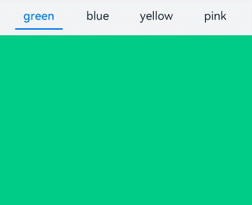
struct TabsExample {
@State fontColor: string = '#182431'
@State selectedFontColor: string = '#007DFF'
@State currentIndex: number = 0
private controller: TabsController = new TabsController()
@Builder TabBuilder(index: number, name: string) {
Column() {
Text(name)
.fontColor(this.currentIndex === index ? this.selectedFontColor : this.fontColor)
.fontSize(16)
.fontWeight(this.currentIndex === index ? 500 : 400)
.lineHeight(22)
.margin({ top: 17, bottom: 7 })
Divider()
.strokeWidth(2)
.color('#007DFF')
.opacity(this.currentIndex === index ? 1 : 0)
}.width('100%')
}
build() {
Column() {
Tabs({ barPosition: BarPosition.Start, controller: this.controller }) {
TabContent() {
Column().width('100%').height('100%').backgroundColor('#00CB87')
}.tabBar(this.TabBuilder(0, 'green'))
TabContent() {
Column().width('100%').height('100%').backgroundColor('#007DFF')
}.tabBar(this.TabBuilder(1, 'blue'))
TabContent() {
Column().width('100%').height('100%').backgroundColor('#FFBF00')
}.tabBar(this.TabBuilder(2, 'yellow'))
TabContent() {
Column().width('100%').height('100%').backgroundColor('#E67C92')
}.tabBar(this.TabBuilder(3, 'pink'))
}
.vertical(false)
.barMode(BarMode.Fixed)
.barWidth(360)
.barHeight(56)
.animationDuration(400)
.onChange((index: number) => {
this.currentIndex = index
})
.width(360)
.height(296)
.margin({ top: 52 })
.backgroundColor('#F1F3F5')
}.width('100%')
}
}
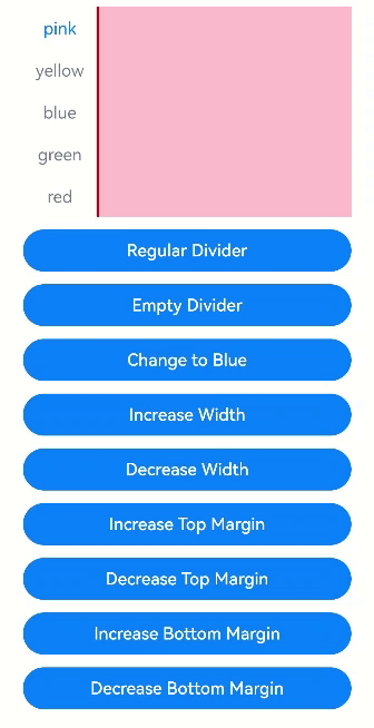
Example 2
// xxx.ets
@Entry
@Component
struct TabsDivider1 {
  private controller1: TabsController = new TabsController()
  @State dividerColor: string = 'red'
  @State strokeWidth: number = 2
  @State startMargin: number = 0
  @State endMargin: number = 0
  @State nullFlag: boolean = false

  build() {
    Column() {
      Tabs({ controller: this.controller1 }) {
        TabContent() {
          Column().width('100%').height('100%').backgroundColor(Color.Pink)
        }.tabBar('pink')

        TabContent() {
          Column().width('100%').height('100%').backgroundColor(Color.Yellow)
        }.tabBar('yellow')

        TabContent() {
          Column().width('100%').height('100%').backgroundColor(Color.Blue)
        }.tabBar('blue')

        TabContent() {
          Column().width('100%').height('100%').backgroundColor(Color.Green)
        }.tabBar('green')

        TabContent() {
          Column().width('100%').height('100%').backgroundColor(Color.Red)
        }.tabBar('red')
      }
      .vertical(true)
      .scrollable(true)
      .barMode(BarMode.Fixed)
      .barWidth(70)
      .barHeight(200)
      .animationDuration(400)
      .onChange((index: number) => {
        console.info(index.toString())
      })
      .height('200vp')
      .margin({ bottom: '12vp' })
      .divider(this.nullFlag ? null : {
        strokeWidth: this.strokeWidth,
        color: this.dividerColor,
        startMargin: this.startMargin,
        endMargin: this.endMargin
      })

      Button ('Regular Divider').width('100%').margin({ bottom: '12vp'})
        .onClick(() => {
          this.nullFlag = false;
          this.strokeWidth = 2;
          this.dividerColor = 'red';
          this.startMargin = 0;
          this.endMargin = 0;
        })
      Button('Empty Divider').width('100%').margin({ bottom: '12vp' })
        .onClick(() => {
          this.nullFlag = true
        })
      Button('Change to Blue').width('100%').margin({ bottom: '12vp'})
        .onClick(() => {
          this.dividerColor = 'blue'
        })
      Button('Increase Width').width('100%').margin({ bottom: '12vp' })
        .onClick(() => {
          this.strokeWidth += 2
        })
      Button('Decrease Width').width('100%').margin({ bottom: '12vp'})
        .onClick(() => {
          if (this.strokeWidth > 2) {
            this.strokeWidth -= 2
          }
        })
      Button ('Increase Top Margin').width ('100%').margin ({ bottom:'12vp'})
        .onClick(() => {
          this.startMargin += 2
        })
      Button ('Decrease Top Margin').width ('100%').margin ({ bottom:'12vp' })
        .onClick(() => {
          if (this.startMargin > 2) {
            this.startMargin -= 2
          }
        })
      Button ('Increase Bottom Margin').width ('100%').margin ({ bottom:'12vp'})
        .onClick(() => {
          this.endMargin += 2
        })
      Button ('Decrease Bottom Margin').width ('100%').margin ({ bottom:'12vp' })
        .onClick(() => {
          if (this.endMargin > 2) {
            this.endMargin -= 2
          }
        })
    }.padding({ top: '24vp', left: '24vp', right: '24vp' })
  }
}
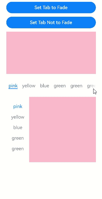
Example 3
// xxx.ets
@Entry
@Component
struct TabsOpaque {
  @State message: string = 'Hello World'
  private controller: TabsController = new TabsController()
  private controller1: TabsController = new TabsController()
  @State selfFadingFade: boolean = true;

  build() {
    Column() {
      Button (Set Tab to Fade').width ('100%').margin ({bottom: '12vp'})
        .onClick((event?: ClickEvent) => {
          this.selfFadingFade = true;
        })
      Button (Set Tab Not to Fade').width ('100%').margin ({bottom: '12vp'})
        .onClick((event?: ClickEvent) => {
          this.selfFadingFade = false;
        })
      Tabs({ barPosition: BarPosition.End, controller: this.controller }) {
        TabContent() {
          Column().width('100%').height('100%').backgroundColor(Color.Pink)
        }.tabBar('pink')

        TabContent() {
          Column().width('100%').height('100%').backgroundColor(Color.Yellow)
        }.tabBar('yellow')

        TabContent() {
          Column().width('100%').height('100%').backgroundColor(Color.Blue)
        }.tabBar('blue')

        TabContent() {
          Column().width('100%').height('100%').backgroundColor(Color.Green)
        }.tabBar('green')

        TabContent() {
          Column().width('100%').height('100%').backgroundColor(Color.Green)
        }.tabBar('green')

        TabContent() {
          Column().width('100%').height('100%').backgroundColor(Color.Green)
        }.tabBar('green')

        TabContent() {
          Column().width('100%').height('100%').backgroundColor(Color.Green)
        }.tabBar('green')

        TabContent() {
          Column().width('100%').height('100%').backgroundColor(Color.Green)
        }.tabBar('green')
      }
      .vertical(false)
      .scrollable(true)
      .barMode(BarMode.Scrollable)
      .barHeight(80)
      .animationDuration(400)
      .onChange((index: number) => {
        console.info(index.toString())
      })
      .fadingEdge(this.selfFadingFade)
      .height('30%')
      .width('100%')

      Tabs({ barPosition: BarPosition.Start, controller: this.controller1 }) {
        TabContent() {
          Column().width('100%').height('100%').backgroundColor(Color.Pink)
        }.tabBar('pink')

        TabContent() {
          Column().width('100%').height('100%').backgroundColor(Color.Yellow)
        }.tabBar('yellow')

        TabContent() {
          Column().width('100%').height('100%').backgroundColor(Color.Blue)
        }.tabBar('blue')

        TabContent() {
          Column().width('100%').height('100%').backgroundColor(Color.Green)
        }.tabBar('green')

        TabContent() {
          Column().width('100%').height('100%').backgroundColor(Color.Green)
        }.tabBar('green')

        TabContent() {
          Column().width('100%').height('100%').backgroundColor(Color.Green)
        }.tabBar('green')
      }
      .vertical(true)
      .scrollable(true)
      .barMode(BarMode.Scrollable)
      .barHeight(200)
      .barWidth(80)
      .animationDuration(400)
      .onChange((index: number) => {
        console.info(index.toString())
      })
      .fadingEdge(this.selfFadingFade)
      .height('30%')
      .width('100%')
    }
    .padding({ top: '24vp', left: '24vp', right: '24vp' })
  }
}
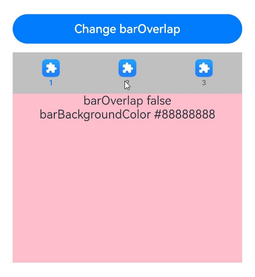
Example 4
// xxx.ets
@Entry
@Component
struct barBackgroundColorTest {
  private controller: TabsController = new TabsController()
  @State barOverlap: boolean = true;
  @State barBackgroundColor: string = '#88888888';

  build() {
    Column() {
      Button ("Change barOverlap").width ('100%').margin ({ bottom:'12vp'})
        .onClick((event?: ClickEvent) => {
          if (this.barOverlap) {
            this.barOverlap = false;
          } else {
            this.barOverlap = true;
          }
        })

      Tabs({ barPosition: BarPosition.Start, index: 0, controller: this.controller }) {
        TabContent() {
          Column() {
            Text(`barOverlap ${this.barOverlap}`).fontSize(16).margin({ top: this.barOverlap ? '56vp' : 0 })
            Text(`barBackgroundColor ${this.barBackgroundColor}`).fontSize(16)
          }.width('100%').width('100%').height('100%')
          .backgroundColor(Color.Pink)
        }
        .tabBar(new BottomTabBarStyle($r('sys.media.ohos_app_icon'), "1"))

        TabContent() {
          Column() {
            Text(`barOverlap ${this.barOverlap}`).fontSize(16).margin({ top: this.barOverlap ? '56vp' : 0 })
            Text(`barBackgroundColor ${this.barBackgroundColor}`).fontSize(16)
          }.width('100%').width('100%').height('100%')
          .backgroundColor(Color.Yellow)
        }
        .tabBar(new BottomTabBarStyle($r('sys.media.ohos_app_icon'), "2"))

        TabContent() {
          Column() {
            Text(`barOverlap ${this.barOverlap}`).fontSize(16).margin({ top: this.barOverlap ? '56vp' : 0 })
            Text(`barBackgroundColor ${this.barBackgroundColor}`).fontSize(16)
          }.width('100%').width('100%').height('100%')
          .backgroundColor(Color.Green)
        }
        .tabBar(new BottomTabBarStyle($r('sys.media.ohos_app_icon'), "3"))
      }
      .vertical(false)
      .barMode(BarMode.Fixed)
      .height('60%')
      .barOverlap(this.barOverlap)
      .scrollable(true)
      .animationDuration(10)
      .barBackgroundColor(this.barBackgroundColor)
    }
    .height(500)
    .padding({ top: '24vp', left: '24vp', right: '24vp' })
  }
}
Example 5
// xxx.ets
@Entry
@Component
struct TabsExample5 {
private controller: TabsController = new TabsController()
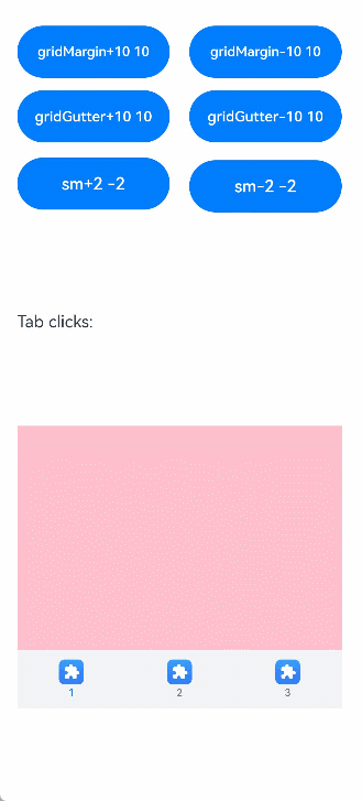
@State gridMargin: number = 10
@State gridGutter: number = 10
@State sm: number = -2
@State clickedContent: string = "";
build() {
Column() {
Row() {
Button("gridMargin+10 " + this.gridMargin)
.width('47%')
.height(50)
.margin({ top: 5 })
.onClick((event?: ClickEvent) => {
this.gridMargin += 10
})
.margin({ right: '6%', bottom: '12vp' })
Button("gridMargin-10 " + this.gridMargin)
.width('47%')
.height(50)
.margin({ top: 5 })
.onClick((event?: ClickEvent) => {
this.gridMargin -= 10
})
.margin({ bottom: '12vp' })
}
Row() {
Button("gridGutter+10 " + this.gridGutter)
.width('47%')
.height(50)
.margin({ top: 5 })
.onClick((event?: ClickEvent) => {
this.gridGutter += 10
})
.margin({ right: '6%', bottom: '12vp' })
Button("gridGutter-10 " + this.gridGutter)
.width('47%')
.height(50)
.margin({ top: 5 })
.onClick((event?: ClickEvent) => {
this.gridGutter -= 10
})
.margin({ bottom: '12vp' })
}
Row() {
Button("sm+2 " + this.sm)
.width('47%')
.height(50)
.margin({ top: 5 })
.onClick((event?: ClickEvent) => {
this.sm += 2
})
.margin({ right: '6%' })
Button("sm-2 " + this.sm).width('47%').height(50).margin({ top: 5 })
.onClick((event?: ClickEvent) => {
this.sm -= 2
})
}
Text ("Tab clicks: "+ this.clickedContent).width ('100%').height (200).margin ({ top: 5 })
Tabs({ barPosition: BarPosition.End, controller: this.controller }) {
TabContent() {
Column().width('100%').height('100%').backgroundColor(Color.Pink)
}.tabBar(BottomTabBarStyle.of($r("sys.media.ohos_app_icon"), "1"))
TabContent() {
Column().width('100%').height('100%').backgroundColor(Color.Green)
}.tabBar(BottomTabBarStyle.of($r("sys.media.ohos_app_icon"), "2"))
TabContent() {
Column().width('100%').height('100%').backgroundColor(Color.Blue)
}.tabBar(BottomTabBarStyle.of($r("sys.media.ohos_app_icon"), "3"))
}
.width('350vp')
.animationDuration(300)
.height('60%')
.barGridAlign({ sm: this.sm, margin: this.gridMargin, gutter: this.gridGutter })
.backgroundColor(0xf1f3f5)
.onTabBarClick((index: number) => {
this.clickedContent += "index " + index + " was clicked\n";
})
}
.width('100%')
.height(500)
.margin({ top: 5 })
.padding('10vp')
}
}
Example 6
// xxx.ets
@Entry
@Component
struct TabsExample6 {
private controller: TabsController = new TabsController()
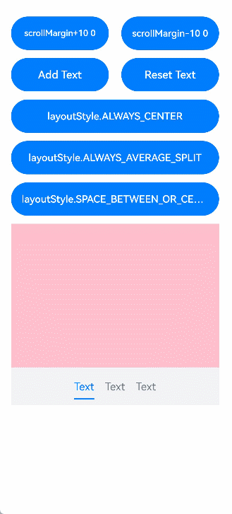
@State scrollMargin: number = 0
@State layoutStyle: LayoutStyle = LayoutStyle.ALWAYS_CENTER
@State text: string = "Text"
build() {
Column() {
Row() {
Button("scrollMargin+10 " + this.scrollMargin)
.width('47%')
.height(50)
.margin({ top: 5 })
.onClick((event?: ClickEvent) => {
this.scrollMargin += 10
})
.margin({ right: '6%', bottom: '12vp' })
Button("scrollMargin-10 " + this.scrollMargin)
.width('47%')
.height(50)
.margin({ top: 5 })
.onClick((event?: ClickEvent) => {
this.scrollMargin -= 10
})
.margin({ bottom: '12vp' })
}
Row() {
Button ("Add Text")
.width('47%')
.height(50)
.margin({ top: 5 })
.onClick((event?: ClickEvent) => {
this.text += 'Add Text'
})
.margin({ right: '6%', bottom: '12vp' })
Button ("Reset Text")
.width('47%')
.height(50)
.margin({ top: 5 })
.onClick((event?: ClickEvent) => {
this.text = "Text"
})
.margin({ bottom: '12vp' })
}
Row() {
Button("layoutStyle.ALWAYS_CENTER")
.width('100%')
.height(50)
.margin({ top: 5 })
.fontSize(15)
.onClick((event?: ClickEvent) => {
this.layoutStyle = LayoutStyle.ALWAYS_CENTER;
})
.margin({ bottom: '12vp' })
}
Row() {
Button("layoutStyle.ALWAYS_AVERAGE_SPLIT")
.width('100%')
.height(50)
.margin({ top: 5 })
.fontSize(15)
.onClick((event?: ClickEvent) => {
this.layoutStyle = LayoutStyle.ALWAYS_AVERAGE_SPLIT;
})
.margin({ bottom: '12vp' })
}
Row() {
Button("layoutStyle.SPACE_BETWEEN_OR_CENTER")
.width('100%')
.height(50)
.margin({ top: 5 })
.fontSize(15)
.onClick((event?: ClickEvent) => {
this.layoutStyle = LayoutStyle.SPACE_BETWEEN_OR_CENTER;
})
.margin({ bottom: '12vp' })
}
Tabs({ barPosition: BarPosition.End, controller: this.controller }) {
TabContent() {
Column().width('100%').height('100%').backgroundColor(Color.Pink)
}.tabBar(SubTabBarStyle.of(this.text))
TabContent() {
Column().width('100%').height('100%').backgroundColor(Color.Green)
}.tabBar(SubTabBarStyle.of(this.text))
TabContent() {
Column().width('100%').height('100%').backgroundColor(Color.Blue)
}.tabBar(SubTabBarStyle.of(this.text))
}
.animationDuration(300)
.height('60%')
.backgroundColor(0xf1f3f5)
.barMode(BarMode.Scrollable, { margin: this.scrollMargin, nonScrollableLayoutStyle: this.layoutStyle })
}
.width('100%')
.height(500)
.margin({ top: 5 })
.padding('24vp')
}
}
你可能感兴趣的鸿蒙文章
harmony 鸿蒙ArkTS-based Declarative Development Paradigm
- 所属分类: 后端技术
- 本文标签:
热门推荐
-
2、 优质文章
-
3、 gt
-
7、 openharmony
-
9、 golang
-
10、 Vue中input框自动聚焦