harmony 鸿蒙Search
Search
The <Search> component provides an area for users to enter search queries.
NOTE
This component is supported since API version 8. Updates will be marked with a superscript to indicate their earliest API version.
Child Components
Not supported
APIs
Search(options?: { value?: string, placeholder?: ResourceStr, icon?: string, controller?: SearchController })
Parameters
| Name | Type | Mandatory | Description |
|---|---|---|---|
| value | string | No | Text input in the search text box. Since API version 10, this parameter supports two-way binding through $$. |
| placeholder | ResourceStr10+ | No | Text displayed when there is no input. |
| icon | string | No | Path to the search icon. By default, the system search icon is used. NOTE The icon data source can be a local or online image. - The supported formats include PNG, JPG, BMP, SVG, GIF, and pixelmap. - The Base64 string is supported in the following format: data:image/[png|jpeg|bmp|webp];base64,[base64 data], where [base64 data] is a Base64 string. If this attribute and the searchIcon attribute are both set, the searchIcon attribute takes precedence. |
| controller | SearchController | No | Controller of the <Search> component. |
Attributes
In addition to the universal attributes, the following attributes are supported.
| Name | Type | Description |
|---|---|---|
| searchButton10+ | value: string, option?: SearchButtonOptions |
Text on the search button located next to the search text box. By default, there is no search button. |
| placeholderColor | ResourceColor | Placeholder text color. Default value: ’#99182431’ |
| placeholderFont | Font | Placeholder text style, including the font size, font width, font family, and font style. Currently, only the default font family is supported. |
| textFont | Font | Style of the text entered in the search box, including the font size, font width, font family, and font style. Currently, only the default font family is supported. |
| textAlign | TextAlign | Text alignment mode in the search text box. Currently, the following alignment modes are supported: Start, Center, and End. Default value: TextAlign.Start |
| copyOption9+ | CopyOptions | Whether copy and paste is allowed. Default value: CopyOptions.LocalDevice If this attribute is set to CopyOptions.None, the text can be pasted, but copy or cut is not allowed. |
| searchIcon10+ | IconOptions | Style of the search icon on the left. |
| cancelButton10+ | { style? : CancelButtonStyle icon?: IconOptions } |
Style of the Cancel button on the right. Default value: { style: CancelButtonStyle.INPUT } |
| fontColor10+ | ResourceColor | Font color of the input text. Default value: ’#FF182431’ NOTE Universal text attributes fontSize, fontStyle, fontWeight, and fontFamily are set in the textFont attribute. |
| caretStyle10+ | CaretStyle | Caret style. Default value: { width: 1.5vp color: ‘#007DFF’ } |
| enableKeyboardOnFocus10+ | boolean | Whether to enable the input method when the component obtains focus. Default value: true |
| selectionMenuHidden10+ | boolean | Whether to display the text selection menu when the text box is long-pressed or right-clicked. Default value: false |
| customKeyboard10+ | CustomBuilder | Custom keyboard. NOTE When a custom keyboard is set, activating the text box opens the specified custom component, instead of the system input method. The custom keyboard’s height can be set through the height attribute of the custom component’s root node, and its width is fixed at the default value. The custom keyboard is displayed on top of the current page, without compressing or raising the page. The custom keyboard cannot obtain the focus, but it blocks gesture events. By default, the custom keyboard is closed when the input component loses the focus. You can also use the stopEditing API to close the keyboard. |
IconOptions10+
| Name | Type | Mandatory | Description |
|---|---|---|---|
| size | Length | No | Icon size. It cannot be set in percentage. |
| color | ResourceColor | No | Icon color. |
| src | ResourceStr | No | Image source of the icon. |
CaretStyle10+
| Name | Type | Mandatory | Description |
|---|---|---|---|
| width | Length | No | Caret size. It cannot be set in percentage. |
| color | ResourceColor | No | Caret color. |
SearchButtonOptions10+
| Name | Type | Mandatory | Description |
|---|---|---|---|
| fontSize | Length | No | Font size of the button. It cannot be set in percentage. |
| fontColor | ResourceColor | No | Font color of the button. |
CancelButtonStyle10+
| Name | Description |
|---|---|
| CONSTANT | The Cancel button is always displayed. |
| INVISIBLE | The Cancel button is always hidden. |
| INPUT | The Cancel button is displayed when there is text input. |
Events
In addition to the universal events, the following events are supported.
| Name | Description |
|---|---|
| onSubmit(callback: (value: string) => void) | Triggered when users click the search icon or the search button, or touch the search button on a soft keyboard. - value: current text input. |
| onChange(callback: (value: string) => void) | Triggered when the input in the text box changes. - value: current text input. |
| onCopy(callback: (value: string) => void) | Triggered when data is copied to the pasteboard, which is displayed when the search text box is long pressed. - value: text copied. |
| onCut(callback: (value: string) => void) | Triggered when data is cut from the pasteboard, which is displayed when the search text box is long pressed. - value: text cut. |
| onPaste(callback: (value: string) => void) | Triggered when data is pasted from the pasteboard, which is displayed when the search text box is long pressed. -value: text pasted. |
| onTextSelectionChange(callback: (selectionStart: number, selectionEnd: number) => void)10+ | Triggered when the text selection position changes. selectionStart: start position of the text selection area. The start position of text in the text box is 0. selectionEnd: end position of the text selection area. |
| onContentScroll(callback: (totalOffsetX: number, totalOffsetY: number) => void)10+ | Triggered when the text content is scrolled. totalOffsetX: X coordinate offset of the text in the content area. totalOffsetY: Y coordinate offset of the text in the content area. |
SearchController
Implements the controller of the <Search> component. Currently, the controller can be used to control the caret position.
Objects to Import
controller: SearchController = new SearchController()
caretPosition
caretPosition(value: number): void
Sets the position of the caret.
Parameters
| Name | Type | Mandatory | Description |
|---|---|---|---|
| value | number | Yes | Length from the start of the character string to the position where the caret is located. |
stopEditing10+
stopEditing(): void
Exits the editing state.
getTextContentRect10+
getTextContentRect(): RectResult
Obtains the position of the edited text area relative to the component and its size. The unit of the return value is pixel.
Return value
| Type | Description |
|---|---|
| RectResult | Position of the edited text area relative to the component and its size. |
NOTE
- The returned position information is the offset of the first character relative to the search icon in the <Search> component.
- If no text is entered, the return value contains the position information, but the size is 0.
RectResult10+
Describes the position and size.
| Parameter | Type | Description |
|---|---|---|
| x | number | X coordinate. |
| y | number | Y coordinate. |
| width | number | Content width. |
| height | number | Content height. |
getTextContentLineCount10+
getTextContentLineCount(): number
Obtains the number of lines of the edited text.
Return value
| Type | Description |
|---|---|
| number | Number of lines of the edited text. |
Example
Example 1
// xxx.ets
@Entry
@Component
struct SearchExample {
@State changeValue: string = ''
@State submitValue: string = ''
controller: SearchController = new SearchController()
build() {
Column() {
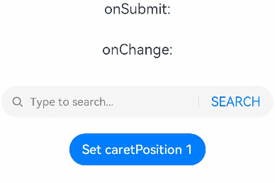
Text('onSubmit:' + this.submitValue).fontSize(18).margin(15)
Text('onChange:' + this.changeValue).fontSize(18).margin(15)
Search({ value: this.changeValue, placeholder: 'Type to search...', controller: this.controller })
.searchButton('SEARCH')
.width('95%')
.height(40)
.backgroundColor('#F5F5F5')
.placeholderColor(Color.Grey)
.placeholderFont({ size: 14, weight: 400 })
.textFont({ size: 14, weight: 400 })
.onSubmit((value: string) => {
this.submitValue = value
})
.onChange((value: string) => {
this.changeValue = value
})
.margin(20)
Button('Set caretPosition 1')
.onClick(() => {
// Move the caret to after the first entered character.
this.controller.caretPosition(1)
})
}.width('100%')
}
}
Example 2
// xxx.ets
@Entry
@Component
struct SearchButtoonExample {
@State submitValue: string = ''
build() {
Column() {
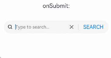
Text('onSubmit:' + this.submitValue).fontSize(18).margin(15)
Search({ placeholder: 'Type to search...' })
.searchButton('SEARCH')
.searchIcon({
src: $r('app.media.search')
})
.cancelButton({
style: CancelButtonStyle.CONSTANT,
icon: {
src: $r('app.media.cancel')
}
})
.width('90%')
.height(40)
.backgroundColor('#F5F5F5')
.placeholderColor(Color.Grey)
.placeholderFont({ size: 14, weight: 400 })
.textFont({ size: 14, weight: 400 })
.onSubmit((value: string) => {
this.submitValue = value
})
.margin(20)
}.width('100%')
}
}
Example 3
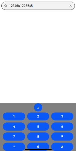
”`ts // xxx.ets @Entry @Component struct SearchExample { controller: SearchController = new SearchController() @State inputValue: string = “”
// Create a custom keyboard component. @Builder CustomKeyboardBuilder() { Column() { Button(‘x’).onClick(() => { // Disable the custom keyboard. this.controller.stopEditing() }) Grid() { ForEach([1, 2, 3, 4, 5, 6, 7, 8, 9, ‘*’, 0, ‘#’], (item: number|string) => { GridItem() { Button(item + “”) .width(110).onClick(() => { this.inputValue += item }) } }) }.maxCount(3).columnsGap(10).rowsGap(10).padding(5) }.backgroundColor(Color.Gray) }
build() { Column() { Search({ controller: this.controller, value: this.inputValue}) // Bind the custom keyboard. .customKeyboard(this.CustomKeyboardBuilder()).margin(10).border({ width: 1 }) } } } “”
你可能感兴趣的鸿蒙文章
harmony 鸿蒙ArkTS-based Declarative Development Paradigm
- 所属分类: 后端技术
- 本文标签:
热门推荐
-
2、 优质文章
-
3、 gt
-
7、 openharmony
-
9、 golang
-
10、 Vue中input框自动聚焦