harmony 鸿蒙气泡提示(Popup)
气泡提示(Popup)
Popup属性可绑定在组件上显示气泡弹窗提示,设置弹窗内容、交互逻辑和显示状态。主要用于屏幕录制、信息弹出提醒等显示状态。
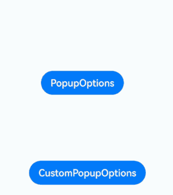
气泡分为两种类型,一种是系统提供的气泡PopupOptions,一种是开发者可以自定义的气泡CustomPopupOptions。其中,PopupOptions通过配置primaryButton和secondaryButton来设置带按钮的气泡;CustomPopupOptions通过配置builder来设置自定义的气泡。
气泡可以通过配置mask来实现模态和非模态窗口,mask为true或者颜色值的时候,气泡为模态窗口,mask为false时,气泡为非模态窗口。
文本提示气泡
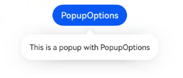
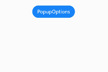
文本提示气泡常用于展示带有文本的信息提示,适用于无交互的场景。Popup属性需绑定组件,当bindPopup属性的参数show为true时,会弹出气泡提示。
在Button组件上绑定Popup属性,每次点击Button按钮时,handlePopup会切换布尔值。当值为true时,触发bindPopup弹出气泡。
@Entry
@Component
struct PopupExample {
  @State handlePopup: boolean = false;

  build() {
    Column() {
      Button('PopupOptions')
        .onClick(() => {
          this.handlePopup = !this.handlePopup;
        })
        .bindPopup(this.handlePopup, {
          message: 'This is a popup with PopupOptions',
        })
    }.width('100%').padding({ top: 5 })
  }
}
添加气泡状态变化的事件
通过onStateChange参数为气泡添加状态变化的事件回调,可以判断气泡的当前显示状态。
@Entry
@Component
struct PopupExample {
  @State handlePopup: boolean = false;

  build() {
    Column() {
      Button('PopupOptions')
        .onClick(() => {
          this.handlePopup = !this.handlePopup;
        })
        .bindPopup(this.handlePopup, {
          message: 'This is a popup with PopupOptions',
          onStateChange: (e)=> { // 返回当前的气泡状态
            if (!e.isVisible) {
              this.handlePopup = false;
            }
          }
        })
    }.width('100%').padding({ top: 5 })
  }
}
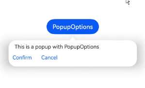
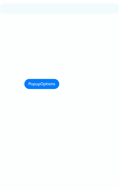
带按钮的提示气泡
通过primaryButton、secondaryButton属性为气泡最多设置两个Button按钮,通过此按钮进行简单的交互,开发者可以通过配置action参数来设置想要触发的操作。
@Entry
@Component
struct PopupExample22 {
  @State handlePopup: boolean = false;

  build() {
    Column() {
      Button('PopupOptions').margin({ top: 200 })
        .onClick(() => {
          this.handlePopup = !this.handlePopup;
        })
        .bindPopup(this.handlePopup, {
          message: 'This is a popup with PopupOptions',
          primaryButton: {
            value: 'Confirm',
            action: () => {
              this.handlePopup = !this.handlePopup;
              console.info('confirm Button click');
            }
          },
          secondaryButton: {
            value: 'Cancel',
            action: () => {
              this.handlePopup = !this.handlePopup;
            }
          },
          onStateChange: (e) => {
            if (!e.isVisible) {
              this.handlePopup = false;
            }
          }
        })
    }.width('100%').padding({ top: 5 })
  }
}
气泡的动画
通过定义transition,可以控制气泡的进场和出场动画效果。
// xxx.ets
@Entry
@Component
struct PopupExample {
  @State handlePopup: boolean = false;
  @State customPopup: boolean = false;

  // popup构造器定义弹框内容
  @Builder popupBuilder() {
    Row() {
      Text('Custom Popup with transitionEffect').fontSize(10)
    }.height(50).padding(5)
  }

  build() {
    Flex({ direction: FlexDirection.Column }) {
      // PopupOptions 类型设置弹框内容
      Button('PopupOptions')
        .onClick(() => {
          this.handlePopup = !this.handlePopup;
        })
        .bindPopup(this.handlePopup, {
          message: 'This is a popup with transitionEffect',
          placementOnTop: true,
          showInSubWindow: false,
          onStateChange: (e) => {
            if (!e.isVisible) {
              this.handlePopup = false;
            }
          },
          // 设置弹窗显示动效为透明度动效与平移动效的组合效果,无退出动效
          transition:TransitionEffect.asymmetric(
            TransitionEffect.OPACITY.animation({ duration: 1000, curve: Curve.Ease }).combine(
              TransitionEffect.translate({ x: 50, y: 50 })),
            TransitionEffect.IDENTITY)
        })
        .position({ x: 100, y: 150 })

      // CustomPopupOptions 类型设置弹框内容
      Button('CustomPopupOptions')
        .onClick(() => {
          this.customPopup = !this.customPopup;
        })
        .bindPopup(this.customPopup, {
          builder: this.popupBuilder,
          placement: Placement.Top,
          showInSubWindow: false,
          onStateChange: (e) => {
            if (!e.isVisible) {
              this.customPopup = false;
            }
          },
          // 设置弹窗显示动效与退出动效为缩放动效
          transition:TransitionEffect.scale({ x: 1, y: 0 }).animation({ duration: 500, curve: Curve.Ease })
        })
        .position({ x: 80, y: 300 })
    }.width('100%').padding({ top: 5 })
  }
}
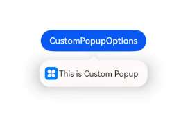
自定义气泡
开发者可以使用CustomPopupOptions的builder创建自定义气泡,\@Builder中可以放自定义的内容。除此之外,还可以通过popupColor等参数控制气泡样式。
@Entry
@Component
struct Index {
  @State customPopup: boolean = false;
  // popup构造器定义弹框内容
  @Builder popupBuilder() {
    Row({ space: 2 }) {
      Image($r("app.media.icon")).width(24).height(24).margin({ left: 5 })
      Text('This is Custom Popup').fontSize(15)
    }.width(200).height(50).padding(5)
  }
  build() {
    Column() {
      Button('CustomPopupOptions')
        .position({x:100,y:200})
        .onClick(() => {
          this.customPopup = !this.customPopup;
        })
        .bindPopup(this.customPopup, {
          builder: this.popupBuilder, // 气泡的内容
          placement:Placement.Bottom, // 气泡的弹出位置
          popupColor:Color.Pink, // 气泡的背景色
          onStateChange: (e) => {
            if (!e.isVisible) {
              this.customPopup = false;
            }
          }
        })
    }
    .height('100%')
  }
}
使用者通过配置placement参数将弹出的气泡放到需要提示的位置。弹窗构造器会触发弹出提示信息,来引导使用者完成操作,也让使用者有更好的UI体验。
气泡样式
气泡除了可以通过builder实现自定义气泡,还可以通过接口设置气泡的样式和显示效果。
背景颜色:气泡的背景色默认为透明,但是会有一个默认的模糊效果,手机上为COMPONENT_ULTRA_THICK。 蒙层样式:气泡默认有蒙层,且蒙层的颜色为透明。 显示大小:气泡大小由内部的builder大小或者message的长度决定的。 显示位置:气泡默认显示在宿主组件的下方,可以通过Placement接口来配置其显示位置以及对齐方向。 以下示例通过设置popupColor(背景颜色)、mask(蒙层样式)、width(气泡宽度)、placement(显示位置)实现气泡的样式。
// xxx.ets

@Entry
@Component
struct PopupExample {
  @State handlePopup: boolean = false;

  build() {
    Column({ space: 100 }) {
      Button('PopupOptions')
        .onClick(() => {
          this.handlePopup = !this.handlePopup;
        })
        .bindPopup(this.handlePopup, {
          width: 200,
          message: 'This is a popup.',
          popupColor: Color.Red, // 设置气泡的背景色
          mask: {
            color: '#33d9d9d9'
          },
          placement: Placement.Top,
          backgroundBlurStyle: BlurStyle.NONE // 去除背景模糊效果需要关闭气泡的模糊背景
        })
    }
    .width('100%')
  }
}
气泡避让软键盘
当软键盘弹出时,气泡默认不会对其避让,可能导致气泡被软键盘覆盖,这时需要设置keyboardAvoidMode为KeyboardAvoidMode.DEFAULT,来使气泡避让键盘。这时如果当前没有位置放下气泡时,气泡会从预设位置平移覆盖宿主组件。
// xxx.ets

@Entry
@Component
struct PopupExample {
  @State handlePopup: boolean = false;

  @Builder popupBuilder() {
    Column({ space: 2 }) {
      Text('Custom Popup').fontSize(20)
        .borderWidth(2)
      TextInput()
    }.width(200).padding(5)
  }

  build() {
    Column({ space: 100 }) {
      TextInput()
      Button('PopupOptions')
        .onClick(() => {
          this.handlePopup = !this.handlePopup;
        })
        .bindPopup(this.handlePopup!!, {
          width: 200,
          builder: this.popupBuilder(),
          placement: Placement.Bottom,
          mask: false,
          autoCancel: false,
          keyboardAvoidMode: KeyboardAvoidMode.DEFAULT
        })
        .position({x: 100, y: 300})
    }
    .width('100%')
  }
}
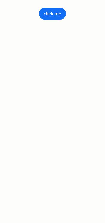
设置气泡内的多态效果
目前使用@Builder自定义气泡内容时,默认不支持多态样式,可以使用@Component新建一个组件实现按下气泡中的内容时背景变色。
@Entry
@Component
struct PopupPage {
  private menus: Array<string> = ["扫一扫", "创建群聊", "电子工卡"]

  // popup构造器定义弹框内容
  @Builder
  popupItemBuilder(name: string, action: string) {
    PopupItemChild({ childName: name, childAction: action })
  }

  // popup构造器定义弹框内容
  @Builder
  popupBuilder() {
    Column() {
      ForEach(
        this.menus,
        (item: string, index) => {
          this.popupItemBuilder(item, String(index))
        },
        (item: string, index) => {
          return item
        })
    }
    .padding(8)
  }

  @State customPopup: boolean = false;

  build() {
    Column() {
      Button('click me')
        .onClick(() => {
          this.customPopup = !this.customPopup
        })
        .bindPopup(
          this.customPopup,
          {
            builder: this.popupBuilder, // 气泡的内容
            placement: Placement.Bottom, // 气泡的弹出位置
            popupColor: Color.White, // 气泡的背景色
            onStateChange: (event) => {
              if (!event.isVisible) {
                this.customPopup = false
              }
            }
          })
    }
    .width('100%')
    .justifyContent(FlexAlign.Center)
  }
}

@Component
struct PopupItemChild {
  @Prop childName: string = '';
  @Prop childAction: string = '';

  build() {
    Row({ space: 8 }) {
      Image($r('app.media.startIcon'))
        .width(24)
        .height(24)
      Text(this.childName)
        .fontSize(16)
    }
    .width(130)
    .height(50)
    .padding(8)
    .onClick(() => {
      this.getUIContext().getPromptAction().showToast({ message: '选中了' + this.childName })
    })
    .stateStyles({
      normal: {
        .backgroundColor(Color.White)
      },
      pressed: {
        .backgroundColor('#1fbb7d')
      }
    })
  }
}
你可能感兴趣的鸿蒙文章
- 所属分类: 后端技术
- 本文标签:
热门推荐
-
2、 优质文章
-
3、 gt
-
7、 openharmony
-
9、 golang
-
10、 Vue中input框自动聚焦