harmony 鸿蒙SaveButton
SaveButton
The <SaveButton> security component allows you to obtain temporary storage permission from the user by their touching the button, eliminating the need for a permission request dialog box.
NOTE
This component is supported since API version 10. Updates will be marked with a superscript to indicate their earliest API version.
Child Components
Not supported
APIs
SaveButton
SaveButton()
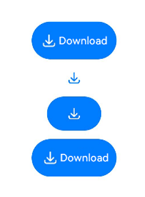
Creates a Save button with an icon, text, and background.
SaveButton
SaveButton(option:{icon?: SaveIconStyle, text?: SaveDescription, buttonType?: ButtonType})
Creates a Save button that contains the specified elements.
Parameters
| Name | Type | Mandatory | Description |
|---|---|---|---|
| icon | SaveIconStyle | No | Icon style of the Save button. If this parameter is not specified, no icon is contained. Either icon or text, or both, must be set. |
| text | SaveDescription | No | Text on the Save button. If this parameter is not specified, no text is contained. Either icon or text, or both, must be set. |
| buttonType | ButtonType | No | Background style of the Save button. If this parameter is not specified, there is no background. |
SaveIconStyle
| Name | Description |
|---|---|
| FULL_FILLED | Filled style icon. |
| LINES | Line style icon. |
SaveDescription
| Name | Description |
|---|---|
| DOWNLOAD | The text on the Save button is Download. |
| DOWNLOAD_FILE | The text on the Save button is Download File. |
| SAVE | The text on the Save button is Save. |
| SAVE_IMAGE | The text on the Save button is Save Image. |
| SAVE_FILE | The text on the Save button is Save File. |
| DOWNLOAD_AND_SHARE | The text on the Save button is Download and Share. |
| RECEIVE | The text on the Save button is Receive. |
| CONTINUE_TO_RECEIVE | The text on the Save button is Continue. |
SaveButtonOnClickResult
| Name | Description |
|---|---|
| SUCCESS | The Save button is touched successfully. |
| TEMPORARY_AUTHORIZATION_FAILED | Temporary authorization fails after the Save button is touched. |
Attributes
This component can only inherit the universal attributes of security components
Events
Only the following events are supported.
| Name | Description |
|---|---|
| onClick(event: (event: ClickEvent), result: SaveButtonOnClickResult) => void) | Triggered when the component is touched. result: authorization result. The authorization is effective for 10 seconds. This means that, a specific media library API can be called, an unlimited number of times, within 10 seconds of the touch. If the API is not called within the 10 seconds, the authorization fails. event: For details, see ClickEvent. |
Example
// xxx.ets
import photoAccessHelper from '@ohos.file.photoAccessHelper';
import fs from '@ohos.file.fs';

@Entry
@Component
struct Index {
  build() {
    Row() {
      Column({space:10}) {
        // Create a default Save button with an icon, text, and background.
        SaveButton().onClick(async (event:ClickEvent, result:SaveButtonOnClickResult) => {
          if (result == SaveButtonOnClickResult.SUCCESS) {
            try {
              const context = getContext(this);
              let helper = photoAccessHelper.getPhotoAccessHelper(context);
              // After onClick is triggered, the createAsset API can be called within 5 seconds to create an image file. After 5 seconds have elapsed, the permission to call createAsset is revoked.
              let uri = await helper.createAsset(photoAccessHelper.PhotoType.IMAGE, 'png');
              // Use the URI to open the file. The write process is not time bound.
              let file = await fs.open(uri, fs.OpenMode.READ_WRITE|fs.OpenMode.CREATE);
              // Write to the file.
              await fs.write(file.fd, "context");
              // Close the file.
              await fs.close(file.fd);
            } catch (error) {
              console.error("error is "+ JSON.stringify(error));
            }
          }
        })
        // Whether an element is contained depends on whether the parameter corresponding to the element is specified.
        SaveButton({icon:SaveIconStyle.FULL_FILLED})
        // Create a Save button with only an icon and background.
        SaveButton({icon:SaveIconStyle.FULL_FILLED, buttonType:ButtonType.Capsule})
        // Create a Save button with an icon, text, and background.
        SaveButton({icon:SaveIconStyle.FULL_FILLED, text:SaveDescription.DOWNLOAD, buttonType:ButtonType.Capsule})
      }.width('100%')
    }.height('100%')
  }
}

你可能感兴趣的鸿蒙文章
harmony 鸿蒙ArkTS-based Declarative Development Paradigm
0
赞
- 所属分类: 后端技术
- 本文标签:
热门推荐
-
2、 - 优质文章
-
3、 gate.io
-
8、 golang
-
9、 openharmony
-
10、 Vue中input框自动聚焦