harmony 鸿蒙SecurityComponent
SecurityComponent
安全控件的基础属性,用于设置安全控件通用的属性。
说明:
该组件从API Version 10开始支持。后续版本如有新增内容,则采用上角标单独标记该内容的起始版本。
属性
| 名称 | 参数类型 | 必填 | 描述 |
|---|---|---|---|
| iconSize | Length | 否 | 设置安全控件上图标的尺寸。 默认值:16vp |
| layoutDirection | SecurityComponentLayoutDirection | 否 | 设置安全控件上图标和文字分布的方向。 默认值:SecurityComponentLayoutDirection.HORIZONTAL |
| layoutOrder | SecurityComponentLayoutOrder | 否 | 设置安全控件上图标和文字分布的顺序。 默认值:SecurityComponentLayoutOrder.ICON_FIRST |
| position | Position | 否 | 设置绝对定位,设置安全控件的左上角相对于父容器左上角的偏移位置。 默认值: { x: 0, y: 0 } |
| markAnchor | Position | 否 | 设置绝对定位的锚点,以安全控件的左上角作为基准点进行偏移。 默认值: { x: 0, y: 0 } |
| offset | Position | 否 | 设置相对定位,安全控件相对于自身的偏移量。 默认值: { x: 0, y: 0 } |
| fontSize | Length | 否 | 设置安全控件上文字的尺寸。 默认值:16fp |
| fontStyle | FontStyle | 否 | 设置安全控件上文字的样式。 默认值:FontStyle.Normal |
| fontWeight | number |FontWeight |string | 否 | 设置安全控件上文字粗细。 默认值:FontWeight.Medium |
| fontFamily | string |Resource | 否 | 设置安全控件上文字的字体。 默认字体:’HarmonyOS Sans’ |
| fontColor | ResourceColor | 否 | 设置安全控件上文字的颜色。 默认值:#ffffffff |
| iconColor | ResourceColor | 否 | 设置安全控件上图标的颜色。 默认值:#ffffffff |
| backgroundColor | ResourceColor | 否 | 设置安全控件的背景颜色。 默认值:#007dff |
| borderStyle | BorderStyle | 否 | 设置安全控件的边框的样式。 默认不设置边框样式 |
| borderWidth | Length | 否 | 设置安全控件的边框的宽度。 默认不设置边框宽度 |
| borderColor | ResourceColor | 否 | 设置安全控件的边框的颜色。 默认不设置边框颜色 |
| borderRadius | Length | 否 | 设置安全控件的边框圆角半径。 默认值:1/2 按钮整高 |
| padding | Padding |Length | 否 | 设置安全控件的内边距。 默认值:上下8vp, 左右24vp |
| textIconSpace | Length | 否 | 设置安全控件中图标和文字的间距。 默认值:4vp |
SecurityComponentLayoutDirection枚举说明
| 名称 | 描述 |
|---|---|
| HORIZONTAL | 安全控件上图标和文字分布的方向为水平排列。 |
| VERTICAL | 安全控件上图标和文字分布的方向为垂直排列。 |
SecurityComponentLayoutOrder枚举说明
| 名称 | 描述 |
|---|---|
| ICON_FIRST | 图标的排列顺序先于文字。 |
| TEXT_FIRST | 文字的排列顺序先于图标。 |
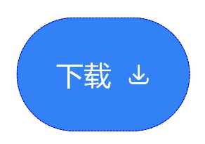
示例
// xxx.ets
@Entry
@Component
struct Index {
  build() {
    Row() {
      Column() {
        // 生成一个保存按钮,并设置它的SecurityComponent属性
        SecSaveButton()
          .fontSize(35)
          .fontColor(Color.White)
          .iconSize(30)
          .layoutDirection(SecurityComponentLayoutDirection.HORIZONTAL)
          .layoutOrder(SecurityComponentLayoutOrder.TEXT_FIRST)
          .borderWidth(1)
          .borderStyle(BorderStyle.Dashed)
          .borderColor(Color.Blue)
          .borderRadius(20)
          .fontWeight(100)
          .iconColor(Color.White)
          .padding({left:50, top:50, bottom:50, right:50})
          .textIconSpace(20)
          .backgroundColor(0x3282f6)
      }.width('100%')
    }.height('100%')
  }
}
你可能感兴趣的鸿蒙文章
0
赞
- 所属分类: 后端技术
- 本文标签:
热门推荐
-
2、 优质文章
-
3、 gt
-
7、 openharmony
-
9、 golang
-
10、 Vue中input框自动聚焦