harmony 鸿蒙Dynamic UI Element Building
Dynamic UI Element Building
After you’ve created a custom component (as described in Basic UI Description), you can customize the internal UI structure for the component, by drawing on the capability of dynamic UI element building.
@Builder
The @Builder decorator is used to decorate a function for quickly generating multiple layouts in a custom component. This function can be declared outside the build function and used in the build function or other @Builder decorated functions. The following example shows how to use @Builder.
// xxx.ets
@Component
struct CompB {
@State CompValue: string = ''
aboutToAppear() {
console.info('CompB aboutToAppear.')
}
aboutToDisappear() {
console.info('CompB aboutToDisappear.')
}
build() {
Column() {
Button(this.CompValue)
.margin(5)
}
}
}
@Entry
@Component
struct CompA {
size1: number = 100
@State CompValue1: string = "Hello,CompValue1"
@State CompValue2: string = "Hello,CompValue2"
@State CompValue3: string = "Hello,CompValue3"
// Use the custom component CompB in the @Builder decorated function CompC.
@Builder CompC(value: string) {
CompB({ CompValue: value })
}
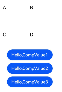
@Builder SquareText(label: string) {
Text(label)
.fontSize(18)
.width(1 * this.size1)
.height(1 * this.size1)
}
// Use the @Builder decorated function SquareText in the @Builder decorated function RowOfSquareTexts.
@Builder RowOfSquareTexts(label1: string, label2: string) {
Row() {
this.SquareText(label1)
this.SquareText(label2)
}
.width(2 * this.size1)
.height(1 * this.size1)
}
build() {
Column() {
Row() {
this.SquareText("A")
this.SquareText("B")
}
.width(2 * this.size1)
.height(1 * this.size1)
this.RowOfSquareTexts("C", "D")
Column() {
// Use the @Builder decorated custom components three times.
this.CompC(this.CompValue1)
this.CompC(this.CompValue2)
this.CompC(this.CompValue3)
}
.width(2 * this.size1)
.height(2 * this.size1)
}
.width(2 * this.size1)
.height(2 * this.size1)
}
}
@BuilderParam8+
The @BuilderParam decorator is used to decorate the function type attributes (for example, @BuilderParam noParam: () => void) in a custom component. When the custom component is initialized, the attributes decorated by @BuilderParam must be assigned values.
Background
In certain circumstances, you may need to add a specific function, such as a click-to-jump action, to a custom component. However, embedding an event method directly inside of the component will add the function to all places where the component is imported. This is where the @BuilderParam decorator comes into the picture. When initializing a custom component, you can assign a @Builder decorated method to the @BuilderParam decorated attribute, thereby adding the specific function to the custom component.
Component Initialization Through Parameters
When initializing a custom component through parameters, assign a @Builder decorated method to the @BuilderParam decorated attribute — content, and call the value of content in the custom component. If no parameter is passed when assigning a value to the @BuilderParam decorated attribute (for example, noParam: this.specificNoParam), define the type of the attribute as a function without a return value (for example, @BuilderParam noParam: () => void). If any parameter is passed when assigning a value to the @BuilderParam decorated attribute (for example, withParam: this.SpecificWithParam(‘WithParamA’)), define the type of the attribute as any (for example, @BuilderParam withParam: any).
// xxx.ets
@Component
struct CustomContainer {
header: string = ''
@BuilderParam noParam: () => void
@BuilderParam withParam: any
footer: string = ''
build() {
Column() {
Text(this.header)
.fontSize(30)
this.noParam()
this.withParam()
Text(this.footer)
.fontSize(30)
}
}
}
@Entry
@Component
struct CustomContainerUser {
@Builder specificNoParam() {
Column() {
Text('noParam').fontSize(30)
}
}
@Builder SpecificWithParam(label: string) {
Column() {
Text(label).fontSize(30)
}
}
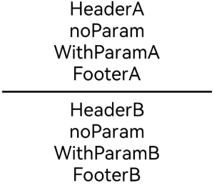
build() {
Column() {
CustomContainer({
header: 'HeaderA',
noParam: this.specificNoParam,
withParam: this.SpecificWithParam('WithParamA'),
footer: 'FooterA'
})
Divider()
.strokeWidth(3)
.margin(10)
CustomContainer({
header: 'HeaderB',
noParam: this.specificNoParam,
withParam: this.SpecificWithParam('WithParamB'),
footer: 'FooterB'
})
}
}
}
Component Initialization Through Trailing Closure
In a custom component, the @BuilderParam decorated attribute can be initialized using a trailing closure. During initialization, the component name is followed by a pair of braces ({}) to form a trailing closure (CustomContainer(){}). You can consider a trailing closure as a container and add content to it. For example, you can add a component ({Column(){…}) to the closure. The syntax of the closure is the same as that of build. In this scenario, the custom component has one and only one @BuilderParam decorated attribute.
Example: Add a <Column> component and a click event to the closure, and call the specificParam method decorated by @Builder in the new <Column> component. After the <Column> component is clicked, the value of the CustomContainer component’s header attribute will change from header to changeHeader. When the component is initialized, the content of the trailing closure will be assigned to the closer attribute decorated by @BuilderParam.
// xxx.ets
@Component
struct CustomContainer {
  header: string = ''
  @BuilderParam closer: () => void

  build() {
    Column() {
      Text(this.header)
        .fontSize(30)
      this.closer()
    }
  }
}

@Builder function specificParam(label1: string, label2: string) {
  Column() {
    Text(label1)
      .fontSize(30)
    Text(label2)
      .fontSize(30)
  }
}

@Entry
@Component
struct CustomContainerUser {
  @State text: string = 'header'

  build() {
    Column() {
      CustomContainer({
        header: this.text,
      }) {
        Column() {
          specificParam('testA', 'testB')
        }.backgroundColor(Color.Yellow)
        .onClick(() => {
          this.text = 'changeHeader'
        })
      }
    }
  }
}

@Styles
The @Styles decorator helps avoid repeated style setting, by extracting multiple style settings into one method. When declaring a component, you can invoke this method and use the @Styles decorator to quickly define and reuse the custom styles of a component. @Styles supports only universal attributes.
@Styles can be defined inside or outside a component declaration. When it is defined outside a component declaration, the component name must be preceded by the keyword function.
// xxx.ets
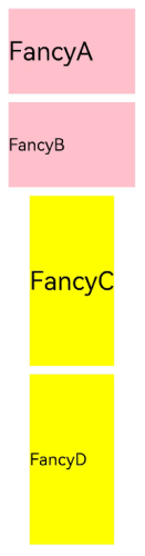
@Styles function globalFancy () {
.width(150)
.height(100)
.backgroundColor(Color.Pink)
}
@Entry
@Component
struct FancyUse {
@Styles componentFancy() {
.width(100)
.height(200)
.backgroundColor(Color.Yellow)
}
build() {
Column({ space: 10 }) {
Text('FancyA')
.globalFancy()
.fontSize(30)
Text('FancyB')
.globalFancy()
.fontSize(20)
Text('FancyC')
.componentFancy()
.fontSize(30)
Text('FancyD')
.componentFancy()
.fontSize(20)
}
}
}
@Styles can also be used inside the StateStyles attribute declaration of a component, to assign state-specific attributes to the component.
In StateStyles, @Styles decorated methods defined outside the component can be directly called, while those defined inside can be called only with the keyword this.
// xxx.ets
@Styles function globalFancy () {
.width(120)
.height(120)
.backgroundColor(Color.Green)
}
@Entry
@Component
struct FancyUse {
@Styles componentFancy() {
.width(80)
.height(80)
.backgroundColor(Color.Red)
}
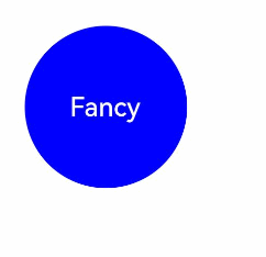
build() {
Row({ space: 10 }) {
Button('Fancy')
.stateStyles({
normal: {
.width(100)
.height(100)
.backgroundColor(Color.Blue)
},
disabled: this.componentFancy,
pressed: globalFancy
})
}
}
}
@Extend
The @Extend decorator adds new attribute methods to built-in components, such as <Text>, <Column>, and <Button>. In this way, the built-in components are extended instantly.
// xxx.ets
@Extend(Text) function fancy (fontSize: number) {
  .fontColor(Color.Red)
  .fontSize(fontSize)
  .fontStyle(FontStyle.Italic)
  .fontWeight(600)
}

@Entry
@Component
struct FancyUse {
  build() {
    Row({ space: 10 }) {
      Text("Fancy")
        .fancy(16)
      Text("Fancy")
        .fancy(24)
      Text("Fancy")
        .fancy(32)
    }
  }
}
NOTE
- The @Extend decorator cannot be defined inside the struct of a custom component.
- The @Extend decorator supports only attribute methods.

@CustomDialog
The @CustomDialog decorator is used to decorate custom dialog boxes, enabling their content and styles to be dynamically set.
// xxx.ets
@CustomDialog
struct DialogExample {
  controller: CustomDialogController
  action: () => void

  build() {
    Row() {
      Button('Close CustomDialog')
        .onClick(() => {
          this.controller.close()
          this.action()
        })
    }.padding(20)
  }
}

@Entry
@Component
struct CustomDialogUser {
  dialogController: CustomDialogController = new CustomDialogController({
    builder: DialogExample({ action: this.onAccept }),
    cancel: this.existApp,
    autoCancel: true
  });

  onAccept() {
    console.info('onAccept');
  }

  existApp() {
    console.info('Cancel dialog!');
  }

  build() {
    Column() {
      Button('Click to open Dialog')
        .onClick(() => {
          this.dialogController.open()
        })
    }
  }
}
你可能感兴趣的鸿蒙文章
harmony 鸿蒙app.json5 Configuration File
harmony 鸿蒙Internal Structure of the app Tag
harmony 鸿蒙Application Configuration File Overview (FA Model)
harmony 鸿蒙Application Configuration File Overview (Stage Model)
harmony 鸿蒙Application Installation and Uninstallation Process
harmony 鸿蒙Application Package Overview
harmony 鸿蒙Application Package Structure in FA Model
- 所属分类: 后端技术
- 本文标签:
热门推荐
-
2、 优质文章
-
3、 gt
-
7、 openharmony
-
9、 golang
-
10、 Vue中input框自动聚焦