harmony 鸿蒙ArkUI Subsystem Changelog
ArkUI Subsystem Changelog
cl.arkui.1 Change in the Default Width of the Linear Style of the Progress Component
Access Level
Public API
Reason for Change
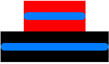
The previous default width of 300 vp for the linear style of the Progress component does not align with the UX specifications.
Change Impact
This change is a non-compatible change. With this change, the default width of the linear style of the Progress component will now adapt to the width of its parent component, offering increased flexibility.
API Level
8
Change Since
OpenHarmony SDK 4.1.6.6
Key API/Component Changes
Before change: In versions earlier than OpenHarmony SDK 4.1.6.6, the default width of the linear style of the Progress component is 300 vp.
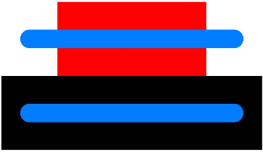
After change: Since OpenHarmony SDK 4.1.6.6, the default width of the linear style of the Progress component dynamically adjusts to match the width of its parent component.
Adaptation Guide
After this change, if the width of the Progress component in linear style does not meet your requirements, you can manually set the width attribute to achieve the desired layout.
你可能感兴趣的鸿蒙文章
harmony 鸿蒙OpenHarmony Docker镜像
harmony 鸿蒙OpenHarmony Docker Image
harmony 鸿蒙IDL Specifications and User Guide (for System Applications Only)
- 所属分类: 后端技术
- 本文标签:
热门推荐
-
2、 优质文章
-
3、 gt
-
7、 openharmony
-
9、 golang
-
10、 Vue中input框自动聚焦