harmony 鸿蒙cl.arkui.1 Specification Change for RichEditor Menu Visibility When Scrolling After Popup
cl.arkui.1 Specification Change for RichEditor Menu Visibility When Scrolling After Popup
Access Level
Public API
Reason for Change
The default UX behavior regarding whether the RichEditor menu should be displayed after the popup and when scrolling stops has changed.
Change Impact
Before change: After the RichEditor menu is popped up, the menu is hidden when scrolling the component and does not automatically reappear after scrolling stops.
After change: After the RichEditor menu is popped up, the menu is hidden when scrolling the component but will automatically reappear after scrolling stops.
Start API Level
API level 12
Change Since
OpenHarmony SDK version 5.0.0.24
Adaptation Guide
The default UX behavior has changed. No adaptation is needed. It does not affect the functional logic. Pay attention to the current rich text menu’s UX performance when scrolling stops.
cl.arkui.2 Corner Customization for bindMenu and bindContextMenu Menus
Access Level
Public API
Reason for Change
Enhancement of functionality
Change Impact
This change is a compatible change.
API Level
12
Change Since
OpenHarmony SDK version 5.0.0.24
Key API/Component Changes
bindMenu, bindContextMenu
Adaptation Guide
This change is a compatible change, and no adaptation is needed. For details about how to use this feature, see Menu Control.
cl.arkui.3 Specification Change in the Use of promptAction.showToast in Unclear UI Contexts
Access Level
Public API
Reason for Change
The functionality of this module relies on the UI execution context and should not be used in places where the UI context is unclear. If this interface is called within non-UI pages or some asynchronous callbacks, it may fail to track the current UI context, leading to incorrect calculation of the toast position.
Change Impact
Before change: In places with an unclear UI context, toasts could be displayed directly, but the position might be incorrect.
After change: In places with an unclear UI context, users are required to specify the corresponding UIContext to obtain the promptAction object for displaying toasts.
Start API Level
API level 9
Change Since
OpenHarmony SDK version 5.0.0.24
Adaptation Guide
When attempting to display a toast within http requests, delays, or sub-windows, the toast may not appear, and the log may show an error code 11 returned by the window. In such cases, users need to specify the context manually, as in the following code example:
import promptAction from '@ohos.promptAction';
import http from '@ohos.net.http';

@Entry
@Component
struct Index {
  @State message: string = 'Show toast';

  build() {
    Row() {
      Button() {
        Text(this.message)
          .fontSize(20)
          .fontWeight(FontWeight.Bold)
      }
      .width('100%')
      .onClick(()=>{
        let httpRequest = http.createHttp()
        let uiContext = this.getUIContext()
        httpRequest.request('https://xxx.com', { method: http.RequestMethod.GET }).then((res: http.HttpResponse) => {
          let promptAction1 = uiContext.getPromptAction()
          promptAction1.showToast({
            message:"Toast for success",
            duration:1000,
            showMode: promptAction.ToastShowMode.TOP_MOST
          })
        }).catch((err: Error)=>{
          let promptAction1 = uiContext.getPromptAction()
          promptAction1.showToast({
            message:"Toast for error",
            duration:1000,
            showMode: promptAction.ToastShowMode.TOP_MOST
          })
          httpRequest.destroy()
        })
      })
    }
    .height('100%')
  }
}
cl.arkui.4 Default Unit Specification Change for backgroundImagePosition Parameter
Access Level
Public API
Reason for Change
The default unit value of the interface does not match the documentation description.
Change Impact
Before change: Numeric values entered for the position type were defaulted to px units.
After change: Numeric values entered for the position type are defaulted to vp units.
Start API Level
The feature was at API level 7, and the change was made in API level 12.
Change Since
OpenHarmony SDK version 5.0.0.24
Adaptation Guide
The default behavior has changed, and no adaptation is required. However, you need to ensure that the new default effect meets expectations. If px units are needed, values can be concatenated as a string with “px” appended, or converted from px to vp before setting.
cl.arkui.5 Default Value Change for RicEditor Component’s RichEditorTextStyle Universal Attribute
Access Level
Public API
Reason for Change
Enhancement of UX specifications.
Change Impact
This change is non-compatible.
Modification of the font display size set in the RichEditorTextStyle universal attribute when the font size is 0.
- Before change: Content was not displayed when the font size was set to 0.
- After change: When the font size is set to 0, it displays with the default font size of 16fp.
Modification of the default font color set in the RichEditorTextStyle universal attribute.
- Before change: The default font color was Color.Black.
- After change: The default font color is font_primary from system resources.
Modification of the default text decoration color set in the RichEditorTextStyle universal attribute.
- Before change: The default decoration line color was Color.Black.
- After change: The default decoration line color follows the font color.
Start API Level
10
Change Since
OpenHarmony SDK version 5.0.0.24
Adaptation Guide
The default behavior has changed, and no adaptation is required. However, developers should ensure that the new default effects meet their expectations. If the new defaults do not meet the requirements, custom modifications to the effect control variables should be made to achieve the desired outcome.
cl.arkui.6 Change in Parent-Child Relationship When Using Custom Components in @Builder Function
Access Level
Public API
Reason for Change
When a Builder function is passed into a child component, the this within the child component refers to the parent component where the Builder function is defined. This can lead to runtime errors in certain scenarios, hence the change is necessary.
Change Impact
Example 1:
@Entry
@Component
struct Index {
  @Builder thirdBuilder() {
    Third()
  }
  build() {
    Column() {
      Second({secondBuilder: this.thirdBuilder.bind(this)})
    }
  }
}

@Component
struct Second {
  @Provide message: string = 'Hello';
  @BuilderParam secondBuilder: ()=>void;
  build() {
    Column() {
      this.secondBuilder()
    }
  }
}

@Component
struct Third {
  @Consume message: string;
  build() {
    Column() {
      Text(this.message).fontSize(30)
    }
  }
}
Before the change:
Executing the aforementioned code would result in a runtime error.
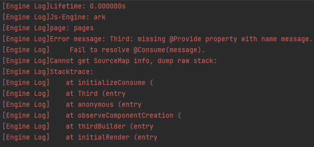
After the change:
No errors occur.
Scenario Examples Involved
Example of dialog nesting:
@Builder
function customDialogBuilderFunc(){}

@CustomDialog
struct CustomDialogExampleTwo {
  @BuilderParam grandsonBuilderFunc: ()=>void;
  grandsonFunc: ()=>void = ()=>{};
  controllerTwo?: CustomDialogController;
  @State message: string = "I'm the second dialog box.";
  @State showIf: boolean = false;
  build() {
    Column() {
      this.grandsonBuilderFunc()
      Button("show/hide Text")
        .onClick(()=>{
          this.grandsonFunc()
        })
      Button ('Close Second Dialog Box')
        .onClick(() => {
          if (this.controllerTwo != undefined) {
            this.controllerTwo.close()
          }
        })
        .margin(20)
    }
  }
}

@CustomDialog
struct CustomDialogExample {
  @BuilderParam childBuilderFunc: ()=>void = customDialogBuilderFunc;
  childFunc: null|(()=>void) = null;
  dialogControllerTwo: CustomDialogController|null = new CustomDialogController({
    builder: CustomDialogExampleTwo({grandsonBuilderFunc: this.childBuilderFunc, grandsonFunc: this.childFunc!}),
    alignment: DialogAlignment.Bottom,
    offset: { dx: 0, dy: -25 } })
  controller?: CustomDialogController;

  build() {
    Column() {
      Button ('Open Second Dialog Box and close this box')
        .onClick(() => {
          this.controller!.close();
          this.dialogControllerTwo!.open();
        })
        .margin(20)
    }.borderRadius(10)
  }
}

@Entry
@Component
struct CustomDialogUser {
  @State inputValue: string = 'Click Me';
  @State styleFlag: boolean = false;
  @Builder parentBuilderFunc() {
    if (this.styleFlag) {
      Text(this.inputValue).fontSize(35)
    }
  }
  parentFunc() {
    this.styleFlag = !this.styleFlag;
  }
  dialogController: CustomDialogController|null = new CustomDialogController({
    builder: CustomDialogExample({childBuilderFunc: this.parentBuilderFunc.bind(this), childFunc: this.parentFunc.bind(this),}),
    cancel: this.exitApp,
    autoCancel: true,
    alignment: DialogAlignment.Bottom,
    offset: { dx: 0, dy: -20 },
    gridCount: 4,
    customStyle: false
  })


  aboutToDisappear() {
    this.dialogController = null;
  }

  onCancel() {
    console.info('Callback when the first button is clicked');
  }

  onAccept() {
    console.info('Callback when the second button is clicked');
  }

  exitApp() {
    console.info('Click the callback in the blank area');
  }
  build() {
    Column() {
      Button(this.inputValue)
        .onClick(() => {
          if (this.dialogController != null) {
            this.dialogController.open()
          }
        }).backgroundColor(0x317aff)
    }.width('100%').margin({ top: 5 })
  }
}
Example of component freezing:
@Entry
@Component
struct Index {
  @Builder
  parentComponent() {
    Third()
  }
  build() {
    Column() {
      Second({childBuilderParam: this.parentComponent.bind(this)})
    }.width('100%').margin({ top: 5 })
  }
}

@Component({freezeWhenInactive: true})
struct Second {
  @BuilderParam childBuilderParam: ()=>void;
  build() {
    Column() {
      this.childBuilderParam();
    }.width('100%').margin({ top: 5 })
  }
}

@Component
struct Third {
  @State message: string = '111';
  build() {
    Column() {
      Text(this.message)
    }.width('100%').margin({ top: 5 })
  }
}
Start API Level
9
Change Since
OpenHarmony SDK version 5.0.0.24
Key API/Component Changes
@Builder
Adaptation Guide
This change is a compatibility improvement. No adaptation is required.
cl.arkui.7 Change in the Rule for Handling Boundary Values of the Menu Component’s radius API
Access Level
Public API
Reason for Change
Enhancement of UX specifications.
Change Impact
This change is non-compatible.
Before the change: When the sum of the two maximum corner radii in the horizontal direction is greater than or equal to the menu’s width, all four corners of the menu use the menu’s default corner radius value.
After the change: When the sum of the two maximum corner radii in the horizontal direction is greater than the menu’s width, or when the sum of the two maximum corner radii in the vertical direction is greater than the menu’s height, all four corners of the menu use the menu’s default corner radius value.
API Level
12
Change Since
OpenHarmony SDK version 5.0.0.24
Key API/Component Changes
The radius interface within the Menu component.
Adaptation Guide
If the expectation is to use the menu’s default corner radius, there is no need to set the radius property for the Menu component.
If a custom corner radius is expected, it can be set through the radius interface with a custom value that does not exceed the boundary values.
cl.arkui.8 Specification Change for RichEditor’s onWillChange and onDidChange Interfaces
Access Level
Public API
Reason for Change
Enhancement of interface capabilities.
Change Impact
This change is non-compatible.
Before the change:
The parameter of the OnWillChange callback function, RichEditorChangeValue, was information about the replaced span and the new span. The return value of the OnDidChange callback function was information about the new span.
After the change:
The parameter of the OnWillChange callback function, RichEditorChangeValue, is the index range of the replaced content and information about the new span. The return value of the OnDidChange callback function is the index range of the replaced content and the index range of the new content.
API Level
12
Change Since
OpenHarmony SDK version 5.0.0.24
Key API/Component Changes
The OnWillChange and OnDidChange interfaces of RichEditor.
Adaptation Guide
See RichEditor for the usage of the enhanced APIs.
你可能感兴趣的鸿蒙文章
harmony 鸿蒙API Model Conversion List
harmony 鸿蒙Bundle Manager Subsystem Changelog
- 所属分类: 后端技术
- 本文标签:
热门推荐
-
2、 优质文章
-
3、 gt
-
7、 openharmony
-
9、 golang
-
10、 Vue中input框自动聚焦