harmony 鸿蒙SideBarContainer
SideBarContainer
The <SideBarContainer> component contains a sidebar and content area as its child components. The sidebar is the first child component and can be shown or hidden as needed. The content area is the second child component.
NOTE
This component is supported since API version 8. Updates will be marked with a superscript to indicate their earliest API version.
Child Components
Supported
NOTE
- Built-in components and custom components are allowed, without support for (if/else, ForEach, and LazyForEach) rendering control.
- This component must contain two child components.
- If there are three or more child components, only the first and second child components are displayed. If there is only one child component, the sidebar is displayed, and the content area is blank.
APIs
SideBarContainer( type?: SideBarContainerType )
Parameters
| Name | Type | Mandatory | Description |
|---|---|---|---|
| type | SideBarContainerType | No | Display type of the sidebar. Default value: SideBarContainerType.Embed |
SideBarContainerType
| Name | Description |
|---|---|
| Embed | The sidebar is embedded in the component and displayed side by side with the content area. When the component size is less than the sum of minContentWidth and minSideBarWidth and showSideBar is not set, the sidebar is automatically hidden. If minSideBarWidth or minContentWidth is not set, the default value will be used for calculation. The user can bring out the sidebar in Overlay mode by clicking the control button. |
| Overlay | The sidebar is displayed overlaid on the content area. |
| AUTO | The sidebar is displayed in Embed mode when the component size is greater than or equal to the sum of minSideBarWidth and minContentWidth and in Overlay mode otherwise. If minSideBarWidth or minContentWidth is not set, the default value will be used for calculation. If the calculation result is less than 600 vp, 600 vp will be used as the breakpoint value for mode switching. |
Attributes
In addition to the universal attributes, the following attributes are supported.
| Name | Type | Description |
|---|---|---|
| showSideBar | boolean | Whether to display the sidebar. Default value: true Since API version 10, this attribute supports $$ for two-way binding of variables. |
| controlButton | ButtonStyle | Attributes of the sidebar control button. |
| showControlButton | boolean | Whether to display the sidebar control button. Default value: true |
| sideBarWidth | number |Length9+ | Width of the sidebar. Default value: 240vp Unit: vp NOTE In API version 9 and earlier versions, the default value is 200vp. In API version 10, the default value is 240vp. A value less than 0 evaluates to the default value. The value must comply with the width constraints. If it is not within the valid range, the valid value closest to the set one is used. The width of the sidebar, whether it is specified or kept at the default value, takes precedence over that of the sidebar child components. |
| minSideBarWidth | number |Length9+ | Minimum width of the sidebar. Default value: 240vp Unit: vp NOTE In API version 9 and earlier versions, the default value is 200vp. In API version 10, the default value is 240vp. A value less than 0 evaluates to the default value. The value cannot exceed the width of the sidebar container itself. Otherwise, the width of the sidebar container itself is used. minSideBarWidth, whether it is specified or kept at the default value, takes precedence over minWidth of the sidebar child components. |
| maxSideBarWidth | number |Length9+ | Maximum width of the sidebar. Default value: 280vp Unit: vp NOTE A value less than 0 evaluates to the default value. The value cannot exceed the width of the sidebar container itself. Otherwise, the width of the sidebar container itself is used. maxSideBarWidth, whether it is specified or kept at the default value, takes precedence over maxWidth of the sidebar child components. |
| autoHide9+ | boolean | Whether to automatically hide the sidebar when it is dragged to be smaller than the minimum width. Default value: true NOTE The value is subject to the minSideBarWidth attribute method. If it is not set in minSideBarWidth, the default value is used. Whether the sidebar should be hidden is determined when it is being dragged. When its width is less than the minimum width, the damping effect is required to trigger hiding (a distance out of range). |
| sideBarPosition9+ | SideBarPosition | Position of the sidebar. Default value: SideBarPosition.Start |
| divider10+ | DividerStyle |null | Divider style. - DividerStyle (default): The divider is displayed. - null: The divider is not displayed. |
| minContentWidth10+ | Dimension | Minimum content area width of the sidebar container. Default value: 360vp Unit: vp NOTE If this attribute is set to a value less than 0, the default value 360vp will be used. If this attribute is not set, the width of the content area can shrink to 0. In Embed mode, when the component size is increased, only the content area is enlarged; when the component size is decreased, the content area is shrunk until its width reaches the value defined by minContentWidth; if the component size is further decreased, while respecting the minContentWidth settings, the sidebar is shrunk until its width reaches the value defined by minSideBarWidth; if the component size is further decreased, then: - If autoHide is set to false, while respecting the minSideBarWidth and minContentWidth settings, the content area has its content clipped. - If autoHide is set to true, the sidebar is hidden first, and then the content area is shrunk. After its width reaches the value defined by minContentWidth, the content area has its content clipped. minContentWidth, whether it is specified or kept at the default value, takes precedence over minSideBarWidth and sideBarWidth of the sidebar. |
ButtonStyle
| Name | Type | Mandatory | Description |
|---|---|---|---|
| left | number | No | Spacing between the sidebar control button and the left of the container. Default value: 16vp Unit: vp |
| top | number | No | Spacing between the sidebar control button and the top of the container. Default value: 48vp Unit: vp |
| width | number | No | Width of the sidebar control button. Default value: API version 9 and earlier versions: 32vp API version 10 and later versions: 24vp Unit: vp |
| height | number | No | Height of the sidebar control button. Default value: API version 9 and earlier versions: 32vp API version 10 and later versions: 24vp Unit: vp |
| icons | { shown: string |PixelMap |Resource , hidden: string |PixelMap |Resource , switching?: string |PixelMap |Resource } |
No | Icons of the sidebar control button. - shown: icon of the control button when the sidebar is shown. NOTE When an error occurs during resource obtaining, the default icon is used. - hidden: icon of the control button when the sidebar is hidden. - switching: icon of the control button when the sidebar is switching between the shown and hidden states. |
SideBarPosition9+
| Name | Description |
|---|---|
| Start | The sidebar is on the left side of the container. |
| End | The sidebar is on the right side of the container. |
DividerStyle10+
| Name | Type | Mandatory | Description |
|---|---|---|---|
| strokeWidth | Length | Yes | Stroke width of the divider. |
| color | ResourceColor | No | Color of the divider. Default value: #000000, 3% |
| startMargin | Length | No | Distance between the divider and the top of the sidebar. Default value: 0 |
| endMargin | Length | No | Distance between the divider and the bottom of the sidebar. Default value: 0 |
NOTE
The settings of the universal size attributes width and height do not take effect for the sidebar child component. The settings do not take effect for the sidebar content area either. By default, the sidebar content area takes up the remaining space of the sidebar container.
If the showSideBar attribute is not set, the sidebar’s visibility is subject to its size.
- If the size is less than 520 vp, the sidebar is not displayed by default.
- If the size is greater than or equal to 520 vp, the sidebar is displayed by default.
Events
In addition to the universal events, the following events are supported.
| Name | Description |
|---|---|
| onChange(callback: (value: boolean) => void) | Triggered when the status of the sidebar switches between shown and hidden. The value true means that the sidebar is displayed, and false means the opposite. This event is triggered when any of the following conditions is met: 1. The value of showSideBar changes. 2. The showSideBar attribute adapts to behavior changes. 3. The autoHide API is triggered when the divider is dragged. |
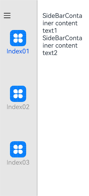
Example
// xxx.ets
@Entry
@Component
struct SideBarContainerExample {
  normalIcon: Resource = $r("app.media.icon")
  selectedIcon: Resource = $r("app.media.icon")
  @State arr: number[] = [1, 2, 3]
  @State current: number = 1

  build() {
    SideBarContainer(SideBarContainerType.Embed) {
      Column() {
        ForEach(this.arr, (item: number) => {
          Column({ space: 5 }) {
            Image(this.current === item ? this.selectedIcon : this.normalIcon).width(64).height(64)
            Text("Index0" + item)
              .fontSize(25)
              .fontColor(this.current === item ? '#0A59F7' : '#999')
              .fontFamily('source-sans-pro,cursive,sans-serif')
          }
          .onClick(() => {
            this.current = item
          })
        }, (item: string) => item)
      }.width('100%')
      .justifyContent(FlexAlign.SpaceEvenly)
      .backgroundColor('#19000000')

      Column() {
        Text('SideBarContainer content text1').fontSize(25)
        Text('SideBarContainer content text2').fontSize(25)
      }
      .margin({ top: 50, left: 20, right: 30 })
    }
    .controlButton({
      icons: {
        hidden: $r('app.media.drawer'),
        shown: $r('app.media.drawer'),
        switching: $r('app.media.drawer')
      }
    })
    .sideBarWidth(150)
    .minSideBarWidth(50)
    .maxSideBarWidth(300)
    .minContentWidth(0)
    .onChange((value: boolean) => {
      console.info('status:' + value)
    })
    .divider({ strokeWidth: '1vp', color: Color.Gray, startMargin: '4vp', endMargin: '4vp' })
  }
}
你可能感兴趣的鸿蒙文章
harmony 鸿蒙ArkTS-based Declarative Development Paradigm
- 所属分类: 后端技术
- 本文标签:
热门推荐
-
2、 优质文章
-
3、 gt
-
7、 openharmony
-
9、 golang
-
10、 Vue中input框自动聚焦