harmony 鸿蒙Scroll
Scroll
The <Scroll> component scrolls the content when the layout size of a component exceeds the size of its parent component.
NOTE - This component is supported since API version 7. Updates will be marked with a superscript to indicate their earliest API version. - When nesting a <List> within this component, specify the width and height for the <List> under scenarios where consistently high performance is required. If the width and height are not specified, this component will load all content of the <List>. - This component can scroll only when the size on the main axis is less than the content size. - This component can produce a bounce effect only when there is more than one screen of content.
Child Components
This component supports only one child component.
APIs
Scroll(scroller?: Scroller)
Parameters
| Name | Type | Mandatory | Description |
|---|---|---|---|
| scroller | Scroller | No | Scroller, which can be bound to scrollable components. |
Attributes
In addition to the universal attributes, the following attributes are supported.
| Name | Type | Description |
|---|---|---|
| scrollable | ScrollDirection | Scroll direction. Default value: ScrollDirection.Vertical |
| scrollBar | BarState | Scrollbar status. Default value: BarState.Auto NOTE If the container component cannot be scrolled, the scrollbar is not displayed. If the size of a child component of a container component is infinite, the scrollbar cannot be dragged or scrolled with the child component. |
| scrollBarColor | string |number |Color | Color of the scrollbar. |
| scrollBarWidth | string |number | Width of the scrollbar. This attribute cannot be set in percentage. Default value: 4 Unit: vp NOTE If the width of the scrollbar exceeds its height, it will change to the default value. |
| edgeEffect | EdgeEffect | Scroll effect. For details, see EdgeEffect. Default value: EdgeEffect.None |
| enableScrollInteraction10+ | boolean | Whether to support scroll gestures. When this attribute is set to false, scrolling by finger or mouse is not supported, but the scrolling controller API is not affected. Default value: true |
| nestedScroll10+ | NestedScrollOptions | Nested scrolling options. You can set the nested scrolling mode in the forward and backward directions to implement scrolling linkage with the parent component. |
| friction10+ | number |Resource | Friction coefficient. It applies only to gestures in the scrolling area, and it affects only indirectly the scroll chaining during the inertial scrolling process. Default value: 0.9 for wearable devices and 0.6 for non-wearable devices NOTE A value less than or equal to 0 evaluates to the default value. |
ScrollDirection
| Name | Description |
|---|---|
| Horizontal | Only horizontal scrolling is supported. |
| Vertical | Only vertical scrolling is supported. |
| None | Scrolling is disabled. |
| Free(deprecated) | Vertical or horizontal scrolling is supported. This API is deprecated since API version 9. |
Events
| Name | Description |
|---|---|
| onScrollFrameBegin9+(event: (offset: number, state: ScrollState) => { offsetRemain }) | Triggered when each frame scrolling starts. The input parameters indicate the amount by which the <Scroll> component will scroll. The event handler then works out the amount by which the component needs to scroll based on the real-world situation and returns the result. - offset: amount to scroll by. - state: current scrolling status. - offsetRemain: actual amount by which the component scrolls. NOTE 1. This event is triggered when scrolling is started by the <Scroll> component or other input settings, such as keyboard and mouse operations. 2. This event is not triggered when the controller API is called. 3. This event does not support the out-of-bounds bounce effect. NOTE The value of offsetRemain can be a negative value. If the onScrollFrameBegine event and scrollBy method are used to implement nested scrolling, set the edgeEffect attribute of the scrollable child component to None. For example, if a <List> is nested in the <Scroll> component, edgeEffect of the <List> must be set to EdgeEffect.None. |
| onScroll(event: (xOffset: number, yOffset: number) => void) | Triggered to return the horizontal and vertical offsets during scrolling when the specified scroll event occurs. NOTE 1. This event is triggered when scrolling is started by the <Scroll> component or other input settings, such as keyboard and mouse operations. 2. This event is triggered when the controller API is called. 3. This event supports the out-of-bounds bounce effect. |
| onScrollEdge(event: (side: Edge) => void) | Triggered when scrolling reaches the edge. NOTE 1. This event is triggered when scrolling reaches the edge after being started by the <Scroll> component or other input settings, such as keyboard and mouse operations. 2. This event is triggered when the controller API is called. 3. This event supports the out-of-bounds bounce effect. |
| onScrollEnd(deprecated) (event: () => void) | Triggered when scrolling stops. This event is deprecated since API version 9. Use the onScrollStop event instead. NOTE 1. This event is triggered when scrolling is stopped by the <Scroll> component or other input settings, such as keyboard and mouse operations. 2. This event is triggered when the controller API is called, accompanied by a transition animation. |
| onScrollStart9+(event: () => void) | Triggered when scrolling starts and is initiated by the user’s finger dragging the <Scroll> component or its scrollbar. This event is also triggered when the animation contained in the scrolling triggered by Scroller starts. NOTE 1. This event is triggered when scrolling is started by the <Scroll> component or other input settings, such as keyboard and mouse operations. 2. This event is triggered when the controller API is called, accompanied by a transition animation. |
| onScrollStop9+(event: () => void) | Triggered when scrolling stops after the user’s finger leaves the screen. This event is also triggered when the animation contained in the scrolling triggered by Scroller stops. NOTE 1. This event is triggered when scrolling is stopped by the <Scroll> component or other input settings, such as keyboard and mouse operations. 2. This event is triggered when the controller API is called, accompanied by a transition animation. |
NOTE
If the onScrollFrameBegin event and scrollBy method are used to implement nested scrolling, set the edgeEffect attribute of the scrollable child component to None. For example, if a <List> is nested in the <Scroll> component, edgeEffect of the <List> must be set to EdgeEffect.None.
Scroller
Implements a controller for a scrollable container component. You can bind this component to a container component and use it to control the scrolling of that component. One controller can control only one container component. The supported container components are <List>, <Scroll>, <ScrollBar>, <Grid>, and <WaterFlow>.
Objects to Import
scroller: Scroller = new Scroller()
scrollTo
scrollTo(value: { xOffset: number|string, yOffset: number|string, animation?: { duration?: number, curve?: Curve|ICurve }|boolean }): void
Scrolls to the specified position.
Parameters
| Name | Type | Mandatory | Description |
|---|---|---|---|
| xOffset | number |string | Yes | Horizontal scrolling offset. NOTE This parameter cannot be set in percentage. If the value is less than 0, no operation is performed. That is, this parameter does not take effect. This parameter is valid only when the scroll axis is the x-axis. |
| yOffset | number |string | Yes | Vertical scrolling offset. NOTE This parameter cannot be set in percentage. If the value is less than 0, no operation is performed. That is, this parameter does not take effect. This parameter is valid only when the scroll axis is the y-axis. |
| animation | {duration?: number, curve?: Curve |ICurve10+ } |boolean10+ | No | Animation configuration, which includes the following: - duration: scrolling duration. - curve: scrolling curve. - boolean: whether to enable the default spring animation. Default value: { duration: 1000, curve: Curve.Ease } boolean: false NOTE A value less than 0 evaluates to the default value. Currently, the <List>, <Scroll>, <Grid>, and <WaterFlow> support the Boolean type and ICurve. |
scrollEdge
scrollEdge(value: Edge): void
Scrolls to the edge of the container, regardless of the scroll axis direction. Edge.Top and Edge.Start produce the same effect, and Edge.Bottom and Edge.End produce the same effect.
Parameters
| Name | Type | Mandatory | Description |
|---|---|---|---|
| value | Edge | Yes | Edge position to scroll to. |
scrollPage
scrollPage(value: { next: boolean, direction?: Axis }): void
Scrolls to the next or previous page.
Parameters
| Name | Type | Mandatory | Description |
|---|---|---|---|
| next | boolean | Yes | Whether to turn to the next page. The value true means to scroll to the next page, and false means to scroll to the previous page. |
| direction(deprecated) | Axis | No | Scrolling direction: horizontal or vertical. This API is deprecated since API version 9. |
currentOffset
currentOffset(): { xOffset: number, yOffset: number }
Obtains the scrolling offset.
Return value
| Type | Description |
|---|---|
| { xOffset: number, yOffset: number } |
xOffset: horizontal scrolling offset. yOffset: vertical scrolling offset. NOTE The unit of the return value is vp. |
scrollToIndex
scrollToIndex(value: number, smooth?: boolean, align?: ScrollAlign): void
Scrolls to the item with the specified index.
When smooth is set to true, all passed items are loaded and counted in layout calculation. This may result in performance issues if a large number of items are involved.
NOTE
This API only works for the <Grid>, <List>, and <WaterFlow> components.
Parameters
| Name | Type | Mandatory | Description |
|---|---|---|---|
| value | number | Yes | Index of the item to be scrolled to in the container. NOTE If the value set is a negative value or greater than the maximum index of the items in the container, the value is deemed abnormal, and no scrolling will be performed. |
| smooth10+ | boolean | No | Whether to enable the smooth animation for scrolling to the item with the specified index. The value true means to enable that the smooth animation, and false means the opposite. Default value: false NOTE Currently, only the <List> component supports this parameter. |
| align10+ | ScrollAlign | No | How the list item to scroll to is aligned with the container. Default value when the container is <List>: ScrollAlign.START Default value when the container is <Grid>: ScrollAlign.AUTO NOTE Currently, only the <List> and <Grid> components support this parameter. |
scrollBy9+
scrollBy(dx: Length, dy: Length): void
Scrolls by the specified amount.
NOTE
This API only works for the <Scroll>, <ScrollBar>, <Grid>, and <List> components.
Parameters
| Name | Type | Mandatory | Description |
|---|---|---|---|
| dx | Length | Yes | Amount to scroll by in the horizontal direction. The percentage format is not supported. |
| dy | Length | Yes | Amount to scroll by in the vertical direction. The percentage format is not supported. |
isAtEnd10+
isAtEnd(): boolean
Checks whether the component has scrolled to the bottom.
NOTE
This API is available for the <Scroll>, <List>, <Grid>, and <WaterFlow> components.
Return value
| Type | Description |
|---|---|
| boolean | The value true means that the component has scrolled to the bottom, and false means the opposite. |
ScrollAlign10+
| Name | Description |
|---|---|
| START | The start edge of the list item is flush with the start edge of the list. |
| CENTER | The list item is centered along the main axis of the list. |
| END | The end edge of the list item is flush with the end edge of the list. |
| AUTO | The list item is automatically aligned. If the list item is fully contained within the display area, no adjustment is performed. Otherwise, the list item is aligned so that its start or end edge is flush with the start or end edge of the list, whichever requires a shorter scrolling distance. |
NestedScrollOptions10+
| Name | Type | Description |
|---|---|---|
| scrollForward | NestedScrollMode | Nested scrolling option when the component scrolls forward. |
| scrollBackward | NestedScrollMode | Nested scrolling option when the component scrolls backward. |
NestedScrollMode10+
| Name | Description |
|---|---|
| SELF_ONLY | The scrolling is contained within the component, and no scroll chaining occurs, that is, the parent component does not scroll when the component scrolling reaches the boundary. |
| SELF_FIRST | The component scrolls first, and when it hits the boundary, the parent component scrolls. When the parent component hits the boundary, its edge effect is displayed. If no edge effect is specified for the parent component, the edge effect of the child component is displayed instead. |
| PARENT_FIRST | The parent component scrolls first, and when it hits the boundary, the component scrolls. When the component hits the boundary, its edge effect is displayed. If no edge effect is specified for the component, the edge effect of the parent component is displayed instead. |
| PARALLEL | The component and its parent component scroll at the same time. When both the component and its parent component hit the boundary, the edge effect of the component is displayed. If no edge effect is specified for the component, the edge effect of the parent component is displayed instead. |
Example
Example 1
// xxx.ets
import Curves from '@ohos.curves'
@Entry
@Component
struct ScrollExample {
scroller: Scroller = new Scroller()
private arr: number[] = [0, 1, 2, 3, 4, 5, 6, 7, 8, 9]
build() {
Stack({ alignContent: Alignment.TopStart }) {
Scroll(this.scroller) {
Column() {
ForEach(this.arr, (item: number) => {
Text(item.toString())
.width('90%')
.height(150)
.backgroundColor(0xFFFFFF)
.borderRadius(15)
.fontSize(16)
.textAlign(TextAlign.Center)
.margin({ top: 10 })
}, (item: string) => item)
}.width('100%')
}
.scrollable(ScrollDirection.Vertical) // The scrollbar scrolls in the vertical direction.
.scrollBar(BarState.On) // The scrollbar is always displayed.
.scrollBarColor(Color.Gray) // The scrollbar color is gray.
.scrollBarWidth(10) // The scrollbar width is 10.
.friction(0.6)
.edgeEffect(EdgeEffect.None)
.onScroll((xOffset: number, yOffset: number) => {
console.info(xOffset + ' ' + yOffset)
})
.onScrollEdge((side: Edge) => {
console.info('To the edge')
})
.onScrollEnd(() => {
console.info('Scroll Stop')
})
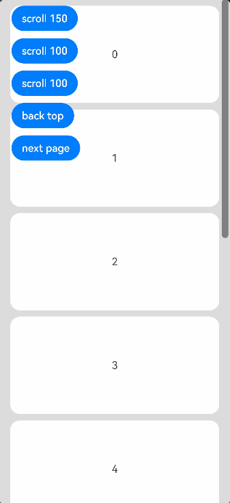
Button('scroll 150')
.height('5%')
.onClick(() => { // Click to scroll down to 150.0 vp.
this.scroller.scrollBy(0, 150)
})
.margin({ top: 10, left: 20 })
Button('scroll 100')
.height('5%')
.onClick(() => { // Click to scroll down by 100.0 vp.
const yOffset: number = this.scroller.currentOffset().yOffset;
this.scroller.scrollTo({ xOffset: 0, yOffset: yOffset + 100 })
})
.margin({ top: 60, left: 20 })
Button('scroll 100')
.height('5%')
.onClick(() => {// Click to scroll down by 100.0 vp. An animation is applied to the scrolling.
let curve = Curves.interpolatingSpring(100, 1, 228, 30) // Create a step curve.
const yOffset: number = this.scroller.currentOffset().yOffset;
this.scroller.scrollTo({ xOffset: 0, yOffset: yOffset + 100, animation: { duration: 1000, curve: curve } })
})
.margin({ top: 110, left: 20 })
Button('back top')
.height('5%')
.onClick(() => { // Click to go back to the top.
this.scroller.scrollEdge(Edge.Top)
})
.margin({ top: 160, left: 20 })
Button('next page')
.height('5%')
.onClick(() => { // Click to go to the next page.
this.scroller.scrollPage({ next: true })
})
.margin({ top: 210, left: 20 })
}.width('100%').height('100%').backgroundColor(0xDCDCDC)
}
}
Example 2
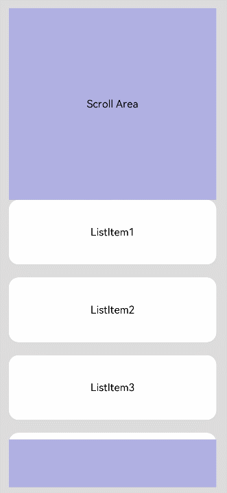
@Entry
@Component
struct NestedScroll {
  @State listPosition: number = 0; // 0 indicates scrolling to the top of the list, 1 indicates scrolling to the middle of the list, and 2 indicates scrolling to the bottom of the list.
  private arr: number[] = [1, 2, 3, 4, 5, 6, 7, 8, 9, 10]
  private scrollerForScroll: Scroller = new Scroller()
  private scrollerForList: Scroller = new Scroller()

  build() {
    Flex() {
      Scroll(this.scrollerForScroll) {
        Column() {
          Text("Scroll Area")
            .width("100%")
            .height("40%")
            .backgroundColor(0X330000FF)
            .fontSize(16)
            .textAlign(TextAlign.Center)
            .onClick(() => {
              this.scrollerForList.scrollToIndex(5)
            })

          List({ space: 20, scroller: this.scrollerForList }) {
            ForEach(this.arr, (item: number) => {
              ListItem() {
                Text("ListItem" + item)
                  .width("100%")
                  .height("100%")
                  .borderRadius(15)
                  .fontSize(16)
                  .textAlign(TextAlign.Center)
                  .backgroundColor(Color.White)
              }.width("100%").height(100)
            }, (item: string) => item)
          }
          .width("100%")
          .height("50%")
          .edgeEffect(EdgeEffect.None)
          .friction(0.6)
          .onReachStart(() => {
            this.listPosition = 0
          })
          .onReachEnd(() => {
            this.listPosition = 2
          })
          .onScrollFrameBegin((offset: number) => {
            if ((this.listPosition == 0 && offset <= 0)||(this.listPosition == 2 && offset >= 0)) {
              this.scrollerForScroll.scrollBy(0, offset)
              return { offsetRemain: 0 }
            }
            this.listPosition = 1
            return { offsetRemain: offset };
          })

          Text("Scroll Area")
            .width("100%")
            .height("40%")
            .backgroundColor(0X330000FF)
            .fontSize(16)
            .textAlign(TextAlign.Center)
        }
      }
      .width("100%").height("100%")
    }.width('100%').height('100%').backgroundColor(0xDCDCDC).padding(20)
  }
}
Example 3
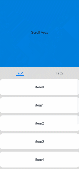
@Entry
@Component
struct StickyNestedScroll {
  @State message: string = 'Hello World'
  @State arr: number[] = []

  @Styles
  listCard() {
    .backgroundColor(Color.White)
    .height(72)
    .width("100%")
    .borderRadius(12)
  }

  build() {
    Scroll() {
      Column() {
        Text("Scroll Area")
          .width("100%")
          .height("40%")
          .backgroundColor('#0080DC')
          .textAlign(TextAlign.Center)
        Tabs({ barPosition: BarPosition.Start }) {
          TabContent() {
            List({ space: 10 }) {
              ForEach(this.arr, (item: number) => {
                ListItem() {
                  Text("item" + item)
                    .fontSize(16)
                }.listCard()
              }, (item: string) => item)
            }.width("100%")
            .edgeEffect(EdgeEffect.Spring)
            .nestedScroll({
              scrollForward: NestedScrollMode.PARENT_FIRST,
              scrollBackward: NestedScrollMode.SELF_FIRST
            })
          }.tabBar("Tab1")

          TabContent() {
          }.tabBar("Tab2")
        }
        .vertical(false)
        .height("100%")
      }.width("100%")
    }
    .edgeEffect(EdgeEffect.Spring)
    .friction(0.6)
    .backgroundColor('#DCDCDC')
    .scrollBar(BarState.Off)
    .width('100%')
    .height('100%')
  }

  aboutToAppear() {
    for (let i = 0; i < 30; i++) {
      this.arr.push(i)
    }
  }
}
你可能感兴趣的鸿蒙文章
harmony 鸿蒙ArkTS-based Declarative Development Paradigm
- 所属分类: 后端技术
- 本文标签:
热门推荐
-
2、 优质文章
-
3、 gt
-
7、 openharmony
-
9、 golang
-
10、 Vue中input框自动聚焦