harmony 鸿蒙Radio
Radio
The <Radio> component allows users to select from a set of mutually exclusive options.
NOTE
This component is supported since API version 8. Updates will be marked with a superscript to indicate their earliest API version.
Child Components
Not supported
APIs
Radio(options: {value: string, group: string})
Since API version 9, this API is supported in ArkTS widgets.
Parameters
| Name | Type | Mandatory | Description |
|---|---|---|---|
| value | string | Yes | Value of the current radio button. |
| group | string | Yes | Name of the group to which the radio button belongs. Only one radio button in a given group can be selected at a time. |
Attributes
In addition to the universal attributes, the following attributes are supported.
| Name | Type | Description |
|---|---|---|
| checked | boolean | Whether the radio button is selected. Default value: false Since API version 9, this API is supported in ArkTS widgets. Since API version 10, this attribute supports $$ for two-way binding of variables. |
| radioStyle10+ | RadioStyle | Style of the radio button in selected or deselected state. Since API version 10, this API is supported in ArkTS widgets. |
Events
In addition to the universal events, the following events are supported.
| Name | Description |
|---|---|
| onChange(callback: (isChecked: boolean) => void) | Triggered when the selected state of the radio button changes. - If isChecked is true, it indicates that the radio button changes from unselected to selected. - If isChecked is false, it indicates that the radio button changes from selected to unselected. Since API version 9, this API is supported in ArkTS widgets. |
RadioStyle
| Name | Type | Mandatory | Default Value | Description |
|---|---|---|---|---|
| checkedBackgroundColor | ResourceColor | No | #007DFF | Color of the background when the radio button is selected. |
| uncheckedBorderColor | ResourceColor | No | #182431 | Color of the border when the radio button is deselected. |
| indicatorColor | ResourceColor | No | #FFFFFF | Color of the indicator when the radio button is selected. |
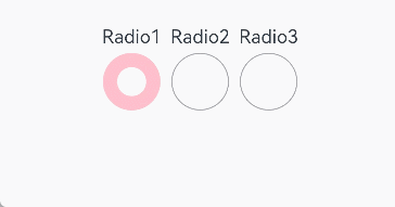
Example
// xxx.ets
@Entry
@Component
struct RadioExample {
  build() {
    Flex({ direction: FlexDirection.Row, justifyContent: FlexAlign.Center, alignItems: ItemAlign.Center }) {
      Column() {
        Text('Radio1')
        Radio({ value: 'Radio1', group: 'radioGroup' }).checked(true)
          .radioStyle({
            checkedBackgroundColor: Color.Pink
          })
          .height(50)
          .width(50)
          .onChange((isChecked: boolean) => {
            console.log('Radio1 status is ' + isChecked)
          })
      }
      Column() {
        Text('Radio2')
        Radio({ value: 'Radio2', group: 'radioGroup' }).checked(false)
          .radioStyle({
            checkedBackgroundColor: Color.Pink
          })
          .height(50)
          .width(50)
          .onChange((isChecked: boolean) => {
            console.log('Radio2 status is ' + isChecked)
          })
      }
      Column() {
        Text('Radio3')
        Radio({ value: 'Radio3', group: 'radioGroup' }).checked(false)
          .radioStyle({
            checkedBackgroundColor: Color.Pink
          })
          .height(50)
          .width(50)
          .onChange((isChecked: boolean) => {
            console.log('Radio3 status is ' + isChecked)
          })
      }
    }.padding({ top: 30 })
  }
}
你可能感兴趣的鸿蒙文章
harmony 鸿蒙ArkTS-based Declarative Development Paradigm
0
赞
- 所属分类: 后端技术
- 本文标签:
热门推荐
-
2、 优质文章
-
3、 gt
-
7、 openharmony
-
9、 golang
-
10、 Vue中input框自动聚焦