harmony 鸿蒙Rating
Rating
The <Rating> component provides a rating bar.
NOTE
This component is supported since API version 7. Updates will be marked with a superscript to indicate their earliest API version.
Child Components
Not supported
APIs
Rating(options?: { rating: number, indicator?: boolean })
Since API version 9, this API is supported in ArkTS widgets.
Parameters
| Name | Type | Mandatory | Description |
|---|---|---|---|
| rating | number | Yes | Value to rate. Default value: 0 Value range: [0, stars] A value less than 0 evaluates to the value 0. A value greater than the value of stars evaluates to the value of stars. Since API version 10, this parameter supports $$ for two-way binding of variables. |
| indicator | boolean | No | Whether the component is used only as an indicator and cannot be operated. Default value: false NOTE When indicator is set to true, the default component height is 12.0 vp, and the component width is calculated as follows: Height x Value of stars. When indicator is set to false, the default component height is 28.0 vp, and the component width is calculated as follows: Height x Value of stars. |
Attributes
| Name | Type | Description |
|---|---|---|
| stars | number | Total number of ratings. Default value: 5 Since API version 9, this API is supported in ArkTS widgets. NOTE A value less than or equal to 0 evaluates to the default value. |
| stepSize | number | Step of an operation. Default value: 0.5 Since API version 9, this API is supported in ArkTS widgets. NOTE A value less than 0.1 evaluates to the default value. Value range: [0.1, stars] |
| starStyle | { backgroundUri: string, foregroundUri: string, secondaryUri?: string } |
Star style. backgroundUri: image path for the unselected star. You can use the default system image or a custom image. foregroundUri: image path for the selected star. You can use the default system image or a custom image. secondaryUri: image path for the partially selected star. You can use the default system image or a custom image. Since API version 9, this API is supported in ArkTS widgets. NOTE For details about the image types supported by the startStyle attribute, see Image. Local and online images are supported, but not PixelMap and Resource objects. By default, the image is loaded in asynchronous mode. Synchronous loading is not supported. If this parameter is set to undefined or an empty string, the <Rating> component loads the default star image source. |
NOTE
The drawing area of each rating image is [width/stars, height], wherein width and height indicate the width and height of the <Rating> component, respectively.
To specify the drawing area as a square, you are advised to customize the width and height in this format: [height * stars, height], width = height * stars.
Events
| Name | Description |
|---|---|
| onChange(callback:(value: number) => void) | Triggered when the rating value changes. Since API version 9, this API is supported in ArkTS widgets. |
Example
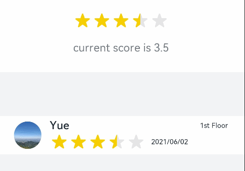
Example 1
// xxx.ets
@Entry
@Component
struct RatingExample {
  @State rating: number = 3.5

  build() {
    Column() {
      Column() {
        Rating({ rating: this.rating, indicator: false })
          .stars(5)
          .stepSize(0.5)
          .margin({ top: 24 })
          .onChange((value: number) => {
            this.rating = value
          })
        Text('current score is ' + this.rating)
          .fontSize(16)
          .fontColor('rgba(24,36,49,0.60)')
          .margin({ top: 16 })
      }.width(360).height(113).backgroundColor('#FFFFFF').margin({ top: 68 })

      Row() {
        Image('common/testImage.jpg')
          .width(40)
          .height(40)
          .borderRadius(20)
          .margin({ left: 24 })
        Column() {
          Text('Yue')
            .fontSize(16)
            .fontColor('#182431')
            .fontWeight(500)
          Row() {
            Rating({ rating: 3.5, indicator: false }).margin({ top: 1, right: 8 })
            Text('2021/06/02')
              .fontSize(10)
              .fontColor('#182431')
          }
        }.margin({ left: 12 }).alignItems(HorizontalAlign.Start)

        Text('1st Floor')
          .fontSize(10)
          .fontColor('#182431')
          .position({ x: 295, y: 8 })
      }.width(360).height(56).backgroundColor('#FFFFFF').margin({ top: 64 })
    }.width('100%').height('100%').backgroundColor('#F1F3F5')
  }
}
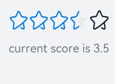
Example 2
// xxx.ets
@Entry
@Component
struct RatingExample {
  @State rating: number = 3.5

  build() {
    Column() {
      Rating({ rating: this.rating, indicator: false })
        .stars(5)
        .stepSize(0.5)
        .starStyle({
          backgroundUri: '/common/imag1.png', // The common folder is at the same level as pages.
          foregroundUri: '/common/imag2.png',
          secondaryUri: '/common/imag3.png'
        })
        .margin({ top: 24 })
        .onChange((value: number) => {
          this.rating = value
        })
      Text('current score is ' + this.rating)
        .fontSize(16)
        .fontColor('rgba(24,36,49,0.60)')
        .margin({ top: 16 })
    }.width('100%').height('100%').backgroundColor('#F1F3F5')
  }
}
你可能感兴趣的鸿蒙文章
harmony 鸿蒙ArkTS-based Declarative Development Paradigm
0
赞
- 所属分类: 后端技术
- 本文标签:
热门推荐
-
2、 优质文章
-
3、 gt
-
7、 openharmony
-
9、 golang
-
10、 Vue中input框自动聚焦