harmony 鸿蒙基础自定义弹出框 (CustomDialog)(不推荐)
基础自定义弹出框 (CustomDialog)(不推荐)
CustomDialog是自定义弹出框,可用于广告、中奖、警告、软件更新等与用户交互响应操作。开发者可以通过CustomDialogController类显示自定义弹出框。具体用法请参考自定义弹出框。
说明:
当前,ArkUI弹出框默认为非页面级弹出框,在页面路由跳转时,如果开发者未调用close方法将其关闭,弹出框将不会自动关闭。若需实现在跳转页面时覆盖弹出框的场景,可以使用组件导航子页面显示类型的弹窗类型或者页面级弹出框。
默认为模态弹窗且有蒙层,不可与蒙层下方控件进行交互(不支持点击和手势等向下透传)。可以通过配置isModal来实现模态和非模态弹窗,详细说明可参考弹窗的种类。
当isModal为true时,弹出框为模态弹窗,且弹窗周围的蒙层区不支持透传。isModal为false时,弹出框为非模态弹窗,且弹窗周围的蒙层区可以透传。因此如果需要同时允许弹出框的交互和弹出框外页面的交互行为,需要将弹出框设置为非模态。
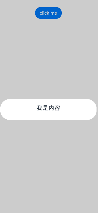
创建自定义弹出框
- 使用\@CustomDialog装饰器装饰自定义弹出框,可在此装饰器内自定义弹出框内容。CustomDialogController需在@Component内定义。
   @CustomDialog
   struct CustomDialogExample {
     controller: CustomDialogController

     build() {
       Column() {
         Text('我是内容')
           .fontSize(20)
       }.height(60).justifyContent(FlexAlign.Center)
     }
   }
- 创建构造器,与装饰器呼应相连。
    @Entry
    @Component
    struct CustomDialogUser {
      dialogController: CustomDialogController = new CustomDialogController({
        builder: CustomDialogExample(),
      })
    }
- 点击与onClick事件绑定的组件使弹出框弹出。
   @Entry
   @Component
   struct CustomDialogUser {
     dialogController: CustomDialogController = new CustomDialogController({
       builder: CustomDialogExample(),
     })

     build() {
       Column() {
         Button('click me')
           .onClick(() => {
             this.dialogController.open();
           })
       }.width('100%').margin({ top: 5 })
     }
   }
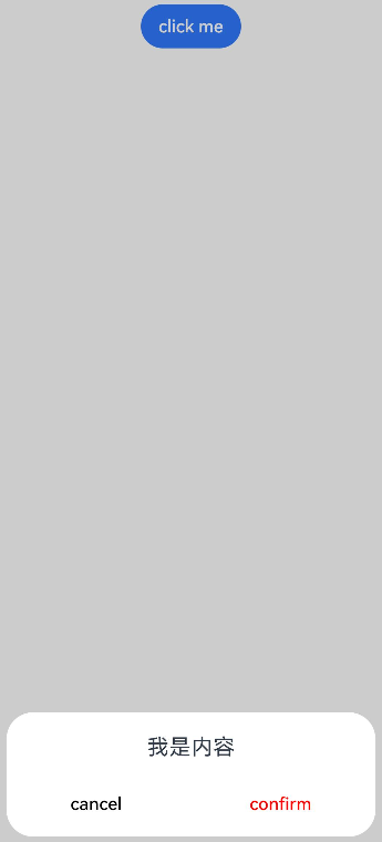
弹出框的交互
弹出框可用于数据交互,完成用户一系列响应操作。
- 在\@CustomDialog装饰器内添加按钮和数据函数。
   @CustomDialog
   struct CustomDialogExample {
     cancel: () => void = () => {
     }
     confirm: () => void = () => {
     }
     controller: CustomDialogController;

     build() {
       Column() {
         Text('我是内容').fontSize(20).margin({ top: 10, bottom: 10 })
         Flex({ justifyContent: FlexAlign.SpaceAround }) {
           Button('cancel')
             .onClick(() => {
               this.controller.close();
               if (this.cancel) {
                 this.cancel();
               }
             }).backgroundColor(0xffffff).fontColor(Color.Black)
           Button('confirm')
             .onClick(() => {
               this.controller.close();
               if (this.confirm) {
                 this.confirm();
               }
             }).backgroundColor(0xffffff).fontColor(Color.Red)
         }.margin({ bottom: 10 })
       }
     }
   }
- 页面内需要在构造器内进行接收,同时创建相应的函数操作。
   @Entry
   @Component
   struct CustomDialogUser {
     dialogController: CustomDialogController = new CustomDialogController({
       builder: CustomDialogExample({
         cancel: ()=> { this.onCancel() },
         confirm: ()=> { this.onAccept() },
       }),
     });

     onCancel() {
       console.info('Callback when the first button is clicked');
     }

     onAccept() {
       console.info('Callback when the second button is clicked');
     }

     build() {
       Column() {
         Button('click me')
           .onClick(() => {
             this.dialogController.open();
           })
       }.width('100%').margin({ top: 5 })
     }
   }
3.可通过弹出框中的按钮实现路由跳转,同时获取跳转页面向当前页传入的参数。
   // Index.ets
   @CustomDialog
   struct CustomDialogExample {
     @Link textValue: string;
     controller?: CustomDialogController;
     cancel: () => void = () => {
     }
     confirm: () => void = () => {
     }

     build() {
       Column({ space: 20 }) {
         if (this.textValue != '') {
           Text(`第二个页面的内容为:${this.textValue}`)
             .fontSize(20)
         } else {
           Text('是否获取第二个页面的内容')
             .fontSize(20)
         }
         Flex({ justifyContent: FlexAlign.SpaceAround }) {
           Button('cancel')
             .onClick(() => {
               if (this.controller != undefined) {
                 this.controller.close();
                 this.cancel();
               }
             }).backgroundColor(0xffffff).fontColor(Color.Black)
           Button('confirm')
             .onClick(() => {
               if (this.controller != undefined && this.textValue != '') {
                 this.controller.close();
               } else if (this.controller != undefined) {
                 this.getUIContext().getRouter().pushUrl({
                   url: 'pages/Index2'
                 });
                 this.controller.close();
               }
             }).backgroundColor(0xffffff).fontColor(Color.Red)
         }.margin({ bottom: 10 })
       }.borderRadius(10).padding({ top: 20 })
     }
   }

   @Entry
   @Component
   struct CustomDialogUser {
     @State textValue: string = '';
     dialogController: CustomDialogController|null = new CustomDialogController({
       builder: CustomDialogExample({
         cancel: () => {
           this.onCancel()
         },
         confirm: () => {
           this.onAccept()
         },
         textValue: this.textValue
       })
     });

     // 在自定义组件即将析构销毁时将dialogController置空
     aboutToDisappear() {
       this.dialogController = null; // 将dialogController置空
     }

     onPageShow() {
       const params = this.getUIContext().getRouter().getParams() as Record<string, string>; // 获取传递过来的参数对象
       if (params) {
         this.dialogController?.open();
         this.textValue = params.info as string; // 获取info属性的值
       }
     }

     onCancel() {
       console.info('Callback when the first button is clicked');
     }

     onAccept() {
       console.info('Callback when the second button is clicked');
     }

     exitApp() {
       console.info('Click the callback in the blank area');
     }

     build() {
       Column() {
         Button('click me')
           .onClick(() => {
             if (this.dialogController != null) {
               this.dialogController.open();
             }
           }).backgroundColor(0x317aff)
       }.width('100%').margin({ top: 5 })
     }
   }
   // Index2.ets
   @Entry
   @Component
   struct Index2 {
     @State message: string = '点击返回';

     build() {
       Column() {
         Button(this.message)
           .type(ButtonType.Capsule)
           .onClick(() => {
              this.getUIContext().getRouter().back({
                url: 'pages/Index',
                params: {
                info: 'Hello World'
              }
           });
         })
       }.width('100%').height('100%').margin({ top: 20 })
     }
   }
弹出框的动画
弹出框通过定义openAnimation控制弹出框出现动画的持续时间,速度等参数。
@CustomDialog
struct CustomDialogExample {
  controller?: CustomDialogController;

  build() {
    Column() {
      Text('Whether to change a text?').fontSize(16).margin({ bottom: 10 })
    }
  }
}

@Entry
@Component
struct CustomDialogUser {
  @State textValue: string = '';
  @State inputValue: string = 'click me';
  dialogController: CustomDialogController|null = new CustomDialogController({
    builder: CustomDialogExample(),
    openAnimation: {
      duration: 1200,
      curve: Curve.Friction,
      delay: 500,
      playMode: PlayMode.Alternate,
      onFinish: () => {
        console.info('play end')
      }
    },
    autoCancel: true,
    alignment: DialogAlignment.Bottom,
    offset: { dx: 0, dy: -20 },
    gridCount: 4,
    customStyle: false,
    backgroundColor: 0xd9ffffff,
    cornerRadius: 10,
  });

  // 在自定义组件即将析构销毁时将dialogController置空
  aboutToDisappear() {
    this.dialogController = null; // 将dialogController置空
  }

  build() {
    Column() {
      Button(this.inputValue)
        .onClick(() => {
          if (this.dialogController != null) {
            this.dialogController.open();
          }
        }).backgroundColor(0x317aff)
    }.width('100%').margin({ top: 5 })
  }
}
弹出框的样式
通过定义弹出框的宽度、高度、背景色、阴影等参数,控制其样式。
@CustomDialog
struct CustomDialogExample {
  controller?: CustomDialogController;

  build() {
    Column() {
      Text('我是内容').fontSize(16).margin({ bottom: 10 })
    }
  }
}

@Entry
@Component
struct CustomDialogUser {
  @State textValue: string = '';
  @State inputValue: string = 'click me';
  dialogController: CustomDialogController|null = new CustomDialogController({
    builder: CustomDialogExample(),
    autoCancel: true,
    alignment: DialogAlignment.Center,
    offset: { dx: 0, dy: -20 },
    gridCount: 4,
    customStyle: false,
    backgroundColor: 0xd9ffffff,
    cornerRadius: 20,
    width: '80%',
    height: '100px',
    borderWidth: 1,
    borderStyle: BorderStyle.Dashed,//使用borderStyle属性,需要和borderWidth属性一起使用
    borderColor: Color.Blue,//使用borderColor属性,需要和borderWidth属性一起使用
    shadow: ({ radius: 20, color: Color.Grey, offsetX: 50, offsetY: 0}),
  });

  // 在自定义组件即将析构销毁时将dialogController置空
  aboutToDisappear() {
    this.dialogController = null; // 将dialogController置空
  }

  build() {
    Column() {
      Button(this.inputValue)
        .onClick(() => {
          if (this.dialogController != null) {
            this.dialogController.open();
          }
        }).backgroundColor(0x317aff)
    }.width('100%').margin({ top: 5 })
  }
}
嵌套自定义弹出框
通过第一个弹出框打开第二个弹出框时,最好将第二个弹出框定义在第一个弹出框的父组件处,通过父组件传给第一个弹出框的回调来打开第二个弹出框。
@CustomDialog
struct CustomDialogExampleTwo {
  controllerTwo?: CustomDialogController;
  @State message: string = "I'm the second dialog box.";
  @State showIf: boolean = false;

  build() {
    Column() {
      if (this.showIf) {
        Text("Text")
          .fontSize(30)
          .height(100)
      }
      Text(this.message)
        .fontSize(30)
        .height(100)
      Button("Create Text")
        .onClick(() => {
          this.showIf = true;
        })
      Button('Close Second Dialog Box')
        .onClick(() => {
          if (this.controllerTwo != undefined) {
            this.controllerTwo.close();
          }
        })
        .margin(20)
    }
  }
}

@CustomDialog
struct CustomDialogExample {
  openSecondBox?: () => void
  controller?: CustomDialogController

  build() {
    Column() {
      Button('Open Second Dialog Box and close this box')
        .onClick(() => {
          this.controller!.close();
          this.openSecondBox!();
        })
        .margin(20)
    }.borderRadius(10)
  }
}

@Entry
@Component
struct CustomDialogUser {
  @State inputValue: string = 'Click Me';
  dialogController: CustomDialogController|null = new CustomDialogController({
    builder: CustomDialogExample({
      openSecondBox: () => {
        if (this.dialogControllerTwo != null) {
          this.dialogControllerTwo.open()
        }
      }
    }),
    cancel: this.exitApp,
    autoCancel: true,
    alignment: DialogAlignment.Bottom,
    offset: { dx: 0, dy: -20 },
    gridCount: 4,
    customStyle: false
  });
  dialogControllerTwo: CustomDialogController|null = new CustomDialogController({
    builder: CustomDialogExampleTwo(),
    alignment: DialogAlignment.Bottom,
    offset: { dx: 0, dy: -25 }
  });

  aboutToDisappear() {
    this.dialogController = null;
    this.dialogControllerTwo = null;
  }

  onCancel() {
    console.info('Callback when the first button is clicked');
  }

  onAccept() {
    console.info('Callback when the second button is clicked');
  }

  exitApp() {
    console.info('Click the callback in the blank area');
  }

  build() {
    Column() {
      Button(this.inputValue)
        .onClick(() => {
          if (this.dialogController != null) {
            this.dialogController.open();
          }
        }).backgroundColor(0x317aff)
    }.width('100%').margin({ top: 5 })
  }
}
由于自定义弹出框在状态管理侧有父子关系,如果将第二个弹出框定义在第一个弹出框内,那么当父组件(第一个弹出框)被销毁(关闭)时,子组件(第二个弹出框)内无法再继续创建新的组件。
实现弹出框的物理返回拦截
执行点击遮障层关闭、侧滑(左滑或右滑)、三键Back、键盘ESC关闭等交互操作时,如果注册了onWillDismiss回调函数,弹出框不会立即关闭。在回调函数中,通过reason获取阻拦关闭弹出框的操作类型,根据原因决定是否关闭弹出框。
@CustomDialog
struct CustomDialogExample {
  cancel: () => void = () => {
  }
  confirm: () => void = () => {
  }
  controller?: CustomDialogController;

  build() {
    Column() {
      Text('Are you sure?')
        .fontSize(20)
        .margin({
          top: 10,
          bottom: 10
        })
      Row() {
        Button('cancel')
          .onClick(() => {
            if (this.controller != undefined) {
              this.controller.close();
            }
          })
          .backgroundColor(0xffffff)
          .fontColor(Color.Black)
        Button('confirm')
          .onClick(() => {
            if (this.controller != undefined) {
              this.controller.close();
            }
          })
          .backgroundColor(0xffffff)
          .fontColor(Color.Red)
      }
      .width('100%')
      .justifyContent(FlexAlign.SpaceAround)
      .margin({ bottom: 10 })
    }
  }
}

@Entry
@Component
struct InterceptCustomDialog {
  dialogController: CustomDialogController = new CustomDialogController({
    builder: CustomDialogExample({
      cancel: () => {
        this.onCancel();
      },
      confirm: () => {
        this.onAccept();
      }
    }),
    onWillDismiss: (dismissDialogAction: DismissDialogAction) => {
      console.log('dialog onWillDismiss reason: ' + dismissDialogAction.reason);
      // 1、PRESS_BACK    点击三键back、侧滑(左滑/右滑)、键盘ESC。
      // 2、TOUCH_OUTSIDE    点击遮障层时
      // 3、CLOSE_BUTTON    点击关闭按钮
      if (dismissDialogAction.reason === DismissReason.PRESS_BACK) {
        // 处理业务逻辑后通过dismiss主动关闭对话框
        // dismissDialogAction.dismiss();
      }
      if (dismissDialogAction.reason === DismissReason.TOUCH_OUTSIDE) {
        // dismissDialogAction.dismiss();
      }
    },
    alignment: DialogAlignment.Bottom,
    offset: { dx: 0, dy: -20 }
  })

  onCancel() {
    console.info('Callback when the first button is clicked');
  }

  onAccept() {
    console.info('Callback when the second button is clicked');
  }

  build() {
    Column() {
      Button('click me')
        .onClick(() => {
          this.dialogController.open();
        })
    }
    .width('100%')
  }
}

设置弹出框避让软键盘的距离
为显示弹出框的独立性,弹出框弹出时会与周边进行避让,包括状态栏、导航条以及键盘等留有间距。故当软键盘弹出时,默认情况下,弹出框会自动避开软键盘,并与之保持16vp的距离。开发者可以利用CustomDialogControllerOptions中的keyboardAvoidMode和keyboardAvoidDistance这两个配置项,来设置弹出框在软键盘弹出时的行为,包括是否需要避开软键盘以及与软键盘之间的距离。 设置软键盘间距时,需要将keyboardAvoidMode值设为KeyboardAvoidMode.DEFAULT。
// xxx.ets
import { LengthMetrics } from '@kit.ArkUI'

@CustomDialog
struct CustomDialogExample {
  controller?: CustomDialogController;
  build() {
    Column() {
      Column() {
        Text('keyboardAvoidDistance: 0vp')
          .fontSize(20)
          .margin({ bottom: 36 })
        TextInput({ placeholder: '' })
      }.backgroundColor('#FFF0F0F0')
    }
  }
}

@Entry
@Component
struct Index {
  dialogController: CustomDialogController|null = new CustomDialogController({
    builder: CustomDialogExample({
    }),
    autoCancel: true,
    gridCount: 4,
    showInSubWindow: true,
    isModal: true,
    customStyle: false,
    cornerRadius: 30,
    alignment:DialogAlignment.Bottom,
    keyboardAvoidMode: KeyboardAvoidMode.DEFAULT, // 软键盘弹出时,弹出框自动避让
    keyboardAvoidDistance: LengthMetrics.vp(0) // 软键盘弹出时与弹出框的距离为0vp
  })

  build() {
    Row() {
      Row({ space: 20 }) {
        Text('打开弹窗')
          .fontSize(30)
          .onClick(() => {
            if (this.dialogController != null) {
              this.dialogController.open();
            }
          })
      }
      .width('100%')
    }
    .height('100%')
  }
}
相关实例
针对自定义弹出框开发,有以下相关实例可供参考:
你可能感兴趣的鸿蒙文章
- 所属分类: 后端技术
- 本文标签:
热门推荐
-
2、 优质文章
-
3、 gt
-
7、 openharmony
-
9、 golang
-
10、 Vue中input框自动聚焦