harmony 鸿蒙自定义弹窗 (CustomDialog)
自定义弹窗 (CustomDialog)
通过CustomDialogController类显示自定义弹窗。使用弹窗组件时,优先考虑自定义弹窗,便于弹窗样式与内容的自定义。
说明:
从API version 7开始支持。后续版本如有新增内容,则采用上角标单独标记该内容的起始版本。
接口
constructor(value: CustomDialogControllerOptions)
配置自定义弹窗的参数。
说明:
自定义弹窗的所有参数,不支持动态刷新。
原子化服务API: 从API version 11开始,该接口支持在原子化服务中使用。
系统能力: SystemCapability.ArkUI.ArkUI.Full
参数:
| 参数名 | 类型 | 必填 | 说明 |
|---|---|---|---|
| value | CustomDialogControllerOptions | 是 | 配置自定义弹窗的参数。 |
CustomDialogControllerOptions对象说明
系统能力: SystemCapability.ArkUI.ArkUI.Full
| 名称 | 类型 | 必填 | 说明 |
|---|---|---|---|
| builder | CustomDialog | 是 | 自定义弹窗内容构造器。 说明: 若builder构造器使用回调函数作为入参,请注意使用this绑定问题,如builder: custombuilder({ callback: ()=> {…}})。 若在builder中监听数据变化可以使用@Link或@Consume,而其他方式如@Prop、@ObjectLink不适用此场景。 原子化服务API: 从API version 11开始,该接口支持在原子化服务中使用。 |
| cancel | () => void | 否 | 返回、ESC键和点击遮障层弹窗退出时的回调。 原子化服务API: 从API version 11开始,该接口支持在原子化服务中使用。 |
| autoCancel | boolean | 否 | 是否允许点击遮障层退出,true表示关闭弹窗。false表示不关闭弹窗。 默认值:true 原子化服务API: 从API version 11开始,该接口支持在原子化服务中使用。 |
| alignment | DialogAlignment | 否 | 弹窗在竖直方向上的对齐方式。 默认值:DialogAlignment.Default 原子化服务API: 从API version 11开始,该接口支持在原子化服务中使用。 |
| offset | Offset | 否 | 弹窗相对alignment所在位置的偏移量。 默认值:{ dx: 0, dy: 0 } 原子化服务API: 从API version 11开始,该接口支持在原子化服务中使用。 |
| customStyle | boolean | 否 | 弹窗容器样式是否自定义。值为true表示弹窗容器样式不能自定义,值为false表示弹窗样式可以自定义。 设置false时(默认值): 1、圆角为32vp。 2、未设置弹窗宽度高度:弹窗容器的宽度根据栅格系统自适应。高度自适应自定义的内容节点。 3、设置弹窗宽度高度:弹窗容器的宽度不超过默认样式下的最大宽度(自定义节点设置100%的宽度),弹窗容器的高度不超过默认样式下的最大高度(自定义节点设置100%的高度)。 设置为true: 1、圆角为0,弹窗背景色为透明色。 2、不支持设置弹窗宽度、高度、边框宽度、边框样式、边框颜色以及阴影宽度。 原子化服务API: 从API version 11开始,该接口支持在原子化服务中使用。 |
| gridCount8+ | number | 否 | 弹窗宽度占栅格宽度的个数。 默认为按照窗口大小自适应,异常值按默认值处理,最大栅格数为系统最大栅格数。 取值范围:大于等于0的整数。 原子化服务API: 从API version 11开始,该接口支持在原子化服务中使用。 |
| maskColor10+ | ResourceColor | 否 | 自定义蒙层颜色。 默认值:0x33000000 原子化服务API: 从API version 11开始,该接口支持在原子化服务中使用。 |
| maskRect10+ | Rectangle | 否 | 弹窗遮蔽层区域,在遮蔽层区域内的事件不透传,在遮蔽层区域外的事件透传。 默认值:{ x: 0, y: 0, width: ‘100%’, height: ‘100%’ } 说明: showInSubWindow为true时,maskRect不生效。 原子化服务API: 从API version 11开始,该接口支持在原子化服务中使用。 |
| openAnimation10+ | AnimateParam | 否 | 自定义设置弹窗弹出的动画效果相关参数。 说明: tempo默认值为1,当设置小于等于0的值时按默认值处理。 iterations默认值为1,默认播放一次,设置为其他数值时按默认值处理。 playMode控制动画播放模式,默认值为PlayMode.Normal,设置为其他数值时按照默认值处理。 原子化服务API: 从API version 11开始,该接口支持在原子化服务中使用。 |
| closeAnimation10+ | AnimateParam | 否 | 自定义设置弹窗关闭的动画效果相关参数。 说明: tempo默认值为1,当设置小于等于0的值时按默认值处理。 iterations默认值为1,默认播放一次,设置为其他数值时按默认值处理。 playMode控制动画播放模式,默认值为PlayMode.Normal,设置为其他数值时按照默认值处理。 页面转场切换时,建议使用默认关闭动效。 原子化服务API: 从API version 11开始,该接口支持在原子化服务中使用。 |
| showInSubWindow10+ | boolean | 否 | 某弹框需要显示在主窗口之外时,是否在子窗口显示此弹窗。值为true表示在子窗口显示弹窗。 默认值:false,弹窗显示在应用内,而非独立子窗口。 说明:showInSubWindow为true的弹窗无法触发显示另一个showInSubWindow为true的弹窗。不建议在showInSubWindow为true的弹窗中使用CalendarPicker、CalendarPickerDialog、DatePickerDialog、TextPickerDialog、TimePickerDialog、Toast组件,弹窗会影响上述组件行为。 原子化服务API: 从API version 11开始,该接口支持在原子化服务中使用。 |
| backgroundColor10+ | ResourceColor | 否 | 设置弹窗背板填充。 默认值:Color.Transparent 说明: 如果同时设置了内容构造器的背景色,则backgroundColor会被内容构造器的背景色覆盖。 backgroundColor会与模糊属性backgroundBlurStyle叠加产生效果,如果不符合预期,可将backgroundBlurStyle设置为BlurStyle.NONE,即可取消模糊。 原子化服务API: 从API version 11开始,该接口支持在原子化服务中使用。 |
| cornerRadius10+ | Dimension | BorderRadiuses | 否 | 设置背板的圆角半径。 可分别设置4个圆角的半径。 默认值:{ topLeft: ‘32vp’, topRight: ‘32vp’, bottomLeft: ‘32vp’, bottomRight: ‘32vp’ } 说明:自定义弹窗默认的背板圆角半径为32vp,如果需要使用cornerRadius属性,请和borderRadius属性一起使用。 原子化服务API: 从API version 11开始,该接口支持在原子化服务中使用。 |
| isModal11+ | boolean | 否 | 弹窗是否为模态窗口。值为true表示为模态窗口且有蒙层,不可与弹窗周围其他控件进行交互,即蒙层区域无法事件透传。值为false表示为非模态窗口且无蒙层,可以与弹窗周围其他控件进行交互。 默认值:true 原子化服务API: 从API version 12开始,该接口支持在原子化服务中使用。 |
| onWillDismiss12+ | Callback<DismissDialogAction> | 否 | 交互式关闭回调函数。 说明: 1.当用户执行点击遮障层关闭、侧滑(左滑/右滑)、三键back、键盘ESC关闭交互操作时,如果注册该回调函数,则不会立刻关闭弹窗。在回调函数中可以通过reason得到阻拦关闭弹窗的操作类型,从而根据原因选择是否能关闭弹窗。当前组件返回的reason中,暂不支持CLOSE_BUTTON的枚举值。 2.在onWillDismiss回调中,不能再做onWillDismiss拦截。 原子化服务API: 从API version 12开始,该接口支持在原子化服务中使用。 |
| borderWidth12+ | Dimension | EdgeWidths | 否 | 设置弹窗背板的边框宽度。 可分别设置4个边框宽度。 默认值:0。 百分比参数方式:以父元素弹窗宽的百分比来设置弹窗的边框宽度。 当弹窗左边框和右边框大于弹窗宽度,弹窗上边框和下边框大于弹窗高度,显示可能不符合预期。 原子化服务API: 从API version 12开始,该接口支持在原子化服务中使用。 |
| borderColor12+ | ResourceColor | EdgeColors | 否 | 设置弹窗背板的边框颜色。 默认值:Color.Black 如果使用borderColor属性,需要和borderWidth属性一起使用。 原子化服务API: 从API version 12开始,该接口支持在原子化服务中使用。 |
| borderStyle12+ | BorderStyle | EdgeStyles | 否 | 设置弹窗背板的边框样式。 默认值:BorderStyle.Solid 如果使用borderStyle属性,需要和borderWidth属性一起使用。 原子化服务API: 从API version 12开始,该接口支持在原子化服务中使用。 |
| width12+ | Dimension | 否 | 设置弹窗背板的宽度。 说明: - 弹窗宽度默认最大值:400vp。 - 百分比参数方式:弹窗参考宽度为所在窗口的宽度,在此基础上调小或调大。 原子化服务API: 从API version 12开始,该接口支持在原子化服务中使用。 |
| height12+ | Dimension | 否 | 设置弹窗背板的高度。 说明: - 弹窗高度默认最大值:0.9 *(窗口高度 - 安全区域)。 - 百分比参数方式:弹窗参考高度为(窗口高度 - 安全区域),在此基础上调小或调大。 原子化服务API: 从API version 12开始,该接口支持在原子化服务中使用。 |
| shadow12+ | ShadowOptions | ShadowStyle | 否 | 设置弹窗背板的阴影。 当设备为2in1时,默认场景下获焦阴影值为ShadowStyle.OUTER_FLOATING_MD,失焦为ShadowStyle.OUTER_FLOATING_SM。其他设备默认无阴影。 原子化服务API: 从API version 12开始,该接口支持在原子化服务中使用。 |
| backgroundBlurStyle12+ | BlurStyle | 否 | 弹窗背板模糊材质。 默认值:BlurStyle.COMPONENT_ULTRA_THICK 说明: 设置为BlurStyle.NONE即可关闭背景虚化。当设置了backgroundBlurStyle为非NONE值时,则不要设置backgroundColor,否则颜色显示将不符合预期效果。 原子化服务API: 从API version 12开始,该接口支持在原子化服务中使用。 |
| backgroundBlurStyleOptions19+ | BackgroundBlurStyleOptions | 否 | 背景模糊效果。默认值请参考BackgroundBlurStyleOptions类型说明。 原子化服务API: 从API version 19开始,该接口支持在原子化服务中使用。 |
| backgroundEffect19+ | BackgroundEffectOptions | 否 | 背景效果参数。默认值请参考BackgroundEffectOptions类型说明。 原子化服务API: 从API version 19开始,该接口支持在原子化服务中使用。 |
| keyboardAvoidMode12+ | KeyboardAvoidMode | 否 | 用于设置弹窗是否在拉起软键盘时进行自动避让。 默认值:KeyboardAvoidMode.DEFAULT 原子化服务API: 从API version 12开始,该接口支持在原子化服务中使用。 |
| enableHoverMode14+ | boolean | 否 | 是否响应悬停态,值为true时,响应悬停态。 默认值:false,默认不响应。 原子化服务API: 从API version 14开始,该接口支持在原子化服务中使用。 |
| hoverModeArea14+ | HoverModeAreaType | 否 | 悬停态下弹窗默认展示区域。 默认值:HoverModeAreaType.BOTTOM_SCREEN。 原子化服务API: 从API version 14开始,该接口支持在原子化服务中使用。 |
| onWillAppear19+ | Callback<void> | 否 | 弹窗显示动效前的事件回调。 说明: 1.正常时序依次为:onWillAppear>>onDidAppear>>onWillDisappear>>onDidDisappear。 2.在onWillAppear内设置改变弹窗显示效果的回调事件,二次弹出生效。 原子化服务API: 从API version 19开始,该接口支持在原子化服务中使用。 |
| onDidAppear19+ | Callback<void> | 否 | 弹窗弹出时的事件回调。 说明: 1.正常时序依次为:onWillAppear>>onDidAppear>>onWillDisappear>>onDidDisappear。 2.在onDidAppear内设置改变弹窗显示效果的回调事件,二次弹出生效。 3.快速点击弹出,关闭弹窗时,onWillDisappear在onDidAppear前生效。 4.弹窗入场动效未完成时彻底关闭弹窗,动效打断,onDidAppear不会触发。 原子化服务API: 从API version 19开始,该接口支持在原子化服务中使用。 |
| onWillDisappear19+ | Callback<void> | 否 | 弹窗退出动效前的事件回调。 说明: 1.正常时序依次为:onWillAppear>>onDidAppear>>onWillDisappear>>onDidDisappear。 原子化服务API: 从API version 19开始,该接口支持在原子化服务中使用。 |
| onDidDisappear19+ | Callback<void> | 否 | 弹窗消失时的事件回调。 说明: 1.正常时序依次为:onWillAppear>>onDidAppear>>onWillDisappear>>onDidDisappear。 原子化服务API: 从API version 19开始,该接口支持在原子化服务中使用。 |
| keyboardAvoidDistance15+ | LengthMetrics | 否 | 弹窗避让键盘后,和键盘之间的距离。 说明: - 默认值:16vp。 - 默认单位:vp。 - 当且仅当keyboardAvoidMode属性设置为DEFAULT时生效。 原子化服务API: 从API version 15开始,该接口支持在原子化服务中使用。 |
| levelMode15+ | LevelMode | 否 | 设置弹窗显示层级。 说明: - 默认值:LevelMode.OVERLAY。 - 当且仅当showInSubWindow属性设置为false时生效。 原子化服务API: 从API version 15开始,该接口支持在原子化服务中使用。 |
| levelUniqueId15+ | number | 否 | 设置页面级弹窗需要显示的层级下的节点 uniqueId。 取值范围:大于等于0的数字。 说明: - 当且仅当levelMode属性设置为LevelMode.EMBEDDED时生效。 原子化服务API: 从API version 15开始,该接口支持在原子化服务中使用。 |
| immersiveMode15+ | ImmersiveMode | 否 | 设置页面内弹窗蒙层效果。 说明: - 默认值:ImmersiveMode.DEFAULT - 当且仅当levelMode属性设置为LevelMode.EMBEDDED时生效。 原子化服务API: 从API version 15开始,该接口支持在原子化服务中使用。 |
| levelOrder18+ | LevelOrder | 否 | 设置弹窗显示的顺序。 说明: - 默认值:LevelOrder.clamp(0) - 不支持动态刷新顺序。 原子化服务API: 从API version 18开始,该接口支持在原子化服务中使用。 |
| focusable19+ | boolean | 否 | 设置弹窗是否获取焦点。值为true表示获取焦点,值为false表示不获取焦点。 默认值:true 说明: 只有弹出覆盖在当前窗口之上的弹窗才可以获取焦点。 原子化服务API: 从API version 19开始,该接口支持在原子化服务中使用。 |
说明:
- 按下返回键和ESC键时会让弹窗退出。
- 弹窗在避让软键盘时到达极限高度之后会压缩高度。 需要注意:高度压缩生效在外层容器上,如果容器根节点中的子组件设置了较大的固定高度,由于容器默认不裁剪,依然可能存在超出屏幕显示的情况。
- 自定义弹窗仅适用于简单提示场景,不能替代页面使用。弹窗避让软键盘时,与软键盘之间存在16vp的安全间距。
- 为了达成良好的视觉体验,弹窗的显示和关闭存在默认动画,动画时长不同设备间可能存在差异。 需要注意:在动画播放过程中,页面不响应触摸、滑动、点击操作。关闭默认弹窗动画效果可设置openAnimation和closeAnimation的duration为0。
- 当前,ArkUI弹出框默认为非页面级弹出框,在页面路由跳转时,如果开发者未调用close方法将其关闭,弹出框将不会自动关闭。若需实现在跳转页面时覆盖弹出框的场景,可以使用组件导航子页面显示类型的弹窗类型或者页面级弹出框。
- customStyle为true时,弹窗显示区域为屏幕;为false时,受安全区域的影响,弹窗显示区域将排除安全区域。
DismissDialogAction12+
Dialog关闭的信息。
原子化服务API: 从API version 12开始,该接口支持在原子化服务中使用。
系统能力: SystemCapability.ArkUI.ArkUI.Full
属性
| 名称 | 类型 | 可读 | 可写 | 说明 |
|---|---|---|---|---|
| dismiss | Callback<void> | 否 | 否 | Dialog关闭回调函数。开发者需要退出时调用,不需要退出时无需调用。 |
| reason | DismissReason | 否 | 否 | Dialog无法关闭原因。根据开发者需要选择不同操作下,Dialog是否需要关闭。 |
CustomDialogController
原子化服务API: 从API version 11开始,该接口支持在原子化服务中使用。
导入对象
dialogController : CustomDialogController|null = new CustomDialogController(CustomDialogControllerOptions)
说明:
CustomDialogController仅在作为@CustomDialog和@Component struct成员变量,且在@Component struct内部定义时赋值才有效,具体用法可参考下方示例。
若尝试在CustomDialog中传入多个其他的Controller,以实现在CustomDialog中打开另一个或另一些CustomDialog,那么此处需要将指向自己的controller放在所有controller的后面。详细用法可参考示例1弹出嵌套弹窗。
constructor
constructor(value: CustomDialogControllerOptions)
自定义弹窗的构造器。
原子化服务API: 从API version 11开始,该接口支持在原子化服务中使用。
系统能力: SystemCapability.ArkUI.ArkUI.Full
参数:
| 参数名 | 类型 | 必填 | 说明 |
|---|---|---|---|
| value | CustomDialogControllerOptions | 是 | 配置自定义弹窗的参数。 |
open
open()
显示自定义弹窗内容,允许多次使用,但如果弹框为SubWindow模式,则该弹框不允许再弹出SubWindow弹框。
原子化服务API: 从API version 11开始,该接口支持在原子化服务中使用。
系统能力: SystemCapability.ArkUI.ArkUI.Full
close
close()
原子化服务API: 从API version 11开始,该接口支持在原子化服务中使用。
系统能力: SystemCapability.ArkUI.ArkUI.Full
关闭显示的自定义弹窗,若已关闭,则不生效。
getState20+
getState(): PromptActionCommonState
获取自定义弹窗的状态。
原子化服务API: 从API version 20开始,该接口支持在原子化服务中使用。
系统能力: SystemCapability.ArkUI.ArkUI.Full
返回值:
| 类型 | 说明 |
|---|---|
| PromptActionCommonState | 返回对应的弹窗状态。 |
PromptActionCommonState20+
type PromptActionCommonState = promptAction.CommonState
自定义弹窗的状态。
原子化服务API: 从API version 20开始,该接口支持在原子化服务中使用。
系统能力: SystemCapability.ArkUI.ArkUI.Full
| 类型 | 说明 |
|---|---|
| promptAction.CommonState | 返回对应的弹窗状态。 |
示例
示例1(弹出嵌套弹窗)
该示例实现了在CustomDialog中打开另一个或另一些CustomDialog。
// xxx.ets
@CustomDialog
struct CustomDialogExampleTwo {
controllerTwo?: CustomDialogController;
build() {
Column() {
Text('我是第二个弹窗')
.fontSize(30)
.height(100)
Button('点我关闭第二个弹窗')
.onClick(() => {
if (this.controllerTwo != undefined) {
this.controllerTwo.close();
}
})
.margin(20)
}
}
}
@CustomDialog
@Component
struct CustomDialogExample {
@Link textValue: string;
@Link inputValue: string;
dialogControllerTwo: CustomDialogController|null = new CustomDialogController({
builder: CustomDialogExampleTwo(),
alignment: DialogAlignment.Bottom,
onWillDismiss:(dismissDialogAction: DismissDialogAction)=> {
console.info("reason=" + JSON.stringify(dismissDialogAction.reason));
console.log("dialog onWillDismiss");
if (dismissDialogAction.reason == DismissReason.PRESS_BACK) {
dismissDialogAction.dismiss();
}
if (dismissDialogAction.reason == DismissReason.TOUCH_OUTSIDE) {
dismissDialogAction.dismiss();
}
},
offset: { dx: 0, dy: -25 } })
controller?: CustomDialogController;
// 若尝试在CustomDialog中传入多个其他的Controller,以实现在CustomDialog中打开另一个或另一些CustomDialog,那么此处需要将指向自己的controller放在所有controller的后面
cancel: () => void = () => {
}
confirm: () => void = () => {
}
build() {
Column() {
Text('Change text').fontSize(20).margin({ top: 10, bottom: 10 })
TextInput({ placeholder: '', text: this.textValue }).height(60).width('90%')
.onChange((value: string) => {
this.textValue = value;
})
Text('Whether to change a text?').fontSize(16).margin({ bottom: 10 })
Flex({ justifyContent: FlexAlign.SpaceAround }) {
Button('cancel')
.onClick(() => {
if (this.controller != undefined) {
this.controller.close();
this.cancel();
}
}).backgroundColor(0xffffff).fontColor(Color.Black)
Button('confirm')
.onClick(() => {
if (this.controller != undefined) {
this.inputValue = this.textValue;
this.controller.close();
this.confirm();
}
}).backgroundColor(0xffffff).fontColor(Color.Red)
}.margin({ bottom: 10 })
Button('点我打开第二个弹窗')
.onClick(() => {
if (this.dialogControllerTwo != null) {
this.dialogControllerTwo.open();
}
})
.margin(20)
}.borderRadius(10)
// 如果需要使用border属性或cornerRadius属性,请和borderRadius属性一起使用。
}
}
@Entry
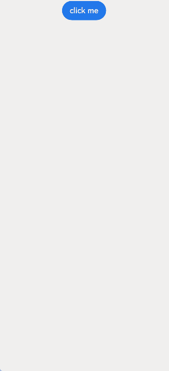
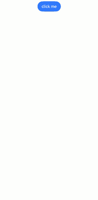
@Component
struct CustomDialogUser {
@State textValue: string = ''
@State inputValue: string = 'click me'
dialogController: CustomDialogController|null = new CustomDialogController({
builder: CustomDialogExample({
cancel: ()=> { this.onCancel(); },
confirm: ()=> { this.onAccept(); },
textValue: this.textValue,
inputValue: this.inputValue
}),
cancel: this.exitApp,
autoCancel: true,
onWillDismiss:(dismissDialogAction: DismissDialogAction)=> {
console.info("reason=" + JSON.stringify(dismissDialogAction.reason));
console.log("dialog onWillDismiss");
if (dismissDialogAction.reason == DismissReason.PRESS_BACK) {
dismissDialogAction.dismiss();
}
if (dismissDialogAction.reason == DismissReason.TOUCH_OUTSIDE) {
dismissDialogAction.dismiss();
}
},
alignment: DialogAlignment.Bottom,
offset: { dx: 0, dy: -20 },
gridCount: 4,
customStyle: false,
cornerRadius: 10,
})
// 在自定义组件即将析构销毁时将dialogController置空
aboutToDisappear() {
this.dialogController = null; // 将dialogController置空
}
onCancel() {
console.info('Callback when the first button is clicked');
}
onAccept() {
console.info('Callback when the second button is clicked');
}
exitApp() {
console.info('Click the callback in the blank area');
}
build() {
Column() {
Button(this.inputValue)
.onClick(() => {
if (this.dialogController != null) {
this.dialogController.open();
}
}).backgroundColor(0x317aff)
}.width('100%').margin({ top: 5 })
}
}
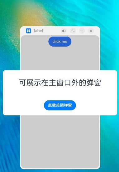
示例2(可在主窗外弹出的弹窗)
在2in1设备上设置showInSubWindow为true时,可以弹出在主窗外显示的弹窗。
// xxx.ets
@CustomDialog
struct CustomDialogExample {
  controller?: CustomDialogController;
  cancel: () => void = () => {
  }
  confirm: () => void = () => {
  }
  build() {
    Column() {
      Text('可展示在主窗口外的弹窗')
        .fontSize(30)
        .height(100)
      Button('点我关闭弹窗')
        .onClick(() => {
          if (this.controller != undefined) {
            this.controller.close();
          }
        })
        .margin(20)
    }
  }
}
@Entry
@Component
struct CustomDialogUser {
  dialogController: CustomDialogController|null = new CustomDialogController({
    builder: CustomDialogExample({
      cancel: ()=> { this.onCancel(); },
      confirm: ()=> { this.onAccept(); }
    }),
    cancel: this.existApp,
    autoCancel: true,
    onWillDismiss:(dismissDialogAction: DismissDialogAction)=> {
      console.info("reason=" + JSON.stringify(dismissDialogAction.reason));
      console.log("dialog onWillDismiss");
      if (dismissDialogAction.reason == DismissReason.PRESS_BACK) {
        dismissDialogAction.dismiss();
      }
      if (dismissDialogAction.reason == DismissReason.TOUCH_OUTSIDE) {
        dismissDialogAction.dismiss();
      }
    },
    alignment: DialogAlignment.Center,
    offset: { dx: 0, dy: -20 },
    gridCount: 4,
    showInSubWindow: true,
    isModal: true,
    customStyle: false,
    cornerRadius: 10,
    focusable: true
  })
  // 在自定义组件即将析构销毁时将dialogController置空
  aboutToDisappear() {
    this.dialogController = null; // 将dialogController置空
  }

  onCancel() {
    console.info('Callback when the first button is clicked');
  }

  onAccept() {
    console.info('Callback when the second button is clicked');
  }

  existApp() {
    console.info('Click the callback in the blank area');
  }

  build() {
    Column() {
      Button('click me')
        .onClick(() => {
          if (this.dialogController != null) {
            this.dialogController.open();
          }
        }).backgroundColor(0x317aff)
    }.width('100%').margin({ top: 5 })
  }
}
示例3(设置弹窗的样式)
该示例定义了CustomDialog的样式,包括宽度、高度、背景色、阴影等。
// xxx.ets
@CustomDialog
struct CustomDialogExample {
  controller?: CustomDialogController;
  cancel: () => void = () => {
  }
  confirm: () => void = () => {
  }
  build() {
    Column() {
      Text('这是自定义弹窗')
        .fontSize(30)
        .height(100)
      Button('点我关闭弹窗')
        .onClick(() => {
          if (this.controller != undefined) {
            this.controller.close();
          }
        })
        .margin(20)
    }
  }
}
@Entry
@Component
struct CustomDialogUser {
  dialogController: CustomDialogController|null = new CustomDialogController({
    builder: CustomDialogExample({
      cancel: ()=> { this.onCancel(); },
      confirm: ()=> { this.onAccept(); }
    }),
    cancel: this.existApp,
    autoCancel: true,
    onWillDismiss:(dismissDialogAction: DismissDialogAction)=> {
      console.info("reason=" + JSON.stringify(dismissDialogAction.reason))
      console.log("dialog onWillDismiss")
      if (dismissDialogAction.reason == DismissReason.PRESS_BACK) {
        dismissDialogAction.dismiss();
      }
      if (dismissDialogAction.reason == DismissReason.TOUCH_OUTSIDE) {
        dismissDialogAction.dismiss();
      }
    },
    alignment: DialogAlignment.Center,
    offset: { dx: 0, dy: -20 },
    customStyle: false,
    cornerRadius: 20,
    width: 300,
    height: 200,
    borderWidth: 1,
    borderStyle: BorderStyle.Dashed,//使用borderStyle属性,需要和borderWidth属性一起使用
    borderColor: Color.Blue,//使用borderColor属性,需要和borderWidth属性一起使用
    backgroundColor: Color.White,
    shadow: ({ radius: 20, color: Color.Grey, offsetX: 50, offsetY: 0}),
  })
  // 在自定义组件即将析构销毁时将dialogController置空
  aboutToDisappear() {
    this.dialogController = null; // 将dialogController置空
  }

  onCancel() {
    console.info('Callback when the first button is clicked');
  }

  onAccept() {
    console.info('Callback when the second button is clicked');
  }

  existApp() {
    console.info('Click the callback in the blank area');
  }

  build() {
    Column() {
      Button('click me')
        .onClick(() => {
          if (this.dialogController != null) {
            this.dialogController.open();
          }
        }).backgroundColor(0x317aff)
    }.width('100%').margin({ top: 5 })
  }
}
示例4(悬停态弹窗)
该示例展示了在折叠屏悬停态下设置dialog布局区域的效果。
@CustomDialog
@Component
struct CustomDialogExample {
  @Link textValue: string;
  @Link inputValue: string;
  controller?: CustomDialogController;

  build() {
    Column() {
      Text('Change text').fontSize(20).margin({ top: 10, bottom: 10 })
      TextInput({ placeholder: '', text: this.textValue }).height(60).width('90%')
        .onChange((value: string) => {
          this.textValue = value;
        })
      Text('Whether to change a text?').fontSize(16).margin({ bottom: 10 })
      Flex({ justifyContent: FlexAlign.SpaceAround }) {
        Button('cancel')
          .onClick(() => {
            if (this.controller != undefined) {
              this.controller.close();
            }
          }).backgroundColor(0xffffff).fontColor(Color.Black)
        Button('confirm')
          .onClick(() => {
            if (this.controller != undefined) {
              this.inputValue = this.textValue;
              this.controller.close();
            }
          }).backgroundColor(0xffffff).fontColor(Color.Red)
      }.margin({ bottom: 10 })

      Button('点我打开第二个弹窗')
        .margin(20)
    }.borderRadius(10)
    // 如果需要使用border属性或cornerRadius属性,请和borderRadius属性一起使用。
  }
}
@Entry
@Component
struct CustomDialogUser {
  @State textValue: string = '';
  @State inputValue: string = 'click me';
  dialogController: CustomDialogController|null = new CustomDialogController({
    builder: CustomDialogExample({
      textValue: this.textValue,
      inputValue: this.inputValue
    }),
    cancel: this.exitApp,
    autoCancel: true,
    onWillDismiss: (dismissDialogAction: DismissDialogAction)=> {
      console.info("reason=" + JSON.stringify(dismissDialogAction.reason));
      console.log("dialog onWillDismiss");
      if (dismissDialogAction.reason == DismissReason.PRESS_BACK) {
        dismissDialogAction.dismiss();
      }
      if (dismissDialogAction.reason == DismissReason.TOUCH_OUTSIDE) {
        dismissDialogAction.dismiss();
      }
    },
    alignment: DialogAlignment.Bottom,
    offset: { dx: 0, dy: -20 },
    gridCount: 4,
    customStyle: false,
    cornerRadius: 10,
    enableHoverMode: true,
    hoverModeArea: HoverModeAreaType.TOP_SCREEN
  })

  // 在自定义组件即将析构销毁时将dialogController置空
  aboutToDisappear() {
    this.dialogController = null; // 将dialogController置空
  }

  exitApp() {
    console.info('Click the callback in the blank area');
  }

  build() {
    Column() {
      Button(this.inputValue)
        .onClick(() => {
          if (this.dialogController != null) {
            this.dialogController.open();
          }
        }).backgroundColor(0x317aff)
    }.width('100%').margin({ top: 5 })
  }
}

示例5(获取弹窗的状态)
该示例实现了在CustomDialogController中调用getState获取弹窗当前状态。
// xxx.ets
@CustomDialog
struct CustomDialogExample {
  controller?: CustomDialogController

  build() {
    Column() {
      Button("点我查询弹窗状态:通过自定义组件自带controller")
        .onClick(() => {
          if (this.getDialogController() != undefined) {
            console.info('state:' + this.getDialogController().getState())
          } else {
            console.info('state: no exist')
          }
        }).margin(20)
      Button('点我查询弹窗状态:通过CustomDialogController ')
        .onClick(() => {
          console.info('state:' + this.controller?.getState())
        }).margin(20)
      Button('点我关闭弹窗')
        .onClick(() => {
          if (this.getDialogController() != undefined) {
            this.getDialogController().close()
          }
        }).margin(20)

    }
  }
}

@Entry
@Component
struct CustomDialogUser {
  @State bg: ResourceColor = Color.Green
  dialogController: CustomDialogController|null = new CustomDialogController({
    builder: CustomDialogExample({
    }),
    autoCancel: false
  })

  build() {
    Column() {
      Button('click me')
        .onClick(() => {
          if (this.dialogController != null) {
            this.dialogController.open()
          }
        }).backgroundColor(0x317aff)
    }.width('100%').margin({ top: 5 })
    .backgroundColor(this.bg)
  }
}
示例6(使用@Link和@Consume监听数据变化)
该示例使用@Link和@Consume实现页面与弹窗内数据的双向绑定。
@CustomDialog
@Component
struct CustomDialogExample {
  @Link textValue: string;
  @Consume inputValue: string;
  controller?: CustomDialogController;

  cancel: () => void = () => {
  }
  confirm: () => void = () => {
  }

  build() {
    Column() {
      Text('Change text').fontSize(20).margin({ top: 10, bottom: 10 })
      TextInput({ placeholder: '', text: this.textValue }).height(60).width('90%')
        .onChange((value: string) => {
          this.textValue = value;
        })
      Text('Whether to change a text?').fontSize(16).margin({ bottom: 10 })
      Flex({ justifyContent: FlexAlign.SpaceAround }) {
        Button('cancel')
          .onClick(() => {
            if (this.controller != undefined) {
              this.controller.close();
              this.cancel();
            }
          }).backgroundColor(0xffffff).fontColor(Color.Black)
        Button('confirm')
          .onClick(() => {
            if (this.controller != undefined) {
              this.inputValue = this.textValue;
              this.controller.close();
              this.confirm();
            }
          }).backgroundColor(0xffffff).fontColor(Color.Red)
      }.margin({ bottom: 10 })
    }.borderRadius(10)
  }
}
@Entry
@Component
struct CustomDialogUser {
  @State textValue: string = ''
  @Provide inputValue: string = 'click me'
  dialogController: CustomDialogController|null = new CustomDialogController({
    builder: CustomDialogExample({
      cancel: ()=> { this.onCancel(); },
      confirm: ()=> { this.onAccept(); },
      textValue: this.textValue
    }),
    cancel: this.exitApp,
    autoCancel: true,
    onWillDismiss:(dismissDialogAction: DismissDialogAction)=> {
      if (dismissDialogAction.reason == DismissReason.PRESS_BACK) {
        dismissDialogAction.dismiss();
      }
      if (dismissDialogAction.reason == DismissReason.TOUCH_OUTSIDE) {
        dismissDialogAction.dismiss();
      }
    },
    alignment: DialogAlignment.Center,
    offset: { dx: 0, dy: -20 },
    gridCount: 4,
    customStyle: false,
    cornerRadius: 10,
  })

  // 在自定义组件即将析构销毁时将dialogController置空
  aboutToDisappear() {
    this.dialogController = null; // 将dialogController置空
  }

  onCancel() {
    console.info('Callback when the first button is clicked');
  }

  onAccept() {
    console.info('Callback when the second button is clicked');
  }

  exitApp() {
    console.info('Click the callback in the blank area');
  }
  build() {
    Column() {
      Button(this.inputValue)
        .onClick(() => {
          if (this.dialogController != null) {
            this.dialogController.open();
          }
        }).backgroundColor(0x317aff)
    }.width('100%').margin({ top: 5 })
  }
}

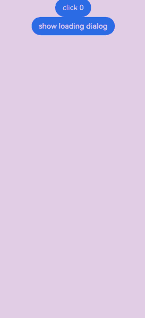
示例7(自定义带loading的弹窗)
该示例使用maskColor,maskRect和LoadingProgress,实现带loading的弹窗,并展示不在maskRect区域的事件透传效果。
import window from '@ohos.window';

@CustomDialog
@Component
struct LoadingDialogExample {
  controller?: CustomDialogController;
  cancel: () => void = () => {
  }
  confirm: () => void = () => {
  }

  build() {
    Column() {
      LoadingProgress().color(Color.Blue).layoutWeight(1)
    }.borderRadius(10).width(100).height(100)
  }
}

@Entry
@Component
struct CustomDialogUser {
  @State number: number = 0;
  dialogController: CustomDialogController|null = null;

  // 在自定义组件即将析构销毁时将dialogController置空
  aboutToDisappear() {
    this.dialogController = null; // 将dialogController置空
  }

  onCancel() {
    console.info('Callback when the first button is clicked');
  }

  onAccept() {
    console.info('Callback when the second button is clicked');
  }

  exitApp() {
    console.info('Click the callback in the blank area');
  }

  build() {
    Column() {
      Button("click " + this.number).onClick(() => {
        this.number++;
      })
      Button("show loading dialog").onClick(() => {
        //获取窗口对象
        let windowClass = window.getLastWindow(this.getUIContext().getHostContext());
        windowClass.then(window => {
          //获取窗口信息,设置maskRect
          let properties = window.getWindowProperties();
          let maskRect = {
            x: this.getUIContext().px2vp(properties.windowRect.left + 150),
            y: this.getUIContext().px2vp(properties.windowRect.top + 350),
            width: this.getUIContext().px2vp(properties.windowRect.width - 300),
            height: this.getUIContext().px2vp(properties.windowRect.height - 700)
          } as Rectangle
          if (this.dialogController == null) {
            this.dialogController = new CustomDialogController({
              builder: LoadingDialogExample({
                cancel: () => {
                  this.onCancel();
                },
                confirm: () => {
                  this.onAccept();
                },
              }),
              cancel: this.exitApp,
              maskRect: maskRect,
              autoCancel: false,
              maskColor: "#33AA0000",
              showInSubWindow: false,
              backgroundBlurStyle: BlurStyle.NONE,
              onWillDismiss: (dismissDialogAction: DismissDialogAction) => {
                if (dismissDialogAction.reason == DismissReason.PRESS_BACK) {
                  dismissDialogAction.dismiss();
                }
                if (dismissDialogAction.reason == DismissReason.TOUCH_OUTSIDE) {
                  dismissDialogAction.dismiss();
                }
              },
              alignment: DialogAlignment.Center,
              customStyle: false,
              cornerRadius: 10,
              openAnimation: { duration: 0, tempo: 0 },
              closeAnimation: { duration: 0, tempo: 0 }
            })
          }
          this.dialogController.close();
          this.dialogController.open();
        })
      }).backgroundColor(0x317aff)
    }.width('100%').margin({ top: 5 })
  }
}
示例8(不使用keyboardAvoidDistance调整弹窗与软键盘的间距)
该示例通过监听键盘变化,调整布局margin的bottom,实现与使用keyboardAvoidDistance调整弹窗与软键盘的间距一样的效果。
import window from '@ohos.window';

@CustomDialog
@Component
struct CustomDialogExample {
  @Link textValue: string;
  @Link inputValue: string;
  @Link isKeyboardShow: boolean
  @Link navigationBarHeight: number
  controller?: CustomDialogController;
  cancel: () => void = () => {
  }
  confirm: () => void = () => {
  }

  build() {
    Column() {
      Text('Change text').fontSize(20).margin({ top: 10, bottom: 10 })
      TextInput({ placeholder: '', text: this.textValue }).height(60).width('90%')
        .onChange((value: string) => {
          this.textValue = value;
        })
      Text('Whether to change a text?').fontSize(16).margin({ bottom: 10 })
      Flex({ justifyContent: FlexAlign.SpaceAround }) {
        Button('cancel')
          .onClick(() => {
            if (this.controller != undefined) {
              this.controller.close();
              this.cancel();
            }
          }).backgroundColor(0xffffff).fontColor(Color.Black)
        Button('confirm')
          .onClick(() => {
            if (this.controller != undefined) {
              this.inputValue = this.textValue;
              this.controller.close();
              this.confirm();
            }
          }).backgroundColor(0xffffff).fontColor(Color.Red)
      }.margin({ bottom: 10 })
    }.borderRadius(10)
    .margin({
      // 通过键盘显隐调整间距(键盘与弹窗间距为16vp)
      bottom: this.isKeyboardShow ? -16 : this.navigationBarHeight
    }).backgroundColor(Color.White)
  }
}

@Entry
@Component
struct CustomDialogUser {
  @State textValue: string = ''
  @State inputValue: string = 'click me'
  @State isKeyboardShow: boolean = false
  @State navigationBarHeight: number = 0
  windowClass: window.Window|null = null
  dialogController: CustomDialogController|null = new CustomDialogController({
    builder: CustomDialogExample({
      cancel: () => {
        this.onCancel();
      },
      confirm: () => {
        this.onAccept();
      },
      textValue: this.textValue,
      inputValue: this.inputValue,
      isKeyboardShow: this.isKeyboardShow,
      navigationBarHeight: this.navigationBarHeight
    }),
    cancel: this.exitApp,
    autoCancel: true,
    onWillDismiss: (dismissDialogAction: DismissDialogAction) => {
      if (dismissDialogAction.reason == DismissReason.PRESS_BACK) {
        dismissDialogAction.dismiss();
      }
      if (dismissDialogAction.reason == DismissReason.TOUCH_OUTSIDE) {
        dismissDialogAction.dismiss();
      }
    },
    alignment: DialogAlignment.Bottom,
    customStyle: true,
    cornerRadius: 10,
  })

  aboutToAppear(): void {
    let windowClass = window.getLastWindow(this.getUIContext().getHostContext());
    windowClass.then(win => {
      this.windowClass = win;
      // 获取底部导航栏高度
      let navigationArea = this.windowClass?.getWindowAvoidArea(window.AvoidAreaType.TYPE_NAVIGATION_INDICATOR);
      this.navigationBarHeight = navigationArea.bottomRect.height;
      this.windowClass?.on('avoidAreaChange', (data) => {
        if (data.type == window.AvoidAreaType.TYPE_KEYBOARD) {
          this.isKeyboardShow = data.area.bottomRect.height > 0;
        }
      })
    });
  }

  // 在自定义组件即将析构销毁时将dialogController置空
  aboutToDisappear() {
    this.dialogController = null; // 将dialogController置空
    this.windowClass?.off('avoidAreaChange')
  }

  onCancel() {
    console.info('Callback when the first button is clicked');
  }

  onAccept() {
    console.info('Callback when the second button is clicked');
  }

  exitApp() {
    console.info('Click the callback in the blank area');
  }

  build() {
    Column() {
      Button(this.inputValue)
        .onClick(() => {
          if (this.dialogController != null) {
            this.dialogController.open();
          }
        }).backgroundColor(0x317aff)
    }.width('100%').margin({ top: 5 })
  }
}
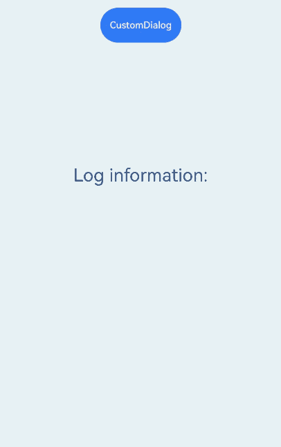
示例9(弹窗生命周期)
该示例展示了弹窗生命周期的相关接口的使用方法。
// xxx.ets
@CustomDialog
struct CustomDialogExample1 {
  controller?: CustomDialogController
  cancel: () => void = () => {
  }
  confirm: () => void = () => {
  }
  build() {
    Column() {
      Text('允许访问相机?')
        .fontSize(30)
        .height(100)
      Button('点我关闭弹窗')
        .onClick(() => {
          if (this.controller != undefined) {
            this.controller.close()
          }
        })
        .margin(20)
    }
  }
}

@Entry
@Component
struct Example3 {
  @State log:string = 'Log information:';
  dialogController: CustomDialogController|null = new CustomDialogController({
    builder: CustomDialogExample1({
      cancel: ()=> { this.onCancel() },
      confirm: ()=> { this.onAccept() }
    }),
    cancel: this.existApp,
    autoCancel: true,
    alignment: DialogAlignment.Bottom,
    onWillDismiss:(dismissDialogAction: DismissDialogAction)=> {
      console.info("reason=" + JSON.stringify(dismissDialogAction.reason))
      console.log("dialog onWillDismiss")
      if (dismissDialogAction.reason == DismissReason.PRESS_BACK) {
        dismissDialogAction.dismiss()
      }
      if (dismissDialogAction.reason == DismissReason.TOUCH_OUTSIDE) {
        dismissDialogAction.dismiss()
      }
    },
    onDidAppear: () => {
      this.log += '# onDidAppear'
      console.info("CustomDialog,is onDidAppear!")
    },
    onDidDisappear: () => {
      this.log += '# onDidDisappear'
      console.info("CustomDialog,is onDidDisappear!")
    },
    onWillAppear: () => {
      this.log = 'Log information:onWillAppear'
      console.info("CustomDialog,is onWillAppear!")
    },
    onWillDisappear: () => {
      this.log += '# onWillDisappear'
      console.info("CustomDialog,is onWillDisappear!")
    },
    offset: { dx: 0, dy: -20 },
    customStyle: false,
  })
  onCancel() {
    console.info('CustomDialog Callback when the first button is clicked')
  }

  onAccept() {
    console.info('CustomDialog Callback when the second button is clicked')
  }

  existApp() {
    console.info('CustomDialog Click the callback in the blank area')
  }
  build() {
    Column({ space: 5 }) {
      Button('CustomDialog')
        .onClick(() => {
          this.dialogController?.open()
        }).backgroundColor(0x317aff).height("88px")
      Text(this.log).fontSize(30).margin({ top: 200 })
    }.width('100%').margin({ top: 5 })
  }
}
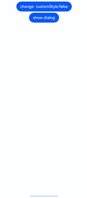
示例10(不同customStyle下的弹窗示例)
该示例时在对齐方式为DialogAlignment.Bottom时,展示customStyle不同值下,弹窗内容与安全区域的效果。
@CustomDialog
@Component
struct CustomStyleDialogExample {
  controller?: CustomDialogController;
  cancel: () => void = () => {
  }
  confirm: () => void = () => {
  }

  build() {
    Column().borderRadius(10).width(110).height(110).backgroundColor("#2787d9")
  }
}

@Entry
@Component
struct CustomDialogUser {
  @State customStyle: boolean = false;
  dialogController: CustomDialogController|null = null;

  // 在自定义组件即将析构销毁时将dialogController置空
  aboutToDisappear() {
    this.dialogController = null; // 将dialogController置空
  }

  onCancel() {
    console.info('Callback when the first button is clicked');
  }

  onAccept() {
    console.info('Callback when the second button is clicked');
  }

  exitApp() {
    console.info('Click the callback in the blank area');
  }

  build() {
    Column() {
      Button("change  customStyle:" + this.customStyle).onClick(() => {
        this.customStyle = !this.customStyle;
      })
      Button("show dialog").onClick(() => {
        if (this.dialogController != null) {
          this.dialogController.close();
        }
        this.dialogController = new CustomDialogController({
          builder: CustomStyleDialogExample({
            cancel: () => {
              this.onCancel();
            },
            confirm: () => {
              this.onAccept();
            },
          }),
          cancel: this.exitApp,
          autoCancel: true,
          showInSubWindow: false,
          onWillDismiss: (dismissDialogAction: DismissDialogAction) => {
            if (dismissDialogAction.reason == DismissReason.PRESS_BACK) {
              dismissDialogAction.dismiss();
            }
            if (dismissDialogAction.reason == DismissReason.TOUCH_OUTSIDE) {
              dismissDialogAction.dismiss();
            }
          },
          alignment: DialogAlignment.Bottom,
          customStyle: this.customStyle,
          cornerRadius: 10,
          openAnimation: { duration: 0, tempo: 0 },
          closeAnimation: { duration: 0, tempo: 0 }
        })
        this.dialogController.open();
      }).margin({ top: 5 })
    }.width('100%').margin({ top: 5 })
  }
}
你可能感兴趣的鸿蒙文章
- 所属分类: 后端技术
- 本文标签:
热门推荐
-
2、 优质文章
-
3、 gt
-
7、 openharmony
-
9、 golang
-
10、 Vue中input框自动聚焦