harmony 鸿蒙TextPicker
TextPicker
The <TextPicker> component allows users to scroll to select text.
NOTE
This component is supported since API version 8. Updates will be marked with a superscript to indicate their earliest API version.
Child Components
Not supported
APIs
TextPicker(options?: {range: string[]|string[][]|Resource|TextPickerRangeContent[]|TextCascadePickerRangeContent[], selected?: number, value?: string})
Creates a text picker based on the selection range specified by range.
Parameters
| Name | Type | Mandatory | Description |
|---|---|---|---|
| range | string[] |string[][]10+ |Resource | TextPickerRangeContent[]10+ |TextCascadePickerRangeContent[]10+ |
Yes | Data selection range of the picker. This parameter cannot be set to an empty array. If set to an empty array, it will not be displayed. If it is dynamically changed to an empty array, the current value remains displayed. NOTE For a single-column picker, use a value of the string[], Resource, or TextPickerRangeContent[] type. For a multi-column picker, use a value of the string[] type. For a multi-column linked picker, use a value of the TextCascadePickerRangeContent[] type. The Resource type supports only strarray.json. |
| selected | number |number[]10+ | No | Index of the default item in the range. Default value: 0 NOTE For a single-column picker, use a value of the number type. For a multi-column (linked) picker, use a value of the number[] type. Since API version 10, this parameter supports $$ for two-way binding of variables. |
| value | string |string[]10+ | No | Value of the default item in the range. The priority of this parameter is lower than that of selected. Default value: value of the first item NOTE This parameter works only when the picker contains text only. For a single-column picker, use a value of the string type. For a multi-column (linked) picker, use a value of the string[] type. Since API version 10, this parameter supports $$ for two-way binding of variables. |
TextPickerRangeContent10+
| Name | Type | Mandatory | Description |
|---|---|---|---|
| icon | string |Resource | Yes | Image resource. |
| text | string |Resource | No | Text information. |
TextCascadePickerRangeContent10+
| Name | Type | Mandatory | Description |
|---|---|---|---|
| text | string |Resource | Yes | Text information. |
| children | TextCascadePickerRangeContent[] | No | Linkage data. |
Attributes
In addition to the universal attributes, the following attributes are supported.
| Name | Type | Description |
|---|---|---|
| defaultPickerItemHeight | number |string | Height of each item in the picker. |
| disappearTextStyle10+ | PickerTextStyle | Font color, font size, and font width for the top and bottom items. Default value: { color: ‘#ff182431’, font: { size: ‘14fp’, weight: FontWeight.Regular } } |
| textStyle10+ | PickerTextStyle | Font color, font size, and font width of all items except the top, bottom, and selected items. Default value: { color: ‘#ff182431’, font: { size: ‘16fp’, weight: FontWeight.Regular } } |
| selectedTextStyle10+ | PickerTextStyle | Font color, font size, and font width of the selected item. Default value: { color: ‘#ff007dff’, font: { size: ‘20vp’, weight: FontWeight.Medium } } |
| selectedIndex10+ | number |number[] | Index of the default selected item in the array. Its priority is higher than that of the selected value in options. NOTE For a single-column picker, use a value of the number type. For a multi-column (linked) picker, use a value of the number[] type. |
| canLoop10+ | boolean | Whether to support scroll looping. The value true means to support scroll looping, and false means the opposite. Default value: true |
Events
In addition to the universal events, the following events are supported.
| Name | Description |
|---|---|
| onAccept(callback: (value: string, index: number) => void)(deprecated) | Triggered when the OK button in the dialog box is clicked. - value: value of the selected item. - index: index of the selected item. This API is deprecated since API version 10. NOTE This event can be triggered only in the text picker dialog box. |
| onCancel(callback: () => void)(deprecated) | Triggered when the Cancel button in the dialog box is clicked. This API is deprecated since API version 10. NOTE This event can be triggered only in the text picker dialog box. |
| onChange(callback: (value: string |string[]10+, index: number |number[]10+) => void) | Triggered when an item in the picker is selected. - value: value of the selected item. (For a multi-column picker, value is of the array type.) - index: index of the selected item. (For a multi-column picker, index is of the array type.) NOTE When the picker contains text only or both text and imagery, value indicates the text value of the selected item. When the picker contains imagery only, value is empty. |
Example
// xxx.ets
class bottom {
bottom:number = 50
}
let bott:bottom = new bottom()
@Entry
@Component
struct TextPickerExample {
private select: number = 1
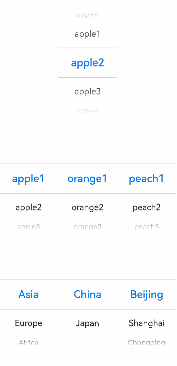
private apfruits: string[] = ['apple1', 'apple2', 'apple3', 'apple4']
private orfruits: string[] = ['orange1', 'orange2', 'orange3', 'orange4']
private pefruits: string[] = ['peach1', 'peach2', 'peach3', 'peach4']
private multi: string[][] = [this.apfruits, this.orfruits, this.pefruits]
private cascade: TextCascadePickerRangeContent[] = [
{
text: 'Category 1',
children: [{ text: 'China', children: [{ text: 'Beijing' }, { text: 'Shanghai' }, { text: 'Chongqing' }] },
{ text: 'Japan', children: [{ text: 'Tokyo' }, { text: 'Hokkaido' }, { text: 'Osaka' }] }]
},
{
text: 'Europe',
children: [{ text: 'Germany', children: [{ text: 'Berlin' }, { text: 'Munich' }, { text: 'Nuremberg' }] },
{ text: 'France', children: [{ text: 'Paris' }, { text: 'Lille' }, { text: 'Orleans' }] }]
},
{
text: 'Africa',
children: [{ text: 'Egypt', children: [{ text: 'Cairo' }, { text: 'Damietta' }, { text: 'Girga' }] },
{ text: 'Algeria', children: [{ text: 'Alger' }, { text: 'Oran' }, { text: 'Adrar' }] }]
}
]
build() {
Column() {
TextPicker({ range: this.apfruits, selected: this.select })
.onChange((value: string|string[], index: number|number[]) => {
console.info('Picker item changed, value: ' + value + ', index: ' + index)
}).margin(bott)
TextPicker({ range: this.multi })
.onChange((value: string|string[], index: number|number[]) => {
console.info('TextPicker multi-column: onChange' + JSON.stringify(value) + ',' + 'index:' + JSON.stringify(index))
}).margin(bott)
TextPicker({ range: this.cascade })
.onChange((value: string|string[], index: number|number[]) => {
console.info('TextPicker multi-column linkage: onChange' + JSON.stringify(value) + ',' + 'index:' + JSON.stringify(index))
})
}
}
}
// xxx.ets
@Entry
@Component
struct TextPickerExample {
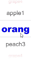
private select: number = 1
private fruits: string[] = ['apple1', 'orange2', 'peach3', 'grape4']
build() {
Column() {
TextPicker({ range: this.fruits, selected: this.select })
.onChange((value: string|string[], index: number|number[]) => {
console.info('Picker item changed, value: ' + value + ', index: ' + index)
})
.disappearTextStyle({color: Color.Red, font: {size: 15, weight: FontWeight.Lighter}})
.textStyle({color: Color.Black, font: {size: 20, weight: FontWeight.Normal}})
.selectedTextStyle({color: Color.Blue, font: {size: 30, weight: FontWeight.Bolder}})
}.width('100%').height('100%')
}
}
你可能感兴趣的鸿蒙文章
harmony 鸿蒙ArkTS-based Declarative Development Paradigm
0
赞
- 所属分类: 后端技术
- 本文标签:
热门推荐
-
2、 优质文章
-
3、 gt
-
7、 openharmony
-
9、 golang
-
10、 Vue中input框自动聚焦