harmony 鸿蒙TextInput
TextInput
The <TextInput> component provides single-line text input.
NOTE
This component is supported since API version 7. Updates will be marked with a superscript to indicate their earliest API version.
Child Components
Not supported
APIs
TextInput(value?:{placeholder?: ResourceStr, text?: ResourceStr, controller?: TextInputController})
Parameters
| Name | Type | Mandatory | Description |
|---|---|---|---|
| placeholder | ResourceStr | No | Text displayed when there is no input. |
| text | ResourceStr | No | Current text input. If the component has stateStyles or any other attribute that may trigger updating configured, you are advised to bind the state variable to the text in real time through the onChange event, so as to prevent display errors when the component is updated. Since API version 10, this parameter supports two-way binding through $$. |
| controller8+ | TextInputController | No | Text input controller. |
Attributes
Among the universal attributes and universal text attributes, fontColor, fontSize, fontStyle, fontWeight, and fontFamily are supported. In addition, the following attributes are supported.
| Name | Type | Description |
|---|---|---|
| type | InputType | Input box type. Default value: InputType.Normal |
| placeholderColor | ResourceColor | Placeholder text color. The default value follows the theme. |
| placeholderFont | Font | Placeholder text font. |
| enterKeyType | EnterKeyType | Type of the Enter key. Currently, only the default value is supported. Default value: EnterKeyType.Done |
| caretColor | ResourceColor | Color of the caret in the text box. Default value: ’#007DFF’ |
| maxLength | number | Maximum number of characters in the text input. |
| inputFilter8+ | { value: ResourceStr, error?: (value: string) => void } |
Regular expression for input filtering. Only inputs that comply with the regular expression can be displayed. Other inputs are filtered out. The regular expression can match single characters, but not strings. - value: regular expression to set. - error: filtered-out content to return when regular expression matching fails. |
| copyOption9+ | CopyOptions | Whether copy and paste is allowed. Default value: CopyOptions.LocalDevice If this attribute is set to CopyOptions.None, the paste operation is allowed, but not the copy or cut operation. |
| showPasswordIcon9+ | boolean | Whether to display the password icon at the end of the password text box. Default value: true |
| style9+ | TextInputStyle |TextContentStyle | Text input style. For the inline input style, only InputType.Normal is supported. Default value: TextInputStyle.Default |
| textAlign9+ | TextAlign | Horizontal alignment of the text. Default value: TextAlign.Start NOTE Available options are TextAlign.Start, TextAlign.Center, and TextAlign.End. To set vertical alignment for the text, use the align attribute. The align attribute alone does not control the horizontal position of the text. In other words, Alignment.TopStart, Alignment.Top, and Alignment.TopEnd produce the same effect, top-aligning the text; Alignment.Start, Alignment.Center, and Alignment.End produce the same effect, centered-aligning the text vertically; Alignment.BottomStart, Alignment.Bottom, and Alignment.BottomEnd produce the same effect, bottom-aligning the text. |
| selectedBackgroundColor10+ | ResourceColor | Background color of the selected text. If the opacity is not set, the color is opaque. For example, 0x80000000 indicates black with 50% opacity. |
| caretStyle10+ | { width: Length } |
Caret style. It cannot be set in percentage. |
| caretPosition10+ | number | Caret position. |
| showUnit10+ | CustomBuilder | Unit for content in the component. By default, there is no unit. |
| showError10+ | string |undefined | Error message displayed when an error occurs. By default, no error message is displayed. NOTE If the parameter type is string and the input content does not comply with specifications, the error message is displayed. If the parameter type is undefined, no error message is displayed. See Example 2. |
| showUnderline10+ | boolean | Whether to show an underline. By default, the underline comes in the color of ’#33182431’, thickness of 1 px, and input box size of 48 vp. The underline supports only the InputType.Normal type. Default value: false |
| passwordIcon10+ | PasswordIcon | Password icon to display at the end of the password text box. By default, the system-provided icon is used. |
| enableKeyboardOnFocus10+ | boolean | Whether to enable the input method when the component obtains focus. Default value: true |
| selectionMenuHidden10+ | boolean | Whether to display the text selection menu when the text box is long-pressed or right-clicked. Default value: false |
| barState10+ | BarState | Scrollbar state when the inline input style is used. Default value: BarState.Auto |
| maxLines10+ | number | Maximum number of lines that can be displayed when the inline input style is used. Default value: 3 |
| customKeyboard10+ | CustomBuilder | Custom keyboard. NOTE When a custom keyboard is set, activating the text box opens the specified custom component, instead of the system input method, and the enterKeyType attribute setting for the system keyboard will not take effect. The custom keyboard’s height can be set through the height attribute of the custom component’s root node, and its width is fixed at the default value. The custom keyboard is displayed on top of the current page, without compressing or raising the page. The custom keyboard cannot obtain the focus, but it blocks gesture events. By default, the custom keyboard is closed when the input component loses the focus. You can also use the TextInputController.stopEditing API to close the keyboard. |
NOTE
The default value of the universal attribute padding is as follows:
{
top: 8 vp,
right: 16 vp,
bottom: 8 vp,
left: 16 vp
}Since API version 10, .width(‘auto’) can be set for the <TextInput> component. Under this setting, the component auto-adapts its width to the text width, while respecting the constraintSize configuration and the maximum and minimum width restrictions received by the parent container. For details, see Size.
EnterKeyType
| Name | Description |
|---|---|
| Go | The Enter key is labeled “Go.” |
| Search | The Enter key is labeled “Search.” |
| Send | The Enter key is labeled “Send.” |
| Next | The Enter key is labeled “Next.” |
| Done | The Enter key is labeled “Done.” |
InputType
| Name | Description |
|---|---|
| Normal | Normal input mode. The value can contain digits, letters, underscores (_), spaces, and special characters. |
| Password | Password input mode. The value can contain digits, letters, underscores (_), spaces, and special characters. An eye icon is used to show or hide the password, and the password is hidden behind dots by default. The password input mode does not support underlines. |
| Email address input mode. The value can contain digits, letters, underscores (_), and at signs (@). Only one at sign (@) is allowed. | |
| Number | Digit input mode. |
| PhoneNumber9+ | Phone number input mode. The value can contain digits, plus signs (+), hyphens (-), asterisks (*), and number signs (#). The length is not limited. |
TextInputStyle9+
| Name | Description |
|---|---|
| Default | Default style. The caret width is fixed at 1.5 vp, and the caret height is subject to the background height and font size of the selected text. |
| Inline | Inline input style. The background height of the selected text is the same as the height of the text box. This style is used in scenarios where editing and non-editing states are obvious, for example, renaming in the file list view. The showError attribute is not supported for this style. |
PasswordIcon10+
| Name | Type | Mandatory | Description |
|---|---|---|---|
| onIconSrc | string |Resource | No | Icon that can be used to hide the password in password input mode. |
| offIconSrc | string |Resource | No | Icon that can be used to show the password in password input mode. |
Events
In addition to the universal events, the following events are supported.
| Name | Description |
|---|---|
| onChange(callback: (value: string) => void) | Triggered when the input in the text box changes. value: text content. This event is triggered when any of the following conditions is met: 1. Keyboard input is received. 2. Paste and cut is performed. 3. Ctrl+V is pressed. |
| onSubmit(callback: (enterKey: EnterKeyType) => void) | Triggered when the Enter key on the keyboard is pressed. The return value is the current type of the Enter key. enterKeyType: type of the Enter key. For details, see EnterKeyType. |
| onEditChanged(callback: (isEditing: boolean) => void)(deprecated) | Triggered when the input status changes. Since API version 8, onEditChange is recommended. |
| onEditChange(callback: (isEditing: boolean) => void)8+ | Triggered when the input status changes. When the cursor is placed in the text box, it is in the editing state. Otherwise, it is in the non-editing state. If the value of isEditing is true, text input is in progress. |
| onCopy(callback:(value: string) => void)8+ | Triggered when the copy button on the pasteboard, which displays when the text box is long pressed, is clicked. value: text to be copied. |
| onCut(callback:(value: string) => void)8+ | Triggered when the cut button on the pasteboard, which displays when the text box is long pressed, is clicked. value: text to be cut. |
| onPaste(callback:(value: string) => void)8+ | Triggered when the paste button on the pasteboard, which displays when the text box is long pressed, is clicked. value: text to be pasted. |
| onTextSelectionChange(callback: (selectionStart: number, selectionEnd: number) => void)10+ | Triggered when the text selection position changes. selectionStart: start position of the text selection area. The start position of text in the text box is 0. selectionEnd: end position of the text selection area. |
| onContentScroll(callback: (totalOffsetX: number, totalOffsetY: number) => void)10+ | Triggered when the text content is scrolled. totalOffsetX: X coordinate offset of the text in the content area. totalOffsetY: Y coordinate offset of the text in the content area. |
TextInputController8+
Implements the controller of the <TextInput> component.
Objects to Import
controller: TextInputController = new TextInputController()
caretPosition8+
caretPosition(value: number): void
Sets the position of the caret.
Parameters
| Name | Type | Mandatory | Description |
|---|---|---|---|
| value | number | Yes | Length from the start of the string to the position where the caret is located. |
setTextSelection10+
setTextSelection(selectionStart: number, selectionEnd: number): void
Sets the text selection area, which will be highlighted.
Parameters
| Name | Type | Mandatory | Description |
|---|---|---|---|
| selectionStart | number | Yes | Start position of the text selection range. The start position of text in the text box is 0. |
| selectionEnd | number | Yes | End position of the text selection range. |
stopEditing10+
stopEditing(): void
Exits the editing state.
getTextContentRect10+
getTextContentRect(): RectResult
Obtains the position of the edited text area relative to the component and its size. The unit of the return value is pixel.
Return value
| Type | Description |
|---|---|
| RectResult | Position of the edited text area relative to the component and its size. |
NOTE
- If no text is entered, the return value contains the position information, but the size is 0.
- The position information is the offset of the first character relative to the editable area.
RectResult10+
Describes the position and size.
| Parameter | Type | Description |
|---|---|---|
| x | number | X coordinate. |
| y | number | Y coordinate. |
| width | number | Content width. |
| height | number | Content height. |
getTextContentLineCount10+
getTextContentLineCount(): number
Obtains the number of lines of the edited text.
Return value
| Type | Description |
|---|---|
| number | Number of lines of the edited text. |
Example
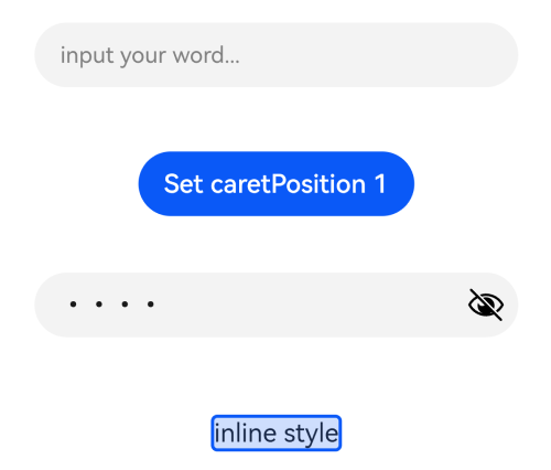
Example 1
// xxx.ets
@Entry
@Component
struct TextInputExample {
  @State text: string = ''
  controller: TextInputController = new TextInputController()

  build() {
    Column() {
      TextInput({ text: this.text, placeholder: 'input your word...', controller: this.controller })
        .placeholderColor(Color.Grey)
        .placeholderFont({ size: 14, weight: 400 })
        .caretColor(Color.Blue)
        .width(400)
        .height(40)
        .margin(20)
        .fontSize(14)
        .fontColor(Color.Black)
        .inputFilter('[a-z]', (e) => {
          console.log(JSON.stringify(e))
        })
        .onChange((value: string) => {
          this.text = value
        })
      Text(this.text)
      Button('Set caretPosition 1')
        .margin(15)
        .onClick(() => {
          // Move the caret to after the first entered character.
          this.controller.caretPosition(1)
        })
      // Password text box.
      TextInput({ placeholder: 'input your password...' })
        .width(400)
        .height(40)
        .margin(20)
        .type(InputType.Password)
        .maxLength(9)
        .showPasswordIcon(true)
      // Inline-style text box.
      TextInput({ text: 'inline style' })
        .width(400)
        .height(50)
        .margin(20)
        .borderRadius(0)
        .style(TextInputStyle.Inline)
    }.width('100%')
  }
}
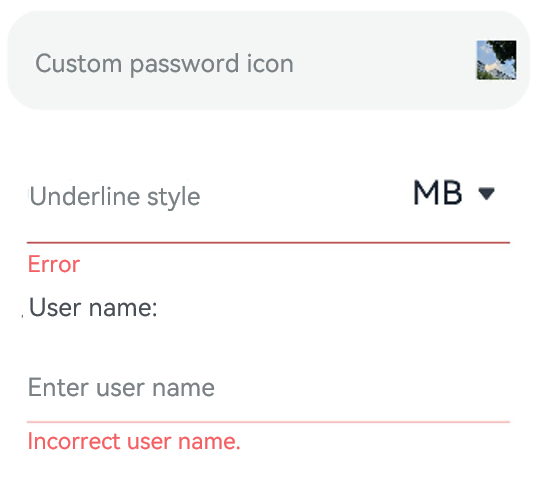
Example 2
@Entry
@Component
struct TextInputExample {
  @State PassWordSrc1: Resource = $r('app.media.onIcon')
  @State PassWordSrc2: Resource = $r('app.media.offIcon')
  @State TextError: string = ''
  @State Text: string = ''
  @State NameText: string = 'test'

  @Builder itemEnd() {
    Select([{ value: 'KB' },
      { value: 'MB' },
      { value: 'GB' },
      { value: 'TB', }])
      .height("48vp")
      .borderRadius(0)
      .selected(2)
      .align(Alignment.Center)
      .value('MB')
      .font({ size: 20, weight: 500 })
      .fontColor('#182431')
      .selectedOptionFont({ size: 20, weight: 400 })
      .optionFont({ size: 20, weight: 400 })
      .backgroundColor(Color.Transparent)
      .responseRegion({ height: "40vp", width: "80%", x: '10%', y: '6vp' })
      .onSelect((index: number) => {
        console.info('Select:' + index)
      })
  }

  build() {
    Column({ space: 20 }) {
      // Customize the password icon.
      TextInput({ placeholder: 'Custom password icon' })
        .type(InputType.Password)
        .width(380)
        .height(60)
        .passwordIcon({ onIconSrc: this.PassWordSrc1, offIconSrc: this.PassWordSrc2 })
      // Show an underline.
      TextInput({ placeholder: 'Underline style' })
        .showUnderline(true)
        .width(380)
        .height(60)
        .showError('Error')
        .showUnit(this.itemEnd.bind(this))

      Text (`User name: ${this.Text}`)
        .width('95%')
      TextInput({ placeholder: 'Enter user name', text: this.Text })
        .showUnderline(true)
        .width(380)
        .showError(this.TextError)
        .onChange((value: string) => {
          this.Text = value
        })
        .onSubmit(() => {// If the entered user name is incorrect, the text box will be cleared and the error message will be displayed.
          if (this.Text == this.NameText) {
            this.TextError = ''
          } else {
            this.TextError ='Incorrect user name.'
            this.Text = ''
          }
        })

    }.width('100%')
  }
}
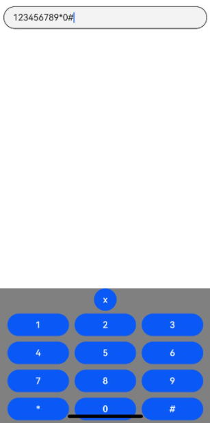
Example 3
// xxx.ets
@Entry
@Component
struct TextInputExample {
  controller: TextInputController = new TextInputController()
  @State inputValue: string = ""

  // Create a custom keyboard component.
  @Builder CustomKeyboardBuilder() {
    Column() {
      Button('x').onClick(() => {
        // Disable the custom keyboard.
        this.controller.stopEditing()
      })
      Grid() {
        ForEach([1, 2, 3, 4, 5, 6, 7, 8, 9, '*', 0, '#'], (item:number|string) => {
          GridItem() {
            Button(item + "")
              .width(110).onClick(() => {
              this.inputValue += item
            })
          }
        })
      }.maxCount(3).columnsGap(10).rowsGap(10).padding(5)
    }.backgroundColor(Color.Gray)
  }

  build() {
    Column() {
      TextInput({ controller: this.controller, text: this.inputValue })
        // Bind the custom keyboard.
        .customKeyboard(this.CustomKeyboardBuilder()).margin(10).border({ width: 1 })
    }
  }
}
你可能感兴趣的鸿蒙文章
harmony 鸿蒙ArkTS-based Declarative Development Paradigm
- 所属分类: 后端技术
- 本文标签:
热门推荐
-
2、 优质文章
-
3、 gt
-
7、 openharmony
-
9、 golang
-
10、 Vue中input框自动聚焦