harmony 鸿蒙Location
Location
The location attributes set the alignment mode, layout direction, and position of a component.
NOTE
The APIs of this module are supported since API version 7. Updates will be marked with a superscript to indicate their earliest API version.
Attributes
| Name | Type | Description |
|---|---|---|
| align | Alignment | Alignment mode of the component content in the drawing area. This attribute is available only in the following components: <Stack>, <Button>, <StepperItem>, <Marquee>, <text>, <TextArea>, and <TextInput>. For details about the alignment results of text-related components (the last four aforementioned components), see textAlign. If the component does not support the textAlign attribute, horizontal text alignment cannot be set. Default value: Alignment.Center Since API version 9, this API is supported in ArkTS widgets. |
| direction | Direction | Horizontal layout of the component. Default value: Direction.Auto Since API version 9, this API is supported in ArkTS widgets. |
| position | Position | Offset of the component’s upper left corner relative to the parent component’s upper left corner. This offset is expressed using absolute values. With this attribute set, the component does not participate in the layout of the parent component. That is, it is relocated during drawing based on the settings, but does not take up space in the parent component. This attribute is applicable to scenarios where the component is fixed at a position in the parent container, for example, where it is pinned to top or floating above the UI. Since API version 9, this API is supported in ArkTS widgets. |
| markAnchor | Position | Anchor point of the component for positioning. The upper left corner of the component is used as the reference point for offset. Generally, this attribute is used together with the position and offset attributes. When used independently, this attribute is similar to offset. The default value varies by API version. API version 9 and earlier: { x: 0, y: 0 } API version 10: none Since API version 9, this API is supported in ArkTS widgets. |
| offset | Position | Offset of the component relative to itself. This offset is expressed using relative values. With this attribute set, the component participates in the layout of the parent component. During drawing, an extra offset is made based on the offset provided by the parent component. The default value varies by API version. API version 9 and earlier: { x: 0, y: 0 } API version 10: none Since API version 9, this API is supported in ArkTS widgets. |
| alignRules9+ | { left?: { anchor: string, align: HorizontalAlign }; right?: { anchor: string, align: HorizontalAlign }; middle?: { anchor: string, align: HorizontalAlign }; top?: { anchor: string, align: VerticalAlign }; bottom?: { anchor: string, align: VerticalAlign }; center?: { anchor: string, align: VerticalAlign } } |
Alignment rules relative to the container. This attribute is valid only when the container is <RelativeContainer>. - left: left-aligned. - right: right-aligned. - middle: center-aligned. - top: top-aligned. - bottom: bottom-aligned. - center: center-aligned. This API is supported in ArkTS widgets. NOTE - anchor: ID of the component that functions as the anchor point. - align: alignment mode relative to the anchor component. |
Example
Example 1
// xxx.ets
@Entry
@Component
struct PositionExample1 {
build() {
Column() {
Column({ space: 10 }) {
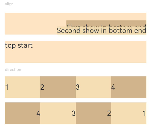
// When the component content is within the area specified by the component width and height, set the alignment mode of the content in the component.
Text('align').fontSize(9).fontColor(0xCCCCCC).width('90%')
Stack() {
Text('First show in bottom end').height('65%').backgroundColor(0xD2B48C)
Text('Second show in bottom end').backgroundColor(0xF5DEB3).opacity(0.9)
}.width('90%').height(50).margin({ top: 5 }).backgroundColor(0xFFE4C4)
.align(Alignment.BottomEnd)
Stack() {
Text('top start')
}.width('90%').height(50).margin({ top: 5 }).backgroundColor(0xFFE4C4)
.align(Alignment.TopStart)
// To arrange the child components from left to right, set direction of the parent container to Direction.Ltr.
Text('direction').fontSize(9).fontColor(0xCCCCCC).width('90%')
Row() {
Text('1').height(50).width('25%').fontSize(16).backgroundColor(0xF5DEB3)
Text('2').height(50).width('25%').fontSize(16).backgroundColor(0xD2B48C)
Text('3').height(50).width('25%').fontSize(16).backgroundColor(0xF5DEB3)
Text('4').height(50).width('25%').fontSize(16).backgroundColor(0xD2B48C)
}
.width('90%')
.direction(Direction.Ltr)
// To arrange the child components from right to left, set direction of the parent container to Direction.Rtl.
Row() {
Text('1').height(50).width('25%').fontSize(16).backgroundColor(0xF5DEB3).textAlign(TextAlign.End)
Text('2').height(50).width('25%').fontSize(16).backgroundColor(0xD2B48C).textAlign(TextAlign.End)
Text('3').height(50).width('25%').fontSize(16).backgroundColor(0xF5DEB3).textAlign(TextAlign.End)
Text('4').height(50).width('25%').fontSize(16).backgroundColor(0xD2B48C).textAlign(TextAlign.End)
}
.width('90%')
.direction(Direction.Rtl)
}
}
.width('100%').margin({ top: 5 })
}
}
Example 2
// xxx.ets
@Entry
@Component
struct PositionExample2 {
build() {
Column({ space: 20 }) {
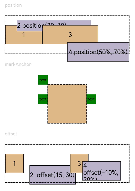
// Set the offset of the component's upper left corner relative to the parent component's upper left corner.
Text('position').fontSize(12).fontColor(0xCCCCCC).width('90%')
Row() {
Text('1').size({ width: '30%', height: '50' }).backgroundColor(0xdeb887).border({ width: 1 }).fontSize(16)
.textAlign(TextAlign.Center)
Text('2 position(30, 10)')
.size({ width: '60%', height: '30' })
.backgroundColor(0xbbb2cb)
.border({ width: 1 })
.fontSize(16)
.align(Alignment.Start)
.position({ x: 30, y: 10 })
Text('3').size({ width: '45%', height: '50' }).backgroundColor(0xdeb887).border({ width: 1 }).fontSize(16)
.textAlign(TextAlign.Center)
Text('4 position(50%, 70%)')
.size({ width: '50%', height: '50' })
.backgroundColor(0xbbb2cb)
.border({ width: 1 })
.fontSize(16)
.position({ x: '50%', y: '70%' })
}.width('90%').height(100).border({ width: 1, style: BorderStyle.Dashed })
// Offset relative to the start point. x indicates the horizontal distance between the end point and the start point. If the value of x is greater than 0, the component is offset to the left. Otherwise, the component is offset to the right.
// y indicates the vertical distance between the end point and the start point. If the value of y is greater than 0, the component is offset to the top. Otherwise, the component is offset to the bottom.
Text('markAnchor').fontSize(12).fontColor(0xCCCCCC).width('90%')
Stack({ alignContent: Alignment.TopStart }) {
Row()
.size({ width: '100', height: '100' })
.backgroundColor(0xdeb887)
Text('text')
.fontSize('30px')
.textAlign(TextAlign.Center)
.size({ width: 25, height: 25 })
.backgroundColor(Color.Green)
.markAnchor({ x: 25, y: 25 })
Text('text')
.fontSize('30px')
.textAlign(TextAlign.Center)
.size({ width: 25, height: 25 })
.backgroundColor(Color.Green)
.markAnchor({ x: -100, y: -25 })
Text('text')
.fontSize('30px')
.textAlign(TextAlign.Center)
.size({ width: 25, height: 25 })
.backgroundColor(Color.Green)
.markAnchor({ x: 25, y: -25 })
}.margin({ top: 25 }).border({ width: 1, style: BorderStyle.Dashed })
// Offset of the component relative to itself. If the value of x is greater than 0, the component is offset to the right. Otherwise, the component is offset to the left. If the value of y is greater than 0, the component is offset to the bottom. Otherwise, the component is offset to the top.
Text('offset').fontSize(12).fontColor(0xCCCCCC).width('90%')
Row() {
Text('1').size({ width: '15%', height: '50' }).backgroundColor(0xdeb887).border({ width: 1 }).fontSize(16)
.textAlign(TextAlign.Center)
Text('2 offset(15, 30)')
.size({ width: 120, height: '50' })
.backgroundColor(0xbbb2cb)
.border({ width: 1 })
.fontSize(16)
.align(Alignment.Start)
.offset({ x: 15, y: 30 })
Text('3').size({ width: '15%', height: '50' }).backgroundColor(0xdeb887).border({ width: 1 }).fontSize(16)
.textAlign(TextAlign.Center)
Text('4 offset(-10%, 20%)')
.size({ width: 100, height: '50' })
.backgroundColor(0xbbb2cb)
.border({ width: 1 })
.fontSize(16)
.offset({ x: '-5%', y: '20%' })
}.width('90%').height(100).border({ width: 1, style: BorderStyle.Dashed })
}
.width('100%').margin({ top: 25 })
}
}
你可能感兴趣的鸿蒙文章
harmony 鸿蒙ArkTS-based Declarative Development Paradigm
0
赞
- 所属分类: 后端技术
- 本文标签:
热门推荐
-
2、 优质文章
-
3、 gt
-
7、 openharmony
-
9、 golang
-
10、 Vue中input框自动聚焦