Menu Control
A context menu – a vertical list of items – can be bound to a component and displayed by long-pressing, clicking, or right-clicking the component.
NOTE
The APIs of this module are supported since API version 7. Updates will be marked with a superscript to indicate their earliest API version.
CustomBuilder does not support the use of bindMenu and bindContextMenu methods. To display a multi-level menu, use the <Menu> component instead.
Attributes
| Name | Type | Description |
|---|---|---|
| bindMenu | content: Array<MenuElement> |CustomBuilder, options?: MenuOptions | Menu bound to the component, which is displayed when the user clicks the component. A menu item can be a combination of text and icons or a custom component. content: array of menu item icons and text, or custom component. options: parameters of the context menu. |
| bindContextMenu8+ | content: CustomBuilder, responseType: ResponseType options?: ContextMenuOptions | Context menu bound to the component, which is displayed when the user long-presses or right-clicks the component. Only custom menu items are supported. responseType: how the context menu is triggered, which can be long-press or right-click. options: parameters of the context menu. |
MenuElement
| Name | Type | Mandatory | Description |
|---|---|---|---|
| value | string | Yes | Menu item text. |
| icon10+ | ResourceStr | No | Menu item icon. |
| enabled11+ | boolean | No | Whether to enable interactions with the menu item. Default value: true, indicating that interactions with the menu item are enabled. |
| action | () => void | Yes | Action triggered when a menu item is clicked. |
MenuOptions10+
| Name | Type | Mandatory | Description |
|---|---|---|---|
| title | string | No | Menu title. NOTE This parameter is effective only when content is set to Array<MenuElement>. |
| offset | Position | No | Offset for showing the context menu, which should not cause the menu to extend beyond the screen. NOTE When the menu is displayed relative to the parent component area, the width or height of the area is automatically counted into the offset based on the placement attribute of the menu. When the menu is displayed above the parent component (that is, placement is set to Placement.TopLeft, Placement.Top, or Placement.TopRight), a positive value of x indicates rightward movement relative to the parent component, and a positive value of y indicates upward movement. When the menu is displayed below the parent component (that is, placement is set to Placement.BottomLeft, Placement.Bottom, or Placement.BottomRight), a positive value of x indicates rightward movement relative to the parent component, and a positive value of y indicates downward movement. When the menu is displayed on the left of the parent component (that is, placement is set to Placement.LeftTop, Placement.Left, or Placement.LeftBottom), a positive value of x indicates leftward movement relative to the parent component, and a positive value of y indicates downward movement. When the menu is displayed on the right of the parent component (that is, placement is set to Placement.RightTop, Placement.RightTop, or Placement.RightBottom), a positive value of x indicates rightward movement relative to the parent component, and a positive value of y indicates downward movement. If the display position of the menu is adjusted (different from the main direction of the initial placement value), the offset value is invalid. |
| placement | Placement | No | Preferred position of the context menu. If the set position is insufficient for holding the component, it will be automatically adjusted. NOTE If placement is set to undefined or null or is not set, the default value BottomLeft is used, and the position is relative to the parent component. |
| onAppear | () => void | No | Callback triggered when the menu is displayed. |
| onDisappear | () => void | No | Callback triggered when the menu is hidden. |
ContextMenuOptions10+
| Name | Type | Mandatory | Description |
|---|---|---|---|
| offset | Position | No | Offset for showing the context menu, which should not cause the menu to extend beyond the screen. NOTE When the menu is displayed relative to the parent component area, the width or height of the area is automatically counted into the offset based on the placement attribute of the menu. When the menu is displayed above the parent component (that is, placement is set to Placement.TopLeft, Placement.Top, or Placement.TopRight), a positive value of x indicates rightward movement relative to the parent component, and a positive value of y indicates upward movement. When the menu is displayed below the parent component (that is, placement is set to Placement.BottomLeft, Placement.Bottom, or Placement.BottomRight), a positive value of x indicates rightward movement relative to the parent component, and a positive value of y indicates downward movement. When the menu is displayed on the left of the parent component (that is, placement is set to Placement.LeftTop, Placement.Left, or Placement.LeftBottom), a positive value of x indicates leftward movement relative to the parent component, and a positive value of y indicates downward movement. When the menu is displayed on the right of the parent component (that is, placement is set to Placement.RightTop, Placement.RightTop, or Placement.RightBottom), a positive value of x indicates rightward movement relative to the parent component, and a positive value of y indicates downward movement. If the display position of the menu is adjusted (different from the main direction of the initial placement value), the offset value is invalid. |
| placement | Placement | No | Preferred position of the context menu. If the set position is insufficient for holding the component, it will be automatically adjusted. NOTE Setting placement to undefined or null is equivalent to not setting it at all, and the context menu is displayed where the mouse is clicked. |
| enableArrow | boolean | No | Whether to display an arrow. If the size and position of the context menu are insufficient for holding an arrow, no arrow is displayed. Default value: false, indicating that no arrow is displayed NOTE An arrow is displayed in the position specified by placement. If placement is not set or its value is invalid, the arrow is displayed above the target. If the position is insufficient for holding the arrow, it is automatically adjusted. |
| arrowOffset | Length | No | Offset of the arrow relative to the context menu. When the arrow is placed in a horizontal position with the context menu: The value indicates the distance from the arrow to the leftmost; the arrow is centered by default. When the arrow is placed in a vertical position with the context menu: The value indicates the distance from the arrow to the top; the arrow is centered by default. The offset settings take effect only when the value is valid, can be converted to a number greater than 0, and does not cause the arrow to extend beyond the safe area of the context menu. The value of placement determines whether the offset is horizontal or vertical. |
| preview11+ | MenuPreviewMode|CustomBuilder | No | Preview displayed when the context menu is triggered by a long-press. It can be a screenshot of the target component or custom content. Default value: MenuPreviewMode.NONE, indicating no preview. NOTE - This parameter is effective only when responseType is set to ResponseType.LongPress. - If preview is set to MenuPreviewMode.NONE or is not set, the enableArrow parameter is effective. - If preview is set to MenuPreviewMode.IMAGE or CustomBuilder, the enableArrow parameter is not effective. |
| onAppear | () => void | No | Callback triggered when the menu is displayed. |
| onDisappear | () => void | No | Callback triggered when the menu is hidden. |
Example
Example 1
Menu with Textual Menu Items
// xxx.ets
@Entry
@Component
struct MenuExample {
  build() {
    Column() {
      Text('click for Menu')
    }
    .width('100%')
    .margin({ top: 5 })
    .bindMenu([
      {
        value: 'Menu1',
        action: () => {
          console.info('handle Menu1 select')
        }
      },
      {
        value: 'Menu2',
        action: () => {
          console.info('handle Menu2 select')
        }
      },
    ])
  }
}

Example 2
Menu with Custom Menu Items
@Entry
@Component
struct MenuExample {
  @State listData: number[] = [0, 0, 0]

  @Builder MenuBuilder() {
    Flex({ direction: FlexDirection.Column, justifyContent: FlexAlign.Center, alignItems: ItemAlign.Center }) {
      ForEach(this.listData, (item:number, index) => {
        Column() {
          Row() {
            Image($r("app.media.icon")).width(20).height(20).margin({ right: 5 })
            Text(`Menu${index as number + 1}`).fontSize(20)
          }
          .width('100%')
          .height(30)
          .justifyContent(FlexAlign.Center)
          .align(Alignment.Center)
          .onClick(() => {
            console.info(`Menu${index as number + 1} Clicked!`)
          })

          if (index != this.listData.length - 1) {
            Divider().height(10).width('80%').color('#ccc')
          }
        }.padding(5).height(40)
      })
    }.width(100)
  }

  build() {
    Column() {
      Text('click for menu')
        .fontSize(20)
        .margin({ top: 20 })
        .bindMenu(this.MenuBuilder)
    }
    .height('100%')
    .width('100%')
    .backgroundColor('#f0f0f0')
  }
}
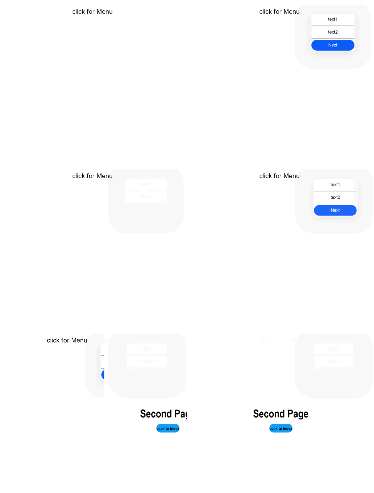
Example 3
Context Menu (Displayed Upon Right-Click)
// xxx.ets
@Entry
@Component
struct ContextMenuExample {
  @Builder MenuBuilder() {
    Flex({ direction: FlexDirection.Column, justifyContent: FlexAlign.Center, alignItems: ItemAlign.Center }) {
      Text('Test menu item 1')
        .fontSize(20)
        .width(100)
        .height(50)
        .textAlign(TextAlign.Center)
      Divider().height(10)
      Text('Test menu item 2')
        .fontSize(20)
        .width(100)
        .height(50)
        .textAlign(TextAlign.Center)
    }.width(100)
  }

  build() {
    Column() {
      Text('rightclick for menu')
    }
    .width('100%')
    .margin({ top: 5 })
    .bindContextMenu(this.MenuBuilder, ResponseType.RightClick)
  }
}
Example 4
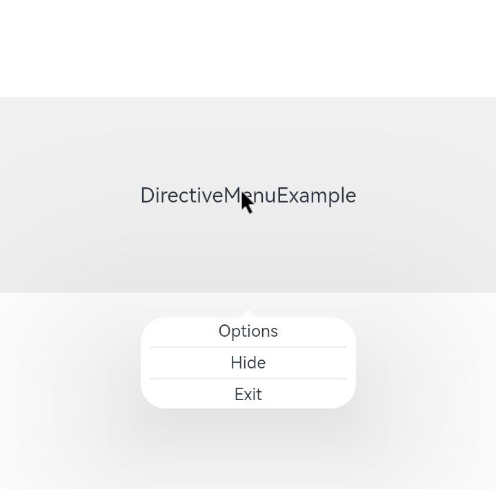
Directive Menu (Displayed Upon Right-Click)
// xxx.ets
@Entry
@Component
struct DirectiveMenuExample {
  @Builder MenuBuilder() {
    Flex({ direction: FlexDirection.Column, alignItems: ItemAlign.Center, justifyContent: FlexAlign.Center }) {
      Text('Options')
      Divider().strokeWidth(2).margin(5).color('#F0F0F0')
      Text('Hide')
      Divider().strokeWidth(2).margin(5).color('#F0F0F0')
      Text('Exit')
    }
    .width(200)
  }

  build() {
    Flex({ direction: FlexDirection.Column, alignItems: ItemAlign.Center, justifyContent: FlexAlign.Center }) {
      Column() {
        Text("DirectiveMenuExample")
          .fontSize(20)
          .width('100%')
          .height("25%")
          .backgroundColor('#F0F0F0')
          .textAlign(TextAlign.Center)
          .bindContextMenu(this.MenuBuilder, ResponseType.RightClick, {
            enableArrow: true,
            placement: Placement.Bottom
          })
      }
    }
    .width('100%')
    .height('100%')
  }
}
你可能感兴趣的鸿蒙文章
harmony 鸿蒙ArkTS-based Declarative Development Paradigm