harmony 鸿蒙Search
Search
搜索框组件,适用于浏览器的搜索内容输入框等应用场景。
说明:
该组件从API Version 8开始支持。后续版本如有新增内容,则采用上角标单独标记该内容的起始版本。
子组件
无
接口
Search(options?: { value?: string, placeholder?: ResourceStr, icon?: string, controller?: SearchController })
参数:
| 参数名 | 参数类型 | 必填 | 参数描述 |
|---|---|---|---|
| value | string | 否 | 设置当前显示的搜索文本内容。 从API version 10开始,该参数支持$$双向绑定变量。 |
| placeholder | ResourceStr10+ | 否 | 设置无输入时的提示文本。 |
| icon | string | 否 | 设置搜索图标路径,默认使用系统搜索图标。 说明: icon的数据源支持本地图片和网络图片。 - 支持的图片格式包括png、jpg、bmp、svg、gif和pixelmap。 - 支持Base64字符串。格式data:image/[png|jpeg|bmp|webp];base64,[base64 data], 其中[base64 data]为Base64字符串数据。 如果与属性searchIcon同时设置,则searchIcon优先。 |
| controller | SearchController | 否 | 设置Search组件控制器。 |
属性
除支持通用属性外,还支持以下属性:
| 名称 | 参数类型 | 描述 |
|---|---|---|
| searchButton10+ | value: string, option?: SearchButtonOptions |
搜索框末尾搜索按钮文本内容,默认无搜索按钮。 |
| placeholderColor | ResourceColor | 设置placeholder文本颜色。 默认值:’#99182431’。 |
| placeholderFont | Font | 设置placeholder文本样式,包括字体大小,字体粗细,字体族,字体风格。目前仅支持默认字体族。 |
| textFont | Font | 设置搜索框内输入文本样式,包括字体大小,字体粗细,字体族,字体风格。目前仅支持默认字体族。 |
| textAlign | TextAlign | 设置文本在搜索框中的对齐方式。目前支持的对齐方式有:Start、Center、End。 默认值:TextAlign.Start |
| copyOption9+ | CopyOptions | 设置输入的文本是否可复制。 默认值:CopyOptions.LocalDevice,支持设备内复制。 设置CopyOptions.None时,当前Search中的文字无法被复制或剪切,仅支持粘贴。 |
| searchIcon10+ | IconOptions | 设置左侧搜索图标样式。 |
| cancelButton10+ | { style? : CancelButtonStyle icon?: IconOptions } |
设置右侧清除按钮样式。 默认值: { style:CancelButtonStyle.INPUT } |
| fontColor10+ | ResourceColor | 设置输入文本的字体颜色。 默认值:’#FF182431’。 说明: 文本通用属性fontSize、fontStyle、fontWeight和fontFamily在textFont属性中设置。 |
| caretStyle10+ | CaretStyle | 设置光标样式。 默认值: { width:1.5vp color:’#007DFF’ } |
| enableKeyboardOnFocus10+ | boolean | Search获焦时,是否绑定输入法 默认值:true。从API version 10开始,获焦默认绑定输入法。 |
| selectionMenuHidden10+ | boolean | 设置长按输入框或者右键输入框时,是否弹出文本选择菜单。 默认值:false |
| customKeyboard10+ | CustomBuilder | 设置自定义键盘。 说明: 当设置自定义键盘时,输入框激活后不会打开系统输入法,而是加载指定的自定义组件。 自定义键盘的高度可以通过自定义组件根节点的height属性设置,宽度不可设置,使用系统默认值。 自定义键盘采用覆盖原始界面的方式呈现,不会对应用原始界面产生压缩或者上提。 自定义键盘无法获取焦点,但是会拦截手势事件。 默认在输入控件失去焦点时,关闭自定义键盘,开发者也可以通过stopEditing方法控制键盘关闭。 |
IconOptions10+对象说明
| 参数名 | 参数类型 | 必填 | 参数描述 |
|---|---|---|---|
| size | Length | 否 | 图标尺寸,不支持百分比。 |
| color | ResourceColor | 否 | 图标颜色。 |
| src | ResourceStr | 否 | 图标/图片源。 |
CaretStyle10+对象说明
| 参数名 | 参数类型 | 必填 | 参数描述 |
|---|---|---|---|
| width | Length | 否 | 光标尺寸,不支持百分比。 |
| color | ResourceColor | 否 | 光标颜色。 |
SearchButtonOptions10+对象说明
| 参数名 | 参数类型 | 必填 | 参数描述 |
|---|---|---|---|
| fontSize | Length | 否 | 文本按钮字体大小,不支持百分比。 |
| fontColor | ResourceColor | 否 | 文本按钮字体颜色。 |
CancelButtonStyle10+枚举说明
| 名称 | 描述 |
|---|---|
| CONSTANT | 清除按钮常显样式。 |
| INVISIBLE | 清除按钮常隐样式。 |
| INPUT | 清除按钮输入样式。 |
事件
除支持通用事件外,还支持以下事件:
| 名称 | 功能描述 |
|---|---|
| onSubmit(callback: (value: string) => void) | 点击搜索图标、搜索按钮或者按下软键盘搜索按钮时触发该回调。 -value: 当前搜索框中输入的文本内容。 |
| onChange(callback: (value: string) => void) | 输入内容发生变化时,触发该回调。 -value: 当前搜索框中输入的文本内容。 |
| onCopy(callback: (value: string) => void) | 长按搜索框弹出剪切板之后,点击剪切板的复制按钮触发该回调。 -value: 复制的文本内容。 |
| onCut(callback: (value: string) => void) | 长按搜索框弹出剪切板之后,点击剪切板的剪切按钮触发该回调。 -value: 剪切的文本内容。 |
| onPaste(callback: (value: string) => void) | 长按搜索框弹出剪切板之后,点击剪切板的粘贴按钮触发该回调。 -value: 粘贴的文本内容。 |
| onTextSelectionChange(callback: (selectionStart: number, selectionEnd: number) => void)10+ | 文本选择的位置发生变化时,触发该回调。 selectionStart:文本选择区域起始位置,文本框中文字的起始位置为0。 selectionEnd:文本选择区域结束位置。 |
| onContentScroll(callback: (totalOffsetX: number, totalOffsetY: number) => void)10+ | 文本内容滚动时,触发该回调。 totalOffsetX:文本在内容区的横坐标偏移。 totalOffsetY:文本在内容区的纵坐标偏移。 |
SearchController
Search组件的控制器,目前通过它可控制Search组件的光标位置。
导入对象
controller: SearchController = new SearchController()
caretPosition
caretPosition(value: number): void
设置输入光标的位置。
参数:
| 参数名 | 参数类型 | 必填 | 参数描述 |
|---|---|---|---|
| value | number | 是 | 从字符串开始到光标所在位置的长度。 |
stopEditing10+
stopEditing(): void
退出编辑态。
getTextContentRect10+
getTextContentRect(): RectResult
获取已编辑文本内容区域相对组件的位置和大小,返回值单位为像素。
返回值:
| 类型 | 说明 |
|---|---|
| RectResult | 已编辑文本内容的相对组件的位置和大小。 |
说明:
- 返回的位置信息是相对Search组件中搜索图标的偏移值。
- 不输入文本时,返回值中有相对Search组件的位置信息,但大小为0。
- 返回值中的位置信息是第一个字符相对于可编辑组件的位置。
RectResult10+
位置和大小。
| 参数 | 类型 | 描述 |
|---|---|---|
| x | number | 水平方向横坐标。 |
| y | number | 竖直方向纵坐标。 |
| width | number | 内容宽度大小。 |
| height | number | 内容高度大小。 |
getTextContentLineCount10+
getTextContentLineCount(): number
获取已编辑文本内容的行数。
返回值:
| 类型 | 说明 |
|---|---|
| number | 已编辑文本内容行数。 |
示例
示例1
// xxx.ets
@Entry
@Component
struct SearchExample {
@State changeValue: string = ''
@State submitValue: string = ''
controller: SearchController = new SearchController()
build() {
Column() {
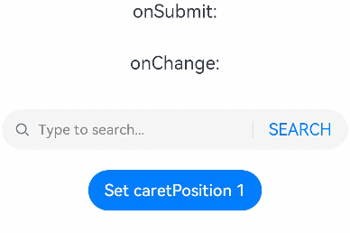
Text('onSubmit:' + this.submitValue).fontSize(18).margin(15)
Text('onChange:' + this.changeValue).fontSize(18).margin(15)
Search({ value: this.changeValue, placeholder: 'Type to search...', controller: this.controller })
.searchButton('SEARCH')
.width('95%')
.height(40)
.backgroundColor('#F5F5F5')
.placeholderColor(Color.Grey)
.placeholderFont({ size: 14, weight: 400 })
.textFont({ size: 14, weight: 400 })
.onSubmit((value: string) => {
this.submitValue = value
})
.onChange((value: string) => {
this.changeValue = value
})
.margin(20)
Button('Set caretPosition 1')
.onClick(() => {
// 设置光标位置到输入的第一个字符后
this.controller.caretPosition(1)
})
}.width('100%')
}
}
示例2
// xxx.ets
@Entry
@Component
struct SearchButtoonExample {
@State submitValue: string = ''
build() {
Column() {
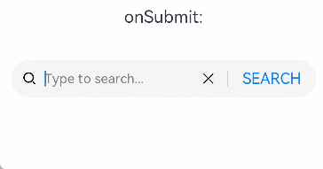
Text('onSubmit:' + this.submitValue).fontSize(18).margin(15)
Search({ placeholder: 'Type to search...' })
.searchButton('SEARCH')
.searchIcon({
src: $r('app.media.search')
})
.cancelButton({
style: CancelButtonStyle.CONSTANT,
icon: {
src: $r('app.media.cancel')
}
})
.width('90%')
.height(40)
.backgroundColor('#F5F5F5')
.placeholderColor(Color.Grey)
.placeholderFont({ size: 14, weight: 400 })
.textFont({ size: 14, weight: 400 })
.onSubmit((value: string) => {
this.submitValue = value
})
.margin(20)
}.width('100%')
}
}
示例3
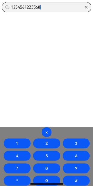
”`ts // xxx.ets @Entry @Component struct SearchExample { controller: SearchController = new SearchController() @State inputValue: string = “”
// 自定义键盘组件 @Builder CustomKeyboardBuilder() { Column() { Button(‘x’).onClick(() => { // 关闭自定义键盘 this.controller.stopEditing() }) Grid() { ForEach([1, 2, 3, 4, 5, 6, 7, 8, 9, ‘*’, 0, ‘#’], (item: number|string) => { GridItem() { Button(item + “”) .width(110).onClick(() => { this.inputValue += item }) } }) }.maxCount(3).columnsGap(10).rowsGap(10).padding(5) }.backgroundColor(Color.Gray) }
build() { Column() { Search({ controller: this.controller, value: this.inputValue}) // 绑定自定义键盘 .customKeyboard(this.CustomKeyboardBuilder()).margin(10).border({ width: 1 }) } } } “”
你可能感兴趣的鸿蒙文章
harmony 鸿蒙@ohos.arkui.advanced.Counter(计数器组件)
harmony 鸿蒙@ohos.arkui.advanced.SegmentButton(分段按钮)
热门推荐
-
2、 优质文章
-
3、 gt
-
7、 openharmony
-
9、 golang
-
10、 Vue中input框自动聚焦