harmony 鸿蒙TextArea
TextArea
The <TextArea> component provides multi-line text input and automatically wraps text so that each line does not have more than the width of the component.
NOTE
This component is supported since API version 7. Updates will be marked with a superscript to indicate their earliest API version.
Child Components
Not supported
APIs
TextArea(value?:{placeholder?: ResourceStr, text?: ResourceStr, controller?: TextAreaController})
Parameters
| Name | Type | Mandatory | Description |
|---|---|---|---|
| placeholder | ResourceStr | No | Text displayed when there is no input. When only the placeholder attribute is set, the text selection handle is still available; the caret stays at the beginning of the placeholder text when the handle is released. |
| text | ResourceStr | No | Current text input. If the component has stateStyles or any other attribute that may trigger updating configured, you are advised to bind the state variable to the text in real time through the onChange event, so as to prevent display errors when the component is updated. Since API version 10, this parameter supports two-way binding through $$. |
| controller8+ | TextAreaController | No | Text area controller. |
Attributes
Among the universal attributes and universal text attributes, fontColor, fontSize, fontStyle, fontWeight, and fontFamily are supported. In addition, the following attributes are supported.
| Name | Type | Description |
|---|---|---|
| placeholderColor | ResourceColor | Placeholder text color. The default value follows the theme. |
| placeholderFont | Font | Placeholder text style, including the font size, font width, font family, and font style. Currently, only the default font family is supported. |
| textAlign | TextAlign | Horizontal alignment of the text. Default value: TextAlign.Start NOTE Available options are TextAlign.Start, TextAlign.Center, and TextAlign.End. To set vertical alignment for the text, use the align attribute. The align attribute alone does not control the horizontal position of the text. In other words, Alignment.TopStart, Alignment.Top, and Alignment.TopEnd produce the same effect, top-aligning the text; Alignment.Start, Alignment.Center, and Alignment.End produce the same effect, centered-aligning the text vertically; Alignment.BottomStart, Alignment.Bottom, and Alignment.BottomEnd produce the same effect, bottom-aligning the text. |
| caretColor | ResourceColor | Color of the caret in the text box. Default value: ’#007DFF’ |
| inputFilter8+ | { value: ResourceStr, error?: (value: string) => void } |
Regular expression for input filtering. Only inputs that comply with the regular expression can be displayed. Other inputs are filtered out. The specified regular expression can match single characters, but not strings. - value: regular expression to set. - error: filtered-out content to return when regular expression matching fails. |
| copyOption9+ | CopyOptions | Whether copy and paste is allowed. Default value: CopyOptions.LocalDevice If this attribute is set to CopyOptions.None, the paste operation is allowed, but the copy and cut operations are not. |
| maxLength10+ | number | Maximum number of characters in the text input. By default, there is no maximum number of characters. When the maximum number of characters is reached, no more characters can be entered, and the border turns red. |
| showCounter10+ | boolean | Whether to show the number of entered characters when maxLength is set. Default value: false |
| style10+ | TextContentStyle | Style of the component. Default value: TextContentStyle.DEFAULT |
| enableKeyboardOnFocus10+ | boolean | Whether to enable the input method when the component obtains focus. Default value: true |
| selectionMenuHidden10+ | boolean | Whether to display the text selection menu when the text box is long-pressed or right-clicked. Default value: false |
| barState10+ | BarState | Scrollbar state when the inline input style is used. Default value: BarState.Auto |
| maxLines10+ | number | Maximum number of lines that can be displayed when the inline input style is used. Default value: 3 |
| customKeyboard10+ | CustomBuilder | Custom keyboard. NOTE When a custom keyboard is set, activating the text box opens the specified custom component, instead of the system input method. The custom keyboard’s height can be set through the height attribute of the custom component’s root node, and its width is fixed at the default value. The custom keyboard is displayed on top of the current page, without compressing or raising the page. The custom keyboard cannot obtain the focus, but it blocks gesture events. By default, the custom keyboard is closed when the input component loses the focus. You can also use the TextAreaController.stopEditing API to close the keyboard. |
NOTE
The default value of the universal attribute padding is as follows:
{
top: 8 vp,
right: 16 vp,
bottom: 8 vp,
left: 16 vp
}
Events
In addition to the universal events, the following events are supported.
| Name | Description |
|---|---|
| onChange(callback: (value: string) => void) | Triggered when the input in the text box changes. - value: text entered. |
| onEditChange(callback: (isEditing: boolean) => void)10+ | Triggered when the input status changes. When the cursor is placed in the text box, it is in the editing state. Otherwise, it is in the non-editing state. If the value of isEditing is true, text input is in progress. |
| onCopy8+(callback:(value: string) => void) | Triggered when the copy button on the pasteboard, which displays when the text box is long pressed, is clicked. - value: text to be copied. |
| onCut8+(callback:(value: string) => void) | Triggered when the cut button on the pasteboard, which displays when the text box is long pressed, is clicked. - value: text to be cut. |
| onPaste8+(callback:(value: string) => void) | Triggered when the paste button on the pasteboard, which displays when the text box is long pressed, is clicked. - value: text to be pasted. |
| onTextSelectionChange(callback: (selectionStart: number, selectionEnd: number) => void)10+ | Triggered when the text selection position changes. selectionStart: start position of the text selection area. The start position of text in the text box is 0. selectionEnd: end position of the text selection area. |
| onContentScroll(callback: (totalOffsetX: number, totalOffsetY: number) => void)10+ | Triggered when the text content is scrolled. totalOffsetX: X coordinate offset of the text in the content area. totalOffsetY: Y coordinate offset of the text in the content area. |
TextAreaController8+
Defines the controller for controlling the <TextArea> component. Currently, the controller can be used to control the caret position.
Objects to Import
controller: TextAreaController = new TextAreaController()
caretPosition8+
caretPosition(value: number): void
Sets the position of the caret.
Parameters
| Name | Type | Mandatory | Description |
|---|---|---|---|
| value | number | Yes | Length from the start of the string to the position where the caret is located. |
setTextSelection10+
setTextSelection(selectionStart: number, selectionEnd: number): void
Sets the text selection range and highlights the selected text when the component is focused. This API works only when the value of selectionStart is less than that of selectionEnd.
Parameters
| Name | Type | Mandatory | Description |
|---|---|---|---|
| selectionStart | number | Yes | Start position of the text selection range. The start position of text in the text box is 0. A value less than 0 evaluates to the value 0. A value greater than the maximum text length evaluates to the maximum text length. |
| selectionEnd | number | Yes | End position of the text selection range. A value less than 0 evaluates to the value 0. A value greater than the maximum text length evaluates to the maximum text length. |
stopEditing10+
stopEditing(): void
Exits the editing state.
getTextContentRect10+
getTextContentRect(): RectResult
Obtains the position of the edited text area relative to the component and its size. The unit of the return value is pixel.
Return value
| Type | Description |
|---|---|
| RectResult | Position of the edited text area relative to the component and its size. |
NOTE
- If no text is entered, the return value contains the position information, but the size is 0.
- The position information is the offset of the first character relative to the editable area.
- If there is input, the width in the return value is the fixed width of the editable area.
RectResult10+
Describes the position and size.
| Parameter | Type | Description |
|---|---|---|
| x | number | X coordinate. |
| y | number | Y coordinate. |
| width | number | Content width. |
| height | number | Content height. |
getTextContentLineCount10+
getTextContentLineCount(): number
Obtains the number of lines of the edited text.
Return value
| Type | Description |
|---|---|
| number | Number of lines of the edited text. |
Example
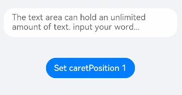
Example 1
// xxx.ets
@Entry
@Component
struct TextAreaExample {
  @State text: string = ''
  controller: TextAreaController = new TextAreaController()

  build() {
    Column() {
      TextArea({
        text: this.text,
        placeholder: 'The text area can hold an unlimited amount of text. input your word...',
        controller: this.controller
      })
        .placeholderFont({ size: 16, weight: 400 })
        .width(336)
        .height(56)
        .margin(20)
        .fontSize(16)
        .fontColor('#182431')
        .backgroundColor('#FFFFFF')
        .onChange((value: string) => {
          this.text = value
        })
      Text(this.text)
      Button('Set caretPosition 1')
        .backgroundColor('#007DFF')
        .margin(15)
        .onClick(() => {
          // Move the caret to after the first entered character.
          this.controller.caretPosition(1)
        })
    }.width('100%').height('100%').backgroundColor('#F1F3F5')
  }
}
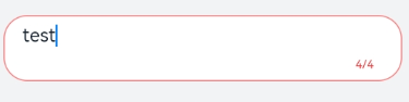
Example 2
// xxx.ets
@Entry
@Component
struct TextAreaExample {
  @State text: string = 'test'
  @State counterVisible: boolean = false
  @State maxNumber: number = -1
  controller: TextAreaController = new TextAreaController()

  build() {
    Column() {
      TextArea({
        text: this.text,
        placeholder: 'The text area can hold an unlimited amount of text. input your word...',
        controller: this.controller
      })
        .placeholderFont({ size: 16, weight: 400 })
        .width(336)
        .height(56)
        .margin(20)
        .fontSize(16)
        .fontColor('#182431')
        .maxLength(4)
        .showCounter(true)
        .backgroundColor('#FFFFFF')
        .onChange((value: string) => {
          this.text = value
        })
    }.width('100%').height('100%').backgroundColor('#F1F3F5')
  }
}
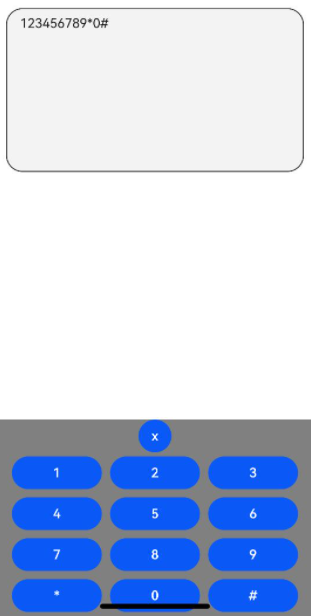
Example 3
// xxx.ets
@Entry
@Component
struct TextAreaExample {
  controller: TextAreaController = new TextAreaController()
  @State inputValue: string = ""

  // Create a custom keyboard component.
  @Builder CustomKeyboardBuilder() {
    Column() {
      Button('x').onClick(() => {
        // Disable the custom keyboard.
        this.controller.stopEditing()
      })
      Grid() {
        ForEach([1, 2, 3, 4, 5, 6, 7, 8, 9, '*', 0, '#'], (item: number|string) => {
          GridItem() {
            Button(item + "")
              .width(110).onClick(() => {
              this.inputValue += item
            })
          }
        })
      }.maxCount(3).columnsGap(10).rowsGap(10).padding(5)
    }.backgroundColor(Color.Gray)
  }

  build() {
    Column() {
      TextArea({ controller: this.controller, text: this.inputValue})
        // Bind the custom keyboard.
        .customKeyboard(this.CustomKeyboardBuilder()).margin(10).border({ width: 1 })
        .height(200)
    }
  }
}
你可能感兴趣的鸿蒙文章
harmony 鸿蒙ArkTS-based Declarative Development Paradigm
- 所属分类: 后端技术
- 本文标签:
热门推荐
-
2、 优质文章
-
3、 gt
-
7、 openharmony
-
9、 golang
-
10、 Vue中input框自动聚焦