harmony 鸿蒙Service Widget Overview
Service Widget Overview
A service widget (also called widget) is a set of UI components that display important information or operations specific to an application. It provides users with direct access to a desired application service, without the need to open the application first. A widget is usually displayed as part of the UI of another application (which can only be a system application, such as the home screen) and provides basic interactive features such as opening a UI page or sending a message.
Service Widget Architecture
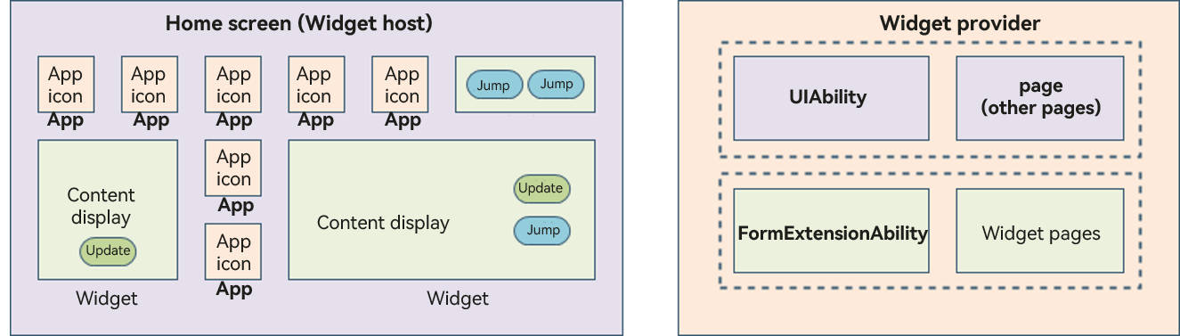
Figure 1 Service widget architecture
Before you get started, it would be helpful if you have a basic understanding of the following concepts:
Widget host: an application that displays the widget content and controls the widget location. An example is the home screen in the preceding figure.
- Application icon: an icon for entry to an application, clicking which starts the application process. The icon content does not support interactions.
- Widget: an interactive UI in various sizes. It may provide buttons to implement different features, such as the button to update the widget content or switch to an application.
Widget provider: an application that provides widget content to be displayed. It controls the display content, display logic, and component click events triggered on a widget.
- FormExtensionAbility: a widget service logic module, which provides lifecycle callbacks invoked when a widget is created, destroyed, or updated.
- Widget page: a widget UI module, which contains display and interaction information such as components, layouts, and events.
Below is the typical procedure of using a widget:
Figure 2 Typical procedure of using a widget
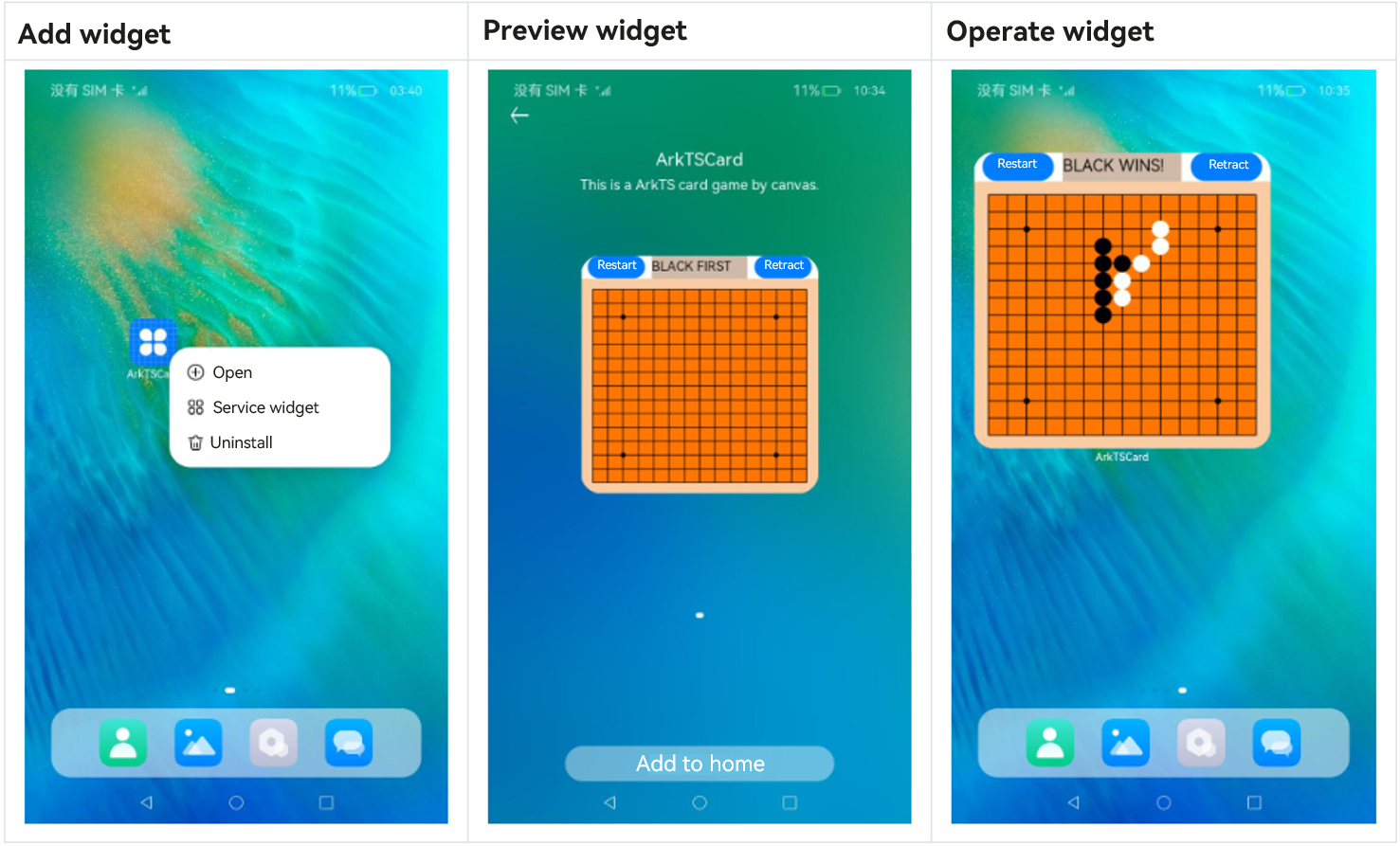
Touch and hold an application icon on the home screen to display the shortcut menu.
Touch Service widget to access the preview screen.
Touch the Add to home button. The widget is then added to the home screen.
Widget UI Development Modes
In the stage model, the UI of a widget can be developed in ArkTS or JS.
A widget developed in the ArkTS-based declarative development paradigm is called ArkTS widget.
A widget developed in the JS-compatible web-like development paradigm is called JS widget.
ArkTS widgets and JS widgets have different implementation principles and features. The following table lists the differences in capabilities.
| Category | JS Widget | ArkTS Widget |
|---|---|---|
| Development paradigm | Web-like paradigm | Declarative paradigm |
| Component capability | Supported | Supported |
| Layout capability | Supported | Supported |
| Event capability | Supported | Supported |
| Custom animation | Not supported | Supported |
| Custom drawing | Not supported | Supported |
| Logic code execution (excluding the import capability) | Not supported | Supported |
As can be seen above, ArkTS widgets provide more capabilities and use cases than JS widgets. Therefore, ArkTS widgets are always recommended, except for the case where the widget consists of only static pages.
Dynamic Widgets and Static Widgets
ArkTS widgets can be further classified as dynamic or static (distinguished by the isDynamic field in the form_config.json file). The differences between these two types are as follows: - Dynamic widget: With support for universal events and custom animations, this type of widget is applicable to scenarios involving complex service logic and interactions. Compared with its static counterpart, the dynamic widget is more feature rich and memory hogging. - Static widget: This type of widget provides UI components and layout capabilities, but does not support universal events or custom animations. It displays content in a static form and only allows for redirection to a specified UIAbility through the FormLink component. It is applicable for information display (where the UI is relatively fixed), consuming significantly less memory than the dynamic widget.
The following table compares the capabilities of static widget and dynamic widgets. |Capability|Static Widget|Dynamic Widget| |——–|——–|——–| |Component capability|Supported|Supported| |Layout capability|Supported|Supported| |Event capability|Conditionally supported|Supported| |Custom animation|Not supported|Supported| |Custom drawing|Supported|Supported| |Logic code execution (excluding the import capability)|Supported|Supported|
When using static widgets, avoid the following scenarios: - Scenarios where the UI is refreshed frequently
Scenarios where state variables are passed through FormLink during refresh
Scenarios that involve complex service logic
Scenarios that involve animations
你可能感兴趣的鸿蒙文章
harmony 鸿蒙Using Explicit Want to Start an Application Component
harmony 鸿蒙Using Implicit Want to Open a Website
harmony 鸿蒙AbilityStage Component Container
harmony 鸿蒙Accessing a DataAbility
harmony 鸿蒙Accessing a DataShareExtensionAbility from the FA Model
harmony 鸿蒙AccessibilityExtensionAbility
harmony 鸿蒙Common action and entities Values
- 所属分类: 后端技术
- 本文标签:
热门推荐
-
2、 优质文章
-
3、 gt
-
7、 openharmony
-
9、 golang
-
10、 Vue中input框自动聚焦