harmony 鸿蒙Image Effect (System API)
Image Effect (System API)
With image effects, you can define how a component blends with the existing content on the canvas below.
NOTE
The initial APIs of this module are supported since API version 13. Newly added APIs will be marked with a superscript to indicate their earliest API version.
This topic describes only system APIs provided by the module. For details about its public APIs, see Image Effects.
advancedBlendMode
advancedBlendMode(effect: BlendMode|Blender, type?: BlendApplyType): T
Defines how the component’s content (including the content of it child components) is blended with the existing content on the canvas (possibly offscreen canvas) below. This API cannot be used together with blendMode.
Widget capability: This API can be used in ArkTS widgets since API version 13.
System capability: SystemCapability.ArkUI.ArkUI.Full
System API: This is a system API.
Parameters
| Name | Type | Mandatory | Description |
|---|---|---|---|
| effect | BlendMode |Blender | Yes | Blend mode or blender type, depending on the parameter type. When the parameter type is BlendMode, it indicates the blend mode. Default value: BlendMode.NONE When the parameter type is Blender, it indicates the blender type, used to describe the blending effect. A Blender instance must be created using methods, for example, uiEffect.createBrightnessBlender, from the uiEffect module. Using a custom object as a parameter will not take effect. |
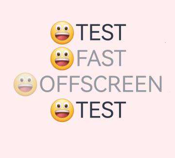
| type | BlendApplyType | No | Whether the blend mode is implemented offscreen. Default value: BlendApplyType.FAST NOTE 1. When BlendApplyType.FAST is set, the blend mode is not implemented offscreen. 2. When BlendApplyType.OFFSCREEN is set, an offscreen canvas the size of the current component is created. The content of the current component (including child components) is then drawn onto the offscreen canvas, and blended with the existing content on the canvas below using the specified blend mode. 3. For text components, this API does not apply to emoji expressions when not offscreen. |
Example
This example shows how to add a brightness effect to a component using advancedBlendMode.
// xxx.ets
import { uiEffect } from "@kit.ArkGraphics2D"

// Use uiEffect.createBrightnessBlender to create a BrightnessBlender instance, which can be used to apply the brightness effect to a component.
let blender: uiEffect.BrightnessBlender = uiEffect.createBrightnessBlender({
  cubicRate: 0.5,
  quadraticRate: 0.5,
  linearRate: 0.5,
  degree: 0.5,
  saturation: 0.5,
  positiveCoefficient: [2.3, 4.5, 2.0],
  negativeCoefficient: [0.5, 2.0, 0.5],
  fraction: 0.5
});
// Using a custom object as a parameter will not take effect.
let blender1: uiEffect.BrightnessBlender = {
  cubicRate: 0.5,
  quadraticRate: 0.5,
  linearRate: 0.5,
  degree: 0.5,
  saturation: 0.5,
  positiveCoefficient: [2.3, 4.5, 2.0],
  negativeCoefficient: [0.5, 2.0, 0.5],
  fraction: 0.5
};

@Entry
@Component
struct Index {
  build() {
    Stack() {
      Image($r('app.media.img_1'))

      Column() {
        Text(String.fromCodePoint(0x1F600) + 'TEST')
          .fontSize(60)

        Text(String.fromCodePoint(0x1F600) + 'FAST')
          .fontSize(60)
          .advancedBlendMode(blender)

        Text(String.fromCodePoint(0x1F600) + 'OFFSCREEN')
          .fontSize(60)
          .advancedBlendMode(blender, BlendApplyType.OFFSCREEN)

        Text(String.fromCodePoint(0x1F600) + 'TEST')
          .fontSize(60)
          .advancedBlendMode(blender1)
      }
    }
  }
}
Below is how the component looks with the brightness effect applied:
你可能感兴趣的鸿蒙文章
- 所属分类: 后端技术
- 本文标签:
热门推荐
-
2、 优质文章
-
3、 gt
-
7、 openharmony
-
9、 golang
-
10、 Vue中input框自动聚焦