harmony 鸿蒙Indicator
Indicator
The Indicator component provides two types of navigation indicators: dot indicators and digit indicators.
It extracts the existing capabilities of the Indicator from the existing Swiper component and makes them available as a standalone component. You can use the Indicator component independently or bind it to a Swiper component through IndicatorComponentController.
When multiple Indicator components are bound to a single Swiper, only the last bound Indicator is active.
Similarly, if an Indicator is bound to multiple Swiper components, only the last bound Swiper works with the Indicator.
NOTE
This component is supported since API version 15. Updates will be marked with a superscript to indicate their earliest API version.
Child Components
Not supported
APIs
IndicatorComponent(controller?: IndicatorComponentController)
A constructor used to create an Indicator component. You can optionally pass a controller to manage the Indicator component.
Widget capability: This API can be used in ArkTS widgets since API version 15.
Atomic service API: This API can be used in atomic services since API version 15.
System capability: SystemCapability.ArkUI.ArkUI.Full
Parameters
|Name|Type|Mandatory|Description| |—–|—–|–| —| |controller| IndicatorComponentController|No|Controller to manage the Indicator component.|
Attributes
In addition to the universal attributes, the following attributes are supported.
style
style(indicatorStyle: DotIndicator|DigitIndicator)
Sets the style of the navigation indicator.
Widget capability: This API can be used in ArkTS widgets since API version 15.
Atomic service API: This API can be used in atomic services since API version 15.
System capability: SystemCapability.ArkUI.ArkUI.Full
Parameters
| Name | Type | Mandatory | Description |
|---|---|---|---|
| indicatorStyle | DotIndicator |DigitIndicator | Yes | Style of the navigation indicator. - DotIndicator: dot style. - DigitIndicator: digit style. Default style: DotIndicator |
count
count(totalCount: number)
Sets the total number of navigation points.
When the Indicator component is used with a Swiper component, the count is subject to the number of pages in the Swiper component.
Widget capability: This API can be used in ArkTS widgets since API version 15.
Atomic service API: This API can be used in atomic services since API version 15.
System capability: SystemCapability.ArkUI.ArkUI.Full
Parameters
| Name | Type | Mandatory | Description |
|---|---|---|---|
| totalCount | number | Yes | Total number of navigation points. Default value: 2 |
initialIndex
initialIndex(index: number)
Sets the initial index of the navigation indicator when it first appears. If the value is less than 0 or greater than or equal to the total count, the default value 0 is used.
This attribute does not take effect when the Indicator component is bound to a Swiper component.
Widget capability: This API can be used in ArkTS widgets since API version 15.
Atomic service API: This API can be used in atomic services since API version 15.
System capability: SystemCapability.ArkUI.ArkUI.Full
Parameters
| Name | Type | Mandatory | Description |
|---|---|---|---|
| index | number | Yes | Initial index of the navigation indicator when it first appears. Default value: 0 |
loop
loop(isLoop: boolean)
Sets whether to enable looping. The value true means to enable looping.
This attribute does not take effect when the Indicator component is bound to a Swiper component.
Widget capability: This API can be used in ArkTS widgets since API version 15.
Atomic service API: This API can be used in atomic services since API version 15.
System capability: SystemCapability.ArkUI.ArkUI.Full
Parameters
| Name | Type | Mandatory | Description |
|---|---|---|---|
| isLoop | boolean | Yes | Whether to enable looping. Default value: true |
vertical
vertical(isVertical: boolean)
Sets whether the navigation is vertical.
This attribute does not take effect when the Indicator component is bound to a Swiper component.
Widget capability: This API can be used in ArkTS widgets since API version 15.
Atomic service API: This API can be used in atomic services since API version 15.
System capability: SystemCapability.ArkUI.ArkUI.Full
Parameters
| Name | Type | Mandatory | Description |
|---|---|---|---|
| isVertical | boolean | Yes | Whether the navigation is vertical. Default value: false |
Events
In addition to the universal events, the following events are supported.
onChange
onChange(event: Callback<number>)
Triggered when the currently selected navigation index changes. The callback provides the new index.
Widget capability: This API can be used in ArkTS widgets since API version 15.
Atomic service API: This API can be used in atomic services since API version 15.
System capability: SystemCapability.ArkUI.ArkUI.Full
Parameters
| Name | Type | Mandatory | Description |
|---|---|---|---|
| event | Callback<number> | Yes | Callback triggered when the index changes. |
IndicatorComponentController
Implements a controller for the Indicator component, allowing you to control navigation.
constructor
constructor()
A constructor used to create an IndicatorComponentController object.
Widget capability: This API can be used in ArkTS widgets since API version 15.
Atomic service API: This API can be used in atomic services since API version 15.
System capability: SystemCapability.ArkUI.ArkUI.Full
showNext
showNext(): void
Moves to the next navigation point.
Widget capability: This API can be used in ArkTS widgets since API version 15.
Atomic service API: This API can be used in atomic services since API version 15.
System capability: SystemCapability.ArkUI.ArkUI.Full
showPrevious
showPrevious(): void
Moves to the previous navigation point.
Widget capability: This API can be used in ArkTS widgets since API version 15.
Atomic service API: This API can be used in atomic services since API version 15.
System capability: SystemCapability.ArkUI.ArkUI.Full
changeIndex
changeIndex(index: number, useAnimation?: boolean): void
Moves to a specific navigation index.
Widget capability: This API can be used in ArkTS widgets since API version 15.
Atomic service API: This API can be used in atomic services since API version 15.
System capability: SystemCapability.ArkUI.ArkUI.Full
Parameters
| Name | Type | Mandatory | Description |
|---|---|---|---|
| index | number | Yes | Target navigation index. |
| useAnimation | boolean | No | Whether to use an animation for when the target index is reached. The value true means to use an animation, and false means the opposite. Default value: false |
Example
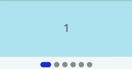
Example 1: Using a Dot Indicator with a Swiper Component
This example shows how to bind a dot-style Indicator component to a **Swiper **component using IndicatorComponentController.
@Entry
@Component
struct DotIndicatorDemo {
  private indicatorController: IndicatorComponentController = new IndicatorComponentController()
  private swiperController: SwiperController = new SwiperController()
  @State list: number[] = []
  aboutToAppear(): void {
    for (let i = 1; i <= 6; i++) {
      this.list.push(i);
    }
  }

  build() {
    Column() {
      Swiper(this.swiperController) {
        ForEach(this.list, (item: string) => {
          Text(item.toString())
            .width('100%')
            .height(160)
            .backgroundColor(0xAFEEEE)
            .textAlign(TextAlign.Center)
            .fontSize(30)
        }, (item: string) => item)
      }
      .cachedCount(2)
      .index(0)
      .autoPlay(true)
      .interval(2000)
      .indicator(this.indicatorController)
      .loop(true)
      .duration(1000)
      .itemSpace(0)
      .curve(Curve.Linear)
      .onChange((index: number) => {
        console.info(index.toString())
      })

      IndicatorComponent(this.indicatorController)
        .initialIndex(0)
        .style(
          new DotIndicator()
            .itemWidth(15)
            .itemHeight(15)
            .selectedItemWidth(15)
            .selectedItemHeight(15)
            .color(Color.Gray)
            .selectedColor(Color.Blue))
        .loop(true)
        .count(6)
        .vertical(true)
        .onChange((index: number) => {
          console.log("current index: " + index )
        })
    }
  }
}
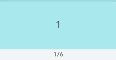
Example 2: Using a Digit Indicator with a Swiper Component
This example shows how to bind a digit-style Indicator component to a **Swiper **component using IndicatorComponentController.
@Entry
@Component
struct DigitIndicatorDemo {
  private indicatorController: IndicatorComponentController = new IndicatorComponentController()
  private swiperController: SwiperController = new SwiperController()
  @State list: number[] = []
  aboutToAppear(): void {
    for (let i = 1; i <= 6; i++) {
      this.list.push(i);
    }
  }

  build() {
    Column() {
      Swiper(this.swiperController) {
        ForEach(this.list, (item: string) => {
          Text(item.toString())
            .width('100%')
            .height(160)
            .backgroundColor(0xAFEEEE)
            .textAlign(TextAlign.Center)
            .fontSize(30)
        }, (item: string) => item)
      }
      .cachedCount(2)
      .index(0)
      .autoPlay(true)
      .interval(2000)
      .indicator(this.indicatorController)
      .loop(true)
      .duration(1000)
      .itemSpace(0)
      .curve(Curve.Linear)
      .onChange((index: number) => {
        console.info(index.toString())
      })

      IndicatorComponent(this.indicatorController)
        .initialIndex(0)
        .style(Indicator.digit()
          .fontColor(Color.Gray)
          .selectedFontColor(Color.Gray)
          .digitFont({ size: 20, weight: FontWeight.Bold })
          .selectedDigitFont({ size: 20, weight: FontWeight.Normal }))
        .loop(true)
        .count(6)
        .vertical(true)
        .onChange((index: number) => {
          console.log("current index: " + index )
        })
    }
  }
}
你可能感兴趣的鸿蒙文章
- 所属分类: 后端技术
- 本文标签:
热门推荐
-
2、 优质文章
-
3、 gt
-
7、 openharmony
-
9、 golang
-
10、 Vue中input框自动聚焦