harmony 鸿蒙Bottom Tab
Bottom Tab
Bottom tabs, as a common navigation component, allow users to quickly access different functions of an application.
How to Use
Use bottom tabs only on level-1 screens to provide quick switch between different tab pages.
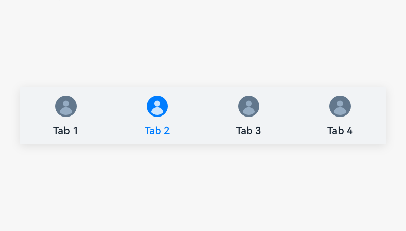
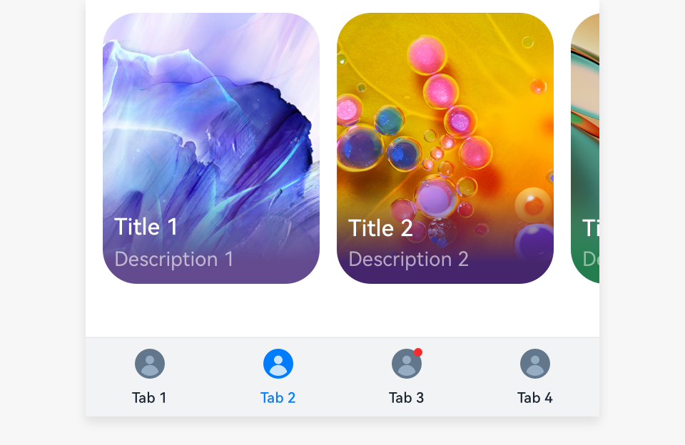
Place bottom tabs at the bottom of the screen to reflect the level-1 categories of an application. These categories are presented in an equal manner. This practice allows users to perform actions with one hand.
Use the combination of an icon and a text for each bottom tab. When users touch a tab, the tab is activated and highlighted.
Use a siderbar rather than bottom tables on tablets in landscape mode so that your users can perform actions with both hands.
Use concise text on each bottom tab.
Use two to five bottom tabs to avoid an overwhelming layout.
Use badges on bottom tabs to notify users of new unread information. For details, see Badges.
Resources
For details about the development guide related to the bottom tab, see Tabs and TabContent.
你可能感兴趣的鸿蒙文章
harmony 鸿蒙OpenHarmony Application UX Design Specifications
harmony 鸿蒙Animation Attributes
harmony 鸿蒙Animation Design Principles
harmony 鸿蒙Application Navigation Structure Design
harmony 鸿蒙Application Page Structure Design
- 所属分类: 后端技术
- 本文标签:
热门推荐
-
2、 优质文章
-
3、 gt
-
7、 openharmony
-
9、 golang
-
10、 Vue中input框自动聚焦