harmony 鸿蒙Badge
Badge
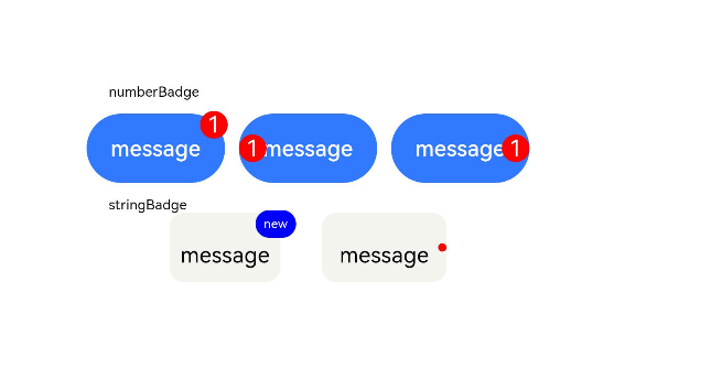
The <Badge> component is a container that can be attached to another component for tagging.
NOTE
This component is supported since API version 7. Updates will be marked with a superscript to indicate their earliest API version.
Child Components
This component supports only one child component.
NOTE
Built-in components and custom components are allowed, with support for (if/else, ForEach, and LazyForEach) rendering control.
APIs
Badge
Badge(value: {count: number, position?: BadgePosition |Position, maxCount?: number, style: BadgeStyle})
Creates a badge.
Since API version 9, this API is supported in ArkTS widgets.
Parameters
| Name | Type | Mandatory | Description |
|---|---|---|---|
| count | number | Yes | Number of notifications. NOTE If the value is less than or equal to 0, no badge is displayed. Value range: [-2147483648, 2147483647] If the value is not an integer, it is rounded off to the nearest integer. For example, 5.5 is rounded off to 5. |
| position | BadgePosition|Position10+ | No | Position to display the badge relative to the parent component. Default value: BadgePosition.RightTop NOTE This parameter cannot be set in percentage. If it is set to an invalid value, the default value (0,0) will be used. |
| maxCount | number | No | Maximum number of notifications. When the maximum number is reached, only maxCount+ is displayed. Default value: 99 Value range: [-2147483648, 2147483647] If the value is not an integer, it is rounded off to the nearest integer. For example, 5.5 is rounded off to 5. |
| style | BadgeStyle | Yes | Style of the badge, including the font color, font size, badge color, and badge size. |
Badge
Badge(value: {value: string, position?: BadgePosition |Position, style: BadgeStyle})
Creates a badge based on the given string.
Since API version 9, this API is supported in ArkTS widgets.
Parameters
| Name | Type | Mandatory | Default Value | Description |
|---|---|---|---|---|
| value | string | Yes | - | Prompt content. |
| position | BadgePosition|Position10+ | No | BadgePosition.RightTop | Position to display the badge relative to the parent component. |
| style | BadgeStyle | Yes | - | Style of the badge, including the font color, font size, badge color, and badge size. |
BadgePosition
Since API version 9, this API is supported in ArkTS widgets.
| Name | Description |
|---|---|
| RightTop | The badge is displayed in the upper right corner of the parent component. |
| Right | The badge is vertically centered on the right of the parent component. |
| Left | The badge is vertically centered on the left of the parent component. |
BadgeStyle
Since API version 9, this API is supported in ArkTS widgets.
| Name | Type | Mandatory | Description |
|---|---|---|---|
| color | ResourceColor | No | Font color. Default value: Color.White |
| fontSize | number |string | No | Font size. Default value: 10 Unit: vp NOTE This parameter cannot be set in percentage. |
| badgeSize | number |string | No | Badge size. Default value: 16 Unit: vp NOTE This parameter cannot be set in percentage. If it is set to an invalid value, the default value is used. |
| badgeColor | ResourceColor | No | Badge color. Default value: Color.Red |
| fontWeight10+ | number |FontWeight |string | No | Font weight of the text. Default value: FontWeight.Normal NOTE This parameter cannot be set in percentage. |
| borderColor10+ | ResourceColor | No | Border color of the background. |
| borderWidth10+ | Length | No | Border width of the background. Default value: 1 Unit: vp NOTE This parameter cannot be set in percentage. |
Attributes
The universal attributes are supported.
Events
The universal events are supported.
Example
// xxx.ets
@Entry
@Component
struct BadgeExample {
  @Builder TabBuilder(index: number) {
    Column() {
      if (index === 2) {
        Badge({
          value: '',
          style: { badgeSize: 6, badgeColor: '#FA2A2D' }
        }) {
          Image('/common/public_icon_off.svg')
            .width(24)
            .height(24)
        }
        .width(24)
        .height(24)
        .margin({ bottom: 4 })
      } else {
        Image('/common/public_icon_off.svg')
          .width(24)
          .height(24)
          .margin({ bottom: 4 })
      }
      Text('Tab')
        .fontColor('#182431')
        .fontSize(10)
        .fontWeight(500)
        .lineHeight(14)
    }.width('100%').height('100%').justifyContent(FlexAlign.Center)
  }

  @Builder itemBuilder(value: string) {
    Row() {
      Image('common/public_icon.svg').width(32).height(32).opacity(0.6)
      Text(value)
        .width(177)
        .height(21)
        .margin({ left: 15, right: 76 })
        .textAlign(TextAlign.Start)
        .fontColor('#182431')
        .fontWeight(500)
        .fontSize(16)
        .opacity(0.9)
      Image('common/public_icon_arrow_right.svg').width(12).height(24).opacity(0.6)
    }.width('100%').padding({ left: 12, right: 12 }).height(56)
  }

  build() {
    Column() {
      Text('dotsBadge').fontSize(18).fontColor('#182431').fontWeight(500).margin(24)
      Tabs() {
        TabContent()
          .tabBar(this.TabBuilder(0))
        TabContent()
          .tabBar(this.TabBuilder(1))
        TabContent()
          .tabBar(this.TabBuilder(2))
        TabContent()
          .tabBar(this.TabBuilder(3))
      }
      .width(360)
      .height(56)
      .backgroundColor('#F1F3F5')

      Column() {
        Text('stringBadge').fontSize(18).fontColor('#182431').fontWeight(500).margin(24)
        List({ space: 12 }) {
          ListItem() {
            Text('list1').fontSize(14).fontColor('#182431').margin({ left: 12 })
          }
          .width('100%')
          .height(56)
          .backgroundColor('#FFFFFF')
          .borderRadius(24)
          .align(Alignment.Start)

          ListItem() {
            Badge({
              value: 'New',
              position: BadgePosition.Right,
              style: { badgeSize: 16, badgeColor: '#FA2A2D' }
            }) {
              Text('list2').width(27).height(19).fontSize(14).fontColor('#182431')
            }.width(49.5).height(19)
            .margin({ left: 12 })
          }
          .width('100%')
          .height(56)
          .backgroundColor('#FFFFFF')
          .borderRadius(24)
          .align(Alignment.Start)
        }.width(336)

        Text('numberBadge').fontSize(18).fontColor('#182431').fontWeight(500).margin(24)
        List() {
          ListItem() {
            this.itemBuilder('list1')
          }

          ListItem() {
            Row() {
              Image('common/public_icon.svg').width(32).height(32).opacity(0.6)
              Badge({
                count: 1,
                position: BadgePosition.Right,
                style: { badgeSize: 16, badgeColor: '#FA2A2D' }
              }) {
                Text('list2')
                  .width(177)
                  .height(21)
                  .textAlign(TextAlign.Start)
                  .fontColor('#182431')
                  .fontWeight(500)
                  .fontSize(16)
                  .opacity(0.9)
              }.width(240).height(21).margin({ left: 15, right: 11 })

              Image('common/public_icon_arrow_right.svg').width(12).height(24).opacity(0.6)
            }.width('100%').padding({ left: 12, right: 12 }).height(56)
          }

          ListItem() {
            this.itemBuilder('list3')
          }

          ListItem() {
            this.itemBuilder('list4')
          }
        }
        .width(336)
        .height(232)
        .backgroundColor('#FFFFFF')
        .borderRadius(24)
        .padding({ top: 4, bottom: 4 })
        .divider({ strokeWidth: 0.5, color: 'rgba(0,0,0,0.1)', startMargin: 60, endMargin: 12 })
      }.width('100%').backgroundColor('#F1F3F5').padding({ bottom: 12 })
    }.width('100%')
  }
}
你可能感兴趣的鸿蒙文章
harmony 鸿蒙ArkTS-based Declarative Development Paradigm
- 所属分类: 后端技术
- 本文标签:
热门推荐
-
2、 优质文章
-
3、 gt
-
7、 openharmony
-
9、 golang
-
10、 Vue中input框自动聚焦