harmony 鸿蒙Column
Column
The
NOTE
This component is supported since API version 7. Updates will be marked with a superscript to indicate their earliest API version.
Child Components
Supported
APIs
Column(value?: {space?: string|number})
Since API version 9, this API is supported in ArkTS widgets.
Parameters
| Name | Type | Mandatory | Description |
|---|---|---|---|
| space | string |number | No | Vertical spacing between two adjacent child components. Since API version 9, this parameter does not take effect when it is set to a negative number or when justifyContent is set to FlexAlign.SpaceBetween, FlexAlign.SpaceAround or FlexAlign.SpaceEvenly. Default value: 0 NOTE The value can be a number greater than or equal to 0 or a string that can be converted to a number. |
Attributes
In addition to the universal attributes, the following attributes are supported.
| Name | Type | Description |
|---|---|---|
| alignItems | HorizontalAlign | Alignment mode of the child components in the horizontal direction. Default value: HorizontalAlign.Center Since API version 9, this API is supported in ArkTS widgets. |
| justifyContent8+ | FlexAlign | Alignment mode of the child components in the vertical direction. Default value: FlexAlign.Start Since API version 9, this API is supported in ArkTS widgets. |
NOTE
During column layout, child components do not shrink if flexShrink is not set for them. In this case, the total size of the child components on the main axis can exceed the size of the container on the main axis.
Events
The universal events are supported.
Example
// xxx.ets
@Entry
@Component
struct ColumnExample {
build() {
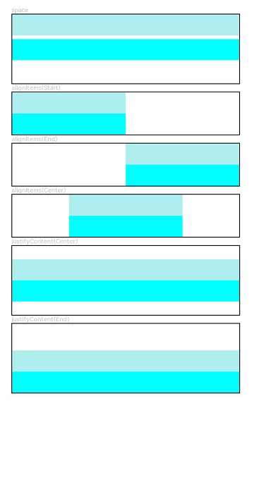
Column({ space: 5 }) {
// Set the vertical spacing between two adjacent child components to 5.
Text('space').width('90%')
Column({ space: 5 }) {
Column().width('100%').height(30).backgroundColor(0xAFEEEE)
Column().width('100%').height(30).backgroundColor(0x00FFFF)
}.width('90%').height(100).border({ width: 1 })
// Set the alignment mode of the child components in the horizontal direction.
Text('alignItems(Start)').width('90%')
Column() {
Column().width('50%').height(30).backgroundColor(0xAFEEEE)
Column().width('50%').height(30).backgroundColor(0x00FFFF)
}.alignItems(HorizontalAlign.Start).width('90%').border({ width: 1 })
Text('alignItems(End)').width('90%')
Column() {
Column().width('50%').height(30).backgroundColor(0xAFEEEE)
Column().width('50%').height(30).backgroundColor(0x00FFFF)
}.alignItems(HorizontalAlign.End).width('90%').border({ width: 1 })
Text('alignItems(Center)').width('90%')
Column() {
Column().width('50%').height(30).backgroundColor(0xAFEEEE)
Column().width('50%').height(30).backgroundColor(0x00FFFF)
}.alignItems(HorizontalAlign.Center).width('90%').border({ width: 1 })
// Set the alignment mode of the child components in the vertical direction.
Text('justifyContent(Center)').width('90%')
Column() {
Column().width('90%').height(30).backgroundColor(0xAFEEEE)
Column().width('90%').height(30).backgroundColor(0x00FFFF)
}.height(100).border({ width: 1 }).justifyContent(FlexAlign.Center)
Text('justifyContent(End)').width('90%')
Column() {
Column().width('90%').height(30).backgroundColor(0xAFEEEE)
Column().width('90%').height(30).backgroundColor(0x00FFFF)
}.height(100).border({ width: 1 }).justifyContent(FlexAlign.End)
}.width('100%').padding({ top: 5 })
}
}
你可能感兴趣的鸿蒙文章
harmony 鸿蒙ArkTS-based Declarative Development Paradigm
0
赞
- 所属分类: 后端技术
- 本文标签:
热门推荐
-
2、 优质文章
-
3、 gt
-
7、 openharmony
-
9、 golang
-
10、 Vue中input框自动聚焦