harmony 鸿蒙Custom Component Lifecycle
Custom Component Lifecycle
The lifecycle callbacks of a custom component are used to notify users of the lifecycle of the component. These callbacks are private and are invoked by the development framework at a specified time at runtime. They cannot be manually invoked from applications.
NOTE
- The initial APIs of this module are supported since API version 7. Newly added APIs will be marked with a superscript to indicate their earliest API version.
- Promise and asynchronous callback functions can be used in lifecycle functions, for example, network resource getters and timer setters.
aboutToAppear
aboutToAppear?(): void
Invoked after a new instance of the custom component is created and before its build function is executed. You can change state variables in the aboutToAppear function. The change will take effect when you execute the build function next time.
Since API version 9, this API is supported in ArkTS widgets.
aboutToDisappear
aboutToDisappear?(): void
Invoked before the destructor of the custom component is consumed. Do not change state variables in the aboutToDisappear function as doing this can cause unexpected errors. For example, the modification of the @Link decorated variable may cause unstable application running.
Since API version 9, this API is supported in ArkTS widgets.
onPageShow
onPageShow?(): void
Invoked when a page is displayed. This callback is used in the routing process or scenarios where the application is switched to the foreground or background. It works only for the custom components decorated by @Entry.
onPageHide
onPageHide?(): void
Invoked when a page is hidden. This callback is used in the routing process or scenarios where the application is switched to the foreground or background. It works only for the custom components decorated by @Entry.
onBackPress
onBackPress?(): void|boolean
Invoked when a user clicks the back button. It works only for the custom components decorated by @Entry.
// xxx.ets
@Entry
@Component
struct IndexComponent {
  @State textColor: Color = Color.Black;

  onPageShow() {
    this.textColor = Color.Blue;
    console.info('IndexComponent onPageShow');
  }

  onPageHide() {
    this.textColor = Color.Transparent;
    console.info('IndexComponent onPageHide');
  }

  onBackPress() {
    this.textColor = Color.Red;
    console.info('IndexComponent onBackPress');
  }

  build() {
    Column() {
      Text('Hello World')
        .fontColor(this.textColor)
        .fontSize(30)
        .margin(30)
    }.width('100%')
  }
}

onLayout(deprecated)
onLayout?(children: Array<LayoutChild>, constraint: ConstraintSizeOptions): void
Invoked when the custom component lays out its child components. Through this callback the component receives its child component layout information and size constraint from the ArkUI framework. The state variable cannot be changed in the onLayout callback.
This API is supported since API version 9 and deprecated since API version 10. You are advised to use onPlaceChildren instead.
Parameters
| Name | Type | Description |
|---|---|---|
| children | Array<LayoutChild)> | Child component layout information. |
| constraint | ConstraintSizeOptions | Size constraint information of the parent component. |
onPlaceChildren10+
onPlaceChildren?(selfLayoutInfo: GeometryInfo, children: Array<Layoutable>, constraint: ConstraintSizeOptions):void
Invoked when the custom component lays out its child components. Through this callback the component receives its child component size constraint from the ArkUI framework. The state variable cannot be changed in the onPlaceChildren callback.
Since API version 10, this API is supported in ArkTS widgets.
Parameters
| Name | Type | Description |
|---|---|---|
| selfLayoutInfo | GeometryInfo | Layout information of the parent component. |
| children | Array<Layoutable> | Child component layout information. |
| constraint | ConstraintSizeOptions | Size constraint information of the parent component. |
onMeasure(deprecated)
onMeasure?(children: Array<LayoutChild>, constraint: ConstraintSizeOptions): void
Invoked when the custom component needs to determine its size. Through this callback the component receives its child component layout information and size constraint from the ArkUI framework. The state variable cannot be changed in the onMeasure callback.
This API is supported since API version 9 and deprecated since API version 10. You are advised to use onMeasureSize instead.
Parameters
| Name | Type | Description |
|---|---|---|
| children | Array<LayoutChild)> | Child component layout information. |
| constraint | ConstraintSizeOptions | Size constraint information of the parent component. |
onMeasureSize10+
onMeasureSize?(selfLayoutInfo: GeometryInfo, children: Array<Measurable>, constraint: ConstraintSizeOptions):MeasureResult
Invoked when the custom component needs to determine its size. Through this callback the component receives its child component layout information and size constraint from the ArkUI framework. The state variable cannot be changed in the onMeasureSize callback.
Since API version 10, this API is supported in ArkTS widgets.
Parameters
| Name | Type | Description |
|---|---|---|
| selfLayoutInfo | GeometryInfo | Layout information of the parent component. |
| children | Array<Measurable> | Child component layout information. |
| constraint | ConstraintSizeOptions | Size constraint information of the parent component. |
aboutToReuse10+
aboutToReuse?(params: { [key: string]: unknown }): void
Invoked when a reusable custom component is re-added to the node tree from the reuse cache to receive construction parameters of the component.
Since API version 10, this API is supported in ArkTS widgets.
Parameters
| Name | Type | Description |
|---|---|---|
| params | { [key: string]: unknown } | Construction parameters of the custom component. |
// xxx.ets
@Entry
@Component
struct Index {
  @State message: string = 'Hello World'
  @State switch: boolean = true

  build() {
    Column() {
      Button(this.message)
        .fontSize(50)
        .fontWeight(FontWeight.Bold)
        .onClick(() => {
          this.switch = !this.switch
        })
      if (this.switch) {
        Child()
      }
    }
    .height("100%")
    .width('100%')
  }
}

@Reusable
@Component
struct Child {
  aboutToReuse(params: Object) {
    console.info("Recycle Child")
  }

  build() {
    Column() {
      Text("Child Component")
        .fontSize(20)
    }
    .borderWidth(2)
    .height(100)
  }
}
LayoutChild(deprecated)
Child component layout information.
This API is supported since API version 9 and deprecated since API version 10. It is supported in ArkTS widgets.
| Parameter | Type | Description |
|---|---|---|
| name | string | Name of the child component. |
| id | string | ID of the child component. |
| constraint | ConstraintSizeOptions | Constraint size of the child component. |
| borderInfo | LayoutBorderInfo) | Provides the border information of the child component. |
| position | Position | Position coordinates of the child component. |
| measure | (childConstraint:) => void | Method called to apply the size constraint to the child component. |
| layout | (LayoutInfo: LayoutInfo)) => void | Method called to apply the layout information to the child component. |
LayoutBorderInfo(deprecated)
Provides the border information of the child component.
This API is supported since API version 9 and deprecated since API version 10. It is supported in ArkTS widgets.
| Parameter | Type | Description |
|---|---|---|
| borderWidth | EdgeWidths | Edge widths in different directions of the component. |
| margin | Margin | Margins in different directions of the component. |
| padding | Padding | Paddings in different directions of the component. |
LayoutInfo(deprecated)
Provides the layout information of the child component.
This API is supported since API version 9 and deprecated since API version 10. It is supported in ArkTS widgets.
| Parameter | Type | Description |
|---|---|---|
| position | Position | Position coordinates of the child component. |
| constraint | ConstraintSizeOptions | Constraint size of the child component. |
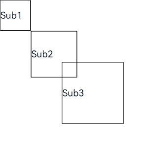
// xxx.ets
@Entry
@Component
struct Index {
  build() {
    Column() {
      CustomLayout() {
        ForEach([1, 2, 3], (index: number) => {
          Text('Sub' + index)
            .fontSize(30)
            .borderWidth(2)
        })
      }
    }
  }
}


@Component
struct CustomLayout {
  @Builder
  doNothingBuilder() {
  };

  @BuilderParam builder: () => void = this.doNothingBuilder;

  onLayout(children: Array<LayoutChild>, constraint: ConstraintSizeOptions) {
    let pos = 0;
    children.forEach((child) => {
      child.layout({ position: { x: pos, y: pos }, constraint: constraint })
      pos += 100;
    })
  }

  onMeasure(children: Array<LayoutChild>, constraint: ConstraintSizeOptions) {
    let size = 100;
    children.forEach((child) => {
      child.measure({ minHeight: size, minWidth: size, maxWidth: size, maxHeight: size })
      size += 50;
    })
  }

  build() {
    this.builder()
  }
}
GeometryInfo10+
Layout information of the parent component.
This API is supported since API version 10 and is supported in ArkTS widgets.
| Parameter | Type | Description |
|---|---|---|
| borderWidth | EdgeWidth | Border width of the parent component. |
| margin | Margin | Margin of the parent component. |
| padding | Padding | Padding of the parent component. |
Layoutable10+
Provides the child component layout information.
This API is supported since API version 10 and is supported in ArkTS widgets.
| Parameter | Type | Description |
|---|---|---|
| measureResult | MeasureResult | Measurement result of the child component. |
| layout | (Position) => void | Method called to apply the layout information to the child component. |
Measurable10+
Provides the child component location information.
This API is supported since API version 10 and is supported in ArkTS widgets.
| Parameter | Type | Description |
|---|---|---|
| measure | (childConstraint:) => MeasureResult | Method called to apply the size constraint to the child component. Return value: measurement result of the child component. |
MeasureResult10+
Provides the measurement result of the component.
Since API version 10, this API is supported in ArkTS widgets.
| Parameter | Type | Description |
|---|---|---|
| width | Number | Width obtained from the measurement result. |
| height | Number | Height obtained from the measurement result. |
SizeResult10+
Provides the component size information.
Since API version 10, this API is supported in ArkTS widgets.
| Parameter | Type | Description |
|---|---|---|
| width | Number | Width obtained from the measurement result. |
| height | Number | Height obtained from the measurement result. |
NOTE
- The custom layout does not support the LazyForEach syntax.
- Create a custom layout in builder mode. Make sure the build() method of a custom component contains only this.builder(), as shown in the recommended example below.
- The priority of the layout and size information set for the child component is lower than that of the information set by onMeasureSize and onPlaceChildren.
- When onPlaceChildren and onMeasureSize are called using custom components, trailing closures are not supported. You are advised to follow the example below.
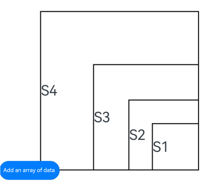
// xxx.ets
@Entry
@Component
struct Index {
  build() {
    Column() {
      CustomLayout({ builder: ColumnChildren })
    }
  }
}

@Builder
function ColumnChildren() {
  ForEach([1, 2, 3], (index: number) => {// LazyForEach is not supported.
    Text('S' + index)
      .fontSize(30)
      .width(100)
      .height(100)
      .borderWidth(2)
      .offset({ x: 10, y: 20 })
  })
}

@Component
struct CustomLayout {
  @Builder
  doNothingBuilder() {
  };

  @BuilderParam builder: () => void = this.doNothingBuilder;
  @State startSize: number = 100;
  result: SizeResult = {
    width: 0,
    height: 0
  };

  onPlaceChildren(selfLayoutInfo: GeometryInfo, children: Array<Layoutable>, constraint: ConstraintSizeOptions) {
    let startPos = 400;
    children.forEach((child) => {
      let pos = startPos - child.measureResult.height;
      child.layout({ x: pos, y: pos })
    })
  }

  onMeasureSize(selfLayoutInfo: GeometryInfo, children: Array<Measurable>, constraint: ConstraintSizeOptions) {
    let size = 100;
    children.forEach((child) => {
      let result: MeasureResult = child.measure({ minHeight: size, minWidth: size, maxWidth: size, maxHeight: size })
      size += result.width / 2
      ;
    })
    this.result.width = 100;
    this.result.height = 400;
    return this.result;
  }

  build() {
    this.builder()
  }
}
你可能感兴趣的鸿蒙文章
harmony 鸿蒙ArkTS-based Declarative Development Paradigm
- 所属分类: 后端技术
- 本文标签:
热门推荐
-
2、 优质文章
-
3、 gt
-
7、 openharmony
-
9、 golang
-
10、 Vue中input框自动聚焦