harmony 鸿蒙Custom Component Layout
Custom Component Layout
If you need to lay out child components in a custom component through calculation, you are advised to use the following APIs:
onMeasureSize: invoked upon layout to measure the size of the component’s child components. It is executed before onPlaceChildren.
onPlaceChildren: invoked upon layout to set the start position of the component’s child components.
Example
// xxx.ets
@Entry
@Component
struct Index {
  build() {
    Column() {
      CustomLayout({ builder: ColumnChildren })
    }
  }
}

// Pass multiple components in a builder as level-1 child components of the custom component (that is, container components for example, <Column>, are not included).
@Builder
function ColumnChildren() {
  ForEach([1, 2, 3], (index: number) => { // LazyForEach is not supported.
    Text('S' + index)
      .fontSize(30)
      .width(100)
      .height(100)
      .borderWidth(2)
      .offset({ x: 10, y: 20 })
  })
}

@Component
struct CustomLayout {
  @Builder
  doNothingBuilder() {
  };

  @BuilderParam builder: () => void = this.doNothingBuilder;
  @State startSize: number = 100;
  result: SizeResult = {
    width: 0,
    height: 0
  };

  // Step 1: Calculate the size of each child component.
  onMeasureSize(selfLayoutInfo: GeometryInfo, children: Array<Measurable>, constraint: ConstraintSizeOptions) {
    let size = 100;
    children.forEach((child) => {
      let result: MeasureResult = child.measure({ minHeight: size, minWidth: size, maxWidth: size, maxHeight: size })
      size += result.width / 2;
    })
    this.result.width = 100;
    this.result.height = 400;
    return this.result;
  }
  // Step 2: Place the child components.
  onPlaceChildren(selfLayoutInfo: GeometryInfo, children: Array<Layoutable>, constraint: ConstraintSizeOptions) {
    let startPos = 300;
    children.forEach((child) => {
      let pos = startPos - child.measureResult.height;
      child.layout({ x: pos, y: pos })
    })
  }

  build() {
    this.builder()
  }
}
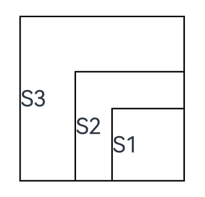
In the preceding example, the Index page contains a custom component that implements a custom layout and whose child components are passed in a builder on the Index page.
onMeasureSize and onPlaceChildren are called in the custom component to set the size and position of its child components. In onMeasureSize, the initial size is set at 100, and the size of each child component is increased by half of the size of the previous child component, leading to component size increment. In onPlaceChildren, startPos is 300, the position of each child component is startPos minus its own height, and the lower right corner of all child components is at the corner point (300,300). In this way, child components are stacked, starting from the lower right corner.
你可能感兴趣的鸿蒙文章
harmony 鸿蒙\@AnimatableExtend Decorator: Definition of Animatable Attributes
harmony 鸿蒙Application State Management Overview
harmony 鸿蒙AppStorage: Storing Application-wide UI State
harmony 鸿蒙Basic Syntax Overview
harmony 鸿蒙\@Builder Decorator: Custom Builder Function
harmony 鸿蒙\@BuilderParam Decorator: Referencing the \@Builder Function
harmony 鸿蒙Creating a Custom Component
harmony 鸿蒙Mixing Use of Custom Components
harmony 鸿蒙Constraints on Access Modifiers of Custom Component Member Variables
- 所属分类: 后端技术
- 本文标签:
热门推荐
-
2、 优质文章
-
3、 gt
-
7、 openharmony
-
9、 golang
-
10、 Vue中input框自动聚焦