harmony 鸿蒙SplitLayout
SplitLayout
SplitLayout is a component that enables you to divide the available space vertically into separate sections, each of which can contain solely text or a combination of text and images.
NOTE
This component is supported since API version 10. Updates will be marked with a superscript to indicate their earliest API version.
Modules to Import
import { SplitLayout } from '@kit.ArkUI';
Child Components
Not supported
Attributes
The universal attributes are not supported.
SplitLayout
SplitLayout({mainImage: Resource, primaryText: string, secondaryText?: string, tertiaryText?: string, container: () => void })
Decorator: @Component
Atomic service API: This API can be used in atomic services since API version 11.
System capability: SystemCapability.ArkUI.ArkUI.Full
| Name | Type | Mandatory | Decorator | Description |
|---|---|---|---|---|
| mainImage | ResourceStr | Yes | @State | Image. |
| primaryText | ResourceStr | Yes | @Prop | Title. |
| secondaryText | ResourceStr | No | @Prop | Subtitle. |
| tertiaryText | ResourceStr | No | @Prop | Auxiliary text. |
| container | () => void | Yes | @BuilderParam | Container in the component. |
Events
The universal events are not supported.
Example
This example demonstrates how to use SplitLayout to achieve a page layout that is both adaptable and responsive.
import { SplitLayout } from '@kit.ArkUI';

@Entry
@Component
struct Index {
  @State demoImage: Resource = $r("app.media.background");

  build() {
    Column() {
      SplitLayout({
        mainImage: this.demoImage,
        primaryText:'New music recommendation',
        secondaryText: 'Get a playlist tailored to your taste;',
        tertiaryText: 'Updated every day',
      }) {
        Text('Example: Components can be added to a blank area container.')
          .margin({ top: 36 })
      }
    }
    .justifyContent(FlexAlign.SpaceBetween)
    .height('100%')
    .width('100%')
  }
}
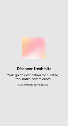
Layout less than 600 vp:

Layout between 600 vp and 840 vp:
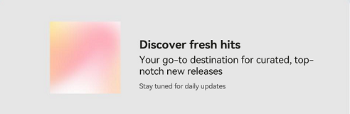
Layout greater than 840 vp:
你可能感兴趣的鸿蒙文章
- 所属分类: 后端技术
- 本文标签:
热门推荐
-
2、 优质文章
-
3、 gt
-
7、 openharmony
-
9、 golang
-
10、 Vue中input框自动聚焦