harmony 鸿蒙TreeView
TreeView
The TreeView component represents a tree view used to display a hierarchical list of items. Each item can contain subitems, which may be expanded or collapsed.
This component is applicable in productivity applications, such as side navigation bars in notepad, email, and Gallery applications.
NOTE
This component is supported since API version 10. Updates will be marked with a superscript to indicate their earliest API version.
Modules to Import
import { TreeView } from "@kit.ArkUI"
Child Components
Not supported
Attributes
The universal attributes are not supported.
TreeView
TreeView({ treeController: TreeController })
Decorator: @Component
Atomic service API: This API can be used in atomic services since API version 11.
System capability: SystemCapability.ArkUI.ArkUI.Full
| Name | Type | Mandatory | Description |
|---|---|---|---|
| treeController | TreeController | Yes | Node information of the tree view. |
TreeController
Implements a TreeController object, which can be bound to a tree view component to control the node information of the component. One TreeController object can be bound to only one tree view component.
Atomic service API: This API can be used in atomic services since API version 11.
System capability: SystemCapability.ArkUI.ArkUI.Full
addNode
addNode(nodeParam?: NodeParam): TreeController
Adds a child node to the selected node.
Atomic service API: This API can be used in atomic services since API version 11.
System capability: SystemCapability.ArkUI.ArkUI.Full
| Name | Type | Mandatory | Description |
|---|---|---|---|
| nodeParam | NodeParam | No | Node information. |
Return value
| Type | Description |
|---|---|
| TreeController | Controller of the TreeView component. |
removeNode
removeNode(): void
Removes the selected node.
Atomic service API: This API can be used in atomic services since API version 11.
System capability: SystemCapability.ArkUI.ArkUI.Full
modifyNode
modifyNode(): void
Modifies the selected node.
Atomic service API: This API can be used in atomic services since API version 11.
System capability: SystemCapability.ArkUI.ArkUI.Full
buildDone
buildDone(): void
Builds a tree view. After a node is added, this API must be called to save the tree information.
Atomic service API: This API can be used in atomic services since API version 11.
System capability: SystemCapability.ArkUI.ArkUI.Full
refreshNode
refreshNode(parentId: number, parentSubTitle: ResourceStr, currentSubtitle: ResourceStr): void
Refreshes the tree view. You can call this API to update the information about the current node.
Atomic service API: This API can be used in atomic services since API version 11.
System capability: SystemCapability.ArkUI.ArkUI.Full
| Name | Type | Mandatory | Description |
|---|---|---|---|
| parentId | number | Yes | ID of the parent node. |
| parentSubTitle | ResourceStr | Yes | Secondary text of the parent node. |
| currentSubtitle | ResourceStr | Yes | Secondary text of the current node. |
NodeParam
System capability: SystemCapability.ArkUI.ArkUI.Full
| Name | Type | Mandatory | Description |
|---|---|---|---|
| parentNodeId | number | No | Parent node. The value must be greater than or equal to -1. Default value: -1. The root node ID is -1. If the value is less than -1, the setting does not take effect. Atomic service API: This API can be used in atomic services since API version 11. |
| currentNodeId | number | No | Current child node. The value must be greater than or equal to -1. The value cannot be the root node ID, cannot be null, and cannot be duplicated. Default value: -1 Atomic service API: This API can be used in atomic services since API version 11. |
| isFolder | boolean | No | Whether the node is a directory. Default value: false. true: The node is a directory. false: The node is not a directory. Atomic service API: This API can be used in atomic services since API version 11. |
| icon | ResourceStr | No | Icon. The default value is an empty string. Atomic service API: This API can be used in atomic services since API version 11. |
| symbolIconStyle18+ | SymbolGlyphModifier | No | Symbol icon, which has higher priority than icon. Default value: undefined Atomic service API: This API can be used in atomic services since API version 18. |
| selectedIcon | ResourceStr | No | Icon of the selected node. The default value is an empty string. Atomic service API: This API can be used in atomic services since API version 11. |
| symbolSelectedIconStyle18+ | SymbolGlyphModifier | No | Symbol icon of the selected node., which has higher priority than selectedIcon. Default value: undefined Atomic service API: This API can be used in atomic services since API version 18. |
| editIcon | ResourceStr | No | Edit icon. The default value is an empty string. Atomic service API: This API can be used in atomic services since API version 11. |
| symbolEditIconStyle18+ | SymbolGlyphModifier | No | Symbol edit icon, which has a higher priority than editIcon. Default value: undefined Atomic service API: This API can be used in atomic services since API version 18. |
| primaryTitle | ResourceStr | No | Primary title. The default value is an empty string. Atomic service API: This API can be used in atomic services since API version 11. |
| secondaryTitle | ResourceStr | No | Secondary title. The default value is an empty string. Atomic service API: This API can be used in atomic services since API version 11. |
| container | () => void | No | Right-click child component bound to the node. The child component is decorated with @Builder. Default value: () => void Atomic service API: This API can be used in atomic services since API version 11. |
TreeListenerManager
Implements a TreeListenerManager object, which can be bound to a tree view component to listen for changes of tree nodes. One TreeListenerManager object can be bound to only one tree view component.
getInstance
static getInstance(): TreeListenerManager
Obtains a TreeListenerManager singleton object.
Atomic service API: This API can be used in atomic services since API version 11.
System capability: SystemCapability.ArkUI.ArkUI.Full
Return value
| Type | Description |
|---|---|
| TreeListenerManager | TreeListenerManager singleton object. |
getTreeListener
getTreeListener(): TreeListener
Obtains a listener.
Atomic service API: This API can be used in atomic services since API version 11.
System capability: SystemCapability.ArkUI.ArkUI.Full
Return value
| Type | Description |
|---|---|
| TreeListener | Obtained listener. |
TreeListener
Listener of the tree view component. You can bind it to the TreeView component and use it to listen for changes of tree nodes. A listener can be bound to only one TreeView component.
on
on(type: TreeListenType, callback: (callbackParam: CallbackParam) => void): void;
Register a listener.
Atomic service API: This API can be used in atomic services since API version 11.
System capability: SystemCapability.ArkUI.ArkUI.Full
| Name | Type | Mandatory | Description |
|---|---|---|---|
| type | TreeListenType | Yes | Listening type. |
| callback | (callbackParam: CallbackParam) => void | Yes | Node information. |
once
once(type: TreeListenType, callback: (callbackParam: CallbackParam) => void): void;
Registers a one-off listener.
Atomic service API: This API can be used in atomic services since API version 11.
System capability: SystemCapability.ArkUI.ArkUI.Full
| Name | Type | Mandatory | Description |
|---|---|---|---|
| type | TreeListenType | Yes | Listening type. |
| callback | (callbackParam: CallbackParam) => void | Yes | Node information. |
off
off(type: TreeListenType, callback?: (callbackParam: CallbackParam) => void): void;
Unregisters a listener.
Atomic service API: This API can be used in atomic services since API version 11.
System capability: SystemCapability.ArkUI.ArkUI.Full
| Name | Type | Mandatory | Description |
|---|---|---|---|
| type | TreeListenType | Yes | Listening type. |
| callback | (callbackParam: CallbackParam) => void | No | Node information. |
TreeListenType
Atomic service API: This API can be used in atomic services since API version 11.
System capability: SystemCapability.ArkUI.ArkUI.Full
| Name | Value | Description |
|---|---|---|
| NODE_CLICK | “NodeClick” | Listens for click events of nodes. |
| NODE_ADD | “NodeAdd” | Listens for add events of nodes. |
| NODE_DELETE | “NodeDelete” | Listens for delete events of nodes. |
| NODE_MODIFY | “NodeModify” | Listens for modify events of nodes. |
| NODE_MOVE | “NodeMove” | Listens for move events of nodes. |
CallbackParam
Atomic service API: This API can be used in atomic services since API version 11.
System capability: SystemCapability.ArkUI.ArkUI.Full
| Name | Type | Mandatory | Description |
|---|---|---|---|
| currentNodeId | number | Yes | ID of the current child node. The value must be greater than or equal to 0. |
| parentNodeId | number | No | ID of the current parent node. The value must be greater than or equal to -1. Default value: -1 |
| childIndex | number | No | Child index. The value must be greater than or equal to -1. Default value: -1 |
Events
The universal events are not supported.
Example
Example 1: Configuring a Simple Tree View
This example showcases how to use TreeController to perform operations on tree nodes, such as adding, deleting, and renaming. It also demonstrates the effects of adding nodes with different parameters.
import { TreeController, TreeListener, TreeListenerManager, TreeListenType, NodeParam, TreeView, CallbackParam } from '@kit.ArkUI'

@Entry
@Component
struct TreeViewDemo {
  private treeController: TreeController = new TreeController();
  private treeListener: TreeListener = TreeListenerManager.getInstance().getTreeListener();
  @State clickId: number = 0;

  aboutToDisappear(): void {
    this.treeListener.off(TreeListenType.NODE_CLICK, undefined);
    this.treeListener.off(TreeListenType.NODE_ADD, undefined);
    this.treeListener.off(TreeListenType.NODE_DELETE, undefined);
    this.treeListener.off(TreeListenType.NODE_MOVE, undefined);
  }

  @Builder menuBuilder1() {
    Flex({ direction: FlexDirection.Column, justifyContent: FlexAlign.Center, alignItems: ItemAlign.Center }) {
      Text('Add').fontSize(16).width(100).height(30).textAlign(TextAlign.Center)
        .onClick((event: ClickEvent) => {
          this.treeController.addNode();
        })
      Divider()
      Text('Delete').fontSize(16).width(100).height(30).textAlign(TextAlign.Center)
        .onClick((event: ClickEvent) => {
          this.treeController.removeNode();
        })
      Divider()
      Text('Rename').fontSize(16).width(100).height(30).textAlign(TextAlign.Center)
        .onClick((event: ClickEvent) => {
          this.treeController.modifyNode();
        })
    }.width(100).border({width: 1, color: 0x80808a, radius: '16dp'})
  }

  aboutToAppear(): void {
    this.treeListener.on(TreeListenType.NODE_CLICK, (callbackParam: CallbackParam) => {
      this.clickId = callbackParam.currentNodeId;
    })
    this.treeListener.on(TreeListenType.NODE_ADD, (callbackParam: CallbackParam) => {
      this.clickId = callbackParam.currentNodeId;
    })
    this.treeListener.on(TreeListenType.NODE_DELETE, (callbackParam: CallbackParam) => {
      this.clickId = callbackParam.currentNodeId;
    })
    this.treeListener.once(TreeListenType.NODE_MOVE, (callbackParam: CallbackParam) => {
      this.clickId = callbackParam.currentNodeId;
    })

    let normalResource: Resource = $r('sys.media.ohos_ic_normal_white_grid_folder');
    let selectedResource: Resource = $r('sys.media.ohos_ic_public_select_all');
    let editResource: Resource = $r('sys.media.ohos_ic_public_edit');
    let nodeParam: NodeParam = { parentNodeId:-1, currentNodeId: 1, isFolder: true, icon: normalResource, selectedIcon: selectedResource,
      editIcon: editResource, primaryTitle: "Directory 1 to verify the adaptive effect",
      secondaryTitle: "6" };
    this.treeController
      .addNode(nodeParam)
      .addNode({parentNodeId:1, currentNodeId: 2, isFolder: false, primaryTitle: "Project 1_1" })
      .addNode({ parentNodeId:-1, currentNodeId: 7, isFolder: true, primaryTitle: "Directory 2" })
      .addNode({ parentNodeId:-1, currentNodeId: 23, isFolder: true, icon: normalResource, selectedIcon: selectedResource,
        editIcon: editResource, primaryTitle: "Directory 3" })
      .addNode({ parentNodeId:-1, currentNodeId: 24, isFolder: false, primaryTitle: "Project 4" })
      .addNode({ parentNodeId:-1, currentNodeId: 31, isFolder: true, icon: normalResource, selectedIcon: selectedResource,
        editIcon: editResource, primaryTitle: "Directory 5", secondaryTitle: "0" })
      .addNode({ parentNodeId:-1, currentNodeId: 32, isFolder: true, icon: normalResource, selectedIcon: selectedResource,
        editIcon: editResource, primaryTitle: "Directory 6", secondaryTitle: "0" })
      .addNode({ parentNodeId:32, currentNodeId: 35, isFolder: true, icon: normalResource, selectedIcon: selectedResource,
        editIcon: editResource, primaryTitle: "Directory 6-1", secondaryTitle: "0" })
      .addNode({ parentNodeId:-1, currentNodeId: 33, isFolder: true, icon: normalResource, selectedIcon: selectedResource,
        editIcon: editResource, primaryTitle: "Directory 7", secondaryTitle: "0" })
      .addNode({ parentNodeId:33, currentNodeId: 34, isFolder: false, primaryTitle: "Project 8" })
      .addNode({ parentNodeId:-1, currentNodeId: 36, isFolder: false, primaryTitle: "Project 9" })
      .buildDone();
    this.treeController.refreshNode (-1, "Parent", "Child");
  }

  build() {
    Column(){
      SideBarContainer(SideBarContainerType.Embed)
      {
        TreeView({ treeController: this.treeController })
        Row() {
          Divider().vertical(true).strokeWidth(2).color(0x000000).lineCap(LineCapStyle.Round)
          Column({ space: 30 }) {
            Text('ClickId=' + this.clickId).fontSize('16fp')
            Button('Add', { type: ButtonType.Normal, stateEffect: true })
              .borderRadius(8).backgroundColor(0x317aff).width(90)
              .onClick((event: ClickEvent) => {
                this.treeController.addNode();
              })
            Button('Modify', { type: ButtonType.Normal, stateEffect: true })
              .borderRadius(8).backgroundColor(0x317aff).width(90)
              .onClick((event: ClickEvent) => {
                this.treeController.modifyNode();
              })
            Button('Remove', { type: ButtonType.Normal, stateEffect: true })
              .borderRadius(8).backgroundColor(0x317aff).width(120)
              .onClick((event: ClickEvent) => {
                this.treeController.removeNode();
              })
          }.height('100%').width('70%').alignItems(HorizontalAlign.Start).margin(10)
        }
      }
      .focusable(true)
      .showControlButton(false)
      .showSideBar(true)
    }
  }}

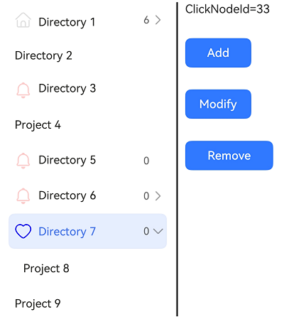
Example 2: Setting the Symbol Icon
This example demonstrates how to use symbolIconStyle, symbolEditIconStyle, and symbolSelectedIconStyle in NodeParam to set custom symbol icons.
import { TreeController, TreeListener, TreeListenerManager, TreeListenType, NodeParam, TreeView, CallbackParam,
  SymbolGlyphModifier } from '@kit.ArkUI'

@Entry
@Component
struct TreeViewDemo {
  private treeController: TreeController = new TreeController();
  private treeListener: TreeListener = TreeListenerManager.getInstance().getTreeListener();
  @State clickNodeId: number = 0;

  aboutToDisappear(): void {
    this.treeListener.off(TreeListenType.NODE_CLICK, undefined);
    this.treeListener.off(TreeListenType.NODE_ADD, undefined);
    this.treeListener.off(TreeListenType.NODE_DELETE, undefined);
    this.treeListener.off(TreeListenType.NODE_MOVE, undefined);
  }

  @Builder menuBuilder1() {
    Flex({ direction: FlexDirection.Column, justifyContent: FlexAlign.Center, alignItems: ItemAlign.Center }) {
      Text('Add').fontSize(16).width(100).height(30).textAlign(TextAlign.Center)
        .onClick((event: ClickEvent) => {
          this.treeController.addNode();
        })
      Divider()
      Text('Delete').fontSize(16).width(100).height(30).textAlign(TextAlign.Center)
        .onClick((event: ClickEvent) => {
          this.treeController.removeNode();
        })
      Divider()
      Text('Rename').fontSize(16).width(100).height(30).textAlign(TextAlign.Center)
        .onClick((event: ClickEvent) => {
          this.treeController.modifyNode();
        })
    }.width(100).border({width: 1, color: 0x80808a, radius: '16dp'})
  }

  aboutToAppear(): void {
    this.treeListener.on(TreeListenType.NODE_CLICK, (callbackParam: CallbackParam) => {
      this.clickNodeId = callbackParam.currentNodeId;
    })
    this.treeListener.on(TreeListenType.NODE_ADD, (callbackParam: CallbackParam) => {
      this.clickNodeId = callbackParam.currentNodeId;
    })
    this.treeListener.on(TreeListenType.NODE_DELETE, (callbackParam: CallbackParam) => {
      this.clickNodeId = callbackParam.currentNodeId;
    })
    this.treeListener.once(TreeListenType.NODE_MOVE, (callbackParam: CallbackParam) => {
      this.clickNodeId = callbackParam.currentNodeId;
    })

    let normalResource: Resource = $r('sys.symbol.house');
    let selectedResource: Resource = $r('sys.symbol.car');
    let editResource: Resource = $r('sys.symbol.calendar');
    let normalSymbolResource: SymbolGlyphModifier = new SymbolGlyphModifier($r('sys.symbol.bell')).fontColor([Color.Red]);
    let selectedSymbolResource: SymbolGlyphModifier = new SymbolGlyphModifier($r('sys.symbol.heart')).fontColor([Color.Blue]);
    let editSymbolResource: SymbolGlyphModifier = new SymbolGlyphModifier($r('sys.symbol.cake')).fontColor([Color.Pink]);
    let nodeParam: NodeParam = { parentNodeId:-1, currentNodeId: 1, isFolder: true, icon: normalResource, selectedIcon: selectedResource,
      editIcon: editResource, primaryTitle: "Directory 1",
      secondaryTitle: "6" };
    this.treeController
      .addNode(nodeParam)
      .addNode({parentNodeId:1, currentNodeId: 2, isFolder: false, primaryTitle: "Project 1_1" })
      .addNode({ parentNodeId:-1, currentNodeId: 7, isFolder: true, primaryTitle: "Directory 2" })
      .addNode({ parentNodeId:-1, currentNodeId: 23, isFolder: true, icon: normalResource, symbolIconStyle: normalSymbolResource,
        selectedIcon: selectedResource, symbolSelectedIconStyle: selectedSymbolResource, editIcon: editResource,
        symbolEditIconStyle: editSymbolResource, primaryTitle: "Directory 3" })
      .addNode({ parentNodeId:-1, currentNodeId: 24, isFolder: false, primaryTitle: "Project 4" })
      .addNode({ parentNodeId:-1, currentNodeId: 31, isFolder: true, icon: normalResource, symbolIconStyle: normalSymbolResource,
        selectedIcon: selectedResource, symbolSelectedIconStyle: selectedSymbolResource, editIcon: editResource,
        symbolEditIconStyle: editSymbolResource, primaryTitle: "Directory 5", secondaryTitle: "0" })
      .addNode({ parentNodeId:-1, currentNodeId: 32, isFolder: true, icon: normalResource, symbolIconStyle: normalSymbolResource,
        selectedIcon: selectedResource, symbolSelectedIconStyle: selectedSymbolResource, editIcon: editResource,
        symbolEditIconStyle: editSymbolResource, primaryTitle: "Directory 6", secondaryTitle: "0" })
      .addNode({ parentNodeId:32, currentNodeId: 35, isFolder: true, icon: normalResource, symbolIconStyle: normalSymbolResource,
        selectedIcon: selectedResource, symbolSelectedIconStyle: selectedSymbolResource, editIcon: editResource,
        symbolEditIconStyle: editSymbolResource, primaryTitle: "Directory 6-1", secondaryTitle: "0" })
      .addNode({ parentNodeId:-1, currentNodeId: 33, isFolder: true, icon: normalResource, symbolIconStyle: normalSymbolResource,
        selectedIcon: selectedResource, symbolSelectedIconStyle: selectedSymbolResource, editIcon: editResource,
        symbolEditIconStyle: editSymbolResource, primaryTitle: "Directory 7", secondaryTitle: "0" })
      .addNode({ parentNodeId:33, currentNodeId: 34, isFolder: false, primaryTitle: "Project 8" })
      .addNode({ parentNodeId:-1, currentNodeId: 36, isFolder: false, primaryTitle: "Project 9" })
      .buildDone();
    this.treeController.refreshNode (-1, "Parent", "Child");
  }

  build() {
    Column(){
      SideBarContainer(SideBarContainerType.Embed)
      {
        TreeView({ treeController: this.treeController })
        Row() {
          Divider().vertical(true).strokeWidth(2).color(0x000000).lineCap(LineCapStyle.Round)
          Column({ space: 30 }) {
            Text('ClickNodeId=' + this.clickNodeId).fontSize('16fp')
            Button('Add', { type: ButtonType.Normal, stateEffect: true })
              .borderRadius(8).backgroundColor(0x317aff).width(90)
              .onClick((event: ClickEvent) => {
                this.treeController.addNode();
              })
            Button('Modify', { type: ButtonType.Normal, stateEffect: true })
              .borderRadius(8).backgroundColor(0x317aff).width(90)
              .onClick((event: ClickEvent) => {
                this.treeController.modifyNode();
              })
            Button('Remove', { type: ButtonType.Normal, stateEffect: true })
              .borderRadius(8).backgroundColor(0x317aff).width(120)
              .onClick((event: ClickEvent) => {
                this.treeController.removeNode();
              })
          }.height('100%').width('80%').alignItems(HorizontalAlign.Start).margin(10)
        }
      }
      .focusable(true)
      .showControlButton(false)
      .showSideBar(true)
    }
  }}
你可能感兴趣的鸿蒙文章
- 所属分类: 后端技术
- 本文标签:
热门推荐
-
2、 优质文章
-
3、 gt
-
7、 openharmony
-
9、 golang
-
10、 Vue中input框自动聚焦