harmony 鸿蒙GridObjectSortComponent
GridObjectSortComponent
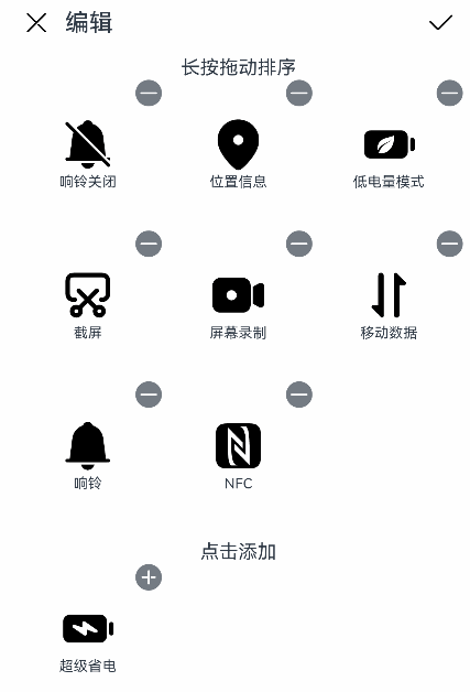
GridObjectSortComponent is a grid object organizer that you can use to edit, drag to sort, add, and delete grid objects.
NOTE
This component is supported since API version 11. Updates will be marked with a superscript to indicate their earliest API version.
Modules to Import
import { GridObjectSortComponent, GridObjectSortComponentItem, GridObjectSortComponentOptions, GridObjectSortComponentType , SymbolGlyphModifier } from '@kit.ArkUI';
Child Components
Not supported
Attributes
The universal attributes are not supported.
GridObjectSortComponent
GridObjectSortComponent({options: GridObjectSortComponentOptions, dataList: Array<GridObjectSortComponentItem>, onSave: (select: Array<GridObjectSortComponentItem>, unselect: Array<GridObjectSortComponentItem>) => void, onCancel: () => void })
Decorator: @Component
Atomic service API: This API can be used in atomic services since API version 12.
System capability: SystemCapability.ArkUI.ArkUI.Full
| Name | Type | Mandatory | Decorator | Description |
|---|---|---|---|---|
| options | GridObjectSortComponentOptions | Yes | @Prop | Component configuration. |
| dataList | Array<GridObjectSortComponentItem> | Yes | - | Data to pass. The maximum data length is 50 characters. If it is exceeded, only the first 50 characters are used. |
| onSave | (select: Array<GridObjectSortComponentItem>, unselect: Array<GridObjectSortComponentItem>) => void | Yes | - | Callback invoked when changes are saved. The data after the changes is returned. |
| onCancel | () => void | Yes | - | Callback invoked when changes are canceled. |
GridObjectSortComponentOptions
Atomic service API: This API can be used in atomic services since API version 12.
System capability: SystemCapability.ArkUI.ArkUI.Full
| Name | Type | Mandatory | Description |
|---|---|---|---|
| type | GridObjectSortComponentType | No | Component display form: text only or|text and imagery. Default value: GridObjectSortComponentType.text |
| imageSize | number |Resource | No | Image size, in vp. The value must be greater than or equal to 0. Default value: 56vp |
| normalTitle | ResourceStr | No | Title displayed in the non-editing state. Default value: Channel |
| showAreaTitle | ResourceStr | No | First subtitle of the display area. Default value: Drag to sort |
| addAreaTitle | ResourceStr | No | Second subtitle of the display area. Default value: Tap to add |
| editTitle | ResourceStr | No | Title displayed in the editing state. Default value: Edit |
GridObjectSortComponentType
Atomic service API: This API can be used in atomic services since API version 12.
System capability: SystemCapability.ArkUI.ArkUI.Full
| Name | Value | Description |
|---|---|---|
| IMAGE_TEXT | ‘image_text’ | Text and imagery. |
| TEXT | ‘text’ | Text only. |
GridObjectSortComponentItem
System capability: SystemCapability.ArkUI.ArkUI.Full
| Name | Type | Mandatory | Description |
|---|---|---|---|
| id | number |string | Yes | Data ID, which must be unique. The default value is an empty string. Atomic service API: This API can be used in atomic services since API version 12. |
| text | ResourceStr | Yes | Text information. Atomic service API: This API can be used in atomic services since API version 12. |
| selected | boolean | Yes | Whether the grid object has been added. The value true means that grid object has been added, and false means the opposite. Atomic service API: This API can be used in atomic services since API version 12. |
| url | ResourceStr | No | URL of the image. Required when GridObjectSortComponentType is set to IMAGE_TEXT. Atomic service API: This API can be used in atomic services since API version 12. |
| symbolStyle18+ | SymbolGlyphModifier | No | Symbol resource of the image. Required when GridObjectSortComponentType is set to IMAGE_TEXT. Atomic service API: This API can be used in atomic services since API version 18. |
| order | number | Yes | Sequence number. The value must be greater than or equal to 0. Default value: 0 Atomic service API: This API can be used in atomic services since API version 12. |
Events
The universal events are not supported.
Example
This example illustrates the basic usage of the GridObjectSortComponent component, involving component configuration initialization, data initialization, and the use of the save and cancel APIs.
import { GridObjectSortComponent, GridObjectSortComponentItem, GridObjectSortComponentOptions, GridObjectSortComponentType, SymbolGlyphModifier } from '@kit.ArkUI';

@Entry
@Component
struct Index {
  // Initialize the component data.
  @State dataList: GridObjectSortComponentItem[] = [
    {
      id: 0,
      url: $r('sys.media.ohos_save_button_filled'),
      text: 'Download',
      selected: true,
      order: 3
    },
    {
      id: 1,
      url: $r('sys.media.ohos_ic_public_web'),
      text: 'Network',
      selected: true,
      order: 9
    },
    {
      id: 2,
      url: $r('sys.media.ohos_ic_public_video'),
      text: 'Video',
      selected: false,
      order: 1
    },
    {
      id: 3,
      symbolStyle: new SymbolGlyphModifier($r('sys.symbol.record_circle')),
      text: 'Recording',
      selected: false,
      order: 4
    }
  ]

  // Initialize the component configuration information.
  @State option: GridObjectSortComponentOptions = {
    type: GridObjectSortComponentType.IMAGE_TEXT,
    imageSize: 45,
    normalTitle: 'Menu',
    editTitle: 'Edit',
    showAreaTitle: 'Drag to sort',
    addAreaTitle: 'Touch to add'
  }

  build() {
    Column() {
      GridObjectSortComponent({
        options: this.option,
        dataList: this.dataList,
        // Callback invoked when changes are saved. The data after the changes is returned.
        onSave: (
          select: Array<GridObjectSortComponentItem>,
          unselect: Array<GridObjectSortComponentItem>
        ) => {
          // save ToDo
        },
        // Callback invoked when changes are canceled.
        onCancel: () =>{
          // cancel ToDo
        }
      })
    }
  }
}
你可能感兴趣的鸿蒙文章
- 所属分类: 后端技术
- 本文标签:
热门推荐
-
2、 优质文章
-
3、 gt
-
7、 openharmony
-
9、 golang
-
10、 Vue中input框自动聚焦