harmony 鸿蒙Hover Event
Hover Event
A hover event is triggered when the cursor slides over a component or when a stylus hovers and moves over the screen.
NOTE
- The APIs of this module are supported since API version 8. Updates will be marked with a superscript to indicate their earliest API version.
- Currently, only an external mouse device, stylus, or touchpad can be used to trigger a hover event.
onHover
onHover(event: (isHover: boolean, event: HoverEvent) => void): T
Triggered when the mouse pointer or stylus enters or leaves the component.
Atomic service API: This API can be used in atomic services since API version 11.
System capability: SystemCapability.ArkUI.ArkUI.Full
Parameters
| Name | Type | Mandatory | Description |
|---|---|---|---|
| isHover | boolean | Yes | Whether the mouse pointer or stylus is hovering over the component. The value true means that the mouse pointer or stylus enters the component, and false means that the mouse pointer or stylus leaves the component. |
| event11+ | HoverEvent | Yes | Event bubbling. |
Return value
| Type | Description |
|---|---|
| T | Current component. |
onHoverMove15+
onHoverMove(event: Callback<HoverEvent>): T
Triggered when a stylus hovers over the component.
Atomic service API: This API can be used in atomic services since API version 15.
System capability: SystemCapability.ArkUI.ArkUI.Full
Parameters
| Name | Type | Mandatory | Description |
|---|---|---|---|
| event | HoverEvent | Yes | Event bubbling property and the position coordinates of the stylus. |
Return value
| Type | Description |
|---|---|
| T | Current component. |
HoverEvent10+
Inherits from BaseEvent.
System capability: SystemCapability.ArkUI.ArkUI.Full
| Name | Type | Read Only | Optional | Description |
|---|---|---|---|---|
| x15+ | number | No | Yes | X coordinate of the stylus’s position relative to the upper left corner of the component being touched. Atomic service API: This API can be used in atomic services since API version 15. |
| y15+ | number | No | Yes | Y coordinate of the stylus’s position relative to the upper left corner of the component being touched. Atomic service API: This API can be used in atomic services since API version 15. |
| windowX15+ | number | No | Yes | X coordinate of the stylus’s position relative to the upper left corner of the application window. Atomic service API: This API can be used in atomic services since API version 15. |
| windowY15+ | number | No | Yes | Y coordinate of the stylus’s position relative to the upper left corner of the application window. Atomic service API: This API can be used in atomic services since API version 15. |
| displayX15+ | number | No | Yes | X coordinate of the stylus’s position relative to the upper left corner of the display. Atomic service API: This API can be used in atomic services since API version 15. |
| displayY15+ | number | No | Yes | Y coordinate of the stylus’s position relative to the upper left corner of the display. Atomic service API: This API can be used in atomic services since API version 15. |
| stopPropagation | () => void | No | No | Stops the event from bubbling upwards or downwards. Atomic service API: This API can be used in atomic services since API version 10. |
Example
Example 1: Using onHover
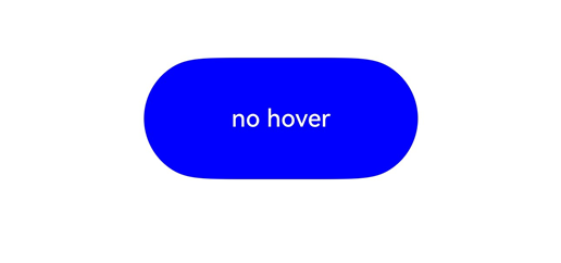
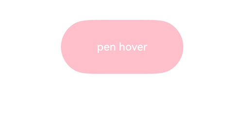
This example demonstrates how to set the onHover() event on a button. When the mouse or stylus hovers over the button, the onHover event is triggered to dynamically change the text content and background color of the button.
// xxx.ets
@Entry
@Component
struct HoverEventExample {
  @State hoverText: string = 'no hover';
  @State color: Color = Color.Blue;

  build() {
    Column({ space: 20 }) {
      Button(this.hoverText)
        .width(180).height(80)
        .backgroundColor(this.color)
        .onHover((isHover: boolean, event: HoverEvent) => {
          // Use the onHover event to dynamically change the text content and background color of a button when the mouse pointer or stylus is hovered on it.
          // Use event.sourceTool to determine whether the device is a mouse device or stylus.
          if (isHover) {
            if (event.sourceTool == SourceTool.Pen) {
              this.hoverText = 'pen hover';
              this.color = Color.Pink;
            } else if (event.sourceTool == SourceTool.MOUSE) {
              this.hoverText = 'mouse hover';
              this.color = Color.Red;
            }
          } else {
            this.hoverText = 'no hover';
            this.color = Color.Blue;
          }
        })
    }.padding({ top: 30 }).width('100%')
  }
}
Diagrams:
The figure below shows how the button looks when not hovered:
The figure below shows how the button looks like when a stylus hovers on it.
Example 2: Using onHoverMove
This example demonstrates how to use the onHoverMove() event to display the current position of a stylus when it hovers over a button.
// xxx.ets
@Entry
@Component
struct OnHoverMoveEventExample {
  @State hoverMoveText: string = '';

  build() {
    Column({ space: 20 }) {
      Button('onHoverMove')
        .width(180).height(80)
        .onHoverMove((event: HoverEvent) => {
          this.hoverMoveText = 'onHoverMove:\nXY = (' + event.x + ', ' + event.y + ')' +
                               '\nwindowXY = (' + event.windowX + ', ' + event.windowY + ')' +
                               '\ndisplayXY = (' + event.displayX + ', ' + event.displayY + ')';
        })

      Text(this.hoverMoveText)
    }.padding({ top: 30 }).width('100%')
  }
}
Diagrams:
The UI continuously updates to show the position of the stylus tip.

你可能感兴趣的鸿蒙文章
- 所属分类: 后端技术
- 本文标签:
热门推荐
-
2、 优质文章
-
3、 gt
-
7、 openharmony
-
9、 golang
-
10、 Vue中input框自动聚焦