harmony 鸿蒙GridContainer
GridContainer
The <GridContainer> component lays out components vertically. It is used only in the grid layout.
NOTE
This component is deprecated since API version 9. You are advised to use <GridCol> and <GridRow> instead.
This component is supported since API version 7. Updates will be marked with a superscript to indicate their earliest API version.
Child Components
Supported
APIs
GridContainer(value?: { columns?: number|‘auto’, sizeType?: SizeType, gutter?: number|string, margin?: number|string})
Parameters
| Name | Type | Mandatory | Description |
|---|---|---|---|
| columns | number |‘auto’ | No | Total number of columns in the current layout. Default value: ‘auto’ |
| sizeType | SizeType | No | Device size type. Default value: SizeType.Auto |
| gutter | number |string | No | Gutter of the grid layout. This parameter cannot be set to a percentage. |
| margin | number |string | No | Margin of the grid layout. This parameter cannot be set to a percentage. |
SizeType
| Name | Description |
|---|---|
| XS | Device of the minimum size. |
| SM | Small-sized device. |
| MD | Medium-sized device. |
| LG | Large-sized device. |
| Auto | Auto. The size type is selected based on the device type. |
Attributes
The universal attributes and attributes of the
Events
The universal events are supported.
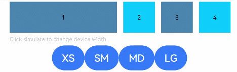
Example
// xxx.ets
@Entry
@Component
struct GridContainerExample {
  @State sizeType: SizeType = SizeType.XS

  build() {
    Column({ space: 5 }) {
      GridContainer({ columns: 12, sizeType: this.sizeType, gutter: 10, margin: 20 }) {
        Row() {
          Text('1')
            .useSizeType({
              xs: { span: 6, offset: 0 },
              sm: { span: 2, offset: 0 },
              md: { span: 2, offset: 0 },
              lg: { span: 2, offset: 0 }
            })
            .height(50).backgroundColor(0x4682B4).textAlign(TextAlign.Center)
          Text('2')
            .useSizeType({
              xs: { span: 2, offset: 6 },
              sm: { span: 6, offset: 2 },
              md: { span: 2, offset: 2 },
              lg: { span: 2, offset: 2 }
            })
            .height(50).backgroundColor(0x00BFFF).textAlign(TextAlign.Center)
          Text('3')
            .useSizeType({
              xs: { span: 2, offset: 8 },
              sm: { span: 2, offset: 8 },
              md: { span: 6, offset: 4 },
              lg: { span: 2, offset: 4 }
            })
            .height(50).backgroundColor(0x4682B4).textAlign(TextAlign.Center)
          Text('4')
            .useSizeType({
              xs: { span: 2, offset: 10 },
              sm: { span: 2, offset: 10 },
              md: { span: 2, offset: 10 },
              lg: { span: 6, offset: 6 }
            })
            .height(50).backgroundColor(0x00BFFF).textAlign(TextAlign.Center)
        }
      }.width('90%')

      Text('Click Simulate to change the device width').fontSize(9).width('90%').fontColor(0xCCCCCC)
      Row() {
        Button('XS')
          .onClick(() => {
            this.sizeType = SizeType.XS
          }).backgroundColor(0x317aff)
        Button('SM')
          .onClick(() => {
            this.sizeType = SizeType.SM
          }).backgroundColor(0x317aff)
        Button('MD')
          .onClick(() => {
            this.sizeType = SizeType.MD
          }).backgroundColor(0x317aff)
        Button('LG')
          .onClick(() => {
            this.sizeType = SizeType.LG
          }).backgroundColor(0x317aff)
      }
    }.width('100%').margin({ top: 5 })
  }
}
你可能感兴趣的鸿蒙文章
harmony 鸿蒙ArkTS-based Declarative Development Paradigm
0
赞
- 所属分类: 后端技术
- 本文标签:
热门推荐
-
2、 优质文章
-
3、 gt
-
7、 openharmony
-
9、 golang
-
10、 Vue中input框自动聚焦