harmony 鸿蒙Shadow Effect
Shadow Effect
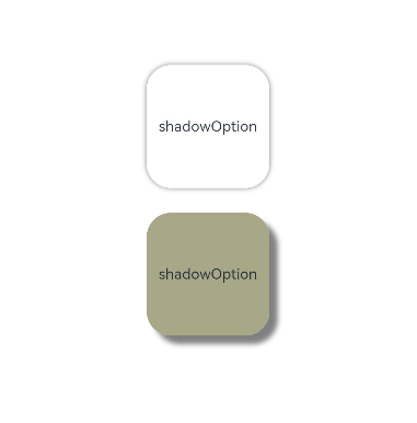
You can use the shadowAPI to apply a shadow effect to a component. Even better, you can set the parameter of this API to ShadowOptions to customize the shadow effect. When the radius or color opacity in ShadowOptions is set to 0, there is no shadow effect.
@Entry
@Component
struct ShadowOptionDemo {
  build() {
    Row() {
      Column() {
        Column() {
          Text('shadowOption').fontSize(12)
        }
        .width(100)
        .aspectRatio(1)
        .margin(10)
        .justifyContent(FlexAlign.Center)
        .backgroundColor(Color.White)
        .borderRadius(20)
        .shadow({ radius: 10, color: Color.Gray })

        Column() {
          Text('shadowOption').fontSize(12)
        }
        .width(100)
        .aspectRatio(1)
        .margin(10)
        .justifyContent(FlexAlign.Center)
        .backgroundColor('#a8a888')
        .borderRadius(20)
        .shadow({
          radius: 10,
          color: Color.Gray,
          offsetX: 20,
          offsetY: 20
        })
      }
      .width('100%')
      .height('100%')
      .justifyContent(FlexAlign.Center)
    }
    .height('100%')
  }
}
你可能感兴趣的鸿蒙文章
harmony 鸿蒙Atomic Service Full Screen Launch Component (FullScreenLaunchComponent)
harmony 鸿蒙Arc Button (ArcButton)
harmony 鸿蒙Frame Animation (ohos.animator)
harmony 鸿蒙Implementing Property Animation
0
赞
- 所属分类: 后端技术
- 本文标签:
热门推荐
-
2、 优质文章
-
3、 gt
-
7、 openharmony
-
9、 golang
-
10、 Vue中input框自动聚焦