harmony 鸿蒙DrawingRenderingContext
DrawingRenderingContext
DrawingRenderingContext provides a rendering context for drawing rectangles, text, images, and other objects on a canvas.
NOTE
This feature is supported since API version 12. Updates will be marked with a superscript to indicate their earliest API version.
APIs
DrawingRenderingContext(unit?: LengthMetricsUnit)
Widget capability: This API can be used in ArkTS widgets since API version 12.
System capability: SystemCapability.ArkUI.ArkUI.Full
Parameters
| Name | Type | Mandatory | Description |
|---|---|---|---|
| unit12+ | LengthMetricsUnit | No | Unit mode of the DrawingRenderingContext object. The value cannot be changed once set. The configuration method is the same as that of CanvasRenderingContext2D. Default value: DEFAULT |
Attributes
Atomic service API: This API can be used in atomic services since API version 12.
System capability: SystemCapability.ArkUI.ArkUI.Full
| Name | Type | Read Only | Optional | Description |
|---|---|---|---|---|
| size | Size | No | No | Width and height of the context. Default unit: vp |
| canvas | Canvas | No | No | Canvas object. For details, see Canvas. |
Size
Atomic service API: This API can be used in atomic services since API version 12.
System capability: SystemCapability.ArkUI.ArkUI.Full
| Name | Type | Read Only | Optional | Description |
|---|---|---|---|---|
| width | number | No | No | Width of the DrawingRenderingContext object, which corresponds to the width of the associated Canvas component. |
| height | number | No | No | Height of the DrawingRenderingContext object, which corresponds to the height of the associated Canvas component. |
Methods
invalidate
invalidate(): void
Atomic service API: This API can be used in atomic services since API version 12.
System capability: SystemCapability.ArkUI.ArkUI.Full
Invalidates the component and triggers re-rendering of the component.
Example
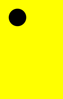
This example shows how to use the APIs in DrawingRenderingContext for drawing.
// xxx.ets
@Entry
@Component
struct CanvasExample {
  private context: DrawingRenderingContext = new DrawingRenderingContext()

  build() {
    Flex({ direction: FlexDirection.Column, alignItems: ItemAlign.Center, justifyContent: FlexAlign.Center }) {
      Canvas(this.context)
        .width('100%')
        .height('100%')
        .backgroundColor('#ffff00')
        .onReady(() => {
          this.context.canvas.drawCircle(200, 200, 100)
          this.context.invalidate()
        })
    }
    .width('100%')
    .height('100%')
  }
}
你可能感兴趣的鸿蒙文章
- 所属分类: 后端技术
- 本文标签:
热门推荐
-
2、 优质文章
-
3、 gt
-
7、 openharmony
-
9、 golang
-
10、 Vue中input框自动聚焦