harmony 鸿蒙Shape
Shape
The Shape component is the parent component of the drawing components. The attributes described in this topic are universal attributes supported by all the drawing components.
Drawing components use Shape as their parent to implement the effect similar to SVG.
The Shape component is used independently to draw a specific shape.
NOTE
This component is supported since API version 7. Updates will be marked with a superscript to indicate their earliest API version.
Child Components
The following child components are supported: Rect](ts-drawing-components-rect.md), Path, Circle, Ellipse, Polyline, Polygon, Image, Text, Column, Row, Shape
APIs
Shape(value?: PixelMap)
Since API version 9, this API is supported in ArkTS widgets, except that PixelMap objects are not supported.
Atomic service API: This API can be used in atomic services since API version 11.
System capability: SystemCapability.ArkUI.ArkUI.Full
Parameters
| Name | Type | Mandatory | Description |
|---|---|---|---|
| value | PixelMap | No | Shape to draw. You can draw a shape in the specified PixelMap object. If no object is specified, the shape is drawn in the current drawing target. |
Attributes
In addition to the universal attributes, the following attributes are supported.
viewPort
viewPort(value: ViewportRect)
Sets the viewport of the shape.
Widget capability: Since API version 9, this API is supported in ArkTS widgets.
Atomic service API: This API can be used in atomic services since API version 11.
System capability: SystemCapability.ArkUI.ArkUI.Full
Parameters
| Name | Type | Mandatory | Description |
|---|---|---|---|
| value | ViewportRect | Yes | Options of the viewport. |
ViewportRect18+
Describes the options of the viewport.
Widget capability: This API can be used in ArkTS widgets since API version 18.
Atomic service API: This API can be used in atomic services since API version 18.
System capability: SystemCapability.ArkUI.ArkUI.Full
| Name | Type | Mandatory | Description |
|---|---|---|---|
| x | string |number | No | Horizontal coordinate of the start point of the viewport. Default value: 0. Default unit: vp. Invalid values are treated as the default value. |
| y | string |number | No | Vertical coordinate of the start point of the viewport. Default value: 0. Default unit: vp. Invalid values are treated as the default value. |
| width | string |number | No | Width of the viewport. The value must be greater than or equal to 0. Default value: 0. Default unit: vp. Invalid values are treated as the default value. |
| height | string |number | No | Height of the viewport. The value must be greater than or equal to 0. Default value: 0. Default unit: vp. Invalid values are treated as the default value. |
fill
fill(value: ResourceColor)
Sets the color of the fill area. An invalid value is handled as the default value. If this attribute and the universal attribute foregroundColor are both set, whichever is set later takes effect.
Widget capability: Since API version 9, this API is supported in ArkTS widgets.
Atomic service API: This API can be used in atomic services since API version 11.
System capability: SystemCapability.ArkUI.ArkUI.Full
Parameters
| Name | Type | Mandatory | Description |
|---|---|---|---|
| value | ResourceColor | Yes | Color of the fill area. Default value: Color.Black |
fillOpacity
fillOpacity(value: number|string|Resource)
Sets the opacity of the fill area. The value range is [0.0, 1.0]. A value less than 0.0 is treated as 0.0. A value greater than 1.0 is treated as 1.0. Any other value is treated as 1.0.
Widget capability: Since API version 9, this API is supported in ArkTS widgets.
Atomic service API: This API can be used in atomic services since API version 11.
System capability: SystemCapability.ArkUI.ArkUI.Full
Parameters
| Name | Type | Mandatory | Description |
|---|---|---|---|
| value | number |string |Resource | Yes | Opacity of the fill area. Default value: 1 |
stroke
stroke(value: ResourceColor)
Sets the stroke color. If this attribute is not set, the component does not have any stroke. If the value is invalid, no stroke will be drawn.
Widget capability: Since API version 9, this API is supported in ArkTS widgets.
Atomic service API: This API can be used in atomic services since API version 11.
System capability: SystemCapability.ArkUI.ArkUI.Full
Parameters
| Name | Type | Mandatory | Description |
|---|---|---|---|
| value | ResourceColor | Yes | Stroke color. |
strokeDashArray
strokeDashArray(value: Array<any>)
Sets the stroke dashes. The value must be greater than or equal to 0. Invalid values are treated as the default value.
Widget capability: Since API version 9, this API is supported in ArkTS widgets.
Atomic service API: This API can be used in atomic services since API version 11.
System capability: SystemCapability.ArkUI.ArkUI.Full
Parameters
| Name | Type | Mandatory | Description |
|---|---|---|---|
| value | Array<any> | Yes | Stroke dashes. Default value: [] Default unit: vp |
strokeDashOffset
strokeDashOffset(value: number|string)
Sets the offset of the start point for drawing the stroke. Invalid values are treated as the default value.
Widget capability: Since API version 9, this API is supported in ArkTS widgets.
Atomic service API: This API can be used in atomic services since API version 11.
System capability: SystemCapability.ArkUI.ArkUI.Full
Parameters
| Name | Type | Mandatory | Description |
|---|---|---|---|
| value | number |string | Yes | Offset of the start point for drawing the stroke. Default value: 0. Default unit: vp |
strokeLineCap
strokeLineCap(value: LineCapStyle)
Sets the cap style of the stroke.
Widget capability: Since API version 9, this API is supported in ArkTS widgets.
Atomic service API: This API can be used in atomic services since API version 11.
System capability: SystemCapability.ArkUI.ArkUI.Full
Parameters
| Name | Type | Mandatory | Description |
|---|---|---|---|
| value | LineCapStyle | Yes | Cap style of the stroke. Default value: LineCapStyle.Butt |
strokeLineJoin
strokeLineJoin(value: LineJoinStyle)
Sets the join style of the stroke.
Widget capability: Since API version 9, this API is supported in ArkTS widgets.
Atomic service API: This API can be used in atomic services since API version 11.
System capability: SystemCapability.ArkUI.ArkUI.Full
Parameters
| Name | Type | Mandatory | Description |
|---|---|---|---|
| value | LineJoinStyle | Yes | Join style of the stroke. Default value: LineJoinStyle.Miter |
strokeMiterLimit
strokeMiterLimit(value: number|string)
Sets the limit on the ratio of the miter length to the value of strokeWidth used to draw a miter join. The miter length indicates the distance from the outer tip to the inner corner of the miter. This attribute works only when strokeLineJoin is set to LineJoinStyle.Miter.
The value must be greater than or equal to 1.0. If the value is in the [0, 1) range, the value 1.0 will be used. In other cases, the default value will be used.
Widget capability: Since API version 9, this API is supported in ArkTS widgets.
Atomic service API: This API can be used in atomic services since API version 11.
System capability: SystemCapability.ArkUI.ArkUI.Full
Parameters
| Name | Type | Mandatory | Description |
|---|---|---|---|
| value | number |string | Yes | Limit on the ratio of the miter length to the value of strokeWidth used to draw a miter join. Default value: 4 |
strokeOpacity
strokeOpacity(value: number|string|Resource)
Sets the stroke opacity. The value range is [0.0, 1.0]. A value less than 0.0 is treated as 0.0. A value greater than 1.0 is treated as 1.0. Any other value is treated as 1.0.
Widget capability: Since API version 9, this API is supported in ArkTS widgets.
Atomic service API: This API can be used in atomic services since API version 11.
System capability: SystemCapability.ArkUI.ArkUI.Full
Parameters
| Name | Type | Mandatory | Description |
|---|---|---|---|
| value | number |string |Resource | Yes | Stroke opacity. Default value: 1 |
strokeWidth
strokeWidth(value: number|string)
Sets the stroke width. If this attribute is of the string type, percentage values are not supported and will be treated as 1 px.
Widget capability: Since API version 9, this API is supported in ArkTS widgets.
Atomic service API: This API can be used in atomic services since API version 11.
System capability: SystemCapability.ArkUI.ArkUI.Full
Parameters
| Name | Type | Mandatory | Description |
|---|---|---|---|
| value | number |string | Yes | Stroke width. The value must be greater than or equal to 0. Default value: 1. Default unit: vp. Invalid values are treated as the default value. |
antiAlias
antiAlias(value: boolean)
Specifies whether anti-aliasing is enabled.
Widget capability: Since API version 9, this API is supported in ArkTS widgets.
Atomic service API: This API can be used in atomic services since API version 11.
System capability: SystemCapability.ArkUI.ArkUI.Full
Parameters
| Name | Type | Mandatory | Description |
|---|---|---|---|
| value | boolean | Yes | Whether anti-aliasing is enabled. true: Anti-aliasing is enabled. false: Anti-aliasing is disabled. Default value: true |
mesh8+
mesh(value: Array<number>, column: number, row: number)
Sets the mesh effect.
Widget capability: Since API version 9, this API is supported in ArkTS widgets.
Atomic service API: This API can be used in atomic services since API version 11.
System capability: SystemCapability.ArkUI.ArkUI.Full
Parameters
| Name | Type | Mandatory | Description |
|---|---|---|---|
| value | Array<number> | Yes | An array of lengths (column + 1) * (row + 1) * 2, which records the position of each vertex of the distorted bitmap. |
| column | number | Yes | Number of columns in the mesh matrix. |
| row | number | Yes | Number of rows in the mesh matrix. |
Example
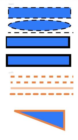
This example demonstrates how to use the Shape component to draw rectangles, ellipses, and lines.
// xxx.ets
@Entry
@Component
struct ShapeExample {
  build() {
    Column({ space: 10 }) {
      Text('basic').fontSize(11).fontColor(0xCCCCCC).width(320)
      // Draw a 300 x 50 rectangle with strokes at (-2, -2). The fill color is 0x317AF7, the stroke color is black, the stroke width is 4, the stroke dash is 20, the offset is 10 to the left, the cap style is rounded, the join style is rounded, and anti-aliasing is enabled (default).
      // Draw a 300 x 50 ellipse with strokes at (-2, 58). The fill color is 0x317AF7, the stroke color is black, the stroke width is 4, the stroke dash is 20, the offset is 10 to the left, the cap style is rounded, the join style is rounded, and anti-aliasing is enabled (default).
      // Draw a 300 x 10 straight line at (-2, 118). The fill color is 0x317AF7, the stroke color is black, the stroke width is 4, the stroke dash is 20, the offset is 10 to the left, the cap style is rounded, the join style is rounded, and anti-aliasing is enabled (default).
      Shape() {
        Rect().width(300).height(50)
        Ellipse().width(300).height(50).offset({ x: 0, y: 60 })
        Path().width(300).height(10).commands('M0 0 L900 0').offset({ x: 0, y: 120 })
      }
      .width(350)
      .height(140)
      .viewPort({
        x: -2,
        y: -2,
        width: 304,
        height: 130
      })
      .fill(0x317AF7)
      .stroke(Color.Black)
      .strokeWidth(4)
      .strokeDashArray([20])
      .strokeDashOffset(10)
      .strokeLineCap(LineCapStyle.Round)
      .strokeLineJoin(LineJoinStyle.Round)
      .antiAlias(true)

      // Draw a 300 x 50 rectangle with strokes at (0, 0) and (-5, -5). The drawing start point is the midpoint of the stroke width by default. To fully display the strokes, you must set the coordinates of the start position of the viewport to negative values so that the viewport is offset by half the stroke width.
      Shape() {
        Rect().width(300).height(50)
      }
      .width(350)
      .height(80)
      .viewPort({
        x: 0,
        y: 0,
        width: 320,
        height: 70
      })
      .fill(0x317AF7)
      .stroke(Color.Black)
      .strokeWidth(10)

      Shape() {
        Rect().width(300).height(50)
      }
      .width(350)
      .height(80)
      .viewPort({
        x: -5,
        y: -5,
        width: 320,
        height: 70
      })
      .fill(0x317AF7)
      .stroke(Color.Black)
      .strokeWidth(10)

      Text('path').fontSize(11).fontColor(0xCCCCCC).width(320)
      // Draw a straight line at (0, -5). The fill color is 0xEE8443, the stroke width is 10, and the stroke dash is 20.
      Shape() {
        Path().width(300).height(10).commands('M0 0 L900 0')
      }
      .width(350)
      .height(20)
      .viewPort({
        x: 0,
        y: -5,
        width: 300,
        height: 20
      })
      .stroke(0xEE8443)
      .strokeWidth(10)
      .strokeDashArray([20])

      // Draw a straight line at (0, -5). The fill color is 0xEE8443, the stroke width is 10, the stroke dash is 20, and the offset is 10 to the left.
      Shape() {
        Path().width(300).height(10).commands('M0 0 L900 0')
      }
      .width(350)
      .height(20)
      .viewPort({
        x: 0,
        y: -5,
        width: 300,
        height: 20
      })
      .stroke(0xEE8443)
      .strokeWidth(10)
      .strokeDashArray([20])
      .strokeDashOffset(10)

      // Draw a straight line at (0, -5). The fill color is 0xEE8443, the stroke width is 10, and the stroke opacity is 0.5.
      Shape() {
        Path().width(300).height(10).commands('M0 0 L900 0')
      }
      .width(350)
      .height(20)
      .viewPort({
        x: 0,
        y: -5,
        width: 300,
        height: 20
      })
      .stroke(0xEE8443)
      .strokeWidth(10)
      .strokeOpacity(0.5)

      // Draw a straight line at (0, -5). The fill color is 0xEE8443, the stroke width is 10, the stroke dash is 20, and the cap style is rounded.
      Shape() {
        Path().width(300).height(10).commands('M0 0 L900 0')
      }
      .width(350)
      .height(20)
      .viewPort({
        x: 0,
        y: -5,
        width: 300,
        height: 20
      })
      .stroke(0xEE8443)
      .strokeWidth(10)
      .strokeDashArray([20])
      .strokeLineCap(LineCapStyle.Round)

      // Draw a closed path at (-20, -5). The fill color is 0x317AF7, the stroke width is 10, the stroke color is 0xEE8443, and the join style is miter (default value).
      Shape() {
        Path().width(200).height(60).commands('M0 0 L400 0 L400 150 Z')
      }
      .width(300)
      .height(200)
      .viewPort({
        x: -20,
        y: -5,
        width: 310,
        height: 90
      })
      .fill(0x317AF7)
      .stroke(0xEE8443)
      .strokeWidth(10)
      .strokeLineJoin(LineJoinStyle.Miter)
      .strokeMiterLimit(5)
    }.width('100%').margin({ top: 15 })
  }
}
你可能感兴趣的鸿蒙文章
- 所属分类: 后端技术
- 本文标签:
热门推荐
-
2、 优质文章
-
3、 gt
-
7、 openharmony
-
9、 golang
-
10、 Vue中input框自动聚焦