harmony 鸿蒙Basics
Basics
The <svg> component is used as the root node of the SVG canvas and can be nested in the SVG. For details, see svg.
NOTE
The width and height must be defined for the <svg> parent component or <svg> component. Otherwise, the component is not drawn.
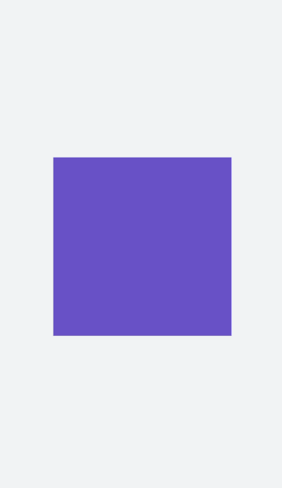
Creating an <svg> Component
Create a <svg> component in the .hml file under pages/index.
<!-- xxx.hml -->
<div class="container">
  <svg width="400" height="400">  </svg>
</div>
/* xxx.css */
.container{
  width: 100%;
  height: 100%;
  flex-direction: column;
  align-items: center;
  justify-content: center;
  background-color: #F1F3F5;
}
svg{
  background-color: blue;
}
Setting Attributes
Set the width, height, x, y, and viewBox attributes to define the width, height, X coordinate, Y coordinate, and SVG viewport of the <svg> component.
<!-- xxx.hml -->
<div class="container">
  <svg width="400" height="400" viewBox="0 0 100 100">
    <svg class="rect" width="100" height="100" x="20" y="10">
    </svg>
  </svg>
</div>
/* xxx.css */
.container{
  width: 100%;
  height: 100%;
  flex-direction: column;
  align-items: center;
  justify-content: center;
  background-color: #F1F3F5;
}
svg{
  background-color: yellow;
}
.rect{
  background-color: red;
}
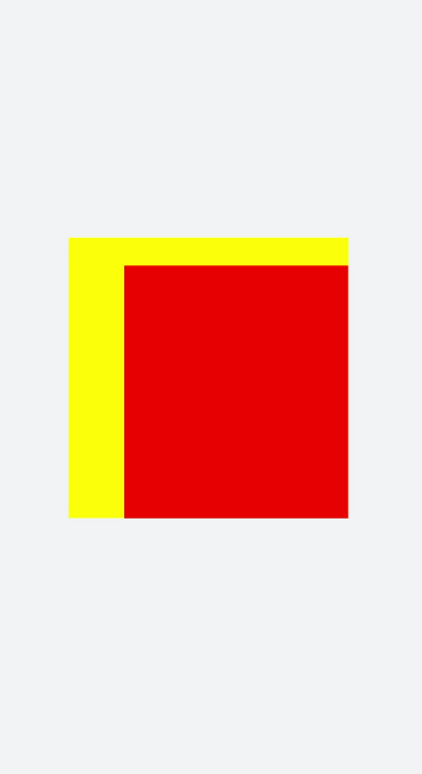
NOTE
If the <svg> component is the root node, the X-axis and Y-axis attributes are invalid.
If the width and height of viewBox are inconsistent with those of the <svg> component, the view box will be scaled in center-aligned mode.
你可能感兴趣的鸿蒙文章
harmony 鸿蒙Atomic Service Full Screen Launch Component (FullScreenLaunchComponent)
harmony 鸿蒙Arc Button (ArcButton)
harmony 鸿蒙Frame Animation (ohos.animator)
harmony 鸿蒙Implementing Property Animation
- 所属分类: 后端技术
- 本文标签:
热门推荐
-
2、 优质文章
-
3、 gt
-
7、 openharmony
-
9、 golang
-
10、 Vue中input框自动聚焦