harmony 鸿蒙NodeContainer
NodeContainer
The NodeContainer component is a basic component that accepts an instance of NodeController and does not allow child nodes to be appended. It must be used together with NodeController.
NOTE
This component is supported since API version 11. Updates will be marked with a superscript to indicate their earliest API version.
Only custom FrameNodes or the root FrameNode obtained from a BuilderNode can be attached to this component. Proxy nodes of built-in system components obtained through querying cannot be attached to this component.
This component does not work with the attribute modifier.
During the construction of the node tree under this component, the UI instance UIContext](../js-apis-arkui-UIContext.md) is used. Switching between different UI instances might cause issues due to instance mismatches. As a result, this component currently does not support reusing nodes across multiple instances.
Child Components
Not supported
APIs
NodeContainer
NodeContainer(controller: NodeController)
Atomic service API: This API can be used in atomic services since API version 12.
System capability: SystemCapability.ArkUI.ArkUI.Full
Parameters
| Name | Type | Mandatory | Description |
|---|---|---|---|
| controller | NodeController | Yes | NodeController instance used to control the upper and lower tree nodes in the NodeContainer. It represents the lifecycle of the NodeContainer. |
Attributes
The universal attributes are supported.
Events
The universal events are supported.
Example
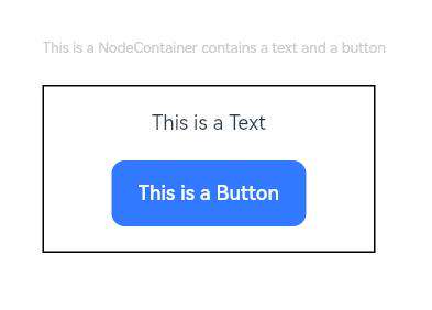
This example demonstrates how to mount a BuilderNode through NodeController.
import { NodeController, BuilderNode, FrameNode, UIContext } from '@kit.ArkUI';

declare class Params {
  text: string
}

@Builder
function buttonBuilder(params: Params) {
  Flex({ direction: FlexDirection.Column, alignItems: ItemAlign.Center, justifyContent: FlexAlign.SpaceEvenly }) {
    Text(params.text)
      .fontSize(12)
    Button(`This is a Button`, { type: ButtonType.Normal, stateEffect: true })
      .fontSize(12)
      .borderRadius(8)
      .backgroundColor(0x317aff)
  }
  .height(100)
  .width(200)
}

class MyNodeController extends NodeController {
  private rootNode: BuilderNode<[Params]>|null = null;
  private wrapBuilder: WrappedBuilder<[Params]> = wrapBuilder(buttonBuilder);

  makeNode(uiContext: UIContext): FrameNode|null {
    if (this.rootNode === null) {
      this.rootNode = new BuilderNode(uiContext);
      this.rootNode.build(this.wrapBuilder, { text: "This is a Text" })
    }
    return this.rootNode.getFrameNode();
  }
}


@Entry
@Component
struct Index {
  private baseNode: MyNodeController = new MyNodeController()

  build() {
    Flex({ direction: FlexDirection.Column, alignItems: ItemAlign.Start, justifyContent: FlexAlign.SpaceEvenly }) {
      Text("This is a NodeContainer contains a text and a button ")
        .fontSize(9)
        .fontColor(0xCCCCCC)
      NodeContainer(this.baseNode)
        .borderWidth(1)
        .onClick(() => {
          console.log("click event");
        })
    }
    .padding({ left: 35, right: 35, top: 35 })
    .height(200)
    .width(300)
  }
}
你可能感兴趣的鸿蒙文章
- 所属分类: 后端技术
- 本文标签:
热门推荐
-
2、 优质文章
-
3、 gt
-
7、 openharmony
-
9、 golang
-
10、 Vue中input框自动聚焦